Matplotlib基础使用
matplotlib
一、Matplotlib基础知识
Matplotlib中的基本图表包括的元素
x轴和y轴 axis
水平和垂直的轴线x轴和y轴刻度 tick
刻度标示坐标轴的分隔,包括最小刻度和最大刻度x轴和y轴刻度标签 tick label
表示特定坐标轴的值绘图区域(坐标系) axes
实际绘图的区域坐标系标题 title
实际绘图的区域轴标签 xlabel ylabel
实际绘图的区域
import numpy as np

import pandas as pd

import matplotlib.pyplot as plt

from pandas import Series,DataFrame

%matplotlib inline   # 魔法指令
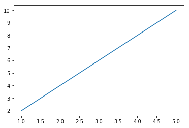
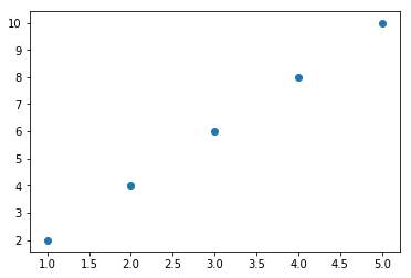
包含单条曲线的图
- 注意:y,x轴的值必须为数字
x=[1,2,3,4,5]

y=[2,4,6,8,10]
plt.plot(x,y)
[<matplotlib.lines.Line2D at 0x2f5e4d8f160>]
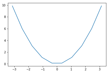
- 绘制抛物线
x = np.linspace(-np.pi,np.pi,num=10)

y = x**2
plt.plot(x,y)
[<matplotlib.lines.Line2D at 0x2f5e4e35748>]
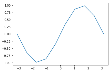
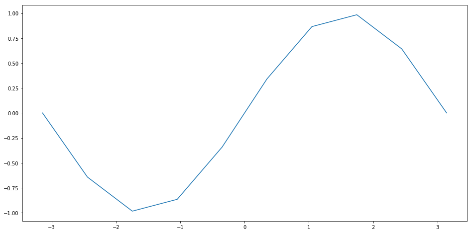
- 绘制正弦曲线图
x = x

y = np.sin(x)

plt.plot(x,y)
[<matplotlib.lines.Line2D at 0x2f5e4e9ab38>]
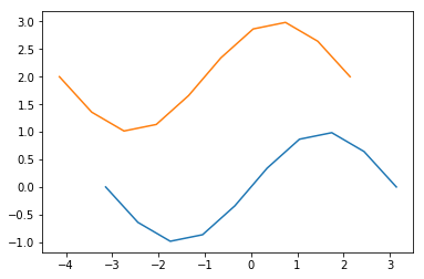
包含多个曲线的图
1、连续调用多次plot函数
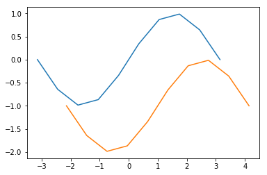
plt.plot(x,y)

plt.plot(x-1,y+2)
[<matplotlib.lines.Line2D at 0x2f5e4eb78d0>]
plt.plot(x,y,x+1,y-1)
[<matplotlib.lines.Line2D at 0x2f5e51832e8>,

 <matplotlib.lines.Line2D at 0x2f5e51834a8>]
2、也可以在一个plot函数中传入多对X,Y值,在一个图中绘制多个曲线
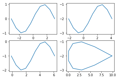
将多个曲线图绘制在一个table区域中:对象形式创建表图
- a=plt.subplot(row,col,loc) 创建曲线图
- a.plot(x,y) 绘制曲线图
ax1 = plt.subplot(2,2,1)

ax1.plot(x,y)

ax2 = plt.subplot(222)

ax2.plot(x+1,y-2)

ax3 = plt.subplot(223)

ax3.plot(x+3,y-1)

ax4 = plt.subplot(224)

ax4.plot(x**2,y-2)
[<matplotlib.lines.Line2D at 0x2f5e6462208>]
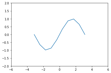
坐标轴界限
axis方法:设置x,y轴刻度值的范围
- plt.axis([xmin,xmax,ymin,ymax])
plt.plot(x,y)

plt.axis([-6,6,-2,2])
[-6, 6, -2, 2]
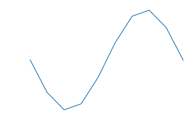
plt.axis('off')
- 关闭坐标轴
plt.plot(x,y)

plt.axis('off')
(-3.4557519189487724,

 3.4557519189487724,

 -1.0832885283134288,

 1.083288528313429)
设置画布比例:plt.figure(figsize=(a,b)) a:x刻度比例 b:y刻度比例 (2:1)表示x刻度显示为y刻度显示的2倍
plt.figure(figsize=(16,8))

plt.plot(x,y)
[<matplotlib.lines.Line2D at 0x2f5e63b6400>]
坐标轴标签
s 标签内容
color 标签颜色
fontsize 字体大小
rotation 旋转角度
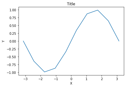
plt的xlabel方法和ylabel方法 title方法
plt.plot(x,y)

plt.xlabel('X')

plt.ylabel('Y')

plt.title('Title')
Text(0.5,1,'Title')
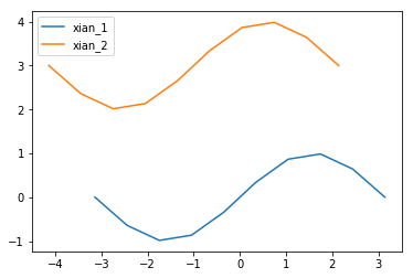
图例
legend方法
两种传参方法:
- 分别在plot函数中增加label参数,再调用plt.legend()方法显示
- 直接在legend方法中传入字符串列表

plt.plot(x,y,label='xian_1')

plt.plot(x-1,y+3,label='xian_2')

plt.legend()
<matplotlib.legend.Legend at 0x2f5e66057b8>
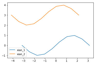
legend的参数
- loc参数
- loc参数用于设置图例标签的位置,一般在legend函数内
- matplotlib已经预定义好几种数字表示的位置
plt.plot(x,y,label='xian_1')

plt.plot(x-1,y+3,label='xian_2')

plt.legend(loc=3)
<matplotlib.legend.Legend at 0x2f5e68f6c88>
| 字符串 | 数值 | 字符串 | 数值 |
|---|---|---|---|
| best | 0 | center left | 6 |
| upper right | 1 | center right | 7 |
| upper left | 2 | lower center | 8 |
| lower left | 3 | upper center | 9 |
| lower right | 4 | center | 10 |
| right | 5 |
- ncol参数: ncol控制图例中有几列,在legend中设置ncol
plt.plot(x,y,label='xian_1')

plt.plot(x-1,y+3,label='xian_2')

plt.legend(loc=3,ncol=2)
<matplotlib.legend.Legend at 0x2f5e6ab4a90>

保存图片
使用figure对象的savefig函数来保存图片
fig = plt.figure()---必须放置在绘图操作之前
figure.savefig的参数选项
- filename
含有文件路径的字符串或Python的文件型对象。图像格式由文件扩展名推断得出,例如,.pdf推断出PDF,.png推断出PNG
(“png”、“pdf”、“svg”、“ps”、“eps”……) - dpi
图像分辨率(每英寸点数),默认为100 - facecolor ,打开保存图片查看
图像的背景色,默认为“w”(白色)
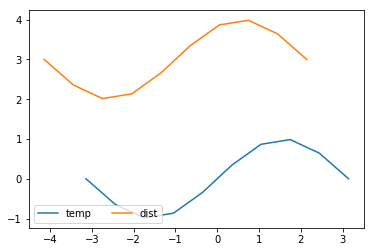
fig = plt.figure()

plt.plot(x,y,label='temp')

plt.plot(x-1,y+3,label='dist')

plt.legend(loc=3,ncol=2)

fig.savefig('./123.png',dpi=300)
设置plot的风格和样式
plot语句中支持除X,Y以外的参数,以字符串形式存在,来控制颜色、线型、点型等要素,语法形式为:
plt.plot(X, Y, 'format', ...)
颜色
参数color或c
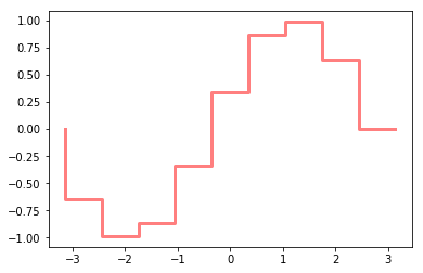
plt.plot(x,y,c='red',alpha=0.5,ls='steps',lw=3)
[<matplotlib.lines.Line2D at 0x2f5e6a4c668>]
颜色值的方式
别名
- color='r'
合法的HTML颜色名
- color = 'red'
| 颜色 | 别名 | HTML颜色名 | 颜色 | 别名 | HTML颜色名 |
|---|---|---|---|---|---|
| 蓝色 | b | blue | 绿色 | g | green |
| 红色 | r | red | 黄色 | y | yellow |
| 青色 | c | cyan | 黑色 | k | black |
| 洋红色 | m | magenta | 白色 | w | white |
HTML十六进制字符串
- color = '#eeefff'
归一化到[0, 1]的RGB元组
- color = (0.3, 0.3, 0.4)
透明度
alpha参数
线型
参数linestyle或ls
| 线条风格 | 描述 | 线条风格 | 描述 |
|---|---|---|---|
| '-' | 实线 | ':' | 虚线 |
| '--' | 破折线 | 'steps' | 阶梯线 |
| '-.' | 点划线 | 'None' / ',' | 什么都不画 |
线宽
linewidth或lw参数
点型
- marker 设置点形
- markersize 设置点形大小
| 标记 | 描述 | 标记 | 描述 |
|---|---|---|---|
| 's' | 正方形 | 'p' | 五边形 |
| 'h' | 六边形1 | 'H' | 六边形2 |
| '8' | 八边形 |
| 标记 | 描述 | 标记 | 描述 |
|---|---|---|---|
| '.' | 点 | 'x' | X |
| '*' | 星号 | '+' | 加号 |
| ',' | 像素 |
| 标记 | 描述 | 标记 | 描述 |
|---|---|---|---|
| 'o' | 圆圈 | 'D' | 菱形 |
| 'd' | 小菱形 | '','None',' ',None | 无 |
| 标记 | 描述 | 标记 | 描述 |
|---|---|---|---|
| '1' | 一角朝下的三脚架 | '3' | 一角朝左的三脚架 |
| '2' | 一角朝上的三脚架 | '4' | 一角朝右的三脚架 |
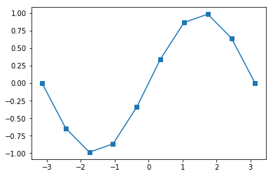
plt.plot(x,y,marker='s')
[<matplotlib.lines.Line2D at 0x2f5e6b87dd8>]
# 绘制线      plt.plot(x1,y1,x2,y2)

# 网格线      plt.grid(True)  axes.grid(color,ls,lw,alpha)

# 获取坐标系  plt.subplot(n1,n2,n3)

# 坐标轴标签  plt.xlabel() plt.ylabel()

# 坐标系标题  plt.title()

# 图例        plt.legend([names],ncol=2,loc=1)  plt.plot(label='name')

# 线风格      --  -. : None  step

# 图片保存    figure.savefig()

# 点的设置    marker markersize markerfacecolor markeredgecolor\width

# 坐标轴刻度  plt.xticks(刻度列表,刻度标签列表) plt.yticks()

#             axes.set_xticks(刻度列表) axes.set_xticklabels(刻度标签列表)
二、2D图形
直方图
- 是一个特殊的柱状图,又叫做密度图。
【直方图的参数只有一个x!!!不像条形图需要传入x,y】
plt.hist()的参数
- bins
直方图的柱数,可选项,默认为10 - color
指定直方图的颜色。可以是单一颜色值或颜色的序列。如果指定了多个数据集合,例如DataFrame对象,颜色序列将会设置为相同的顺序。如果未指定,将会使用一个默认的线条颜色 - orientation
通过设置orientation为horizontal创建水平直方图。默认值为vertical
data = [1,2,3,3,4,2,5]

plt.hist(data,bins=10)
(array([1., 0., 2., 0., 0., 2., 0., 1., 0., 1.]),

 array([1. , 1.4, 1.8, 2.2, 2.6, 3. , 3.4, 3.8, 4.2, 4.6, 5. ]),

 <a list of 10 Patch objects>)
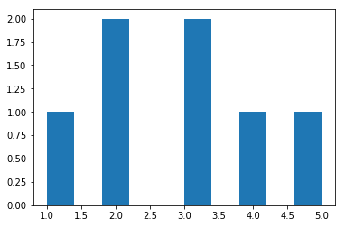
返回值 :
1: 直方图向量,是否归一化由参数normed设定
2: 返回各个bin的区间范围
3: 返回每个bin里面包含的数据,是一个list
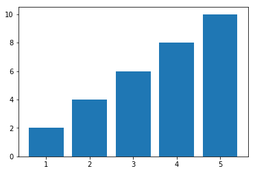
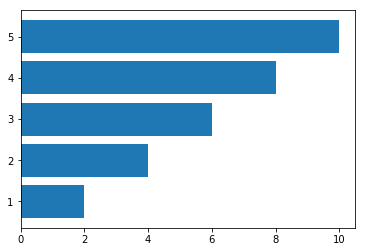
条形图:plt.bar()
- 参数:第一个参数是索引。第二个参数是数据值。第三个参数是条形的宽度
-【条形图有两个参数x,y】
- width 纵向设置条形宽度
- height 横向设置条形高度
bar()、barh()
x = [1,2,3,4,5]

y = [2,4,6,8,10]

plt.bar(x,y)
<Container object of 5 artists>
plt.barh(x,y)
<Container object of 5 artists>
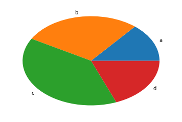
饼图
【饼图也只有一个参数x】
pie()
饼图适合展示各部分占总体的比例,条形图适合比较各部分的大小
普通各部分占满饼图
plt.pie([1,3,5])
([<matplotlib.patches.Wedge at 0x2f5e6d46198>,

  <matplotlib.patches.Wedge at 0x2f5e6d46668>,

  <matplotlib.patches.Wedge at 0x2f5e6d46ba8>],

 [Text(1.03366,0.376222,''),

  Text(-0.191013,1.08329,''),

  Text(-0.191013,-1.08329,'')])

普通未占满饼图:小数/比例
plt.pie([0.2,0.3,0.4])
([<matplotlib.patches.Wedge at 0x2f5e6d8d6d8>,

  <matplotlib.patches.Wedge at 0x2f5e6d8dba8>,

  <matplotlib.patches.Wedge at 0x2f5e6d95128>],

 [Text(0.889919,0.646564,''),

  Text(-0.646564,0.889919,''),

  Text(-0.339919,-1.04616,'')])

饼图阴影、分裂等属性设置
labels参数设置每一块的标签;
labeldistance参数设置标签距离圆心的距离(比例值)
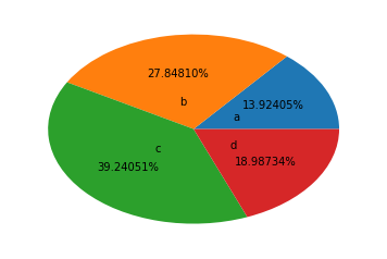
autopct参数设置比例值小数保留位(%.3f%%);
pctdistance参数设置比例值文字距离圆心的距离
explode参数设置每一块顶点距圆心的长度(比例值,列表);
colors参数设置每一块的颜色(列表);
shadow参数为布尔值,设置是否绘制阴影
startangle参数设置饼图起始角度
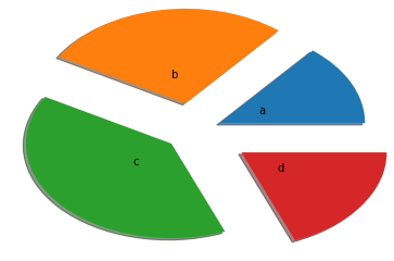
arr=[11,22,31,15]

plt.pie(arr,labels=['a','b','c','d'])
([<matplotlib.patches.Wedge at 0x2f5e7da2f28>,

  <matplotlib.patches.Wedge at 0x2f5e7daa438>,

  <matplotlib.patches.Wedge at 0x2f5e7daa978>,

  <matplotlib.patches.Wedge at 0x2f5e7daaeb8>],

 [Text(0.996424,0.465981,'a'),

  Text(-0.195798,1.08243,'b'),

  Text(-0.830021,-0.721848,'c'),

  Text(0.910034,-0.61793,'d')])
# labeldistance参数设置标签距离圆心的距离(比例值)

arr=[11,22,31,15]

plt.pie(arr,labels=['a','b','c','d'],labeldistance=0.3)
([<matplotlib.patches.Wedge at 0x2f5e7dedb38>,

  <matplotlib.patches.Wedge at 0x2f5e7dedf98>,

  <matplotlib.patches.Wedge at 0x2f5e7df7518>,

  <matplotlib.patches.Wedge at 0x2f5e7df7a58>],

 [Text(0.271752,0.127086,'a'),

  Text(-0.0533994,0.295209,'b'),

  Text(-0.226369,-0.196868,'c'),

  Text(0.248191,-0.168526,'d')])

# autopct参数设置比例值小数保留位(%.3f%%);

arr=[11,22,31,15]

plt.pie(arr,labels=['a','b','c','d'],labeldistance=0.3,autopct='%.5f%%')
([<matplotlib.patches.Wedge at 0x2f5e7e3f668>,

  <matplotlib.patches.Wedge at 0x2f5e7e3fd68>,

  <matplotlib.patches.Wedge at 0x2f5e7e47518>,

  <matplotlib.patches.Wedge at 0x2f5e7e47c88>],

 [Text(0.271752,0.127086,'a'),

  Text(-0.0533994,0.295209,'b'),

  Text(-0.226369,-0.196868,'c'),

  Text(0.248191,-0.168526,'d')],

 [Text(0.543504,0.254171,'13.92405%'),

  Text(-0.106799,0.590419,'27.84810%'),

  Text(-0.452739,-0.393735,'39.24051%'),

  Text(0.496382,-0.337053,'18.98734%')])
# explode参数设置每一块顶点距圆心的长度(比例值,列表);

arr=[11,22,31,15]

plt.pie(arr,labels=['a','b','c','d'],labeldistance=0.3,shadow=True,explode=[0.2,0.3,0.2,0.4])
([<matplotlib.patches.Wedge at 0x2f5e7e8ca90>,

  <matplotlib.patches.Wedge at 0x2f5e7e95240>,

  <matplotlib.patches.Wedge at 0x2f5e7e95a58>,

  <matplotlib.patches.Wedge at 0x2f5e7e9d2b0>],

 [Text(0.45292,0.21181,'a'),

  Text(-0.106799,0.590419,'b'),

  Text(-0.377282,-0.328113,'c'),

  Text(0.579113,-0.393228,'d')])
%m.nf
m 占位
n 小数点后保留几位
f 是以float格式输出
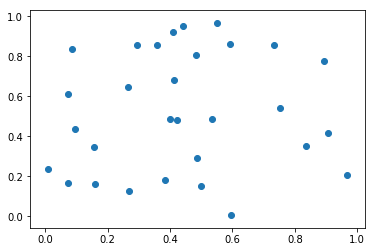
散点图:因变量随自变量而变化的大致趋势
【散点图需要两个参数x,y,但此时x不是表示x轴的刻度,而是每个点的横坐标!】
scatter()
plt.scatter(x,y)
<matplotlib.collections.PathCollection at 0x2f5e7edbe10>
plt.scatter(x,y,marker='d',c="rbgy") 设置不同的散点颜色
x = np.random.random(size=(30,))

y = np.random.random(size=(30,))

plt.scatter(x,y)
<matplotlib.collections.PathCollection at 0x2f5e7f519e8>
Matplotlib基础使用的更多相关文章
- 数据分析与展示——Matplotlib基础绘图函数示例
Matplotlib库入门 Matplotlib基础绘图函数示例 pyplot基础图表函数概述 函数 说明 plt.plot(x,y,fmt, ...) 绘制一个坐标图 plt.boxplot(dat ...
- Matplotlib基础图形之散点图
Matplotlib基础图形之散点图 散点图特点: 1.散点图显示两组数据的值,每个点的坐标位置由变量的值决定 2.由一组不连续的点组成,用于观察两种变量的相关性(正相关,负相关,不相关) 3.例如: ...
- Matplotlib基础知识
Matplotlib基础知识 Matplotlib中的基本图表包括的元素 x轴和y轴 axis水平和垂直的轴线 x轴和y轴刻度 tick刻度标示坐标轴的分隔,包括最小刻度和最大刻度 x轴和y轴刻度标签 ...
- matplotlib基础
Matplotlib 基础 注:本文中的程序都默认引入了numpy库和matplotlib库,并且分别简写为np与plt:如果读者不知道怎么使用numpy库,可以移步到这一博客上进行简单的学习 一.简 ...
- 模块简介与matplotlib基础
模块简介与matplotlib基础 1.基本概念 1.1数据分析 对已知的数据进行分析,提取出一些有价值的信息. 1.2数据挖掘 对大量的数据进行分析与挖掘,得到一些未知的,有价值的信息. 1.3数据 ...
- [笔记]SciPy、Matplotlib基础操作
NumPy.SciPy.Matplotlib,Python下机器学习三大利器.上一篇讲了NumPy基础操作,这节讲讲SciPy和Matplotlib.目前接触到的东西不多,以后再遇到些比较常用的再更新 ...
- 第二周 数据分析之展示 Matplotlib基础绘图函数实例
Pyplot基础图表函数 Pyplot饼图的绘制: Pyplot直方图的绘制: Pyplot极坐标图的绘制: Pyplot散点图的绘制: 单元小结: import numpy as np import ...
- python数据图形化—— matplotlib 基础应用
matplotlib是python中常用的数据图形化工具,用法跟matlab有点相似.调用简单,功能强大.在Windows下可以通过命令行 pip install matplotlib 来进行安装. ...
- python画图matplotlib基础笔记
numpy~~基础计算库,多维数组处理 scipy~~基于numpy,用于数值计算等等,默认调用intel mkl(高度优化的数学库) pandas~~强大的数据框,基于numpy matplotli ...
随机推荐
- 2018-8-10-C#-TimeSpan-时间计算
title author date CreateTime categories C# TimeSpan 时间计算 lindexi 2018-08-10 19:16:51 +0800 2018-06-1 ...
- 利用C51单片机模拟SPI进行双机通信
SPI协议简述 SPI,是英语Serial Peripheral interface的缩写,顾名思义就是串行外围设备接口.由Motorola首创.SPI接口主要应用在 EEPROM,FLASH,实时时 ...
- iBatis.Net 语句 获取Identity ID
<insert id="Table_Operate_Id" parameterClass="Entity" resultClass="Syste ...
- python常用模块学习1
import time time.sleep(1)#暂停时间 time.time()#显示当前系统时间戳 t=time.localtime()#结构化当地时间,可以将结构化时间想象成一个类 print ...
- 字符串format函数使用
#format拼接字符串,format()内的参数必须为可迭代的对象p1="i am {2},age {1},{0}".format("seven",18,'a ...
- k8s阅读笔记3-k8s的网络解析
前言 阅读地址https://rootsongjc.gitbooks.io/kubernetes-handbook/content/concepts/flannel.html k8s客户端的启动 顺序 ...
- 浅谈ContextLoaderListener及其上下文与DispatcherServlet的区别
一般在使用SpingMVC开发的项目中,一般都会在web.xml文件中配置ContextLoaderListener监听器,如下: <listener> <listener-clas ...
- Java IO方式
原创转载请注明出处:https://www.cnblogs.com/agilestyle/p/11444349.html BIO 传统的java.io包,它基于流模型实现,提供了我们最熟知的一些IO功 ...
- 第六周作业—N42-虚怀若谷
一.自建yum仓库,分别为网络源和本地源 [root@centos7 ~]# cd /etc/yum.repos.d/ [root@centos7 yum.repos.d]# mkdir bak #建 ...
- MaxCompute Studio 使用入门
MaxCompute Studio 是MaxCompute 平台提供的安装在开发者客户端的大数据集成开发环境工具,是一套基于流行的集成开发平台 IntelliJ IDEA 的开发插件,可以帮助您方便地 ...