
seaborn
Seaborn是基于matplotlib的Python数据可视化库。 它提供了一个高级界面,用于绘制引人入胜且内容丰富的统计图形。
一 风格及调色盘
风格
1 sns.set() 模式格式
2 sns.set_style() 手动选择样式,从 darkgrid, whitegrid, dark, white, ticks 手动选择一个
3 sns.set_context() 手动选择,表现为图的大小,paper, notebook, talk, poster 选一个
4 sns.despine() 我电脑上不生效,不知道为什么? 有限坐标轴的一些设定
5 with sns.axes_style() 。使sns样式 只在一个cell中生效,否则,整个ipynb都是生效的。
调色盘
1 sns.color_palette()
Return a list of colors defining a color palette. [ deep, muted, bright, pastel, dark, colorblind ] 可以从这几个中选一个。
其它风格样式
# 其他颜色风格

# 风格内容:Accent, Accent_r, Blues, Blues_r, BrBG, BrBG_r, BuGn, BuGn_r, BuPu,

# BuPu_r, CMRmap, CMRmap_r, Dark2, Dark2_r, GnBu, GnBu_r, Greens, Greens_r, Greys, Greys_r, OrRd, OrRd_r, Oranges, Oranges_r, PRGn, PRGn_r,

# Paired, Paired_r, Pastel1, Pastel1_r, Pastel2, Pastel2_r, PiYG, PiYG_r, PuBu, PuBuGn, PuBuGn_r, PuBu_r, PuOr, PuOr_r, PuRd, PuRd_r, Purples,

# Purples_r, RdBu, RdBu_r, RdGy, RdGy_r, RdPu, RdPu_r, RdYlBu, RdYlBu_r, RdYlGn, RdYlGn_r, Reds, Reds_r, Set1, Set1_r, Set2, Set2_r, Set3,

# Set3_r, Spectral, Spectral_r, Wistia, Wistia_r, YlGn, YlGnBu, YlGnBu_r, YlGn_r, YlOrBr, YlOrBr_r, YlOrRd, YlOrRd_r, afmhot, afmhot_r,

# autumn, autumn_r, binary, binary_r, bone, bone_r, brg, brg_r, bwr, bwr_r, cool, cool_r, coolwarm, coolwarm_r, copper, copper_r, cubehelix,

# cubehelix_r, flag, flag_r, gist_earth, gist_earth_r, gist_gray, gist_gray_r, gist_heat, gist_heat_r, gist_ncar, gist_ncar_r, gist_rainbow,

# gist_rainbow_r, gist_stern, gist_stern_r, gist_yarg, gist_yarg_r, gnuplot, gnuplot2, gnuplot2_r, gnuplot_r, gray, gray_r, hot, hot_r, hsv,

# hsv_r, icefire, icefire_r, inferno, inferno_r, jet, jet_r, magma, magma_r, mako, mako_r, nipy_spectral, nipy_spectral_r, ocean, ocean_r,

# pink, pink_r, plasma, plasma_r, prism, prism_r, rainbow, rainbow_r, rocket, rocket_r, seismic, seismic_r, spectral, spectral_r, spring,

# spring_r, summer, summer_r, terrain, terrain_r, viridis, viridis_r, vlag, vlag_r, winter, winter_r
返回值实际上类似 [[0.056191110099001705, 0.1179883217868713, 0.11005894089498236], [0.203019021665379, 0.05622532361389985, 0.09410692718552574]]
2 sns.set_palette()
Set the matplotlib color cycle using a seaborn palette. 设置调色盘。
接收的参数就是 类似 [ [ 0.1,0.2,0.3] , [0.4,0.5,0.3 ] ]
3 sns.husl_palette() / sns.hls_palette()
4 sns.palplot()
Plot the values in a color palette as a horizontal array.
就是讲类似 [ [ 0.1,0.2,0.3] , [0.4,0.5,0.3 ] ] ,转换成对应的具体的颜色。
5 sns.cubehelix_palette()
返回类似 [ [ 0.1,0.2,0.3] , [0.4,0.5,0.3 ] ]
5 sns.light_palette( 'green' ) / sns.dark_palette( 'red' )
某种程度上和 sns.palplot(sns.color_palette('Greens')) 一样。
6 sns.diverging_palette()
Make a diverging palette between two HUSL colors.
这个方法和sns.heatmap() 方法的as_map参数 和 cmap有联系。应该有as_cmp都有关。
补充: with sns.color_palette 和 sns.set_palette 都可以实现设置调色板。前者 我试验的结果是必须带with,而且只在一个cell中生效。
二 分布数据可视化
1 直方图与密度图
sns.distplot
接收单变量参数。 可以理解为将直方图,密度图,rug 融合在一起。
换言之,单维度 可以用distplot
sns.kdeplot
接收单变量,双变量参数。当时单变量的时候,图示密度图;当是双变量的时候,图是热力图。n_levels 参数可以设置,函数介绍中没有,这个参数很关键。和shade参数配合使用 效果更佳。
换言之,双维度,用 kdeplot
sns.rugplot
接收单变量。坐标轴上的小块。
sns.kdeplot(data['a'],data['b'],shade=True,cbar=True,legend=True,n_levels=60,cmap='OrRd',shade_lowest=False)
sns.kdeplot(data['c'],data['d'],shade=True,cbar=True,legend=True,n_levels=60,cmap='Blues',shade_lowest=False)
sns.rugplot(data['a'],axis='x',color='r',alpha=0.3)
sns.rugplot(data['b'],axis='y',color='r',alpha=0.3)
plt.scatter(data['a'],data['b'],s=1,color='k')
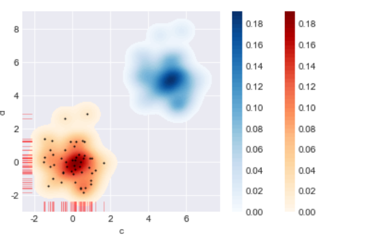
2 散点图
1) 综合散点图
part 1散点图 + 分布图
sns.jointplot( joint_kws=None, marginal_kws=None, annot_kws=None )
Draw a plot of two variables with bivariate and univariate graphs。
有很多参数。
part2 可拆分绘制的散点图
sns.JointGrid
Grid for drawing a bivariate plot with marginal univariate plots 。 我个人觉的这个定义太TM准确了。
j = sns.JointGrid
j.plot_joint()
Draw a bivariate plot of `x` and `y`.
j.plot_marginals()
Draw univariate plots for `x` and `y` separately
j.ax_marg_x.hist / bar
Draw the two marginal plots separately
2)矩阵散点图
sns.pairplot(hue=,palette=, var = [ ] )
Plot pairwise relationships in a dataset.
有很多参数,重要的是hue参数,分类,和 palette 参数 ,颜色区分,var 可以提取想要的数据对比
sns.PairGrid()
Subplot grid for plotting pairwise relationships in a dataset.
p=sns.PairGrid()
p.map_diag
Plot with a univariate function on each diagonal subplot
p.map_lower
Plot with a bivariate function on the lower diagonal subplots.
p.map_offdiag
Plot with a bivariate function on the off-diagonal subplots.
p.map_upper
具体细节不再赘述,官网连接 https://seaborn.pydata.org/
三 分类数据可视化
1 分类散点图
sns.stripplot(jitter,dodge)
Draw a scatterplot where one variable is categorical.
dodge=True 会对 hue 进行第二次视觉上的分类。
sns.swarmplot()
Draw a categorical scatterplot with non-overlapping points.
两者差不多,重要参数有 x,y,hue,order 。会根据x,y的定量还是定性数据,进行第一次分类,然后根据hue参数进行第二次分类。order,选择我们想要展示的数据。
2 分布图
sns.boxplot()
Draw a box plot to show distributions with respect to categories.
sns.violinplot( split= ,inner= ,scale='area')
Draw a combination of boxplot and kernel density estimate.
有这几个参数,可以多多注意下
sns.lvplot()
Draw a letter value plot to show distributions of large datasets.
这个可能没什么乱用吧
3 统计图
sns.barplot()
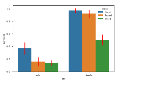
这种样式的。
Show point estimates and confidence intervals as rectangular bars.

A bar plot represents an estimate of central tendency for a numeric

variable with the height of each rectangle and provides some indication of

the uncertainty around that estimate using error bars
典型实例如下,有个重要的方法 sns.set_color_code()
data = sns.load_dataset('car_crashes')

fig  = plt.figure(figsize=(,))

ax1 = fig.add_subplot(,,)

data1 = data.sort_values(by='total',ascending=False)

sns.set_color_codes('pastel')

sns.barplot(x='total',y='abbrev',data=data1,color='r',label='total')

sns.set_color_codes('muted')

sns.barplot(x='speeding',y='abbrev',data=data1,color='r',label='speeding')

plt.legend()

sns.despine()
sns.countplot()
Show the counts of observations in each categorical bin using bars.
只接受一个x,或者一个y
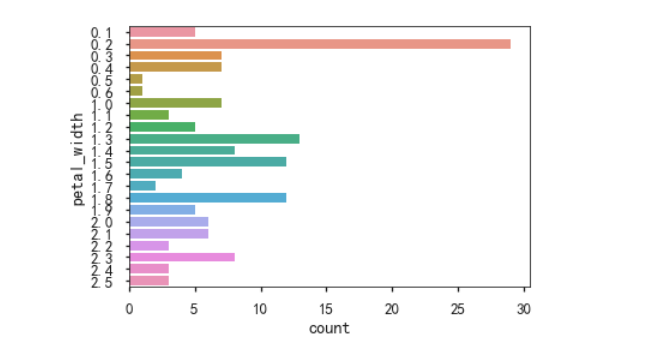
sns.pointplot()
Show point estimates and confidence intervals using scatter plot glyphs.
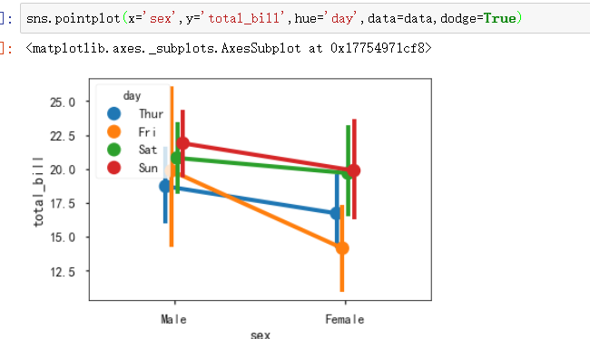
四 线性关系数据可视化
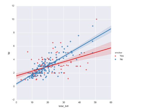
sns.lmplot
Plot data and regression model fits across a FacetGrid.
When thinking about how to assign variables to different facets, a general rule is that it makes sense to use ``hue`` for the most important comparison, followed by ``col`` and ``row``. However, always think about your particular dataset and the goals of the visualization you are creating.
x参数,y参数 必须都是定量的。
五 其它图表可视化
sns.lineplot() 老版本是sns.tsplot()
Draw a line plot with possibility of several semantic groupings.
The relationship between x and y can be shown for different subsets of the data using the hue, size, and style parameters. These parameters control what visual semantics are used to identify the different subsets.
hue,size,style 参数很重要。
x,y 参数是离散的numeric。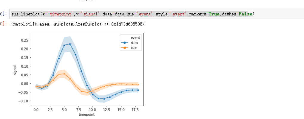
sns.heatmap()
Plot rectangular data as a color-encoded matrix
注意,第一个参数是 2D dataset that can be coerced into an ndarray。所以,会用到 dataframe.pivot 方法。
sns.heatmap(flights,

            annot = True,      # 是否显示数值

            fmt = 'd',         # 格式化字符串

            linewidths = 0.2,  # 格子边线宽度

            #center = ,      # 调色盘的色彩中心值,若没有指定,则以cmap为主

            #cmap = 'Reds',     # 设置调色盘

            cbar = True,       # 是否显示图例色带

            #cbar_kws={"orientation": "horizontal"},   # 是否横向显示图例色带

            #square = True,     # 是否正方形显示图表

           )
sns.set(style="white")

# 设置风格

rs = np.random.RandomState()

d = pd.DataFrame(rs.normal(size=(, )))

corr = d.corr()   # 求解相关性矩阵表格

# 创建数据

mask = np.zeros_like(corr, dtype=np.bool)

mask[np.triu_indices_from(mask)] = True

# 设置一个“上三角形”蒙版

cmap = sns.diverging_palette(, , as_cmap=True)

# 设置调色盘

sns.heatmap(corr, mask=mask, cmap=cmap, vmax=., center=,

            square=True, linewidths=0.2)

# 生成半边热图
六 结构化图表可视化
sns.FacetGrid()
>>> g = sns.FacetGrid(tips, col="time",  hue="smoker")

>>> g = (g.map(plt.scatter, "total_bill", "tip", edgecolor="w")

...       .add_legend())

seaborn的更多相关文章
- 数据可视化(三)- Seaborn简易入门
本文内容来源:https://www.dataquest.io/mission/133/creating-compelling-visualizations 本文数据来源:http://www.cdc ...
- Python可视化:Seaborn库热力图使用进阶
前言 在日常工作中,经常可以见到各种各种精美的热力图,热力图的应用非常广泛,下面一起来学习下Python的Seaborn库中热力图(heatmap)如何来进行使用. 本次运行的环境为: windows ...
- Python - Seaborn可视化:图形个性化设置的几个小技巧
1 概述 在可视化过程中,经常会对默认的制图效果不满意,希望能个性化进行各种设置. 本文通过一个简单的示例,来介绍seaborn可视化过程中的个性化设置.包括常用的设置,如: 设置图表显示颜色 设置图 ...
- seaborn使用(绘图函数)
seaborn使用(绘图函数) 数据集分布的可视化 分类数据的绘图 线性关系可视化 一.数据集分布的可视化 distplot kdeplot rugplot 1.distplot() 灵活的绘制单变量 ...
- seaborn使用(样式管理)
seaborn使用(样式管理) Seaborn是一个在Python中制作具有吸引力和丰富信息的统计图形的库.它建立在matplotlib之上,并与PyData堆栈紧密集成,包括支持scipy和pand ...
- Matplotlib Toolkits:python高级绘图库seaborn
http://blog.csdn.net/pipisorry/article/details/49515745 Seaborn介绍 seaborn (Not distributed with matp ...
- 使用seaborn探索泰坦尼克号上乘客能否获救
titanic数据集是个著名的数据集.kaggle上的titanic乘客生还率预测比赛是一个很好的入门机器学习的比赛. 数据集下载可以去https://www.kaggle.com/c/titanic ...
- seaborn库
首先找到Anaconda Prompt命令行,下载seaborn库 ,命令 pip install seaborn 1.风格设置 import seaborn as sns import num ...
- Python数据可视化-seaborn库之countplot
在Python数据可视化中,seaborn较好的提供了图形的一些可视化功效. seaborn官方文档见链接:http://seaborn.pydata.org/api.html countplot是s ...
- 好用的函数,assert,random.sample,seaborn tsplot, tensorflow.python.platform flags 等,持续更新
python 中好用的函数,random.sample等,持续更新 random.sample random.sample的函数原型为:random.sample(sequence, k),从指定序列 ...
随机推荐
- arcgis server10.2发布地图服务报错
发布地图服务时,读取了本机电脑中的切片方案.发布服务,报打包成功,但发布失败错误. 解决办法:给arcgis账户,赋予读写权限即可.重复发布服务,成功发布.
- Vue框架前言
Vue框架 Vue 框架: 官网 vue框架:渐进式JavaScript框架 vue一个环境:可以只控制页面中一个标签.可以控制一组标签.可以控制整个页面.可以控制整个项目 vue可以根据实际需求,选 ...
- 无锁版以时间为GUID的方法
之前的博客 将时间作为GUID的方法 中,我使用了锁.我在实际的使用中,错将锁的释放放在了if语句中,这纯粹是我的失误,导致了很严重的错误.因此我在想是否有无锁的将时间作为GUID的方式,答案是使用I ...
- Codeforces Round #426 (Div. 2) - B
题目链接:http://codeforces.com/contest/834/problem/B 题意:一共有26个门(A-Z表示),然后现在有n个人要走的门和k个守卫.每当有人要经过某个门时,门要一 ...
- MixConv
深度分离卷积一般使用的是3*3的卷积核,这篇论文在深度分离卷积时使用了多种卷积核,并验证了其有效性 1.大的卷积核能提高模型的准确性,但也不是越大越好.如下,k=9时,精度逐渐降低 2. mixCon ...
- win32 界面 背景图片
case WM_PAINT: { HBITMAP hbm; BITMAP bminfo; hbm = LoadBitmap(GetModuleHandle(NULL), MAKEINTRESOURCE ...
- php.ini中时区设置不成功解决方法
一.在php.ini的[Date]中加入 [Date] date_default_timezone_set('UTC'); date.timezone = "Asia/Shanghai&qu ...
- Pytest安装介绍--使用(html报告)
Pytes是 一个单元测试框架,可以生成html报告. #卸载# pip uninstall pytest#安装# pip install -U pytest# 查看# pytest --versio ...
- phpstudy升级5.7
1:备份当前数据库数据. 最好是导成 SQL 文件 2:备份 PhpStudy 下的 MySQL 文件夹.以防升级失败.还可以使用旧版本的数据库 3:下载MySQL5.7.解压.然后放在 PhpStu ...
- 一次傻乎乎的错误QAQ
东北联赛上有一道题,数据范围是2^60,当时不记得long long的范围,于是写了一个程序试了一下,把队友带入了一个大数的大坑QAQ(蠢哭). 当时写的代码是这样的: #include<ios ...