swiper快速切换插件(两个综合案例源码)
swiper快速切换插件
swiper.js自己去官网下载哈。
先来一个tab切换案例:
demo.html
<!doctype html>

<html>

<head>

    <meta charset="utf-8">

    <meta name="viewport" content="width=device-width, initial-scale=1, maximum-scale=1, minimum-scale=1, user-scalable=no, minimal-ui">

    <title>Swiper Demo</title>

    <link rel="stylesheet" type="text/css" href="../js/swiper/idangerous.swiper2.7.6.css">

    <link rel="stylesheet" type="text/css" href="../css/index.css">

</head>

<body>

<div class="swiper-container">

    <div class="swiper-wrapper">

        <div class="swiper-slide bg-1png"></div>

        <div class="swiper-slide bg-2png"></div>

        <div class="swiper-slide bg-3png"></div>

        <div class="swiper-slide bg-4png"></div>

    </div>

</div>

<div class="tabs">

    <a href="" class="active">首页</a>

    <a href="">课程</a>

    <a href="">发现</a>

    <a href="">我的</a>

</div>

<script type="text/javascript" src="../js/jquery/jquery-1.10.1.min.js"></script>

<script type="text/javascript" src="../js/swiper/idangerous.swiper2.7.6.min.js"></script>

<script type="text/javascript" src="../js/index.js"></script>

</body>

</html>
index.js
var swiper = new Swiper(".swiper-container", {

    onSlideChangeStart: function(swiper) {

        var index = swiper.activeIndex;

        $(".tabs a").removeClass("active");

        $(".tabs a").eq(index).addClass("active");

    }

});

$(".tabs a").click(function(e){

    e.preventDefault();

    var index = $(this).index();

    $(".tabs a").removeClass("active");

    $(this).addClass("active");

    swiper.swipeTo(index);

    return false;

});
swipper杂七杂八知识点补充:
/*垂直滚动:Demo1*/

var swiper = new Swiper(".swiper-container", {

    mode: 'vertical'

});

/*Progress插件:Demo2*/

var swiper = new Swiper(".swiper-container", {

    progress: true,

    onProgressChange: function(swiper){

        for (var i = 0; i < swiper.slides.length; i++){

          var slide = swiper.slides[i];

          var progress = slide.progress;

          var scale, translate, opacity;

          if (progress<=0) {

            opacity = 1 - Math.min(Math.abs(progress),1);

            scale = 1 - Math.min(Math.abs(progress/2),1);

            translate = progress*swiper.width;

          }

          else {

            opacity = 1 - Math.min(Math.abs(progress/2),1);

            scale=1;

            translate=0;

          }

          slide.style.opacity = opacity;

          swiper.setTransform(slide,'translate3d('+(translate)+'px,0,0) scale('+scale+')');

        }

      },

      onTouchStart:function(swiper){

        for (var i = 0; i < swiper.slides.length; i++){

          swiper.setTransition(swiper.slides[i], 0);

        }

      },

      onSetWrapperTransition: function(swiper, speed) {

        for (var i = 0; i < swiper.slides.length; i++){

          swiper.setTransition(swiper.slides[i], speed);

        }

      }

});

// Set Z-Indexes

  for (var i = 0; i < swiper.slides.length; i++){

    swiper.slides[i].style.zIndex = swiper.slides.length - i;

  }

/*3D Flow 插件使用:Demo3*/

var swiper = new Swiper(".swiper-container", {

  tdFlow: {}

});

/*scroll Bar 插件使用: Demo4*/

var swiper = new Swiper(".swiper-container", {

    scrollbar: {

        container : '.swiper-scrollbar',

        draggable : true,

        hide: true,

        snapOnRelease: true

    }

});

/*Tab 综合示例 :Demo5*/

var swiper = new Swiper(".swiper-container", {

    onSlideChangeStart: function(swiper) {

        var index = swiper.activeIndex;

        $(".tabs a").removeClass("active");

        $(".tabs a").eq(index).addClass("active");

    }

});

$(".tabs a").click(function(e){

    e.preventDefault();

    var index = $(this).index();

    $(".tabs a").removeClass("active");

    $(this).addClass("active");

    swiper.swipeTo(index);

    return false;

});
WebApp综合案例:
首先是移动端效果:
然后是pc端效果
index.html
<!DOCTYPE html>
<html lang="en">
<head>
<meta charset="UTF-8">
<title>index</title>
<meta charset="UTF-8">
<meta name="viewport" content="width=device-width, initial-scale=1, minimum-scale=1, maximum-scale=1, user-scalable=no">
<link rel="stylesheet" href="css/base.css">
<link rel="stylesheet" href="css/grid.css">
<link rel="stylesheet" href="css/index.css">
</head>
<body>
<!-- 第一区域 -->
<div class="container1">
<!-- ipad导航 -->
<nav class="nav-container col-md-12 d-none d-md-block">
<ul class="nav col-md-8 col-offset-2 ">
<li class="nav-item">
<a href="###" class="nav-link nav-link-active">前端</a>
</li>
<li class="nav-item">
<a href="###" class="nav-link">java</a>
</li>
<li class="nav-item">
<a href="###" class="nav-link">ios</a>
</li>
<li class="nav-item">
<a href="###" class="nav-link">Android</a>
</li>
<li class="nav-item">
<a href="###" class="nav-link">php</a>
</li>
</ul>
</nav>
<!-- 移动端导航 -->
<nav class="nav-container nav-container-sm d-md-none" id="nav">
<div class="nav-container-wrap">
<p>TEST</p>
<div class="nav-container-sm-right"><img id="toggle-btn" src="img/zhankai.svg" alt=""></div>
<ul class="container-sm">
<li><a href="###" class="nav-link-sm">前端</a></li>
<li><a href="###" class="nav-link-sm">java</a></li>
<li><a href="###" class="nav-link-sm">ios</a></li>
<li><a href="###" class="nav-link-sm">Android</a></li>
<li><a href="###" class="nav-link-sm">php</a></li>
</ul>
</div>
</nav>
<!-- 内容 -->
<div class="container1-content">
<img src="img/1.png">
<p class="img1-p">TEST</p>
<button>start</button>
</div>
</div>
<!-- 第二区域 -->
<div class="container2">
<nav class="container2-nav col-md-12">
<ul class="nav">
<li class="container2-nav-item">
<a href="###" class="nav-link nav-link-active">关于TEST</a>
</li>
<li class="container2-nav-item">
<a href="###" class="nav-link">关于课程</a>
</li>
<li class="container2-nav-item">
<a href="###" class="nav-link">核心团队</a>
</li>
<li class="container2-nav-item">
<a href="###" class="nav-link">新增专题</a>
</li>
</ul>
</nav>
</div>
<!-- 第三区域 -->
<div class="container3 col-md-12">
<div class="container3-content col-md-8 col-md-offset-2">
<h2>响应式</h2>
<p class="container3-content-p">响应式布局是Ethan Marcotte在2010年5月份提出的一个概念,简而言之,就是一个网站能够兼容多个终端——而不是为每个终端做一个特定的版本。这个概念是为解决移动互联网浏览而诞生的。
响应式布局可以为不同终端的用户提供更加舒适的界面和更好的用户体验,而且随着大屏幕移动设备的普及,用“大势所趋”来形容也不为过。随着越来越多的设计师采用这个技术,我们不仅看到很多的创新,还看到了一些成形的模式。</p>
</div>
</div>
<!-- 第四区域 -->
<div class="container4 col-md-12">
<div class="container4-left">
<p>TEST</p>
</div>
<div class="container4-right">
<p>welcome to <a href="#">www.test.com</a></p>
</div>
</div>
<!-- 第五区域 -->
<div class="container5 col-md-12">
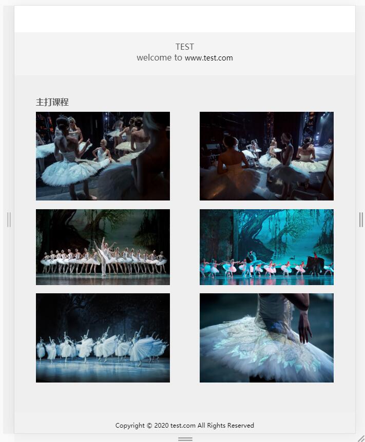
<h3>主打课程</h3>
<div class="container5-content">
<div class="container5-content-img">
<img src="img/1.jpg" alt="">
</div>
<div class="container5-content-img">
<img src="img/2.jpg" alt="">
</div>
<div class="container5-content-img">
<img src="img/3.jpg" alt="">
</div>
<div class="container5-content-img">
<img src="img/4.jpg" alt="">
</div>
<div class="container5-content-img">
<img src="img/5.jpg" alt="">
</div>
<div class="container5-content-img">
<img src="img/6.jpg" alt="">
</div>
</div>
</div>
<!-- 第六区域 -->
<div class="container6 col-md-12">
<p>Copyright © 2020 test.com All Rights Reserved</p>
</div>
<script src="js/jquery-1.10.1.min.js"></script>
<script src="js/index.js"></script>
</body>
</html>
base.css
* {box-sizing: border-box; padding:; margin:; }

html {font-size:16px; }

li {list-style: none; }

a {font-size: 14px; color: #363636; text-decoration: none; }

a:hover {color: #1428a0; }

img {vertical-align: top; width: 100%; height:100%; border: none; }
grid.css
.container {

    width: 100%;

    padding-left: 15px;

    padding-right: 15px;

    margin-left: auto;

    margin-right: auto;

}

.row {

    margin-left: -15px;

    margin-right: -15px;

}

.col-1, .col-2, .col-3, .col-4, .col-5, .col-6, .col-7, .col-8, .col-9, .col-10, .col-11, .col-12,

.col-sm-1, .col-sm-2, .col-sm-3, .col-sm-4, .col-sm-5, .col-sm-6, .col-sm-7, .col-sm-8, .col-sm-9, .col-sm-10, .col-sm-11, .col-sm-12,

.col-md-1, .col-md-2, .col-md-3, .col-md-4, .col-md-5, .col-md-6, .col-md-7, .col-md-8, .col-md-9, .col-md-10, .col-md-11, .col-md-12,

.col-lg-1, .col-lg-2, .col-lg-3, .col-lg-4, .col-lg-5, .col-lg-6, .col-lg-7, .col-lg-8, .col-lg-9, .col-lg-10, .col-lg-11, .col-lg-12,

.col-xl-1, .col-xl-2, .col-xl-3, .col-xl-4, .col-xl-5, .col-xl-6, .col-xl-7, .col-xl-8, .col-xl-9, .col-xl-10, .col-xl-11, .col-xl-12 {

    position: relative;

    padding-left: 15px;

    padding-right: 15px;

}

.col-1, .col-2, .col-3, .col-4, .col-5, .col-6, .col-7, .col-8, .col-9, .col-10, .col-11, .col-12 {

    float: left;

}

.col-1 {

    width: 8.33333333%;

}

.col-2 {

    width: 16.66666667%;

}

.col-3 {

    width: 25%;

}

.col-4 {

    width: 33.33333333%;

}

.col-5 {

    width: 41.66666667%;

}

.col-6 {

    width: 50%;

}

.col-7 {

    width: 58.33333333%;

}

.col-8 {

    width: 66.66666667%;

}

.col-9 {

    width: 75%;

}

.col-10 {

    width: 83.33333333%;

}

.col-11 {

    width: 91.66666667%;

}

.col-12 {

    width: 100%;

}

.col-offset-12 {

    margin-left: 100%;

}

.col-offset-11 {

    margin-left: 91.66666667%;

}

.col-offset-10 {

    margin-left: 83.33333333%;

}

.col-offset-9 {

    margin-left: 75%;

}

.col-offset-8 {

    margin-left: 66.66666667%;

}

.col-offset-7 {

    margin-left: 58.33333333%;

}

.col-offset-6 {

    margin-left: 50%;

}

.col-offset-5 {

    margin-left: 41.66666667%;

}

.col-offset-4 {

    margin-left: 33.33333333%;

}

.col-offset-3 {

    margin-left: 25%;

}

.col-offset-2 {

    margin-left: 16.66666667%;

}

.col-offset-1 {

    margin-left: 8.33333333%;

}

.col-offset-0 {

    margin-left:;

}

.col-pull-12 {

    right: 100%;

}

.col-pull-11 {

    right: 91.66666667%;

}

.col-pull-10 {

    right: 83.33333333%;

}

.col-pull-9 {

    right: 75%;

}

.col-pull-8 {

    right: 66.66666667%;

}

.col-pull-7 {

    right: 58.33333333%;

}

.col-pull-6 {

    right: 50%;

}

.col-pull-5 {

    right: 41.66666667%;

}

.col-pull-4 {

    right: 33.33333333%;

}

.col-pull-3 {

    right: 25%;

}

.col-pull-2 {

    right: 16.66666667%;

}

.col-pull-1 {

    right: 8.33333333%;

}

.col-pull-0 {

    right: auto;

}

.col-push-12 {

    left: 100%;

}

.col-push-11 {

    left: 91.66666667%;

}

.col-push-10 {

    left: 83.33333333%;

}

.col-push-9 {

    left: 75%;

}

.col-push-8 {

    left: 66.66666667%;

}

.col-push-7 {

    left: 58.33333333%;

}

.col-push-6 {

    left: 50%;

}

.col-push-5 {

    left: 41.66666667%;

}

.col-push-4 {

    left: 33.33333333%;

}

.col-push-3 {

    left: 25%;

}

.col-push-2 {

    left: 16.66666667%;

}

.col-push-1 {

    left: 8.33333333%;

}

.col-push-0 {

    left: auto;

}

/*sm*/

@media (min-width: 576px) {

    .col-sm-1, .col-sm-2, .col-sm-3, .col-sm-4, .col-sm-5, .col-sm-6, .col-sm-7, .col-sm-8, .col-sm-9, .col-sm-10, .col-sm-11, .col-sm-12 {

        float: left;

    }

    .col-sm-1 {

        width: 8.33333333%;

    }

    .col-sm-2 {

        width: 16.66666667%;

    }

    .col-sm-3 {

        width: 25%;

    }

    .col-sm-4 {

        width: 33.33333333%;

    }

    .col-sm-5 {

        width: 41.66666667%;

    }

    .col-sm-6 {

        width: 50%;

    }

    .col-sm-7 {

        width: 58.33333333%;

    }

    .col-sm-8 {

        width: 66.66666667%;

    }

    .col-sm-9 {

        width: 75%;

    }

    .col-sm-10 {

        width: 83.33333333%;

    }

    .col-sm-11 {

        width: 91.66666667%;

    }

    .col-sm-12 {

        width: 100%;

    }

    .col-sm-offset-12 {

        margin-left: 100%;

    }

    .col-sm-offset-11 {

        margin-left: 91.66666667%;

    }

    .col-sm-offset-10 {

        margin-left: 83.33333333%;

    }

    .col-sm-offset-9 {

        margin-left: 75%;

    }

    .col-sm-offset-8 {

        margin-left: 66.66666667%;

    }

    .col-sm-offset-7 {

        margin-left: 58.33333333%;

    }

    .col-sm-offset-6 {

        margin-left: 50%;

    }

    .col-sm-offset-5 {

        margin-left: 41.66666667%;

    }

    .col-sm-offset-4 {

        margin-left: 33.33333333%;

    }

    .col-sm-offset-3 {

        margin-left: 25%;

    }

    .col-sm-offset-2 {

        margin-left: 16.66666667%;

    }

    .col-sm-offset-1 {

        margin-left: 8.33333333%;

    }

    .col-sm-offset-0 {

        margin-left:;

    }

    .col-sm-pull-12 {

        right: 100%;

    }

    .col-sm-pull-11 {

        right: 91.66666667%;

    }

    .col-sm-pull-10 {

        right: 83.33333333%;

    }

    .col-sm-pull-9 {

        right: 75%;

    }

    .col-sm-pull-8 {

        right: 66.66666667%;

    }

    .col-sm-pull-7 {

        right: 58.33333333%;

    }

    .col-sm-pull-6 {

        right: 50%;

    }

    .col-sm-pull-5 {

        right: 41.66666667%;

    }

    .col-sm-pull-4 {

        right: 33.33333333%;

    }

    .col-sm-pull-3 {

        right: 25%;

    }

    .col-sm-pull-2 {

        right: 16.66666667%;

    }

    .col-sm-pull-1 {

        right: 8.33333333%;

    }

    .col-sm-pull-0 {

        right: auto;

    }

    .col-sm-push-12 {

        left: 100%;

    }

    .col-sm-push-11 {

        left: 91.66666667%;

    }

    .col-sm-push-10 {

        left: 83.33333333%;

    }

    .col-sm-push-9 {

        left: 75%;

    }

    .col-sm-push-8 {

        left: 66.66666667%;

    }

    .col-sm-push-7 {

        left: 58.33333333%;

    }

    .col-sm-push-6 {

        left: 50%;

    }

    .col-sm-push-5 {

        left: 41.66666667%;

    }

    .col-sm-push-4 {

        left: 33.33333333%;

    }

    .col-sm-push-3 {

        left: 25%;

    }

    .col-sm-push-2 {

        left: 16.66666667%;

    }

    .col-sm-push-1 {

        left: 8.33333333%;

    }

    .col-sm-push-0 {

        left: auto;

    }

}

/*md*/

@media (min-width: 768px) {

    .col-md-1, .col-md-2, .col-md-3, .col-md-4, .col-md-5, .col-md-6, .col-md-7, .col-md-8, .col-md-9, .col-md-10, .col-md-11, .col-md-12 {

        float: left;

    }

    .col-md-1 {

        width: 8.33333333%;

    }

    .col-md-2 {

        width: 16.66666667%;

    }

    .col-md-3 {

        width: 25%;

    }

    .col-md-4 {

        width: 33.33333333%;

    }

    .col-md-5 {

        width: 41.66666667%;

    }

    .col-md-6 {

        width: 50%;

    }

    .col-md-7 {

        width: 58.33333333%;

    }

    .col-md-8 {

        width: 66.66666667%;

    }

    .col-md-9 {

        width: 75%;

    }

    .col-md-10 {

        width: 83.33333333%;

    }

    .col-md-11 {

        width: 91.66666667%;

    }

    .col-md-12 {

        width: 100%;

    }

    .col-md-offset-12 {

        margin-left: 100%;

    }

    .col-md-offset-11 {

        margin-left: 91.66666667%;

    }

    .col-md-offset-10 {

        margin-left: 83.33333333%;

    }

    .col-md-offset-9 {

        margin-left: 75%;

    }

    .col-md-offset-8 {

        margin-left: 66.66666667%;

    }

    .col-md-offset-7 {

        margin-left: 58.33333333%;

    }

    .col-md-offset-6 {

        margin-left: 50%;

    }

    .col-md-offset-5 {

        margin-left: 41.66666667%;

    }

    .col-md-offset-4 {

        margin-left: 33.33333333%;

    }

    .col-md-offset-3 {

        margin-left: 25%;

    }

    .col-md-offset-2 {

        margin-left: 16.66666667%;

    }

    .col-md-offset-1 {

        margin-left: 8.33333333%;

    }

    .col-md-offset-0 {

        margin-left:;

    }

    .col-md-pull-12 {

        right: 100%;

    }

    .col-md-pull-11 {

        right: 91.66666667%;

    }

    .col-md-pull-10 {

        right: 83.33333333%;

    }

    .col-md-pull-9 {

        right: 75%;

    }

    .col-md-pull-8 {

        right: 66.66666667%;

    }

    .col-md-pull-7 {

        right: 58.33333333%;

    }

    .col-md-pull-6 {

        right: 50%;

    }

    .col-md-pull-5 {

        right: 41.66666667%;

    }

    .col-md-pull-4 {

        right: 33.33333333%;

    }

    .col-md-pull-3 {

        right: 25%;

    }

    .col-md-pull-2 {

        right: 16.66666667%;

    }

    .col-md-pull-1 {

        right: 8.33333333%;

    }

    .col-md-pull-0 {

        right: auto;

    }

    .col-md-push-12 {

        left: 100%;

    }

    .col-md-push-11 {

        left: 91.66666667%;

    }

    .col-md-push-10 {

        left: 83.33333333%;

    }

    .col-md-push-9 {

        left: 75%;

    }

    .col-md-push-8 {

        left: 66.66666667%;

    }

    .col-md-push-7 {

        left: 58.33333333%;

    }

    .col-md-push-6 {

        left: 50%;

    }

    .col-md-push-5 {

        left: 41.66666667%;

    }

    .col-md-push-4 {

        left: 33.33333333%;

    }

    .col-md-push-3 {

        left: 25%;

    }

    .col-md-push-2 {

        left: 16.66666667%;

    }

    .col-md-push-1 {

        left: 8.33333333%;

    }

    .col-md-push-0 {

        left: auto;

    }

}

/*lg*/

@media (min-width: 992px) {

    .col-lg-1, .col-lg-2, .col-lg-3, .col-lg-4, .col-lg-5, .col-lg-6, .col-lg-7, .col-lg-8, .col-lg-9, .col-lg-10, .col-lg-11, .col-lg-12 {

        float: left;

    }

    .col-lg-1 {

        width: 8.33333333%;

    }

    .col-lg-2 {

        width: 16.66666667%;

    }

    .col-lg-3 {

        width: 25%;

    }

    .col-lg-4 {

        width: 33.33333333%;

    }

    .col-lg-5 {

        width: 41.66666667%;

    }

    .col-lg-6 {

        width: 50%;

    }

    .col-lg-7 {

        width: 58.33333333%;

    }

    .col-lg-8 {

        width: 66.66666667%;

    }

    .col-lg-9 {

        width: 75%;

    }

    .col-lg-10 {

        width: 83.33333333%;

    }

    .col-lg-11 {

        width: 91.66666667%;

    }

    .col-lg-12 {

        width: 100%;

    }

    .col-lg-offset-12 {

        margin-left: 100%;

    }

    .col-lg-offset-11 {

        margin-left: 91.66666667%;

    }

    .col-lg-offset-10 {

        margin-left: 83.33333333%;

    }

    .col-lg-offset-9 {

        margin-left: 75%;

    }

    .col-lg-offset-8 {

        margin-left: 66.66666667%;

    }

    .col-lg-offset-7 {

        margin-left: 58.33333333%;

    }

    .col-lg-offset-6 {

        margin-left: 50%;

    }

    .col-lg-offset-5 {

        margin-left: 41.66666667%;

    }

    .col-lg-offset-4 {

        margin-left: 33.33333333%;

    }

    .col-lg-offset-3 {

        margin-left: 25%;

    }

    .col-lg-offset-2 {

        margin-left: 16.66666667%;

    }

    .col-lg-offset-1 {

        margin-left: 8.33333333%;

    }

    .col-lg-offset-0 {

        margin-left:;

    }

    .col-lg-pull-12 {

        right: 100%;

    }

    .col-lg-pull-11 {

        right: 91.66666667%;

    }

    .col-lg-pull-10 {

        right: 83.33333333%;

    }

    .col-lg-pull-9 {

        right: 75%;

    }

    .col-lg-pull-8 {

        right: 66.66666667%;

    }

    .col-lg-pull-7 {

        right: 58.33333333%;

    }

    .col-lg-pull-6 {

        right: 50%;

    }

    .col-lg-pull-5 {

        right: 41.66666667%;

    }

    .col-lg-pull-4 {

        right: 33.33333333%;

    }

    .col-lg-pull-3 {

        right: 25%;

    }

    .col-lg-pull-2 {

        right: 16.66666667%;

    }

    .col-lg-pull-1 {

        right: 8.33333333%;

    }

    .col-lg-pull-0 {

        right: auto;

    }

    .col-lg-push-12 {

        left: 100%;

    }

    .col-lg-push-11 {

        left: 91.66666667%;

    }

    .col-lg-push-10 {

        left: 83.33333333%;

    }

    .col-lg-push-9 {

        left: 75%;

    }

    .col-lg-push-8 {

        left: 66.66666667%;

    }

    .col-lg-push-7 {

        left: 58.33333333%;

    }

    .col-lg-push-6 {

        left: 50%;

    }

    .col-lg-push-5 {

        left: 41.66666667%;

    }

    .col-lg-push-4 {

        left: 33.33333333%;

    }

    .col-lg-push-3 {

        left: 25%;

    }

    .col-lg-push-2 {

        left: 16.66666667%;

    }

    .col-lg-push-1 {

        left: 8.33333333%;

    }

    .col-lg-push-0 {

        left: auto;

    }

}

/*xl*/

@media (min-width: 1200px) {

    .col-xl-1, .col-xl-2, .col-xl-3, .col-xl-4, .col-xl-5, .col-xl-6, .col-xl-7, .col-xl-8, .col-xl-9, .col-xl-10, .col-xl-11, .col-xl-12 {

        float: left;

    }

    .col-xl-1 {

        width: 8.33333333%;

    }

    .col-xl-2 {

        width: 16.66666667%;

    }

    .col-xl-3 {

        width: 25%;

    }

    .col-xl-4 {

        width: 33.33333333%;

    }

    .col-xl-5 {

        width: 41.66666667%;

    }

    .col-xl-6 {

        width: 50%;

    }

    .col-xl-7 {

        width: 58.33333333%;

    }

    .col-xl-8 {

        width: 66.66666667%;

    }

    .col-xl-9 {

        width: 75%;

    }

    .col-xl-10 {

        width: 83.33333333%;

    }

    .col-xl-11 {

        width: 91.66666667%;

    }

    .col-xl-12 {

        width: 100%;

    }

    .col-xl-offset-12 {

        margin-left: 100%;

    }

    .col-xl-offset-11 {

        margin-left: 91.66666667%;

    }

    .col-xl-offset-10 {

        margin-left: 83.33333333%;

    }

    .col-xl-offset-9 {

        margin-left: 75%;

    }

    .col-xl-offset-8 {

        margin-left: 66.66666667%;

    }

    .col-xl-offset-7 {

        margin-left: 58.33333333%;

    }

    .col-xl-offset-6 {

        margin-left: 50%;

    }

    .col-xl-offset-5 {

        margin-left: 41.66666667%;

    }

    .col-xl-offset-4 {

        margin-left: 33.33333333%;

    }

    .col-xl-offset-3 {

        margin-left: 25%;

    }

    .col-xl-offset-2 {

        margin-left: 16.66666667%;

    }

    .col-xl-offset-1 {

        margin-left: 8.33333333%;

    }

    .col-xl-offset-0 {

        margin-left:;

    }

    .col-xl-pull-12 {

        right: 100%;

    }

    .col-xl-pull-11 {

        right: 91.66666667%;

    }

    .col-xl-pull-10 {

        right: 83.33333333%;

    }

    .col-xl-pull-9 {

        right: 75%;

    }

    .col-xl-pull-8 {

        right: 66.66666667%;

    }

    .col-xl-pull-7 {

        right: 58.33333333%;

    }

    .col-xl-pull-6 {

        right: 50%;

    }

    .col-xl-pull-5 {

        right: 41.66666667%;

    }

    .col-xl-pull-4 {

        right: 33.33333333%;

    }

    .col-xl-pull-3 {

        right: 25%;

    }

    .col-xl-pull-2 {

        right: 16.66666667%;

    }

    .col-xl-pull-1 {

        right: 8.33333333%;

    }

    .col-xl-pull-0 {

        right: auto;

    }

    .col-xl-push-12 {

        left: 100%;

    }

    .col-xl-push-11 {

        left: 91.66666667%;

    }

    .col-xl-push-10 {

        left: 83.33333333%;

    }

    .col-xl-push-9 {

        left: 75%;

    }

    .col-xl-push-8 {

        left: 66.66666667%;

    }

    .col-xl-push-7 {

        left: 58.33333333%;

    }

    .col-xl-push-6 {

        left: 50%;

    }

    .col-xl-push-5 {

        left: 41.66666667%;

    }

    .col-xl-push-4 {

        left: 33.33333333%;

    }

    .col-xl-push-3 {

        left: 25%;

    }

    .col-xl-push-2 {

        left: 16.66666667%;

    }

    .col-xl-push-1 {

        left: 8.33333333%;

    }

    .col-xl-push-0 {

        left: auto;

    }

}

.d-none {

    display: none !important;

}

.d-block {

    display: block !important;

}

/*sm*/

@media (min-width: 576px) {

    .d-sm-none {

        display: none !important;

    }

    .d-sm-block {

        display: block !important;

    }

}

/*md*/

@media (min-width: 768px) {

    .d-md-none {

        display: none !important;

    }

    .d-md-block {

        display: block !important;

    }

}

/*lg*/

@media (min-width: 992px) {

    .d-lg-none {

        display: none !important;

    }

    .d-lg-block {

        display: block !important;

    }

}

/*xl*/

@media (min-width: 1200px) {

    .d-xl-none {

        display: none !important;

    }

    .d-xl-block {

        display: block !important;

    }

}

.clearfix:after,

.clearfix:before,

.container:after,

.container:before,

.row:after,

.row:before {

    display: table;

    content: ' ';

}

.clearfix:after,

.container:after,

.row:after {

    clear: both;

}
index.css
/*第一区域*/

.container1{

    width:100%;

    height:60vh;

    background-color: #B2C5CC;

}

.nav{

    display: flex;

    padding:3vh 0;

}

.nav-item{

    width:20%;

    text-align: center;

}

.nav-link{

    font-size:1rem;

    color:#757575;

}

.nav-link-active{

    color:orange;

    color:#afafaf;

}

/*移动端导航*/

.nav-container-sm{

    color:white;

    text-align: center;

    position: absolute;

    width: 100%;

}

.nav-container-wrap{

    background-color: #7EA6B1;

    padding:1vh 0;

}

.nav-container-sm-right{

     position: absolute;

     right:10px;

     top:8px;

     width:5%;

}

.container-sm{

    display: none;

}

.nav-container-sm li{

    color:white;

    border-bottom:1px solid white;

    padding:1vh 0;

}

.nav-container-sm li:last-child{

    border-bottom:none;

}

.nav-link-sm{

    color:white;

}

/*内容部分*/

.container1-content{

    text-align: center;

    padding-top: 20%;

}

.container1-content img{

    width:20%;

    height:20%;

}

.container1-content p{

    color: white;

    margin-top: 20px;

    font-size: 1rem;

}

.container1-content button{

    text-align: center;

    margin-top: 8%;

    width: 24%;

    height: 5vh;

    border: none;

    background-color: white;

    font-size: 1.2rem;

    line-height: 5vh;

    color:#757575;

}

/*第二区域*/

.container2-nav{

    border-bottom:1px solid #ccc;

}

.container2-nav-item{

    width:25%;

    text-align: center;

}

.container2-nav-item .nav-link{

    color:#bababa;

}

.container2-nav-item .nav-link-active{

    color:#545454;

}

.container2-content{

    text-align: center;

    padding-top: 10%;

}

/*第三区域*/

.container3{

    padding:10vh 0;

    text-align: center;

    color:#545454;

}

.container3-content p{

    margin-top: 20px;

    font-size: 1rem;

    text-align: left;

    line-height: 1.8rem;

}

/*第四区域*/

.container4{

    padding:2vh 5vh;

    background-color: rgb(244,244,244);

    color:#545454;

}

.container4-left{

    float:left;

}

.container4-right{

    float:right;

}

.container4-right a{

    color:black;

}

/*第五区域*/

.container5{

    background-color: rgb(239,239,239);

    padding:5vh;

    color:#545454;

}

.container5-content{

    display: flex;

    flex-wrap: wrap;

    justify-content: space-between;

    margin-top:1vh;

}

.container5-content-img{

    width:30%;

    margin-bottom:2vh;

}

/*第六区域*/

.container6{

    background-color: rgb(241,241,241);

    font-size: 1.1rem;

    padding: 2vh;

    text-align: center;

}

/*移动端调整*/

@media (max-width: 767px) {

    /*第一区域*/

    .container1-content button {

        font-size:1rem;

    }

    /*第二区域*/

    .container2-nav-item .nav-link{

        font-size: .6rem;

    }

    /*第三区域*/

    .container3 h2{

        font-size:1.2rem;

    }

    .container3-content p {

        font-size: .8rem;

        line-height: 1.8rem;

        padding: 0 10%;

    }

    /*第四区域*/

    .container4{

        height:10vh;

        text-align: center;

    }

    .container4-left {

        float: none;

    }

    .container4-right {

        float: none;

    }

    /*第五区域*/

    .container5-content-img {

        width: 45%;

    }

    .container5 h3{

        font-size:1rem;

    }

    /*第六区域*/

    .container6{

        font-size:.7rem;

    }

}
index.js
$(function(){

    $("#toggle-btn").on('click',function(){

        if($(this).attr('src')=='img/zhankai.svg'){

            $(this).attr('src','img/guanbi.svg');

            $(".container-sm").slideDown();

        }else{

            $(this).attr('src','img/zhankai.svg');

            $(".container-sm").slideUp();

        }

    })

});
swiper快速切换插件(两个综合案例源码)的更多相关文章
- iOS 实现快速切换主题详细教程(附上源码)
前言 iOS 实现主题切换,相信在未来的app里也是会频繁出现的,尽管现在只是出现在主流的APP,如(QQ.新浪微博.酷狗音乐.网易云音乐等),但是现在是看颜值.追求个性的年代,所以根据用户喜好自定义 ...
- Android 全面插件化 RePlugin 流程与源码解析
转自 Android 全面插件化 RePlugin 流程与源码解析 RePlugin,360开源的全面插件化框架,按照官网说的,其目的是“尽可能多的让模块变成插件”,并在很稳定的前提下,尽可能像开发普 ...
- SpringBoot 项目搭建(详细介绍+案例源码)
SpringBoot 项目搭建 SpringBoot 项目整合源码 SpringBoot 项目整合 一.项目准备 1.1 快速创建 SpringBoot 项目 1.2 标准项目结构图如下 1.3 添加 ...
- 插件开发之360 DroidPlugin源码分析(五)Service预注册占坑
请尊重分享成果,转载请注明出处: http://blog.csdn.net/hejjunlin/article/details/52264977 在了解系统的activity,service,broa ...
- 插件开发之360 DroidPlugin源码分析(四)Activity预注册占坑
请尊重分享成果,转载请注明出处: http://blog.csdn.net/hejjunlin/article/details/52258434 在了解系统的activity,service,broa ...
- ThreadLocal 简介 案例 源码分析 MD
Markdown版本笔记 我的GitHub首页 我的博客 我的微信 我的邮箱 MyAndroidBlogs baiqiantao baiqiantao bqt20094 baiqiantao@sina ...
- APICloud案例源码、模块源码、考试源码、开发工具大集合!赶快收藏
APICloud专注于APP开发定制技术,多年来不停为开发者奉献更多的资源.此次,APICloud将以往的的资源进行更新.整合,以合集的形式分享给广大的用户. APICloud应用案例源码合集 API ...
- 出售Illustrator脚本插件面板(包含面板源码,以及面板上所有的功能源码)
出售Illustrator脚本插件面板(包含面板源码,以及面板上所有的功能源码) 购买后可提供相应的小修改,以及教你使用往这个多列面里再加上按钮功能! 这套源码可作为工作使用,也可用为新手学习AI脚面 ...
- android向web提交参数的4种方式总结,附带网站案例源码
第一种:基于http协议通过get方式提交参数 1.对多个参数的封装 public static String get_save(String name, String phone) { /** * ...
随机推荐
- Codeforces 1060C Maximum Subrectangle(子矩阵+预处理)
题意:给出数组a,b,组成矩阵c,其中$c_{ij}=a_i*b_j$,找出最的大子矩阵,使得矩阵元素和<=x,求这个矩阵的size n,m<=2000 思路:对于子矩阵(l1...r1) ...
- ESXi以及WorkStation缩减thin provision模式Linux虚拟机磁盘的方法
1. 公司的服务器采用ESXi 进行管理. 有时候为了灵活性,需要将虚拟机从ESXi服务器上面导出来. 放置到不同的客户机器上面去. 2. 但是发现,比如我在linux里面安装了Oracle数据库, ...
- 浅谈ActionResult之FileResult
FileResult是一个基于文件的ActionResult,利用FileResult,我们可以很容易的将某个物理文件的内容响应给客户端,ASP.NET MVC定义了三个具体的FileResult,分 ...
- 1336 - Sigma Functio
1336 - Sigma Function Sigma function is an interesting function in Number Theory. It is denoted by t ...
- WebSocket协议分析
WebSocket协议分析 1.什么是WebSocket协议 WebScoket协议是基于TCP协议建立的全双工通信,所谓的全双工通信就是双向同时通信. 2.WebSocket协议优点 WebSock ...
- 如何用Java8 Stream API找到心仪的女朋友
传统的的Java 集合操作是有些啰嗦的,当我们需要对结合元素进行过滤,排序等操作的时候,通常需要写好几行代码以及定义临时变量. 而Java8 Stream API 可以极大简化这一操作,代码行数少,且 ...
- Sublime text3的安装及python开发环境的搭建
作者:struct_mooc 博客地址:https:////www.cnblogs.com/structmooc/p/12376592.html 一. Sublime text3的安装 1.subli ...
- hexo博客
安装软件 node.js(建议稳定版本,本人安装v8.11.3) npm install -g hexo-cli hexo init myBlog //初始化,在myBlog的文件夹下建立网站 hex ...
- Golang中的Slice与数组
1.Golang中的数组 数组是一种具有固定长度的基本数据结构,在golang中与C语言一样数组一旦创建了它的长度就不允许改变,数组的空余位置用0填补,不允许数组越界. 数组的一些基本操作: 1.创建 ...
- Android中DatePicker日期选择器的使用和获取选择的年月日
场景 实现效果如下 注: 博客: https://blog.csdn.net/badao_liumang_qizhi 关注公众号 霸道的程序猿 获取编程相关电子书.教程推送与免费下载. 实现 将布局改 ...