flex和box-shadow一些兼容性问题
html代码
<div class="creative-list">

            <a class="creative-list-item">

                <div class="item-img">

                    <img src=""/>

                    <div class="item-sell"></div>

                    <div class="patentImg">

                        <svg class="icon" aria-hidden="true"><use xlink:href="#icon-patent"></use></svg>

                        <span>专利</span>

                    </div>

                </div>

                <div class="item-title">我是标题哈哈哈我是标题哈哈哈我是标题哈哈哈</div>

                <div class="item-middle"><span class="type">西洋陶瓷</span><span class="look-num">1人浏览</span></div>

                <div class="item-bottom">

                    <div class="left">

                       <img src="">

                       <span class="name" title="ccbb">ccbb</span>

                       <span class="integral">750</span>

                    </div>

                    <div class="right">

                        <span class="price">1.00</span>

                        <span class="unit">元</span>

                    </div>

                </div>

            </a>
css代码
.creative-list{

    width: 100%;

    height: auto;

    -webkit-box-sizing: border-box;

            box-sizing: border-box;

    display: -webkit-box;

    display: -ms-flexbox;

    display: flex;

    -ms-flex-wrap: wrap;

        flex-wrap: wrap;

}

.creative-list-item{

    width: 280px;

    -webkit-box-sizing: border-box;

            box-sizing: border-box;

    -webkit-box-shadow: 0 0 12px rgba(0, 0, 0, .2);

            box-shadow: 0 0 12px rgba(0, 0, 0, .2);

    border-radius: 5px;

    background: #fff;

    cursor: pointer;

    margin-right:15px;

    margin-bottom: 15px;

    color: #000;

    overflow: hidden;

}

.creative-list-item:hover{

    color: #000;

}

.creative-list-item .item-img{

    width: 100%;

    height: 200px;

    overflow: hidden;

    position: relative;

}

.creative-list-item .item-img>img{

    width: 100%;

    height: 100%;

    -webkit-transition: -webkit-transform 0.3s;

    transition: -webkit-transform 0.3s;

    transition: transform 0.3s;

    transition: transform 0.3s, -webkit-transform 0.3s;

    -webkit-transform: scale(1);

            transform: scale(1)

}

.creative-list-item .item-img>img:hover{

     -webkit-transform: scale(1.2);

             transform: scale(1.2);

}

.creative-list-item .item-img .item-sell{

    position: absolute;

    top:;

    bottom:;

    left:;

    right:;

    border-radius: 5px 5px 0 0;

    display: block;

    height: 200px;

    background: #000;

    background: url(/static/img/design/yishouchu.png) 50% no-repeat rgba(0, 0, 0, .5);

    filter: alpha(opacity=50);

    opacity: .9;

}

.creative-list-item .item-img .patentImg{

    position: absolute;

    top:;

    left:;

    width: 60px;

    height: 30px;

    z-index: 999px;

    font-size: 12px;

    color: #fff;

    background-color: #fc4147;

    border-radius: 5px 0 12px 0;

}

.item-img .patentImg .icon{

    width: 18px;

    height: 18px;

    fill: currentColor;

    display: inline-block;

    overflow: hidden;

    color: #fff;

    margin: 6px 5px;

}

.item-img .patentImg span {

    position: absolute;

    font-weight: lighter;

    top: 6px;

}

.creative-list-item .item-title{

    padding:0 15px;

    -webkit-box-sizing: border-box;

            box-sizing: border-box;

    font-size: 18px;

    overflow: hidden;

    text-overflow: ellipsis;

    white-space: nowrap;

    margin-top:20px;

    color: #000;

}

.creative-list-item .item-middle {

    margin-top: 15px;

    padding:0 15px;

    font-size: 12px;

    color: #999;

    -webkit-box-sizing: border-box;

            box-sizing: border-box;

}

.item-middle .type{

    background-color: #e5e5e5;

    margin-right: 10px;

    display: inline-block;

    padding: 2px 4px;

    border-radius: 8px;

}

.item-middle .look-num{

    vertical-align: middle;

}

.creative-list-item .item-bottom{

    -webkit-box-sizing: border-box;

            box-sizing: border-box;

    padding:0 15px;

    margin:15px 0;

    display: -webkit-box;

    display: -ms-flexbox;

    display: flex;

    -webkit-box-align: center;

        -ms-flex-align: center;

            align-items: center;

}

.item-bottom img{

    margin-right: 5px;

    height: 30px;

    width: 30px;

    border-radius: 50%;

}

.item-bottom .left{

    -webkit-box-flex:;

        -ms-flex:;

            flex:;

    display: -webkit-box;

    display: -ms-flexbox;

    display: flex;

    -webkit-box-align: center;

        -ms-flex-align: center;

            align-items: center;

}

.item-bottom .name{

    margin-right: 5px;

    font-size: 14px;

    color: #333;

    cursor: pointer;

    max-width: 100px;

    display: inline-block;

    overflow: hidden;

    text-overflow: ellipsis;

    white-space: nowrap;

}

.item-bottom .integral{

    background-color: #fcba07;

    border-radius: 8px;

    font-size: 12px;

    color: #fff;

    display: inline-block;

    padding: 0 4px;

}

.item-bottom .right{

    float: right;

}

.item-bottom .right .price{

    color: #ff6000;

    font-size: 18px;

}

.item-bottom .right .unit{

    color: #ff6000;

    font-size: 12px;

}
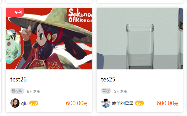
ie11以上 显示正常 效果如下
ie11以下 效果如下

原因 :列表遍历 我这边用的是a标签,ie11以下就不兼容了,只需要给a标签加个属性display:block; 将其变成块级元素即可。可以兼容到ie7
flex和box-shadow一些兼容性问题的更多相关文章
- display:flex和display:box布局浏览器兼容性分析
display:flex和display:box都可用于弹性布局,不同的是display:box是2009年的命名,已经过时,用的时候需要加上前缀:display:flex是2012年之后的命名.在实 ...
- flex和box兼容性写法
display: -webkit-box; /* Chrome 4+, Safari 3.1, iOS Safari 3.2+ */ display: -moz-box; /* Firefox 17- ...
- 如何设置box shadow的透明度
(从已经死了一次又一次终于挂掉的百度空间人工抢救出来的,发表日期2014-04-24) 今天发现使用box-shadow属性,可以很好的给div添加阴影效果,但是添加的效果如果是: -moz-box- ...
- 分享div、text、Box Shadow(阴影)演示及代码的页面
附图: 直接上链接:www.css88.com/tool/css3Preview/Box-Shadow.html
- CSS3新特性,兼容性,兼容方法总结
css3手册css3手册 边框 border-radius 用于添加圆角效果 语法: border-radius:[ <length> | <percentage> ]{1,4 ...
- flexbox布局的兼容性
http://ayqy.net/blog/flexbox布局的兼容性/ 写在前面 flex布局早在2009年就有了,而现在是2015年6月8日,使用最新的flex语法会发现支持程度并不好,即使是在“高 ...
- Flex弹性布局在移动设备上的应用
引文 首先,我们有表格布局.当不考虑语义并且利用一些适当的嵌套和其他技巧,我们可以用table建立具有一定功能的布局. 然后是现在大多数人都在使用的浮动布局.我们可以使用任何我们想用的元素,但浮动并不 ...
- CSS3弹性伸缩布局(二)——flex布局
上一篇博客<CSS3弹性伸缩布局(一)——box布局>介绍了旧版本的box布局,而这篇博客将主要介绍最新版本的flex布局的基础知识. 新版本简介 新版本的Flexbox模型是2012年9 ...
- 67.web--手机端兼容性问题
H5页面窗口自动调整到设备宽度,并禁止用户缩放页面 <meta name="viewport" content="width=device-width,initia ...
- CSS魔法堂:Flex布局
前言 Flex是Flexible Box的缩写,就是「弹性布局」.从2012年已经面世,但由于工作环境的原因一直没有详细了解.最近工作忙到头晕脑胀,是要学点新东西刺激一下大脑,打打鸡血. Flex就 ...
随机推荐
- 560. Subarray Sum Equals K 求和为k的子数组个数
[抄题]: Given an array of integers and an integer k, you need to find the total number of continuous s ...
- flex布局实现elment容器布局
一.flex布局是什么 flex布局,意为"弹性布局",是一种响应式的布局方法 采用 Flex 布局的元素,称为 Flex 容器,它的所有子元素自动成为容器成员. 先放上一个ele ...
- CRM中QueryDict和模型表知识补充
CRM中QueryDict和模型表知识补充 1.QueryDict的用法 request.GET的用法:1.在页面上输入:http://127.0.0.1:8000/index/print(reque ...
- [转载] ul li css 做横向菜单
原文地址: http://www.cnblogs.com/amylis_chen/archive/2011/09/24/2188398.html 第一步:建立一个无序列表 我们先建立一个无序列表,来建 ...
- Eigen使用矩阵作为函数参数
1 使用矩阵作为函数参数介绍 文章来源Writing Functions Taking %Eigen Types as Parameters Eigen为了在函数中传递不同的类型使用了表达式模板技术. ...
- 转 node.js和 android中java加密解密一致性问题;
原文地址,请大家去原文博客了解; http://blog.csdn.net/linminqin/article/details/19972751 我保留一份,防止删除: var crypto = re ...
- rsyslog和logrotate
简介 rsyslog 是一个 syslogd 的多线程增强版. 现在Fedora和Ubuntu, rhel6默认的日志系统都是rsyslog了 rsyslog负责写入日志, logrotate负责备份 ...
- 走进JDK(五)------AbstractList
接下来的一段时间重点介绍java.util这个包中的内容,这个包厉害了,包含了collection与map,提供了集合.队列.映射等实现.一张图了解java中的集合类: AbstractList 一. ...
- centos7升级系统内核
1)升级 方法一: rpm --import https://www.elrepo.org/RPM-GPG-KEY-elrepo.org rpm -Uvh http://www.elrepo.or ...
- redis集群部署那点事
[CentOS]make cc Command not found,make: *** [adlist.o] Error 127” 参考:https://blog.csdn.net/wzygis/ar ...