
炫酷的CSS3发光搜索表单,附演示和源码
昨天在国外的论坛上逛的时候,看到一篇帖子是求助如何利用CSS3实现发光效果的,网友回复中有一个推荐了一款CSS3发光搜索表单,利用CSS3的动画属性,设置0%和100%时的颜色样式,让其渐变,再配合有明显对比的背景,就能模拟出发光的效果了,我把那个CSS3发光表单下载了下来,先来看一下效果图:
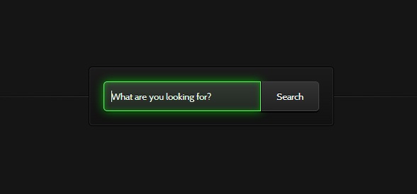
图上的搜索框在被激活的时候会出现闪闪发光的特效。
我们可以在这里查看CSS3发光搜索表单的DEMO演示。
下面我们来一起看看源代码。
HTML代码非常简单,一个文本框和一个提交按钮:
<form action="" method="">

        <input type="search" placeholder="What are you looking for?">

        <button>Search</button>

</form>
然后重点就是CSS3代码了,首先是对搜索框和搜索按钮的样式进行初始化,为了配合背景能出现发光的效果,我们使用了glow动画,我们对它们的样式作了如下设置:
.webdesigntuts-workshop {

    background: #151515;

    height: 100%;

    position: absolute;

    text-align: center;

    width: 100%;

}

.webdesigntuts-workshop:before,

.webdesigntuts-workshop:after {

    content: '';

    display: block;

    height: 1px;

    left: 50%;

    margin: 0 0 0 -400px;

    position: absolute;

    width: 800px;

}

.webdesigntuts-workshop:before {

    background: #444;

    background: -webkit-linear-gradient(left, #151515, #444, #151515);

    background: -moz-linear-gradient(left, #151515, #444, #151515);

    background: -o-linear-gradient(left, #151515, #444, #151515);

    background: -ms-linear-gradient(left, #151515, #444, #151515);

    background: linear-gradient(left, #151515, #444, #151515);

    top: 192px;

}

.webdesigntuts-workshop:after {

    background: #000;

    background: -webkit-linear-gradient(left, #151515, #000, #151515);

    background: -moz-linear-gradient(left, #151515, #000, #151515);

    background: -o-linear-gradient(left, #151515, #000, #151515);

    background: -ms-linear-gradient(left, #151515, #000, #151515);

    background: linear-gradient(left, #151515, #000, #151515);

    top: 191px;

}

.webdesigntuts-workshop form {

    background: #111;

    background: -webkit-linear-gradient(#1b1b1b, #111);

    background: -moz-linear-gradient(#1b1b1b, #111);

    background: -o-linear-gradient(#1b1b1b, #111);

    background: -ms-linear-gradient(#1b1b1b, #111);

    background: linear-gradient(#1b1b1b, #111);

    border: 1px solid #000;

    border-radius: 5px;

    box-shadow: inset 0 0 0 1px #272727;

    display: inline-block;

    font-size: 0px;

    margin: 150px auto 0;

    padding: 20px;

    position: relative;

    z-index:;

}

.webdesigntuts-workshop input {

    background: #222;

    background: -webkit-linear-gradient(#333, #222);

    background: -moz-linear-gradient(#333, #222);

    background: -o-linear-gradient(#333, #222);

    background: -ms-linear-gradient(#333, #222);

    background: linear-gradient(#333, #222);

    border: 1px solid #444;

    border-radius: 5px 0 0 5px;

    box-shadow: 0 2px 0 #000;

    color: #888;

    display: block;

    float: left;

    font-family: 'Cabin', helvetica, arial, sans-serif;

    font-size: 13px;

    font-weight:;

    height: 40px;

    margin:;

    padding: 0 10px;

    text-shadow: 0 -1px 0 #000;

    width: 200px;

}

.ie .webdesigntuts-workshop input {

    line-height: 40px;

}

.webdesigntuts-workshop input::-webkit-input-placeholder {

   color: #888;

}

.webdesigntuts-workshop input:-moz-placeholder {

   color: #888;

}

.webdesigntuts-workshop input:focus {

    -webkit-animation: glow 800ms ease-out infinite alternate;

    -moz-animation: glow 800ms ease-out infinite alternate;

    -o-animation: glow 800ms ease-out infinite alternate;

    -ms-animation: glow 800ms ease-out infinite alternate;

    animation: glow 800ms ease-out infinite alternate;

    background: #222922;

    background: -webkit-linear-gradient(#333933, #222922);

    background: -moz-linear-gradient(#333933, #222922);

    background: -o-linear-gradient(#333933, #222922);

    background: -ms-linear-gradient(#333933, #222922);

    background: linear-gradient(#333933, #222922);

    border-color: #393;

    box-shadow: 0 0 5px rgba(0,255,0,.2), inset 0 0 5px rgba(0,255,0,.1), 0 2px 0 #000;

    color: #efe;

    outline: none;

}

.webdesigntuts-workshop input:focus::-webkit-input-placeholder {

    color: #efe;

}

.webdesigntuts-workshop input:focus:-moz-placeholder {

    color: #efe;

}

.webdesigntuts-workshop button {

    background: #222;

    background: -webkit-linear-gradient(#333, #222);

    background: -moz-linear-gradient(#333, #222);

    background: -o-linear-gradient(#333, #222);

    background: -ms-linear-gradient(#333, #222);

    background: linear-gradient(#333, #222);

    -webkit-box-sizing: content-box;

    -moz-box-sizing: content-box;

    -o-box-sizing: content-box;

    -ms-box-sizing: content-box;

    box-sizing: content-box;

    border: 1px solid #444;

    border-left-color: #000;

    border-radius: 0 5px 5px 0;

    box-shadow: 0 2px 0 #000;

    color: #fff;

    display: block;

    float: left;

    font-family: 'Cabin', helvetica, arial, sans-serif;

    font-size: 13px;

    font-weight:;

    height: 40px;

    line-height: 40px;

    margin:;

    padding:;

    position: relative;

    text-shadow: 0 -1px 0 #000;

    width: 80px;

}

.webdesigntuts-workshop button:hover,

.webdesigntuts-workshop button:focus {

    background: #292929;

    background: -webkit-linear-gradient(#393939, #292929);

    background: -moz-linear-gradient(#393939, #292929);

    background: -o-linear-gradient(#393939, #292929);

    background: -ms-linear-gradient(#393939, #292929);

    background: linear-gradient(#393939, #292929);

    color: #5f5;

    outline: none;

}

.webdesigntuts-workshop button:active {

    background: #292929;

    background: -webkit-linear-gradient(#393939, #292929);

    background: -moz-linear-gradient(#393939, #292929);

    background: -o-linear-gradient(#393939, #292929);

    background: -ms-linear-gradient(#393939, #292929);

    background: linear-gradient(#393939, #292929);

    box-shadow: 0 1px 0 #000, inset 1px 0 1px #222;

    top: 1px;

}
下面是我们定义的glow动画,为了适应不同内核的浏览器,我们分别对其做了如下设置:
@-webkit-keyframes glow {

    0% {

        border-color: #393;

        box-shadow: 0 0 5px rgba(0,255,0,.2), inset 0 0 5px rgba(0,255,0,.1), 0 2px 0 #000;

    }

    100% {

        border-color: #6f6;

        box-shadow: 0 0 20px rgba(0,255,0,.6), inset 0 0 10px rgba(0,255,0,.4), 0 2px 0 #000;

    }

}

@-moz-keyframes glow {

    0% {

        border-color: #393;

        box-shadow: 0 0 5px rgba(0,255,0,.2), inset 0 0 5px rgba(0,255,0,.1), 0 2px 0 #000;

    }

    100% {

        border-color: #6f6;

        box-shadow: 0 0 20px rgba(0,255,0,.6), inset 0 0 10px rgba(0,255,0,.4), 0 2px 0 #000;

    }

}

@-o-keyframes glow {

    0% {

        border-color: #393;

        box-shadow: 0 0 5px rgba(0,255,0,.2), inset 0 0 5px rgba(0,255,0,.1), 0 2px 0 #000;

    }

    100% {

        border-color: #6f6;

        box-shadow: 0 0 20px rgba(0,255,0,.6), inset 0 0 10px rgba(0,255,0,.4), 0 2px 0 #000;

    }

}

@-ms-keyframes glow {

    0% {

        border-color: #393;

        box-shadow: 0 0 5px rgba(0,255,0,.2), inset 0 0 5px rgba(0,255,0,.1), 0 2px 0 #000;

    }

    100% {

        border-color: #6f6;

        box-shadow: 0 0 20px rgba(0,255,0,.6), inset 0 0 10px rgba(0,255,0,.4), 0 2px 0 #000;

    }

}

@keyframes glow {

    0% {

        border-color: #393;

        box-shadow: 0 0 5px rgba(0,255,0,.2), inset 0 0 5px rgba(0,255,0,.1), 0 2px 0 #000;

    }

    100% {

        border-color: #6f6;

        box-shadow: 0 0 20px rgba(0,255,0,.6), inset 0 0 10px rgba(0,255,0,.4), 0 2px 0 #000;

    }

}
最后我们将这个效果的源码打包一份供大家参考学习。下载地址>>
炫酷的CSS3发光搜索表单,附演示和源码的更多相关文章
- 6种炫酷的CSS3按钮边框动画特效
6种炫酷的CSS3按钮边框动画特效Button border animate 用鼠标滑过下面的按钮看看效果! Draw Draw Meet Center Spin Spin Circle Spin T ...
- 炫酷的CSS3抖动样式:CSS Shake
CSS Shake是一个使用CSS3实现的动画样式,使用SASS编写,利用它我们可以实现多种不同样式的抖动效果(如下面的GIF图像): 炫酷的CSS3抖动样式:CSS Shake 这是一个很微小的动画 ...
- 分享7款非常实用的jQuery/CSS3插件演示和源码
上次我们分享了15款效果很酷的最新jQuery/CSS3特效,非常不错,今天要分享7个非常实用的jQuery/CSS3插件演示和源码,一起来看看. 1.jQuery ajax点击地图显示商家网点分布 ...
- 炫酷霸气的HTML5/jQuery应用及源码
也许在5年前,HTML5还是一种很前卫的技术,大家还只是将它当做实验来看待,更别说产品应用了.但是现在HTML5已经非常流行,无论从PC端还是移动端,HTML5都扮演着非常重要的角色.今天我们要分享的 ...
- 7款经典炫酷的HTML5/jQuery动画应用示例及源码
jQuery是一款普遍受前端开发者欢迎的Javascript框架,但是开发者貌似更关注jQuery开发的插件,海量的jQuery插件让前端开发者非常方便.HTML5的加入让jQuery这个家族更加丰富 ...
- 经典炫酷的HTML5/jQuery动画应用示例及源码
jQuery是一款普遍受前端开发者欢迎的Javascript框架,但是开发者貌似更关注jQuery开发的插件,海量的jQuery插件让前端开发者非常方便.HTML5的加入让jQuery这个家族更加丰富 ...
- 利用Bootstrap快速搭建个人响应式主页(附演示+源码)
1.前言 我们每个程序员都渴望搭建自己的技术博客平台与他人进行交流分享,但使用别人的博客模板没有创意.做网站后台的开发人员可能了解前端,可是自己写一个不错的前端还是很费事的.幸好我们有Bootstra ...
- 炫酷的CSS3响应式表单
原创YouTube@ Online Tutorials css代码: * { margin: 0; padding: 0; box-sizing: border-box; font-family: ' ...
- 水印第三版 ~ 变态水印(这次用Magick.NET来实现,附需求分析和源码)
技能 汇总:http://www.cnblogs.com/dunitian/p/4822808.html#skill 以前的水印,只是简单走起,用的是原生态的方法.现在各种变态水印,于是就不再用原生态 ...
随机推荐
- Java中动态代理技术生成的类与原始类的区别 (转)
用动态代理的时候,对它新生成的类长什么样子感到好奇.有幸通过一些资料消除了心里的疑惑. 平时工作使用的Spring框架里面有一个AOP(面向切面)的机制,只知道它是把类重新生成了一遍,在切面上加上了后 ...
- Unity3D 游戏开发架构篇 ——性格一流的设计和持久性
在游戏开发.游戏人物占了非常大的空间.所有内容都是由主角可以说游戏驱动. 下面来介绍一下一流的设计和持久性的作用. 一.应用场景 游戏中的角色类型不一而足,有不同的技能.有不同的属性等等.有些一个玩家 ...
- PageRank算法MapReduce实现
如果你现在需要计算网页的排名只有4一:数据如下面的: baidu 10.00 google,sina,nefu google 10.00 baidu sina 10.00 google nefu 10 ...
- FusionCharts简单教程---建立第一个FusionCharts图形
由于项目需求需要做一个报表,选择FusionCharts作为工具使用.由于以前没有接触过报表,网上也没有比较详细的fusionCharts教程,所以决定好好研究FusionCharts,同时做一个比较 ...
- hdu 4444 Walk (离散化+建图+bfs+三维判重 好题)
Walk Time Limit: 2000/1000 MS (Java/Others) Memory Limit: 65536/65536 K (Java/Others) Total Submi ...
- [转载][NAS] 使用win8的“存储池”功能~
之前自己用DQ77KB搭建一个小存储系统(帖子链接:http://www.chiphell.com/thread-567753-1-1.html),一直使用intel主板带的软RAID功能构建RAID ...
- Centos memcached的php拓展 管理界面
确定已安装apache 一.安装php5 1.安装libxml2 tar zxvf libxml2-.tar.gz cd libxml2- ./configure --prefix=/usr/loca ...
- Java正则表达式例子汇总
1.过滤特殊字符 package com.sheepmu.text; /* * @author sheepmu */ public class HWCompetition { public stati ...
- App设计相关网站
http://sketch.im/ 设计素材 principle 动效软件 http://principleformac.com/ 官网 http://principlecn.com/ 中文网
- hdu 5077 NAND(暴力打表)
题目链接:hdu 5077 NAND 题目大意:Xiaoqiang要写一个编码程序,然后依据x1,x2,x3的值构造出8个字符.如今给定要求生成的8个字符.问 说Xiaoqiang最少要写多少行代码. ...