bootstrap_栅格系统_响应式工具_源码分析
-----------------------------------------------------------------------------
margin 为负
- 使盒子重叠
- 等高 等高布局 双飞翼布局
- 盒子往一边 推 或者 拉
-----------------------------------------------------------------------------
bootstrap 应用层 UI 库,出色的栅格系统,无可比拟
learn it 然后脱离 bootstrap 封装自己单独的 栅格系统
注意: jQuery 版本问题,怪异盒子模型,以及样式覆盖问题!!!
https://v3.bootcss.com
- css3 媒体查询
加了 only 以后,IE就会忽略 不支持的 媒体查询
- css2 媒体选择器
让 link 在 特定的 media 满足的情况下生效
- 2x 图 , 3x 图
使在不同设备完美显示图片的前提下,节约带宽
- -webkit-min-device-pixel-ratio: 2
- https://m.you.163.com 网易严选
- 完美理想视口
        <meta name="viewport" content="width=device-width,

                                       initial-scale=1.0,

                                       user-scalable=no,

                                       minimum-scale=1.0,

                                       maximum-scale=1.0">
- container 固定容器 : width>1200 让 div 固定宽度 1170,居中
- 响应式重叠: 元素另起一行的方式
- 列偏移 margin 为负
- 列排序 push 或者 pull
- 辅助类 :
情景颜色
快速浮动
- 字体图标 :
<span class="glyphicon glyphicon-search" aria-hidden="true"></span>
不失真,矢量性
空间小
兼容性强
- 导航条 消除圆角 加一个类 固定在头部
- 定制 变量值,设置主题颜色等等
-----------------------------------------------------------------------------
animation.css 动画效果库
https://daneden.github.io/animate.css
-----------------------------------------------------------------------------
bootstrap-3.3.7/
- dist/
- css/
bootstrap.css 必用
bootstrap.css.map 表现了 min 版本的变量对应等等
bootstrap.min.css 压缩版
- fonts/
几种字体 必用
- js/
bootstrap.js
bootstrap.min.js
npm.js
- less/ 开发进度源码
- mixin/
grid.less
grid-framework.less
grid.less
variables.less 变量定义
栅格系统 源码分析
容器:两边拥有 槽宽 一半的 padding 15px
行:两边拥有 槽宽 一半的 margin 负15px
列:两边拥有 槽宽 一半的 padding 15px
- 为了维护槽宽的规则
列两边必须的拥有 槽宽 一半的 padding 15px
- 为了能距离列包裹行
行两边必须拥有 槽宽 一半的 margin 负15px
- 为了能使容器完整的包裹住行
容器两边必须拥有 槽宽 一半的 padding 15px
-----------------------------------------------------------------------------
variables.less
        @grid-columns:              12;    // 列数

        @grid-gutter-width:         30px;    // 槽宽

        @screen-sm:                  768px;

        @screen-sm-min:              @screen-sm;

        @screen-md:                  992px;

        @screen-md-min:              @screen-md;

        @screen-lg:                  1200px;

        @screen-lg-min:              @screen-lg;

        @screen-xs-max:              (@screen-sm-min - 1);    767

        @screen-sm-max:              (@screen-md-min - 1);    991

        @screen-md-max:              (@screen-lg-min - 1);    1023
-----------------------------------------------------------------------------
grid.less 入口
        // 包含 container 固定容器这样可以直接用的类

        .container {

            .container-fixed();    // 1. 调用一个混合 mixin

            // (超小屏时,宽度 auto 仍然有槽宽)

            @media (min-width: @screen-sm-min) {

                width: @container-sm;    // 固定宽 750

            }

            @media (min-width: @screen-md-min) {

                width: @container-md;    // 固定宽 970

            }

            @media (min-width: @screen-lg-min) {

                width: @container-lg;    // 固定宽 1170

            }

        }

        // 流体容器

        .container-fluid {

            .container-fixed();

        }

        .row {

            .make-row();    // 设置行 槽宽 的样式

        }

        .make-grid-columns();    // 设置列的公共样式

        // 3. 设置 特定列 的样式

        .make-grid(xs);

        @media (min-width: @screen-sm-min) {

            .make-grid(sm);

        }

        @media (min-width: @screen-md-min) {

            .make-grid(md);

        }

        @media (min-width: @screen-lg-min) {

            .make-grid(lg);

        }
-----------------------------------------------------------------------------
mixins/
grid.less
            // 2. 固定容器、流体容器公共样式

            .container-fixed(@gutter: @grid-gutter-width) {

                // 盒子水平居中

                margin-right: auto;

                margin-left: auto;

                // 设置所有容器左右 padding 15

                padding-left:  floor((@gutter / 2));

                padding-right: ceil((@gutter / 2));

                // 容器自动清除浮动    继承了 .clearfix 这个类

                &:extend(.clearfix all);

            }

            .make-row(@gutter: @grid-gutter-width) {

                // 面试题: margin 为负的地方 加一个padding15 又推回去15 意义在于始终让 容器内容 间距,边距为15px

                margin-left:  ceil((@gutter / -2));

                margin-right: floor((@gutter / -2));

                &:extend(.clearfix all);

            }
-----------------------------------------------------------------------------
grid-framework.less
            .make-grid-columns() {

                // 一个参数

                .col(@index) {

                    //     ~"不编译内容"

                    //     ~".col-xs-1, .col-sm-1, .col-md-1, .col-lg-1";

                    @item: ~".col-xs-@{index}, .col-sm-@{index}, .col-md-@{index}, .col-lg-@{index}";

                    // 再调用, 传参 .col(2, ~".col-xs-1, .col-sm-1, .col-md-1, .col-lg-1")

                    .col((@index + 1), @item);

                }

                                          // 2 < 12 所以进行调用, 递归调用,直到 @index = 13

                .col(@index, @list) when (@index =< @grid-columns) {

                    @item: ~".col-xs-@{index}, .col-sm-@{index}, .col-md-@{index}, .col-lg-@{index}";

                    .col((@index + 1), ~"@{list}, @{item}");

                }

                //    13     12列 选择器

                .col(@index, @list) when (@index > @grid-columns) {

                    @{list} {

                        position: relative;    // 每列都相对定位, 作为定位父元素

                        min-height: 1px;    // 最小高度 1px

                        // 左右 padding 15px

                        padding-left:  ceil((@grid-gutter-width / 2));

                        padding-right: floor((@grid-gutter-width / 2));

                    }

                }

                .col(1);    // 入口

            }

            // 让 12 列 浮动

            .float-grid-columns(@class) {

                .col(@index) {

                    @item: ~".col-@{class}-@{index}";

                    .col((@index + 1), @item);    // 从 12 到 1 设置 样式

                }

                .col(@index, @list) when (@index =< @grid-columns) {

                    @item: ~".col-@{class}-@{index}";

                    .col((@index + 1), ~"@{list}, @{item}");

                }

                .col(@index, @list) when (@index > @grid-columns) {

                    @{list} {

                        float: left;    // 让 特定的列 浮动

                    }

                }

                .col(1);    // 入口

            }

            // 循环 设置列的样式

            //                    12   啥屏幕   样式

            .loop-grid-columns(@index, @class, @type) when (@index >= 0) {

                .calc-grid-column(@index, @class, @type);

                .loop-grid-columns((@index - 1), @class, @type);

            }

            // 设置 特定列 的样式

            .make-grid(@class) {

                .float-grid-columns(@class);    // ① 让 12列 浮动

                                                  // xs

                //                      12        啥屏幕   样式

                .loop-grid-columns(@grid-columns, @class, width);    // ② 设置 width 的百分比

                .loop-grid-columns(@grid-columns, @class, pull);    // ③ pull 列排序 设置 left

                .loop-grid-columns(@grid-columns, @class, push);    // ④ push 列排序 设置 right

                .loop-grid-columns(@grid-columns, @class, offset);    // ⑤ 列偏移 设置 margin-left

            }

            //                  12   啥屏幕   width

            .calc-grid-column(@index, @class, @type) when (@type = width) and (@index > 0) {

              // .col-xs-12 { width: percentage(12/12) }

              // .col-xs-11 { width: percentage(11/12) }

              //    ... ...

              // .col-xs-1 { width: percentage(1/12) }

                .col-@{class}-@{index} {

                    width: percentage((@index / @grid-columns));

                }

            }

            // pull 列排序 设置 left

            .calc-grid-column(@index, @class, @type) when (@type = push) and (@index > 0) {

                // .col-xs-push-12 { left: percentage(100%) }

                // .col-xs-push-11 { left: percentage(11/12) }

                //         ... ...

                // .col-xs-push-1 { left: percentage(1/12) }

                .col-@{class}-push-@{index} {

                    left: percentage((@index / @grid-columns));

                }

            }

            // pull 列排序 设置 left

            .calc-grid-column(@index, @class, @type) when (@type = push) and (@index = 0) {

                // .col-xs-push-0 { left: auto }

                .col-@{class}-push-0 {

                    left: auto;

                }

            }

            // push 列排序 设置 right

            .calc-grid-column(@index, @class, @type) when (@type = pull) and (@index > 0) {

                // .col-xs-pull-12 { right: percentage(100%) }

                // .col-xs-pull-11 { right: percentage(11/12) }

                //         ... ...

                // .col-xs-pull-1 { right: percentage(1/12) }

                .col-@{class}-pull-@{index} {

                    right: percentage((@index / @grid-columns));

                }

            }

            // push 列排序 设置 right

            .calc-grid-column(@index, @class, @type) when (@type = pull) and (@index = 0) {

                // .col-xs-pull-0 { right: auto }

                .col-@{class}-pull-0 {

                    right: auto;

                }

            }

            // 列偏移 设置 margin-left

            .calc-grid-column(@index, @class, @type) when (@type = offset) {

                // .col-xs-offset-12 { margin-left: percentage(100%) }

                // .col-xs-offset-11 { margin-left: percentage(11/12) }

                // .col-xs-offset-1 { margin-left: percentage(1/12) }

                // .col-xs-offset-0 { margin-left: 0 }

                .col-@{class}-offset-@{index} {

                    margin-left: percentage((@index / @grid-columns));

                }

            }
-----------------------------------------------------------------------------
响应式工具 源码分析
responsive-utilities.less
            @-ms-viewport {

                width: device-width;

            }

            .visible-xs,

            .visible-sm,

            .visible-md,

            .visible-lg {

                .responsive-invisibility();    // 1. visible 首先全部 display: none !important;

            }

            .visible-xs-block,

            .visible-xs-inline,

            .visible-xs-inline-block,

            .visible-sm-block,

            .visible-sm-inline,

            .visible-sm-inline-block,

            .visible-md-block,

            .visible-md-inline,

            .visible-md-inline-block,

            .visible-lg-block,

            .visible-lg-inline,

            .visible-lg-inline-block {

                display: none !important;

            }

            .visible-xs {

                @media (max-width: @screen-xs-max) {

                    .responsive-visibility();    // 2. visible 再显示

                }

            }

            .hidden-xs {

                @media (max-width: @screen-xs-max) {

                    .responsive-invisibility();    // hidden 直接 display: none !important;

                }

            }
-----------------------------------------------------------------------------
mixins/
responsive-visibility.less
        .responsive-visibility() {

            display: block !important;    // 默认 block 显示

            // 兼容性 老的表格布局

            table&  { display: table !important; }

            tr&     { display: table-row !important; }

            th&,

            td&     { display: table-cell !important; }

        }

        .responsive-invisibility() {

            display: none !important;

        }
抽出 bootstrap 的栅格系统,引入项目
- 代码结构
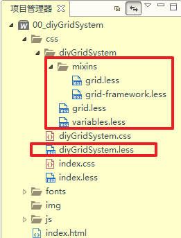
- diyGridSystem.less
@import "./diyGridSystem/mixins/grid";

@import "./diyGridSystem/mixins/grid-framework";

@import "./diyGridSystem/variables";

@import "./diyGridSystem/grid";- grid.less
.container {/**** 固定容器 ****/

    .container-fixed();

    @media (min-width: @screen-sm-min) {

        width: @container-sm;

    }

    @media (min-width: @screen-md-min) {

        width: @container-md;

    }

    @media (min-width: @screen-lg-min) {

        width: @container-lg;

    }

    box-sizing: border-box;

}

.container-fluid {/**** 流体容器 ****/

    .container-fixed();

    box-sizing: border-box;

}

.row {
    /**** 给 行 设置样式 ****/

    .make-row();

    box-sizing: border-box;

}

.make-grid-columns();    /**** 给 列 设置公共样式 ****/

/**** 给 特定列 设置样式 ****/

.make-grid(xs);

@media (min-width: @screen-sm-min) {

    .make-grid(sm);

}

@media (min-width: @screen-md-min) {

    .make-grid(md);

}

@media (min-width: @screen-lg-min) {

    .make-grid(lg);

}- variables.less
- 直接拷贝官网源码即可
- mixins/
- grid.less
/**** 给 固定容器 设置样式 ****/

.container-fixed(@gutter: @grid-gutter-width) {
    /**** 居中 ****/

    margin-right: auto;

    margin-left: auto;

    /**** 固定容器 左右 padding 15px ****/

    padding-left:  floor((@gutter / 2));

    padding-right: ceil((@gutter / 2));

    /**** 清除浮动 ****/

    .clearfix()

}/**** 给 行 设置样式 ****/

.make-row(@gutter: @grid-gutter-width) {/**** 左右拉 -15px    使 内容 始终保持边界、间隔 为 15px ****/

    margin-left:  ceil((@gutter / -2));

    margin-right: floor((@gutter / -2));/**** 清除浮动 ****/

    .clearfix()

}/**** 定义mixin: 清除浮动 ****/

.clearfix() {

    &:before,

    &:after {

        content: " ";    // 1

        display: table;    // 2

    }

    &:after {

        clear: both;

    }

}- grid-framework.less
/**** 给 12-1 列设置公共样式 ****/

.make-grid-columns() {

    .col(@index) {

        @item: ~".col-xs-@{index}, .col-sm-@{index}, .col-md-@{index}, .col-lg-@{index}";

        .col((@index + 1), @item);

    }

    .col(@index, @list) when (@index =< @grid-columns) {

        @item: ~".col-xs-@{index}, .col-sm-@{index}, .col-md-@{index}, .col-lg-@{index}";

        .col((@index + 1), ~"@{list}, @{item}");

    }

    .col(@index, @list) when (@index > @grid-columns) {

        @{list} {

            position: relative;    /**** 每列都开启 相对定位 ****/

            /**** 最小高度为 1 ****/

            min-height: 1px;

            /**** 列 左右 padding 15px ****/

            padding-left:  ceil((@grid-gutter-width / 2));

            padding-right: floor((@grid-gutter-width / 2));

            box-sizing: border-box;

        }

    }

    .col(1);

}

/**** 给特定列设置样式 ****/

.make-grid(@class) {

    .float-grid-columns(@class);    /**** 每列 开启 左浮动 ****/

    .loop-grid-columns(@grid-columns, @class, width);    /**** 设置每列的 width ****/

    .loop-grid-columns(@grid-columns, @class, pull);    /**** 列排序: 设置每列的 left ****/

    .loop-grid-columns(@grid-columns, @class, push);    /**** 列排序: 设置每列的 right ****/

    .loop-grid-columns(@grid-columns, @class, offset);    /**** 列偏移: 设置每列的 margin-left ****/

}

/**** 循环给 每个列 设置样式 ****/

.loop-grid-columns(@index, @class, @type) when (@index >= 0) {

    .calc-grid-column(@index, @class, @type);

    .loop-grid-columns((@index - 1), @class, @type);

}

/**** 每列 开启 左浮动 ****/

.float-grid-columns(@class) {

    .col(@index) {

        @item: ~".col-@{class}-@{index}";

        .col((@index + 1), @item);

    }

    .col(@index, @list) when (@index =< @grid-columns) {

        @item: ~".col-@{class}-@{index}";

        .col((@index + 1), ~"@{list}, @{item}");

    }

    .col(@index, @list) when (@index > @grid-columns) {

        @{list} {

            float: left;

        }

    }

    .col(1);

}

/**** 设置每列的 width ****/

.calc-grid-column(@index, @class, @type) when (@type = width) and (@index > 0) {

    .col-@{class}-@{index} {

        width: percentage((@index / @grid-columns));

    }

}

/**** 列排序: 设置每列的 left ****/

.calc-grid-column(@index, @class, @type) when (@type = push) and (@index > 0) {

    .col-@{class}-push-@{index} {

        left: percentage((@index / @grid-columns));

    }

}

.calc-grid-column(@index, @class, @type) when (@type = push) and (@index = 0) {

    .col-@{class}-push-0 {

        left: auto;

    }

}

/**** 列排序: 设置每列的 right ****/

.calc-grid-column(@index, @class, @type) when (@type = pull) and (@index > 0) {

    .col-@{class}-pull-@{index} {

        right: percentage((@index / @grid-columns));

    }

}

.calc-grid-column(@index, @class, @type) when (@type = pull) and (@index = 0) {

    .col-@{class}-pull-0 {

        right: auto;

    }

}

/**** 列偏移: 设置每列的 margin-left ****/

.calc-grid-column(@index, @class, @type) when (@type = offset) {

    .col-@{class}-offset-@{index} {

        margin-left: percentage((@index / @grid-columns));

    }

}
bootstrap_栅格系统_响应式工具_源码分析的更多相关文章
- Vue3中的响应式对象Reactive源码分析
Vue3中的响应式对象Reactive源码分析 ReactiveEffect.js 中的 trackEffects函数 及 ReactiveEffect类 在Ref随笔中已经介绍,在本文中不做赘述 本 ...
- bootstrap的栅格系统和响应式工具
关于bootstrap的响应式布局,昨天看了杨老师的视频教学https://www.bilibili.com/video/av18357039豁然开朗,在这里记录一下 一:meta标签的引用 < ...
- 并发工具CyclicBarrier源码分析及应用
本文首发于微信公众号[猿灯塔],转载引用请说明出处 今天呢!灯塔君跟大家讲: 并发工具CyclicBarrier源码分析及应用 一.CyclicBarrier简介 1.简介 CyclicBarri ...
- bootstrap快速入门笔记(二)-栅格系统,响应式类
一,栅格系统大致有以下: 1,行row必须包含在 .container (固定宽度)或 .container-fluid (100% 宽度)中,一行有12列 2.“列(column)”在水平方向创建一 ...
- [软件测试]网站压测工具Webbench源码分析
一.我与webbench二三事 Webbench是一个在linux下使用的非常简单的网站压测工具.它使用fork()模拟多个客户端同时访问我们设定的URL,测试网站在压力下工作的性能.Webbench ...
- 网站(Web)压测工具Webbench源码分析
一.我与webbench二三事 Webbench是一个在linux下使用的非常简单的网站压测工具.它使用fork()模拟多个客户端同时访问我们设定的URL,测试网站在压力下工作的性能.Webbench ...
- 云实例初始化工具cloud-init源码分析
源码分析 代码结构 cloud-init的代码结构如下: cloud-init ├── bash_completion # bash自动补全文件 │ └── cloud-init ├── Chan ...
- 从flink-example分析flink组件(3)WordCount 流式实战及源码分析
前面介绍了批量处理的WorkCount是如何执行的 <从flink-example分析flink组件(1)WordCount batch实战及源码分析> <从flink-exampl ...
- flask框架(三)——路由系统route转换成add_url_rule及源码分析
这节我们不用@app.route来写路由,而是通过add_url_rule 传统写法 (<int:nid>传递int类型参数,endpoint是取别名) @app.route('/det ...
随机推荐
- GIT-windows系统部署git服务器
windows系统部署git服务器 因为需要所以就来利用IIS(Internet Information Service )来进行搭建. 进入正文: 不管你是什么win7.win8.win8.1还是w ...
- Entity Framework入门教程(16)---Enum
EF DbFirst模式中的枚举类型使用 这一节介绍EF DbFirst模式中的Enum(枚举类型),CodeFirst模式中的Enum会在以后的EF CoreFirst系列中介绍.EF5中添加了对E ...
- LINUX 常用命令(一)
1.LINUX系统常用命令实例: A0 LINUX命令分内置命令和非内置命令! 一般而言,内置命令就是指在/bin ./usr/bin下系统默认的命令! 非内置命令需要加上命令的绝对路径执行!比如我们 ...
- Coursera, Big Data 1, Introduction (week 3)
什么是分布式文件系统?为什么需要分布式文件系统? 如果文件系统可以管理用网络连接的很多个存储单元,叫分布式文件系统. 分布式文件系统提供了数据可扩展性,容错性,高并发. 这些是传统文件系统不具有的. ...
- JAVA进阶11
间歇性混吃等死,持续性踌躇满志系列-------------第11天 1.ArrayList package cn.intcast.demo11; import java.util.ArrayList ...
- python从爬虫基础到爬取网络小说实例
一.爬虫基础 1.1 requests类 1.1.1 request的7个方法 requests.request() 实例化一个对象,拥有以下方法 requests.get(url, *args) r ...
- 第八节,Opencv的基本使用------存取图像、视频功能、简单信息标注工具
1.存取图像 import cv2 img=cv2.imread('test.jpg') cv2.imwrite('test1.jpg',img) 2.图像的仿射变换 图像的仿射变换涉及图像的形状位置 ...
- WPF 10天修炼 第一天- 入门
简介 WPF技术基于DirectX,完美的整合了矢量图形.2D或3D绘图技术.文件及多媒体技术.WPF将开发人员和设计人员的职责清楚的分离,提供了一种声明编程语言XAML.同时Expression B ...
- vue.js过滤器
import Vue from 'vue' import { ENV } from '@/config/conf' const dateFormat = (str) => { var date ...
- 将DataTable转换为List<T>对象遇到问题:类型“System.Int64”的对象无法转换为类型“System.Int32”。
可以利用反射将DataTable转换为List<T>对象:原始链接http://www.jb51.net/article/67386.htm 但是该方法在DataTable里某个字段类型是 ...