
display:flex不兼容Android、Safari低版本的解决方案 【flex布局】
引自 http://www.cnblogs.com/shimily/articles/7943370.html
<!DOCTYPE html>

<html lang="en">

<head>

    <meta charset="UTF-8">

    <title>flexbox布局</title>

    <style>

    div {

        border: 1px solid #000;

        overflow: hidden;

    }

    div.flex-h:before, div.flex-v:before {

        content: "before";

    }

    div.flex-h:after, div.flex-v:after {

        content: "after";

    }

    .w60 {

        width: 60px;

    }

    .w150 {

        width: 150px;

    }

    .w200 {

        width: 200px;

    }

    .h30 {

        height: 30px;

    }

    .h50 {

        height: 50px;

    }

    /* 父元素-flex容器 */

    .flex {

        display: box;              /* OLD - Android 4.4- */

        display: -webkit-box;      /* OLD - iOS 6-, Safari 3.1-6 */

        display: -moz-box;         /* OLD - Firefox 19- (buggy but mostly works) */

        display: -ms-flexbox;      /* TWEENER - IE 10 */

        display: -webkit-flex;     /* NEW - Chrome */

        display: flex;             /* NEW, Spec - Opera 12.1, Firefox 20+ */

    }

    /* 子元素-平均分栏 */

    .flex1 {

        -webkit-box-flex: 1;      /* OLD - iOS 6-, Safari 3.1-6 */

        -moz-box-flex: 1;         /* OLD - Firefox 19- */

        width: 20%;               /* For old syntax, otherwise collapses. */

        -webkit-flex: 1;          /* Chrome */

        -ms-flex: 1;              /* IE 10 */

        flex: 1;                  /* NEW, Spec - Opera 12.1, Firefox 20+ */

    }

    /* 父元素-横向排列(主轴) */

    .flex-h {

        display: box;              /* OLD - Android 4.4- */

        display: -webkit-box;      /* OLD - iOS 6-, Safari 3.1-6 */

        display: -moz-box;         /* OLD - Firefox 19- (buggy but mostly works) */

        display: -ms-flexbox;      /* TWEENER - IE 10 */

        display: -webkit-flex;     /* NEW - Chrome */

        display: flex;             /* NEW, Spec - Opera 12.1, Firefox 20+ */

        /* 09版 */

        -webkit-box-orient: horizontal;

        /* 12版 */

        -webkit-flex-direction: row;

        -moz-flex-direction: row;

        -ms-flex-direction: row;

        -o-flex-direction: row;

        flex-direction: row;

    }

    /* 父元素-横向换行 */

    .flex-hw {

        /* 09版 */

        -webkit-box-lines: multiple;

        /* 12版 */

        -webkit-flex-wrap: wrap;

        -moz-flex-wrap: wrap;

        -ms-flex-wrap: wrap;

        -o-flex-wrap: wrap;

        flex-wrap: wrap;

    }

    /* 父元素-水平居中(主轴是横向才生效) */

    .flex-hc {

        /* 09版 */

        -webkit-box-pack: center;

        /* 12版 */

        -webkit-justify-content: center;

        -moz-justify-content: center;

        -ms-justify-content: center;

        -o-justify-content: center;

        justify-content: center;

        /* 其它取值如下:

            align-items     主轴原点方向对齐

            flex-end        主轴延伸方向对齐

            space-between   等间距排列,首尾不留白

            space-around    等间距排列,首尾留白

         */

    }

    /* 父元素-纵向排列(主轴) */

    .flex-v {

        display: box;              /* OLD - Android 4.4- */

        display: -webkit-box;      /* OLD - iOS 6-, Safari 3.1-6 */

        display: -moz-box;         /* OLD - Firefox 19- (buggy but mostly works) */

        display: -ms-flexbox;      /* TWEENER - IE 10 */

        display: -webkit-flex;     /* NEW - Chrome */

        display: flex;             /* NEW, Spec - Opera 12.1, Firefox 20+ */

        /* 09版 */

        -webkit-box-orient: vertical;

        /* 12版 */

        -webkit-flex-direction: column;

        -moz-flex-direction: column;

        -ms-flex-direction: column;

        -o-flex-direction: column;

        flex-direction: column;

    }

    /* 父元素-纵向换行 */

    .flex-vw {

        /* 09版 */

        -webkit-box-lines: multiple;

        /* 12版 */

        -webkit-flex-wrap: wrap;

        -moz-flex-wrap: wrap;

        -ms-flex-wrap: wrap;

        -o-flex-wrap: wrap;

        flex-wrap: wrap;

    }

    /* 父元素-竖直居中(主轴是横向才生效) */

    .flex-vc {

        /* 09版 */

        -webkit-box-align: center;

        /* 12版 */

        -webkit-align-items: center;

        -moz-align-items: center;

        -ms-align-items: center;

        -o-align-items: center;

        align-items: center;

    }

    .flex-1 {

        -webkit-box-ordinal-group: 1;   /* OLD - iOS 6-, Safari 3.1-6 */

        -moz-box-ordinal-group: 1;      /* OLD - Firefox 19- */

        -ms-flex-order: 1;              /* TWEENER - IE 10 */

        -webkit-order: 1;               /* NEW - Chrome */

        order: 1;                       /* NEW, Spec - Opera 12.1, Firefox 20+ */

    }

    .flex-2 {

        -webkit-box-ordinal-group: 2;   /* OLD - iOS 6-, Safari 3.1-6 */

        -moz-box-ordinal-group: 2;      /* OLD - Firefox 19- */

        -ms-flex-order: 2;              /* TWEENER - IE 10 */

        -webkit-order: 2;               /* NEW - Chrome */

        order: 2;                       /* NEW, Spec - Opera 12.1, Firefox 20+ */

    }

    </style>

</head>

<body>

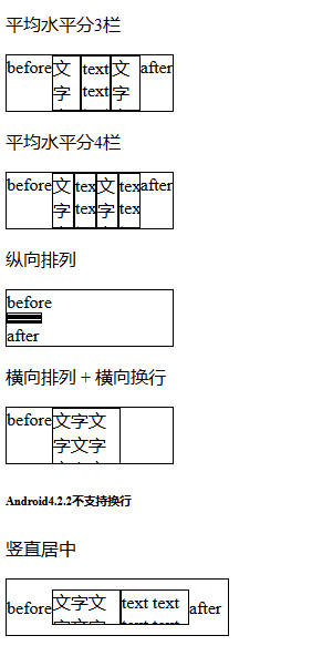
    <p>平均水平分3栏</p>

    <div class="flex-h w150 h50">

        <div class="flex1">文字文字文字文字文字文字文字</div>

        <div class="flex1">text text text text text text text text</div>

        <div class="flex1">文字文字文字文字文字文字文字</div>

    </div>

    <p>平均水平分4栏</p>

    <div class="flex-h w150 h50">

        <div class="flex1">文字文字文字文字文字文字文字</div>

        <div class="flex1">text text text text text text text text</div>

        <div class="flex1">文字文字文字文字文字文字文字</div>

        <div class="flex1">text text text text text text text text</div>

    </div>

    <p>纵向排列</p>

    <div class="flex-v w150 h50">

        <div class="flex1 w60 h50">文字文字文字文字文字文字文字</div>

        <div class="flex1 w60 h50">text text text text text text text text</div>

        <div class="flex1 w60 h50">文字文字文字文字文字文字文字</div>

        <div class="flex1 w60 h50">text text text text text text text text</div>

    </div>

    <p>横向排列 + 横向换行</p>

    <div class="flex-h w150 h50 flex-hw">

        <div class="w60 h50">文字文字文字文字文字文字文字</div>

        <div class="w60 h50">text text text text text text text text</div>

        <div class="w60 h50">文字文字文字文字文字文字文字</div>

        <div class="w60 h50">text text text text text text text text</div>

    </div>

    <h6>Android4.2.2不支持换行</h6>

    <p>竖直居中</p>

    <div class="flex-h flex-vc w200 h50">

        <div class="w60 h30">文字文字文字文字文字文字文字</div>

        <div class="w60 h30">text text text text text text text text</div>

    </div>

    <p>水平居中</p>

    <div class="flex-h flex-hc w200 h50">

        <div class="w60 h30">文字文字文字文字文字文字文字</div>

        <div class="w60 h30">text text text text text text text text</div>

    </div>

    <p>居中</p>

    <div class="flex-h flex-hc flex-vc w200 h50">

        <div class="w60 h30">文字文字文字文字文字文字文字</div>

        <div class="w60 h30">text text text text text text text text</div>

    </div>

    <p>改变顺序(栅格布局,最终效果英文应该在左边)</p>

    <div class="flex-h w200 h50">

        <div class="flex1 flex-2">文字文字文字文字文字文字文字</div>

        <div class="flex1 flex-1">text text text text text text text text</div>

    </div>

    <h6>Android4.2.2下伪元素位置表现不一致</h6>

</body>

</html>
display:flex不兼容Android、Safari低版本的解决方案 【flex布局】的更多相关文章
- 转:display:flex不兼容Android、Safari低版本的解决方案 【flex布局】
<!DOCTYPE html> <html lang="en"> <head> <meta charset="UTF-8&quo ...
- Android较低版本(<5.2) 页面默认Select选择框效果的BUG解决
Bug描述: 使用低版本安卓(<5.2),在微信上打开网页,点击下拉框,会出现如下图所示的用来展示select选项的弹出框: 在选项较少的时候,可以向下滑动,将选项滑到底部 滑动前: 滑动后: ...
- [iOS开发]Xcode8兼容iOS7以及低版本Xcode调试高版本iOS系统
现在的项目一般都要兼容iOS7系统,同时也要兼容iOS10,在Xcode8上面,默认情况下无法调试iOS7,因为缺乏调试iOS7需要的配置文件.同时在低版本的Xcode上面(8以下),也无法调试iOS ...
- Xcode8兼容iOS7以及低版本Xcode调试高版本iOS系统
我们使用Xcode8新建的工程,默认支持的最低系统是iOS8,我们可以手动更改版本到7.0,但是不支持真机调试. 现在的项目一般都要兼容iOS7系统,同时也要兼容iOS10,在Xcode8上面,默认情 ...
- Android 之低版本高版本实现沉浸式状态栏
沉浸式状态栏确切的说应该叫做透明状态栏.一般情况下,状态栏的底色都为黑色,而沉浸式状态栏则是把状态栏设置为透明或者半透明. 沉浸式状态栏是从android Kitkat(Android 4.4)开始出 ...
- IOS:兼容ios6和低版本
viewDidUnload在ios6开始被弃用了,所以我们在这里处理内存警告的这类问题,这个时候我们就要把相应的处理放在 didReceiveMemoryWarning中. - (void)didRe ...
- android popupwindow低版本报空指针
在项目中使用Popupwindow pop=new Popupwindow();在2.3版本报 异常信息: Exception: null 堆栈信息: android.widget.PopupWind ...
- Fundebug前端JavaScript插件更新至1.8.0,兼容低版本的Android浏览器
摘要: 兼容低版本Android浏览器,请大家及时更新. Fundebug前端BUG监控服务 Fundebug是专业的程序BUG监控平台,我们JavaScript插件可以提供全方位的BUG监控,可以帮 ...
- ie低版本内核事件兼容问题(事件绑定,绑定事件自动执行,文档模式问题)
问题情况 搜狗等,兼容模式下,以前前端写的点击事件的代码没有, 后来一看是因为兼容模式为9,导致点击事件失效 解决办法,步骤 1,处理绑定事件兼容问题 ie低版本绑定事件只支持attactevent, ...
随机推荐
- 关于freetype在安装中的遇到的问题
本人电脑配置的是Anconda环境+pycharm2017.2.2 comuniity,每次安装什么包就是直接pip install 的,但是这次在安装freetype的安装中却遇到了麻烦. 具体是在 ...
- python学习-- for和if结合使用
for和if结合使用: <h1> {% for i in contents %} {{ i }}{# 注意i也要用两个大括号 #} {% endfor %} </h1> < ...
- mac iterm 快捷键
标签 新建标签:command + t 关闭标签:command + w 切换标签:command + 数字 command + 左右方向键 切换全屏:command + enter 查找:comma ...
- python集合、字符编码、bytes与二进制
集合 用括号表示{ },可以包含多个元素,用逗号分割 用途 用于关系运算 集合特点 1.每个元素是不可变类型 2.没有重复的元素 3.无序 应用 1.set去重 set(names)的功能是将列表转换 ...
- 2018 ACM 国际大学生程序设计竞赛上海大都会赛重现赛 F Color it
链接:https://www.nowcoder.com/acm/contest/163/F 来源:牛客网 2018 ACM 国际大学生程序设计竞赛上海大都会赛重现赛 F Color it 时间限制:C ...
- iOS开发中六种手势识别
iOS开发中手势识别有六种: 轻击手势(TapGestureRecognizer), 轻扫手势 (SwipeGestureRecognizer), 长按手势(LongPressGestureRecog ...
- UVa——540Team Queue(STL练习map、queue数组的综合使用)
Team Queue Time Limit: 3000MS ...
- BZOJ1499 [NOI2005]瑰丽华尔兹 【单调队列优化dp】
题目 你跳过华尔兹吗?当音乐响起,当你随着旋律滑动舞步,是不是有一种漫步仙境的惬意?众所周知,跳华尔兹时,最重要的是有好的音乐.但是很少有几个人知道,世界上最伟大的钢琴家一生都漂泊在大海上,他的名字叫 ...
- 网络流24题-最长k可重线段集问题
最长k可重线段集问题 时空限制1000ms / 128MB 题目描述 给定平面 x−O−y 上 n 个开线段组成的集合 I,和一个正整数 k .试设计一个算法,从开线段集合 I 中选取出开线段集合 S ...
- Foj 2148 二维几何(点是否在三角形内)
题目大意:给n个坐标(不存在三点共线的点),求能够组成多少个凸四边形. #include<iostream> #include<cstdio> #include<cmat ...