UWP Composition API - GroupListView(二)
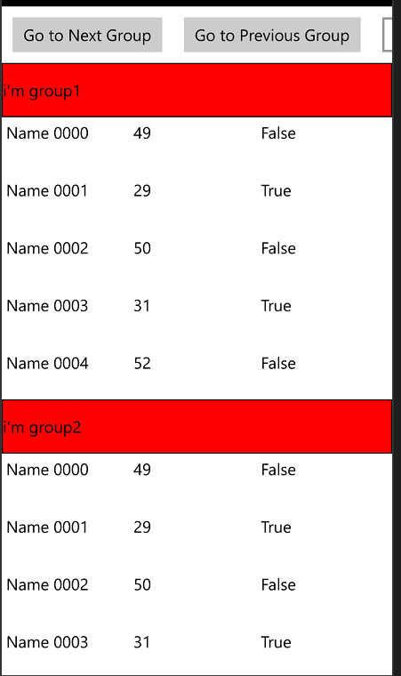
还是先上效果图:

看完了上一篇UWP Composition API - GroupListView(一)的童鞋会问,这不是跟上一篇一样的吗??? 骗点击的??
No,No,其实相对上一个有更简单粗暴的方案,因为上篇是为了研究Composition API,所以含着泪都要做完(有没有被骗的赶脚)。。( ╯□╰ )
那是有没有简单点的方法呢?? 嗯,看到这篇,那答案肯定是Yes。
我再啰嗦下需求:
1.Group中的集合需要支持增量加载ISupportIncrementalLoading
2.支持UI Virtualization
这个简单的方案就是改ListViewItem的模板,其实我在UWP VirtualizedVariableSizedGridView 支持可虚拟化可变大小Item的View(二)有讲过ListViewItem有2套模板-官方地址
看一下我修改之后的模板:
<Style TargetType="local:GroupListViewItem" >
<Setter Property="FontFamily" Value="{ThemeResource ContentControlThemeFontFamily}" />
<Setter Property="FontSize" Value="{ThemeResource ControlContentThemeFontSize}" />
<Setter Property="Background" Value="Transparent"/>
<Setter Property="TabNavigation" Value="Local"/>
<Setter Property="IsHoldingEnabled" Value="True"/>
<Setter Property="Margin" Value="0,0,18,2"/>
<Setter Property="HorizontalContentAlignment" Value="Left"/>
<Setter Property="VerticalContentAlignment" Value="Top"/>
<Setter Property="Template">
<Setter.Value>
<ControlTemplate TargetType="local:GroupListViewItem">
<Border x:Name="OuterContainer">
<VisualStateManager.VisualStateGroups>
<VisualStateGroup x:Name="CommonStates">
<VisualState x:Name="Normal"/>
<VisualState x:Name="PointerOver">
<Storyboard>
<DoubleAnimation Storyboard.TargetName="PointerOverBorder"
Storyboard.TargetProperty="Opacity"
Duration=""
To="" />
<ObjectAnimationUsingKeyFrames Storyboard.TargetName="SelectionBackground"
Storyboard.TargetProperty="Fill">
<DiscreteObjectKeyFrame KeyTime="" Value="{ThemeResource ListViewItemSelectedPointerOverBackgroundThemeBrush}" />
</ObjectAnimationUsingKeyFrames>
<ObjectAnimationUsingKeyFrames Storyboard.TargetName="SelectedBorder"
Storyboard.TargetProperty="Stroke">
<DiscreteObjectKeyFrame KeyTime="" Value="{ThemeResource ListViewItemSelectedPointerOverBorderThemeBrush}" />
</ObjectAnimationUsingKeyFrames>
<ObjectAnimationUsingKeyFrames Storyboard.TargetName="SelectedEarmark"
Storyboard.TargetProperty="Fill">
<DiscreteObjectKeyFrame KeyTime="" Value="{ThemeResource ListViewItemSelectedPointerOverBackgroundThemeBrush}" />
</ObjectAnimationUsingKeyFrames>
</Storyboard>
</VisualState>
<VisualState x:Name="Pressed">
<Storyboard>
<PointerDownThemeAnimation TargetName="ContentContainer" />
</Storyboard>
</VisualState>
<VisualState x:Name="PointerOverPressed">
<Storyboard>
<PointerDownThemeAnimation TargetName="ContentContainer" />
<DoubleAnimation Storyboard.TargetName="PointerOverBorder"
Storyboard.TargetProperty="Opacity"
Duration=""
To="" />
<ObjectAnimationUsingKeyFrames Storyboard.TargetName="SelectionBackground"
Storyboard.TargetProperty="Fill">
<DiscreteObjectKeyFrame KeyTime="" Value="{ThemeResource ListViewItemSelectedPointerOverBackgroundThemeBrush}" />
</ObjectAnimationUsingKeyFrames>
<ObjectAnimationUsingKeyFrames Storyboard.TargetName="SelectedBorder"
Storyboard.TargetProperty="Stroke">
<DiscreteObjectKeyFrame KeyTime="" Value="{ThemeResource ListViewItemSelectedPointerOverBorderThemeBrush}" />
</ObjectAnimationUsingKeyFrames>
<ObjectAnimationUsingKeyFrames Storyboard.TargetName="SelectedEarmark"
Storyboard.TargetProperty="Fill">
<DiscreteObjectKeyFrame KeyTime="" Value="{ThemeResource ListViewItemSelectedPointerOverBackgroundThemeBrush}" />
</ObjectAnimationUsingKeyFrames>
</Storyboard>
</VisualState>
<VisualState x:Name="Disabled">
<Storyboard>
<DoubleAnimation Storyboard.TargetName="contentPresenter"
Storyboard.TargetProperty="Opacity"
Duration=""
To="{ThemeResource ListViewItemDisabledThemeOpacity}" />
</Storyboard>
</VisualState>
</VisualStateGroup>
<VisualStateGroup x:Name="FocusStates">
<VisualState x:Name="Focused">
<Storyboard>
<DoubleAnimation Duration="" To="" Storyboard.TargetProperty="Opacity" Storyboard.TargetName="FocusVisual" />
</Storyboard>
</VisualState>
<VisualState x:Name="Unfocused"/>
<VisualState x:Name="PointerFocused"/>
</VisualStateGroup>
<VisualStateGroup x:Name="SelectionHintStates">
<VisualState x:Name="VerticalSelectionHint">
<Storyboard>
<SwipeHintThemeAnimation TargetName="SelectionBackground" ToVerticalOffset="" ToHorizontalOffset="" />
<SwipeHintThemeAnimation TargetName="ContentBorder" ToVerticalOffset="" ToHorizontalOffset="" />
<SwipeHintThemeAnimation TargetName="SelectedBorder" ToVerticalOffset="" ToHorizontalOffset="" />
<SwipeHintThemeAnimation TargetName="SelectedCheckMark" ToVerticalOffset="" ToHorizontalOffset="" />
<DoubleAnimationUsingKeyFrames Storyboard.TargetName="HintGlyph"
Storyboard.TargetProperty="Opacity"
Duration="0:0:0.500">
<DiscreteDoubleKeyFrame Value="0.5" KeyTime="0:0:0" />
<DiscreteDoubleKeyFrame Value="" KeyTime="0:0:0.500" />
</DoubleAnimationUsingKeyFrames>
</Storyboard>
</VisualState>
<VisualState x:Name="HorizontalSelectionHint">
<Storyboard>
<SwipeHintThemeAnimation TargetName="SelectionBackground" ToHorizontalOffset="-23" ToVerticalOffset="" />
<SwipeHintThemeAnimation TargetName="ContentBorder" ToHorizontalOffset="-23" ToVerticalOffset="" />
<SwipeHintThemeAnimation TargetName="SelectedBorder" ToHorizontalOffset="-23" ToVerticalOffset="" />
<SwipeHintThemeAnimation TargetName="SelectedCheckMark" ToHorizontalOffset="-23" ToVerticalOffset="" />
<DoubleAnimationUsingKeyFrames Storyboard.TargetName="HintGlyph"
Storyboard.TargetProperty="Opacity"
Duration="0:0:0.500">
<DiscreteDoubleKeyFrame Value="0.5" KeyTime="0:0:0" />
<DiscreteDoubleKeyFrame Value="" KeyTime="0:0:0.500" />
</DoubleAnimationUsingKeyFrames>
</Storyboard>
</VisualState>
<VisualState x:Name="NoSelectionHint" />
<VisualStateGroup.Transitions>
<VisualTransition To="NoSelectionHint" GeneratedDuration="0:0:0.65"/>
</VisualStateGroup.Transitions>
</VisualStateGroup>
<VisualStateGroup x:Name="SelectionStates">
<VisualState x:Name="Unselecting">
<Storyboard>
<DoubleAnimation Storyboard.TargetName="HintGlyphBorder"
Storyboard.TargetProperty="Opacity"
Duration=""
To="" />
</Storyboard>
</VisualState>
<VisualState x:Name="Unselected">
<Storyboard>
<DoubleAnimation Storyboard.TargetName="HintGlyphBorder"
Storyboard.TargetProperty="Opacity"
Duration=""
To="" />
</Storyboard>
</VisualState>
<VisualState x:Name="UnselectedPointerOver">
<Storyboard>
<DoubleAnimation Storyboard.TargetName="HintGlyphBorder"
Storyboard.TargetProperty="Opacity"
Duration=""
To="" />
<ObjectAnimationUsingKeyFrames Storyboard.TargetName="contentPresenter"
Storyboard.TargetProperty="Foreground">
<DiscreteObjectKeyFrame KeyTime="" Value="{ThemeResource ListViewItemSelectedForegroundThemeBrush}" />
</ObjectAnimationUsingKeyFrames>
</Storyboard>
</VisualState>
<VisualState x:Name="UnselectedSwiping">
<Storyboard>
<DoubleAnimation Storyboard.TargetName="SelectingGlyph"
Storyboard.TargetProperty="Opacity"
Duration=""
To="0.5" />
<DoubleAnimation Storyboard.TargetName="HintGlyphBorder"
Storyboard.TargetProperty="Opacity"
Duration=""
To="" />
</Storyboard>
</VisualState>
<VisualState x:Name="Selecting">
<Storyboard>
<DoubleAnimation Storyboard.TargetName="SelectionBackground"
Storyboard.TargetProperty="Opacity"
Duration=""
To="" />
<DoubleAnimation Storyboard.TargetName="SelectedBorder"
Storyboard.TargetProperty="Opacity"
Duration=""
To="" />
<DoubleAnimation Storyboard.TargetName="SelectingGlyph"
Storyboard.TargetProperty="Opacity"
Duration=""
To="" />
<DoubleAnimation Storyboard.TargetName="HintGlyphBorder"
Storyboard.TargetProperty="Opacity"
Duration=""
To="" />
<ObjectAnimationUsingKeyFrames Storyboard.TargetName="contentPresenter"
Storyboard.TargetProperty="Foreground">
<DiscreteObjectKeyFrame KeyTime="" Value="{ThemeResource ListViewItemSelectedForegroundThemeBrush}" />
</ObjectAnimationUsingKeyFrames>
</Storyboard>
</VisualState>
<VisualState x:Name="Selected">
<Storyboard>
<DoubleAnimation Storyboard.TargetName="SelectionBackground"
Storyboard.TargetProperty="Opacity"
Duration=""
To="" />
<DoubleAnimation Storyboard.TargetName="SelectedBorder"
Storyboard.TargetProperty="Opacity"
Duration=""
To="" />
<DoubleAnimation Storyboard.TargetName="SelectedCheckMark"
Storyboard.TargetProperty="Opacity"
Duration=""
To="" />
<ObjectAnimationUsingKeyFrames Storyboard.TargetName="contentPresenter"
Storyboard.TargetProperty="Foreground">
<DiscreteObjectKeyFrame KeyTime="" Value="{ThemeResource ListViewItemSelectedForegroundThemeBrush}" />
</ObjectAnimationUsingKeyFrames>
</Storyboard>
</VisualState>
<VisualState x:Name="SelectedSwiping">
<Storyboard>
<DoubleAnimation Storyboard.TargetName="SelectionBackground"
Storyboard.TargetProperty="Opacity"
Duration=""
To="" />
<DoubleAnimation Storyboard.TargetName="SelectedBorder"
Storyboard.TargetProperty="Opacity"
Duration=""
To="" />
<DoubleAnimation Storyboard.TargetName="SelectedCheckMark"
Storyboard.TargetProperty="Opacity"
Duration=""
To="" />
<ObjectAnimationUsingKeyFrames Storyboard.TargetName="contentPresenter"
Storyboard.TargetProperty="Foreground">
<DiscreteObjectKeyFrame KeyTime="" Value="{ThemeResource ListViewItemSelectedForegroundThemeBrush}" />
</ObjectAnimationUsingKeyFrames>
</Storyboard>
</VisualState>
<VisualState x:Name="SelectedUnfocused">
<Storyboard>
<DoubleAnimation Storyboard.TargetName="SelectionBackground"
Storyboard.TargetProperty="Opacity"
Duration=""
To="" />
<DoubleAnimation Storyboard.TargetName="SelectedBorder"
Storyboard.TargetProperty="Opacity"
Duration=""
To="" />
<DoubleAnimation Storyboard.TargetName="SelectedCheckMark"
Storyboard.TargetProperty="Opacity"
Duration=""
To="" />
<ObjectAnimationUsingKeyFrames Storyboard.TargetName="contentPresenter"
Storyboard.TargetProperty="Foreground">
<DiscreteObjectKeyFrame KeyTime="" Value="{ThemeResource ListViewItemSelectedForegroundThemeBrush}" />
</ObjectAnimationUsingKeyFrames>
</Storyboard>
</VisualState>
</VisualStateGroup>
<VisualStateGroup x:Name="DragStates">
<VisualState x:Name="NotDragging" />
<VisualState x:Name="Dragging">
<Storyboard>
<DoubleAnimation Storyboard.TargetName="InnerDragContent"
Storyboard.TargetProperty="Opacity"
Duration=""
To="{ThemeResource ListViewItemDragThemeOpacity}" />
<DragItemThemeAnimation TargetName="InnerDragContent" />
<FadeOutThemeAnimation TargetName="SelectedCheckMarkOuter" />
<FadeOutThemeAnimation TargetName="SelectedBorder" />
</Storyboard>
</VisualState>
<VisualState x:Name="DraggingTarget">
<Storyboard>
<DropTargetItemThemeAnimation TargetName="OuterContainer" />
</Storyboard>
</VisualState>
<VisualState x:Name="MultipleDraggingPrimary">
<Storyboard>
<!-- These two Opacity animations are required - the FadeInThemeAnimations
on the same elements animate an internal Opacity. -->
<DoubleAnimation Storyboard.TargetName="MultiArrangeOverlayBackground"
Storyboard.TargetProperty="Opacity"
Duration=""
To="" />
<DoubleAnimation Storyboard.TargetName="MultiArrangeOverlayText"
Storyboard.TargetProperty="Opacity"
Duration=""
To="" /> <DoubleAnimation Storyboard.TargetName="ContentBorder"
Storyboard.TargetProperty="Opacity"
Duration=""
To="{ThemeResource ListViewItemDragThemeOpacity}" />
<FadeInThemeAnimation TargetName="MultiArrangeOverlayBackground" />
<FadeInThemeAnimation TargetName="MultiArrangeOverlayText" />
<DragItemThemeAnimation TargetName="ContentBorder" />
<FadeOutThemeAnimation TargetName="SelectionBackground" />
<FadeOutThemeAnimation TargetName="SelectedCheckMarkOuter" />
<FadeOutThemeAnimation TargetName="SelectedBorder" />
<FadeOutThemeAnimation TargetName="PointerOverBorder" />
</Storyboard>
</VisualState>
<VisualState x:Name="MultipleDraggingSecondary">
<Storyboard>
<FadeOutThemeAnimation TargetName="ContentContainer" />
</Storyboard>
</VisualState>
<VisualStateGroup.Transitions>
<VisualTransition To="NotDragging" GeneratedDuration="0:0:0.2"/>
</VisualStateGroup.Transitions>
</VisualStateGroup>
<VisualStateGroup x:Name="ReorderHintStates">
<VisualState x:Name="NoReorderHint"/>
<VisualState x:Name="BottomReorderHint">
<Storyboard>
<DragOverThemeAnimation TargetName="ReorderHintContent" ToOffset="{ThemeResource ListViewItemReorderHintThemeOffset}" Direction="Bottom" />
</Storyboard>
</VisualState>
<VisualState x:Name="TopReorderHint">
<Storyboard>
<DragOverThemeAnimation TargetName="ReorderHintContent" ToOffset="{ThemeResource ListViewItemReorderHintThemeOffset}" Direction="Top" />
</Storyboard>
</VisualState>
<VisualState x:Name="RightReorderHint">
<Storyboard>
<DragOverThemeAnimation TargetName="ReorderHintContent" ToOffset="{ThemeResource ListViewItemReorderHintThemeOffset}" Direction="Right" />
</Storyboard>
</VisualState>
<VisualState x:Name="LeftReorderHint">
<Storyboard>
<DragOverThemeAnimation TargetName="ReorderHintContent" ToOffset="{ThemeResource ListViewItemReorderHintThemeOffset}" Direction="Left" />
</Storyboard>
</VisualState>
<VisualStateGroup.Transitions>
<VisualTransition To="NoReorderHint" GeneratedDuration="0:0:0.2"/>
</VisualStateGroup.Transitions>
</VisualStateGroup>
<VisualStateGroup x:Name="DataVirtualizationStates">
<VisualState x:Name="DataAvailable"/>
<VisualState x:Name="DataPlaceholder">
<Storyboard>
<ObjectAnimationUsingKeyFrames Storyboard.TargetName="PlaceholderTextBlock"
Storyboard.TargetProperty="Visibility"
Duration="">
<DiscreteObjectKeyFrame KeyTime="">
<DiscreteObjectKeyFrame.Value>
<Visibility>Visible</Visibility>
</DiscreteObjectKeyFrame.Value>
</DiscreteObjectKeyFrame>
</ObjectAnimationUsingKeyFrames>
<ObjectAnimationUsingKeyFrames Storyboard.TargetName="PlaceholderRect"
Storyboard.TargetProperty="Visibility"
Duration="">
<DiscreteObjectKeyFrame KeyTime="">
<DiscreteObjectKeyFrame.Value>
<Visibility>Visible</Visibility>
</DiscreteObjectKeyFrame.Value>
</DiscreteObjectKeyFrame>
</ObjectAnimationUsingKeyFrames>
</Storyboard>
</VisualState>
</VisualStateGroup>
</VisualStateManager.VisualStateGroups>
<Grid x:Name="ReorderHintContent" Background="Transparent">
<Grid.RowDefinitions>
<RowDefinition Height="auto"/>
<RowDefinition Height="auto"/>
</Grid.RowDefinitions>
<ContentPresenter x:Name="headerPresenter" Grid.Row=""
ContentTransitions="{TemplateBinding ContentTransitions}"
ContentTemplate="{TemplateBinding HeaderTemplate}"
Content="{TemplateBinding Header}"
HorizontalAlignment="Stretch"
VerticalAlignment="Stretch"
/>
<Grid Grid.Row="">
<Path x:Name="SelectingGlyph" Opacity="" Data="F1 M133.1,17.9 L137.2,13.2 L144.6,19.6 L156.4,5.8 L161.2,9.9 L145.6,28.4 z" Fill="{ThemeResource ListViewItemCheckSelectingThemeBrush}" Height="" Stretch="Fill" Width="" HorizontalAlignment="Right" Margin="0,9.5,9.5,0" VerticalAlignment="Top" FlowDirection="LeftToRight"/>
<Border x:Name="HintGlyphBorder"
Height=""
Width=""
HorizontalAlignment="Right"
VerticalAlignment="Top"
Opacity=""
Margin="">
<Path x:Name="HintGlyph" Opacity="" Data="F1 M133.1,17.9 L137.2,13.2 L144.6,19.6 L156.4,5.8 L161.2,9.9 L145.6,28.4 z" Fill="{ThemeResource ListViewItemCheckHintThemeBrush}" Height="" Stretch="Fill" Width="" HorizontalAlignment="Right" Margin="0,5.5,5.5,0" VerticalAlignment="Top" FlowDirection="LeftToRight"/>
</Border>
<Border x:Name="ContentContainer">
<Grid x:Name="InnerDragContent">
<Rectangle x:Name="PointerOverBorder"
IsHitTestVisible="False"
Opacity=""
Fill="{ThemeResource ListViewItemPointerOverBackgroundThemeBrush}"
Margin="" />
<Rectangle x:Name="FocusVisual"
IsHitTestVisible="False"
Opacity=""
StrokeThickness=""
Stroke="{ThemeResource ListViewItemFocusBorderThemeBrush}" />
<Rectangle x:Name="SelectionBackground"
Margin=""
Fill="{ThemeResource ListViewItemSelectedBackgroundThemeBrush}"
Opacity="" />
<Border x:Name="ContentBorder"
Background="{TemplateBinding Background}"
BorderBrush="{TemplateBinding BorderBrush}"
BorderThickness="{TemplateBinding BorderThickness}"
Margin="">
<Grid>
<ContentPresenter x:Name="contentPresenter"
ContentTransitions="{TemplateBinding ContentTransitions}"
ContentTemplate="{TemplateBinding ContentTemplate}"
Content="{TemplateBinding Content}"
HorizontalAlignment="{TemplateBinding HorizontalContentAlignment}"
VerticalAlignment="{TemplateBinding VerticalContentAlignment}"
Margin="{TemplateBinding Padding}" />
<!-- The 'Xg' text simulates the amount of space one line of text will occupy.
In the DataPlaceholder state, the Content is not loaded yet so we
approximate the size of the item using placeholder text. -->
<TextBlock x:Name="PlaceholderTextBlock"
Opacity=""
Text="Xg"
Foreground="{x:Null}"
Margin="{TemplateBinding Padding}"
IsHitTestVisible="False"
AutomationProperties.AccessibilityView="Raw"/>
<Rectangle x:Name="PlaceholderRect"
Visibility="Collapsed"
Fill="{ThemeResource ListViewItemPlaceholderBackgroundThemeBrush}"/>
<Rectangle x:Name="MultiArrangeOverlayBackground"
IsHitTestVisible="False"
Opacity=""
Fill="{ThemeResource ListViewItemDragBackgroundThemeBrush}" />
</Grid>
</Border>
<Rectangle x:Name="SelectedBorder"
IsHitTestVisible="False"
Opacity=""
Stroke="{ThemeResource ListViewItemSelectedBackgroundThemeBrush}"
StrokeThickness="{ThemeResource ListViewItemSelectedBorderThemeThickness}"
Margin="" />
<Border x:Name="SelectedCheckMarkOuter"
IsHitTestVisible="False"
HorizontalAlignment="Right"
VerticalAlignment="Top"
Margin="">
<Grid x:Name="SelectedCheckMark" Opacity="" Height="" Width="">
<Path x:Name="SelectedEarmark" Data="M0,0 L40,0 L40,40 z" Fill="{ThemeResource ListViewItemSelectedBackgroundThemeBrush}" Stretch="Fill"/>
<Path Data="F1 M133.1,17.9 L137.2,13.2 L144.6,19.6 L156.4,5.8 L161.2,9.9 L145.6,28.4 z" Fill="{ThemeResource ListViewItemCheckThemeBrush}" Height="" Stretch="Fill" Width="" HorizontalAlignment="Right" Margin="0,5.5,5.5,0" VerticalAlignment="Top" FlowDirection="LeftToRight"/>
</Grid>
</Border>
<TextBlock x:Name="MultiArrangeOverlayText"
Text="{Binding RelativeSource={RelativeSource TemplatedParent}, Path=TemplateSettings.DragItemsCount}"
Foreground="{ThemeResource ListViewItemDragForegroundThemeBrush}"
FontFamily="{ThemeResource ContentControlThemeFontFamily}"
FontSize="26.667"
IsHitTestVisible="False"
Opacity=""
TextWrapping="Wrap"
TextTrimming="WordEllipsis"
Margin="18,9,0,0"
AutomationProperties.AccessibilityView="Raw"/>
</Grid>
</Border>
</Grid>
</Grid>
</Border>
</ControlTemplate>
</Setter.Value>
</Setter>
</Style>
                            <Grid.RowDefinitions>

                                <RowDefinition Height="auto"/>

                                <RowDefinition Height="auto"/>

                            </Grid.RowDefinitions>

                            <ContentPresenter x:Name="headerPresenter" Grid.Row=""

                                                          ContentTransitions="{TemplateBinding ContentTransitions}"

                                                          ContentTemplate="{TemplateBinding HeaderTemplate}"

                                                          Content="{TemplateBinding Header}"

                                                          HorizontalAlignment="Stretch"

                                                          VerticalAlignment="Stretch"

                                                          />

                            <Grid Grid.Row="">
注意上图,我把默认模板里面的内容放到Grid.Row=1的Gird里面了,然后加了一个HeaderPresenter在上面。
是不是思路清晰了,就是说如果这个Item是Group的第一个,我们就给HeaderPresenter设置Header和HeaderTemplate。
这里我们需要继承ListViewItem,增加Header和HeaderTemplate 2个属性。
    [TemplatePart(Name = "headerPresenter", Type = typeof(ContentPresenter))]

    public class GroupListViewItem : ListViewItem

    {

        ContentPresenter headerPresenter;

        public object Header

        {

            get { return (object)GetValue(HeaderProperty); }

            set { SetValue(HeaderProperty, value); }

        }

        // Using a DependencyProperty as the backing store for Header.  This enables animation, styling, binding, etc...

        public static readonly DependencyProperty HeaderProperty =

            DependencyProperty.Register("Header", typeof(object), typeof(GroupListViewItem), new PropertyMetadata(null, new PropertyChangedCallback(OnHeaderChanged)));

        private static void OnHeaderChanged(DependencyObject d, DependencyPropertyChangedEventArgs e)

        {

            (d as GroupListViewItem).SetHeader();

        }

        public DataTemplate HeaderTemplate

        {

            get { return (DataTemplate)GetValue(HeaderTemplateProperty); }

            set { SetValue(HeaderTemplateProperty, value); }

        }

        // Using a DependencyProperty as the backing store for HeaderTemplate.  This enables animation, styling, binding, etc...

        public static readonly DependencyProperty HeaderTemplateProperty =

            DependencyProperty.Register("HeaderTemplate", typeof(DataTemplate), typeof(GroupListViewItem), new PropertyMetadata(null));

        public GroupListViewItem()

        {

            this.DefaultStyleKey = typeof(GroupListViewItem);

        }

        protected override void OnApplyTemplate()

        {

            base.OnApplyTemplate();

            headerPresenter = GetTemplateChild("headerPresenter") as ContentPresenter;

            if (headerPresenter != null)

            {

                headerPresenter.RegisterPropertyChangedCallback(ContentPresenter.ContentProperty, new DependencyPropertyChangedCallback(OnHeaderPresenterContentChanged));

            }

            else

            {

                Debug.Assert(false, "headerpresenter is missing.");

            }

        }

        private void OnHeaderPresenterContentChanged(DependencyObject sender, DependencyProperty dp)

        {

            if (headerPresenter.Content != Header)

            {

                headerPresenter.Content = Header;

            }

        }

        protected override Size ArrangeOverride(Size finalSize)

        {

            if (headerPresenter != null)

            {

                headerPresenter.Margin = new Thickness(-this.Margin.Left, -this.Margin.Top, -this.Margin.Right, this.Margin.Bottom);

            }

            return base.ArrangeOverride(finalSize);

        }

        public void ClearHeader()

        {

            Header = null;

            ClearValue(GroupListViewItem.HeaderTemplateProperty);

        }

        public void SetHeader()

        {

            if (headerPresenter != null)

            {

                headerPresenter.Content = Header;

            }

        }

    }
当然不要忘记了在GroupListView1里面override 下面2个方法。
        protected override bool IsItemItsOwnContainerOverride(object item)

        {

            return item is GroupListViewItem;

        }

        protected override DependencyObject GetContainerForItemOverride()

        {

            return new GroupListViewItem();

        }
其他就很简单了,只需要处理下置顶的Header就好了,注意红色字的部分。
        private void UpdateGroupHeaders()

        {

            if (groupCollection != null)

            {

                var firstVisibleItemIndex = this.GetFirstVisibleIndex();

                if (firstVisibleItemIndex < )

                {

                    return;

                }

                foreach (var item in groupCollection.GroupHeaders)

                {

                    if (item.FirstIndex == -)

                    {

                        continue;

                    }

                    if (item.FirstIndex <= firstVisibleItemIndex && (firstVisibleItemIndex <= item.LastIndex || item.LastIndex == -))

                    {

                        currentTopGroupHeader.Visibility = Visibility.Visible;

                        currentTopGroupHeader.Margin = new Thickness();

                        currentTopGroupHeader.Clip = null;

                        currentTopGroupHeader.DataContext = item;

                    }

                    else

                    {

                        ListViewItem listViewItem = ContainerFromIndex(item.FirstIndex) as ListViewItem;

                        if (listViewItem == null && item.LastIndex != -)

                        {

                            listViewItem = ContainerFromIndex(item.LastIndex) as ListViewItem;

                        }

                        if (listViewItem != null)

                        {

                            //handle moving header

                            {

                                //unloaded

                                if (listViewItem.ActualHeight ==  || listViewItem.ActualWidth == )

                                {

                                    listViewItem.Loaded += ListViewItem_Loaded;

                                }

                                else

                                {

                                    GeneralTransform gt = listViewItem.TransformToVisual(this);

                                    var rect = gt.TransformBounds(new Rect(, , listViewItem.ActualWidth, listViewItem.ActualHeight));

                                    //add delta,so that it does not look like suddenly

                                    if (rect.Bottom <  || rect.Top > this.ActualHeight)

                                    {

                                    }

                                    //in view port

                                    else

                                    {

                                        if (currentTopGroupHeader != null)

                                        {

                                            var delta = currentTopGroupHeader.ActualHeight - (rect.Top);

                                            if (delta > 0)

                                            {

                                                currentTopGroupHeader.Margin = new Thickness(0, -delta, 0, 0);

                                                currentTopGroupHeader.Clip = new RectangleGeometry() { Rect = new Rect(0, delta, currentTopGroupHeader.ActualWidth, currentTopGroupHeader.ActualHeight) };

                                                if (delta >= currentTopGroupHeader.ActualHeight)

                                                {

                                                    currentTopGroupHeader.Visibility = Visibility.Visible;

                                                    currentTopGroupHeader.Margin = new Thickness(0);

                                                    currentTopGroupHeader.Clip = null;

                                                    currentTopGroupHeader.DataContext = item;

                                                }

                                            }

                                        }

                                    }

                                }

                            }

                        }

                    }

                }

            }

        }
查看一下GroupListView1里面的代码,是不是感觉比之前GroupListView里面的代码简单更好理解(我的错。。。别要问我控件名字怎么这么随意 ,我想不更好的。。( ╯□╰ ))
当然这个GroupListView1里面也有Composition API,这样你们就不会说我是标题党了。。
因为置顶的Header是新加的东东,它不是ScrollViewer的ScrollContentPresenter(在这里我猜想,ScrollContentPresenter是做了Composition 动画的),它不会顺着ScrollViewer向下拖动的时候向下移动,它依然在它自己的位置上,有木有觉得它很孤独。。
如下图:
那么我们把它和ScrollViewer联系起来就好了。。让它和ScrollViewer一起动就好了。注意记得限定下它的值。
        private void CreateVisual()

        {

            visual = ElementCompositionPreview.GetElementVisual(currentTopGroupHeader);

            var scrollViewerManipProps = ElementCompositionPreview.GetScrollViewerManipulationPropertySet(scrollViewer);

            Compositor compositor = scrollViewerManipProps.Compositor;

            expression = compositor.CreateExpressionAnimation("max(0,ScrollViewerManipProps.Translation.Y)");

            // set "dynamic" reference parameter that will be used to evaluate the current position of the scrollbar every frame

            expression.SetReferenceParameter("ScrollViewerManipProps", scrollViewerManipProps);

            visual.StartAnimation("Offset.Y", expression);

            //Windows.UI.Xaml.Media.CompositionTarget.Rendering += OnCompositionTargetRendering;

        }
加上之后:
好了,这个控件也讲完咯,真的没有了。
开源有益,源码GitHub地址。
其实有心的朋友也发现,原来ScrollViewer的超出界限动画,估计也是这样实现的吧??。我在网上也发现很多人问怎么才能禁掉它。
下图是UWP 图片剪切旋转工具,当时我就是拿ScrollViewer做的,当时找了半天也没找到禁止下面动画的方法。

找了一圈,ElementCompositeMode 这个属性有点像。微软的解释是:
没看懂。。试了下,没有用。
另外也没在ScrollViewer或者ScrollContentPresenter 上找到相关的属性。希望微软在之后能暴露相关属性,毕竟不是每个人都希望ScrollViewer有这种动画的。。
如果有童鞋已经知道怎么搞了,请留言下下,让更多的童鞋知道。万分感谢
UWP Composition API - GroupListView(二)的更多相关文章
- UWP Composition API - GroupListView(一)
需求: 光看标题大家肯定不知道是什么东西,先上效果图: 这不就是ListView的Group效果吗?? 看上去是的.但是请听完需求.1.Group中的集合需要支持增量加载ISupportIncreme ...
- UWP Composition API - 锁定列的FlexGrid
需求是第一列锁定,那么怎么让锁定列不跟着滚动条向做移动呢? 其实很简单,让锁定列跟scrollviewer的滚动做反方向移动. 先看一下这个控件的模板,嗯,其实很简单,就是ListView的模板,不同 ...
- UWP Composition API - New FlexGrid 锁定行列
如果之前看了 UWP Jenkins + NuGet + MSBuild 手把手教你做自动UWP Build 和 App store包 这篇的童鞋,针对VS2017,需要对应更新一下配置,需要的童鞋点 ...
- UWP Composition API - RadialMenu
用Windows 8.1的童鞋应该知道OneNote里面有一个RadialMenu.如下图,下图是WIn10应用Drawboard PDF的RadialMenu,Win8.1的机器不好找了.哈哈,由于 ...
- UWP Composition API - PullToRefresh
背景: 之前用ScrollViewer 来做过 PullToRefresh的控件,在项目一些特殊的条件下总有一些问题,比如ScrollViewer不会及时到达指定位置.于是便有了使用Compositi ...
- UWP中使用Composition API实现吸顶(1)
前几天需要在UWP中实现吸顶,就在网上找了一些文章: 吸顶大法 -- UWP中的工具栏吸顶的实现方式之一 在UWP中页面滑动导航栏置顶 发现前人的实现方式大多是控制ListViewBase的Heade ...
- win10 UWP 等级控件Building a UWP Rating Control using XAML and the Composition API | XAML Brewer, by Diederik Krols
原文:Building a UWP Rating Control using XAML and the Composition API | XAML Brewer, by Diederik Krols ...
- [UWP小白日记-12]使用新的Composition API来实现控件的阴影
前言 看了好久官方的Windows UI Dev Labs示例好久才有点心得,真是头大.(其实是英语幼儿园水平(⊙﹏⊙)b) 真的网上关于这个API的资料可以说几乎没有. 正文 首先用这东西的添加WI ...
- Windows Composition API 指南 - 认识 Composition API
微软在 Windows 10中 面向通用 Windows 应用 (Universal Windows Apps, UWA) 新引入了一套用于用户界面合成的 API:Composition API.Co ...
随机推荐
- jQuery 中 jQuery(function(){})与(function(){})(jQuery) 的区别
$(document).ready(function(){ // 在这里写你的代码... }); 在DOM加载完成时运行的代码 可以简写成 jQuery(function(){ // 在这里写你的代码 ...
- 各种主流浏览器CSS、BUG兼容
1.div的垂直居中问题 vertical-align:middle;将行距增加到和整个DIV一样高 line-height:200px;然后插入文字,就垂直居中了.缺点是要控制内容不要换行.---- ...
- jsp中超链接路径的写法
主题 超链接不就是一个地址字符串吗?这能有什么花头? LZSB! 曾经我也是这么想的.... 最近对apache的学习让我对网页中超链接,CSS,js的路径的写法有了一些新的认识. 所以这篇文章主要分 ...
- 最长回文子串(Longest Palindromic Substring)
这算是一道经典的题目了,最长回文子串问题是在一个字符串中求得满足回文子串条件的最长的那一个.常见的解题方法有三种: (1)暴力枚举法,以每个元素为中心同时向左和向右出发,复杂度O(n^2): (2)动 ...
- Web压力测试系统-nGrinder
nGrinder是一个免费的.开放源代码的Web性能测试工具.它本身是JAVA WEB应用程序,在Tomcat服务器中运行. 它由一个controller端和一个或多个Agent端组成.nGrinde ...
- CentOS 6 部署GlusterFS
首先需要关闭CentOS的防火墙和selinux,否则glusterfs将可能无法正常工作. /etc/init.d/iptables status 会得到一系列信息,说明防火墙开着. /etc/in ...
- Eclipse的快捷键
Ctrl+Shift+L调出eclipse的所有快捷键 不定期更新2016#8#19 如何配置快捷键:windown-preferences-General-key 一些操作 Ctrl+D 删除 ...
- 用Burpsuite破解网站密码
burpsuite专业版 一个网站 方法/步骤 1 切换至proxy选项卡的Option选项下,设置代理地址和端口:127.0.0.1:8080. 2 启动刚刚设置的代理 3 打开Internet ...
- combobox实现模糊查询自动填充
利用winform设计软件界面时,经常用到combobox控件,但有时需要绑定数据表中的数据,更进一步,需要实现对数据表中数据的模糊查询功能.本文就讲讲述如何用C#实现combobox下拉列表的模糊查 ...
- java 深入技术七(类的结构和反射)
1.java反射(reflect) java 类的结构 java反射机制就是把java类按结构分解,每一部分对应特定的反射类 java反射机制允许运行时加载,探知和使用在编译期间完全未知的classe ...