jQuery弹性展开收缩菜单插件gooey.js
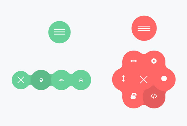
分享一款基于jQuery弹性展开收缩菜单插件gooey.js。这是一款基于gooey.js插件实现的弹性菜单特效代码。效果图如下:
实现的代码。
html代码:
<header class="plugin-demo-header">
<h1>Gooey Menu</h1>
<nav id="gooey-upper">
<input type="checkbox" class="menu-open" name="menu-open1" id="menu-open1"/>
<label class="open-button" for="menu-open1">
<span class="burger burger-1"></span>
<span class="burger burger-2"></span>
<span class="burger burger-3"></span>
</label> <a href="#features" class="gooey-menu-item"> <i title="Features" class="fa fa-cog fa-2x"></i> </a>
<a href="#h-spaced-menu" class="gooey-menu-item"> <i title="Horizontal Menu" class="fa fa-arrows-h fa-2x"></i> </a>
<a href="#menu-v-example" class="gooey-menu-item"> <i title="Vertical Menu" class="fa fa-arrows-v fa-2x"></i> </a>
<a href="#docs" class="gooey-menu-item"> <i title="Docs" class="fa fa-book fa-2x"></i> </a>
<a href="#event-api" class="gooey-menu-item"> <i title="Event API" class="fa fa-code fa-2x"></i> </a>
<a href="#round" class="gooey-menu-item"> <i title="Round Menu" class="fa fa-circle fa-2x"></i> </a> </nav>
</header>
<div class="container">
<div id="page1">
<h1 class="section-label">
Menu Styles</h1>
<div class="section-cont" id="h-spaced-menu">
<i class="desc">Horizontal menu with glued items</i>
<div class="row">
<div class="col-xs-12 col-sm-6 col-md-5">
<nav id="gooey-h">
<input type="checkbox" class="menu-open" name="menu-open2" id="menu-open2"/>
<label class="open-button" for="menu-open2">
<span class="burger burger-1"></span>
<span class="burger burger-2"></span>
<span class="burger burger-3"></span>
</label> <a href="#" class="gooey-menu-item"> <i class="fa fa-train"></i> </a>
<a href="#" class="gooey-menu-item"> <i class="fa fa-bicycle"></i> </a>
<a href="#" class="gooey-menu-item"> <i class="fa fa-rocket"></i> </a>
<a href="#" class="gooey-menu-item"> <i class="fa fa-automobile"></i> </a>
</nav>
</div>
<div class="col-xs-12 col-md-7 code-example">
<pre class="prettyprint linenums">
$(function() {
$("#gooey-h").gooeymenu({
style: "horizontal",
contentColor: "white",
horizontal: {
menuItemPosition: "glue"
}
});
});
</pre>
</div>
</div>
</div>
<div class="section-cont" id="round">
<div class="row">
<div class="col-md-5 col-xs-12 col-sm-6 round-example">
<i class="desc">Round menu with glued items (the glued effect may be achieved by adjusting
"size" and circle radius property values closer (e.g, 80 and 85)) </i>
<nav id="gooey-round">
<input type="checkbox" class="menu-open" name="menu-open3" id="menu-open3"/>
<label class="open-button" for="menu-open3">
<span class="burger burger-1"></span>
<span class="burger burger-2"></span>
<span class="burger burger-3"></span>
</label> <a href="#" class="gooey-menu-item"> <i class="fa fa-train"></i> </a>
<a href="#" class="gooey-menu-item"> <i class="fa fa-bicycle"></i> </a>
<a href="#" class="gooey-menu-item"> <i class="fa fa-rocket"></i> </a>
<a href="#" class="gooey-menu-item"> <i class="fa fa-automobile"></i> </a>
<a href="#" class="gooey-menu-item"> <i class="fa fa-plane"></i> </a>
</nav>
</div>
<div class="col-md-7 col-xs-12 code-example">
<pre class="prettyprint linenums">
$(function() {
$("#gooey-round").gooeymenu({
bgColor: "#ffc0cb",
contentColor: "white",
style: "circle",
circle: {
radius: 85
},
size: 80
});
});
</pre>
</div>
</div>
</div>
<div class="section-cont" id="menu-v-example">
<div class="row">
<div class="col-md-5 col-xs-12 vertical-example">
<i class="desc">Vertical menu ("up" and "down" direction may be achieved by changing
corresponding properties). </i>
<nav id="gooey-v">
<input type="checkbox" class="menu-open" name="menu-open4" id="menu-open4"/>
<label class="open-button" for="menu-open4">
<span class="burger burger-1"></span>
<span class="burger burger-2"></span>
<span class="burger burger-3"></span>
</label> <a href="#" class="gooey-menu-item"> <i class="fa fa-train"></i> </a>
<a href="#" class="gooey-menu-item"> <i class="fa fa-bicycle"></i> </a>
<a href="#" class="gooey-menu-item"> <i class="fa fa-rocket"></i> </a>
<a href="#" class="gooey-menu-item"> <i class="fa fa-automobile"></i> </a>
</nav>
</div>
<div class="col-md-7 col-xs-12 code-example">
<pre class="prettyprint linenums">
$(function() {
$("#gooey-v").gooeymenu({
style: "vertical",
vertical: {
menuItemPosition: "spaced",
direction: "up"
}
});
});
</pre>
</div>
</div>
</div>
<h1 class="section-label">
Event API</h1>
<div class="section-cont" id="event-api">
<div class="row">
<div class="col-md-5 col-xs-12 event-api-ex">
<i class="desc">Use event API to hook into animation "open" and "close" events. In this
example, we change menu item colors when menu "open" and "close" events are triggered.
</i>
<nav id="gooey-API">
<input type="checkbox" class="menu-open" name="menu-open5" id="menu-open5"/>
<label class="open-button" for="menu-open5">
<span class="burger burger-1"></span>
<span class="burger burger-2"></span>
<span class="burger burger-3"></span>
</label> <a href="#" class="gooey-menu-item"> <i class="fa fa-train"></i> </a>
<a href="#" class="gooey-menu-item"> <i class="fa fa-bicycle"></i> </a>
<a href="#" class="gooey-menu-item"> <i class="fa fa-rocket"></i> </a>
<a href="#" class="gooey-menu-item"> <i class="fa fa-automobile"></i> </a>
<a href="#" class="gooey-menu-item"> <i class="fa fa-plane"></i> </a>
</nav>
</div>
<div class="col-md-7 col-xs-12 code-example">
<pre class="prettyprint linenums">
$(function() {
$("#gooey-round").gooeymenu({
circle: {
radius: 85
},
open: function() {
$(this).find(".gooey-menu-item").css("background-color", "steelblue");
$(this).find(".open-button").css("background-color", "steelblue");
},
close: function(gooey) {
$(this).find(".gooey-menu-item").css("background-color", "#00ffff");
$(this).find(".open-button").css("background-color", "#00ffff");
}
});
}); </pre>
</div>
</div>
</div>
</div>
<div id="docs">
<div class="plugin-details">
<h1 class="section-label">
Plugin details</h1>
<p>
<span class="bold">Version</span>: 1.0
<br>
<span class="bold">Created by</span>: Kirill Goltsman
<br>
<span class="bold">Email</span>: goltsmank@gmail.com
</p>
</div>
<h1 class="section-label">
1. Getting started</h1>
<p>
Put "gooey" plugin folder into your project. Include below code snippets into <code>
head</code> section of your html file. You may include Font Awesome plugin if
you want ready-made icons in your menu.
</p>
<pre class="prettyprint linenums lang-html">
<script type="text/javascript" src="https://ajax.googleapis.com/ajax/libs/jquery/1.11.2/jquery.min.js"></script>
<script type="text/javascript" src="gooey/src/gooey.min.js"></script>
<link rel="stylesheet" href="https://cdnjs.cloudflare.com/ajax/libs/font-awesome/4.3.0/css/font-awesome.min.css">
<link rel="stylesheet" href="gooey/src/gooey.min.css">
</pre>
<h1 class="section-label">
2. Add Markup</h1>
<p>
Add markup to your html file. You can use any number of menu links and any labels
or text for your menu links. The markup structure proposed below is desirable to
avoid any bugs. You can use any valid class or id name for your <code>nav</code>
element. This will be automatically handled by the plugin.
<br>
<span class="bold" style="color: red;">Note:</span> If you use several menus on
one page, don't forget to create unique ids and names for your hidden checkbox elements
that have class ".menu-open".
</p>
<pre class="prettyprint linenums html-lang">
<nav id="gooey">
<input type="checkbox" class="menu-open" name="menu-open" id="menu-open"/>
<label class="open-button" for="menu-open">
<span class="burger burger-1"> </span>
<span class="burger burger-2"> </span>
<span class="burger burger-3"> </span>
</label> <a href="#" class="gooey-menu-item"> <i class="fa fa-cab"> </i> </a>
<a href="#" class="gooey-menu-item"> <i class="fa fa-automobile"> </i> </a>
<a href="#" class="gooey-menu-item"> <i class="fa fa-truck"> </i> </a>
<a href="#" class="gooey-menu-item"> <i class="fa fa-rocket"> </i> </a>
</nav> </pre>
<h1 class="section-label">
3. Hook up your menu</h1>
<p>
To indicate your settings, put the following code within a <code>script</code> tag
in your <code>head</code> section, html <code>body</code> element or in a separate
Javascript file. Here is an example of how to set a horizontal Gooey Menu with pink
menu items. Please, remember that a selector's id or class on which <code>gooeyMenu</code>
function is called should be identical to <code>nav</code> element id or class in
your html markup (in this example, <code>nav</code> id is <code>gooey</code>)
</p>
<pre class="prettyprint linenums">
$(function() {
$("#gooey").gooeymenu({
style: "horizontal",
bgColor: "pink"
});
});
</pre>
<h1 class="section-label">
4. Specify your settings</h1>
<p>
You have a list of options to tailor a gooey menu to your needs
</p>
<pre class=" prettyprint linenums"> style: "horizontal", // {String} Sets gooey menu style. Accepted values: "horizontal","vertical","circle"
size:70, // {Integer} Sets a menu item's size in pixels
margin:"medium", // {String} Sets the margin between menu items. Acts only if "spaced" option of "horizontal" or "vertical" style is selected. Accepted values: "small","medium" and "large"
bgColor: "steelblue", // {String} Sets background-color of a menu-item element
contentColor:"white", // {String} Sets font color of a menu item's content;
transitionStep:100, // {Integer} Sets a speed rate at which each menu item unfolds in milliseconds
bounce:false, // {Boolean} Turns "bounce" effect off if {false} and on if {true}
bounceLength:"medium", // {String} Sets the bounce length, if bounce effect is enabled. Accepted values: "small", "medium" and "large"
hover:"white", // {String} Sets menu items' color on hover // Style-specific settings circle: {
radius:80 // {Integer} Sets a radius of menu circle when a menu is opened (in pixels)
},
horizontal: {
menuItemPosition:"glue" // {String} "Spaced" option sets the spacing of menu items by a specified margin. "Glue" option makes items stacked.
},
vertical: {
menuItemPosition:"spaced" // {String} "Spaced" option sets the spacing of menu items by a specified margin. "Glue" option makes items stacked.
direction:"up" // {String} Values: "up" or "down". A direction in which vertical menu unfolds
}, //Callback API
open:function(){}, // {function} Fires when a gooey menu is opened.
<code>$(this)</code> context for the function is the element on which <code>gooeymenu</code> was called
close:function() {} // {function} Fires when a gooey menu is closed. <code>$(this)</code> context for the function is the element on which <code>gooeymenu</code> was called
};
};
</pre>
<h1 class="section-label">
Styling your menu</h1>
<p>
Style menu's margins and indentation. You may set menu items indentation by changing
left/top/right/bottom or margin properties of menu items and menu open button. Since
menu's size will depend on a number of items and menu style selected, you have a
full freedom to set position of your menu according to your needs. Note, that .navimenu
container is relatively positioned by default and menu items are absolutely positioned.
</p>
<pre class="prettyprint linenums">
.navimenu .gooey-menu-item, .navimenu .open-button {
border-radius: 100%;
left: 50px; /* Style left indent */
top:100px; /* Style top indent */
position: absolute;
}
</pre>
<p>
Change a burger icon's background</p>
<pre class='prettyprint linenums'>
.navimenu .burger {
background: white;
}
</pre>
<h1 class="section-label">
Credits</h1>
<p>
Scripts and plugins used in the demo and these docs</p>
<ol class='bold'>
<li>jQuery</li>
<li>FontAwesome </li>
<li>Google Code Prettify </li>
</ol>
</div>
</div>
<header class="plugin-demo-header">
via:http://www.w2bc.com/Article/36782
jQuery弹性展开收缩菜单插件gooey.js的更多相关文章
- 基于jQuery弹性展开收缩菜单插件gooey.js
首先 引入css <link rel="stylesheet" href="css/bootstrap.min.css"> <link rel ...
- js之展开收缩菜单,用到window.onload ,onclick,
目标效果:点击标签1,如果列表标签的style的display是block,改成none,否则改成block,来达到展开收缩菜单效果 一.准备阶段 html文件 <!DOCTYPE html&g ...
- 一款效果精致的 jQuery 多层滑出菜单插件
想要以用户友好的方式呈现多级菜单是件不容易的事情,而且还要跨浏览器兼容就更难了.Multi-Level Push Menu 这款 jQuery 插件提供了呈现这种菜单的解决方案,能够让你无限制的展示菜 ...
- jQuery美化下拉菜单插件dropkick
dropkick是一款基于jquery库的美化下拉框下拉菜单的插件,它通过定制HTML插入可使丑陋无聊的<select>下拉列表变得美丽. name属性是唯一一个必需的填写的,不过你也应该 ...
- JQuery缓冲加载图片插件lazyload.js的使用方法
lazyload.js是一个基于JQuery的插件,可以用来缓冲加载图片.如果一个网页很长并且有很多图片的话,下载图片就需要很多时间,那么就会影响整个网页的加载速度,而这款延迟加载插件,会通过你的滚动 ...
- jQuery实现用户头像裁剪插件cropbox.js
几乎每一个网页是必备图片上传,图片裁剪功能,这里通过cropbox.js插件实现该功能. <script src="js/jquery-1.11.1.min.js">& ...
- Jquery div展开收缩
<html> <meta http-equiv="Content-Type" content="text/html; charset=gb2312&qu ...
- jQuery 当前展开其他收缩 三级下拉菜单(转载)
jQuery可展开收缩三级下拉菜单 <!DOCTYPE html> <html> <head> <meta charset="UTF-8" ...
- jquery多级手风琴插件–accordion.js
手风琴菜单一般用于下拉导航,由于外观非常简洁,使用起来跟手风琴一样可以拉伸和收缩而得名,项目中适当应用手风琴效果会给用户带来非常好的体验.本文借助jQuery插件轻松打造一个非常不错的手风琴效果的菜单 ...
随机推荐
- controller.tabBarItem.title = @"11111"不显示
场景: 在xcode8.3下 今天在弄工程的时候,发现把之前工程中的tabbar控制器拿过来后,在控制器里面用 controller.tabBarItem.title = @"11111& ...
- Android Studio找不到FragmentActivity类
右击项目——>open module settings——>选择第五个选项卡“Dependencies”——>点击加号——>选择第一个Library dependency——& ...
- Linux下实现脚本监测特定进程占用内存情况
Linux系统下,我们可以利用以下命令来获取特定进程的运行情况: cat /proc/$PID/status 其中PID是具体的进程号,这个命令打印出/proc/特定进程/status文件的内容,信息 ...
- 跟我学SharePoint 2013视频培训课程——签出、签入文档(9)
课程简介 第9天,怎样在SharePoint 2013中签出.签入文档 视频 SharePoint 2013 交流群 41032413
- 第二篇:呈现内容_第二节:WebControl呈现
一.WebControl的呈现过程 WebControl派生自Control类,所以WebControl的呈现功能基于Control的呈现逻辑之上,但有了比较大的扩展. 首先,WebControl重写 ...
- 基于tornado的爬虫并发问题
tornado中的coroutine是python中真正意义上的协程,与python3中的asyncio几乎是完全一样的,而且两者之间的future是可以相互转换的,tornado中有与asyncio ...
- flowable 中task的相关操作
1 获取任务列表 1)获取候选人的任务列表 TaskService taskService = processEngine.getTaskService(); List<Task> tas ...
- django -- 为模式增加方法
在django中模式中的方法是行级的.也就是说它操作是表里的行.不是整个表 一.模式定义: from django.db import models # Create your models here ...
- thinkphp的系统变量
define('EXT', '.php'); define('DS', DIRECTORY_SEPARATOR); defined('THINK_PATH') or define('THINK_PAT ...
- SpringBoot actuator 应用监控。
前言 : 今天在阅读 <SpringCloud微服务实战>一书时看到了SpringBoot actuator相关知识,并且自己也本地调试实践.觉得SpringBoot这一套监控还是挺有意思 ...