Simple Validation in WPF
Introduction
This is a simple example of validation in XAML for WPF controls and displaying error messages.
Background
I was looking for something out-of-the-box from WPF where no extra coding of style or template is needed for displaying validation errors, where we just need to code the validation logic for each control and it should automatically display an error icon or message next to the control. However, I did not find anything straightforward like that in WPF. But it can be achieved in two simple steps.
Using the Code
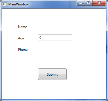
Here is a very simple form in XAML that is created which has three textbox controls:
Let us add code so that when values are entered in the above text boxes, they automatically run validation and if there are validation errors, they will be displayed next to the corresponding control. In order to do this, the following two steps are needed:
- Create a
ControlTemplatewithAdornedElementPlaceHolder - Implement a validation class inheriting the abstract class called
ValidationRule
Here is the sample validation control template. Let us start with a very simple validation control template where all we have is a TextBlock which will display a red exclamatory sign next to the control that has an error.
 Collapse | Copy Code
<ControlTemplate x:Key="validationErrorTemplate">

    <DockPanel>

        <TextBlock Foreground="Red"

            DockPanel.Dock="Top">!</TextBlock>

        <AdornedElementPlaceholder

           x:Name="ErrorAdorner"

        ></AdornedElementPlaceholder>

    </DockPanel>

</ControlTemplate>
Now, let us also create a validator class by inheriting from the ValidationRule class and implementing its abstract method as below:
Collapse | Copy Codepublic class NameValidator : ValidationRule
{
public override ValidationResult Validate
(object value, System.Globalization.CultureInfo cultureInfo)
{
if (value == null)
return new ValidationResult(false, "value cannot be empty.");
else
{
if (value.ToString().Length > 3)
return new ValidationResult
(false, "Name cannot be more than 3 characters long.");
}
return ValidationResult.ValidResult;
}
}
Let's plug this validation control template and the validation rule with control that we want to validate.
Collapse | Copy Code<TextBox Height="23" HorizontalAlignment="Left"
Grid.Column="1" Grid.Row="0" Name="textBox1"
VerticalAlignment="Top" Width="120"
Validation.ErrorTemplate="{StaticResource validationErrorTemplate}"
>
<TextBox.Text>
<Binding Path="Name" Mode="TwoWay"
UpdateSourceTrigger="LostFocus">
<Binding.ValidationRules>
<local:NameValidator></local:NameValidator>
</Binding.ValidationRules>
</Binding>
</TextBox.Text>
</TextBox>
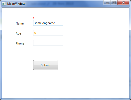
When we run this now and enter a name longer than three characters long, it displays the red exclamatory sign indicating validation error.
Now let us just replace the TextBlock in the above validation control template code (the line that is in bold) with the StackPanel containing an ellipse and a TextBlock to display the same validation error, as below:
Collapse | Copy Code<ControlTemplate x:Key="validationErrorTemplate">
<DockPanel>
<StackPanel Orientation="Horizontal" DockPanel.Dock="Top">
<Grid Width="12" Height="12">
<Ellipse Width="12" Height="12"
Fill="Red" HorizontalAlignment="Center"
VerticalAlignment="Center" ></Ellipse>
<TextBlock Foreground="White" FontWeight="Heavy"
FontSize="8" HorizontalAlignment="Center"
VerticalAlignment="Center" TextAlignment="Center"
ToolTip="{Binding ElementName=ErrorAdorner,
Path=AdornedElement.(Validation.Errors)[0].ErrorContent}"
>X</TextBlock>
</Grid>
<TextBlock Foreground="Red" FontWeight="12" Margin="2,0,0,0"
Text="{Binding ElementName=ErrorAdorner,
Path=AdornedElement.(Validation.Errors)[0].ErrorContent}"
></TextBlock>
</StackPanel>
<AdornedElementPlaceholder
x:Name="ErrorAdorner" ></AdornedElementPlaceholder>
</DockPanel>
</ControlTemplate>
Now when we run the code and validation fails, a validation error will be displayedas shown in the screenshot below (coded validator class for age and phone number as well).
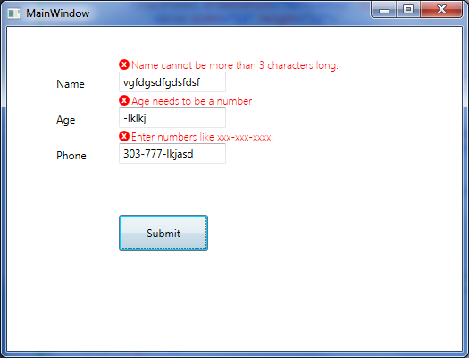
That is all that is needed for the simplest validation error to show up next to the control. Notice in the validation control template, we are using a DockPanel as the layout control, therefore we can easily change where the error icon and error message will be displayed. We can display them on top of the control that is failing validation (as the above picture), or on the left, right, or bottom.
Simple Validation in WPF的更多相关文章
- Reusable async validation for WPF with Prism 5
WPF has supported validation since the first release in .NET 3.0. That support is built into the bin ...
- [WPF系列]-Data Validation
项目经常前台界面涉及到用户输入时,我们常常会用到数据有效性的验证.在网页中我们之前用js来校验Form中的数据有效性.在WPF中我们如何实现这种验证机制了?答案:INotifyDataErrorInf ...
- WPF 验证没有通过无法保存数据(非常好)+ 虚似数据库
Validation control with a single validation rule is easy, but what if we need to validate a control ...
- [WPF系列]-Prism+EF
源码:Prism5_Tutorial 参考文档 Data Validation in WPF √ WPF 4.5 – ASYNCHRONOUS VALIDATION Reusable asyn ...
- WPF 验证
WPF中TextBox的自动验证: 演示 : 用以下两个TextBox分别显示验证IP和非空值验证,先看效果: IP自动验证效果: 非空值自动验证效果: 第一步:定义TextBox验证的样式: < ...
- WPF 自动验证
WPF中TextBox的自动验证: 演示 : 用以下两个TextBox分别显示验证IP和非空值验证,先看效果: IP自动验证效果: 非空值自动验证效果: 第一步:定义TextBox验证的样式: < ...
- 为WIN8 APP创建置顶desktop应用
Windows 8: TopMost window I am working on my next ambitious project “MouseTouch” which is multi to ...
- MVVM中数据验证之 ViewModel vs. Model
MMVM模式示意图. View绑定到ViewModel,然后执行一些命令在向它请求一个动作.而反过来 ...
- nuget packages batch install
d:\nuget\nuget.exe install EnterpriseLibrary.Common -NoCache -Verbosity detailed -OutputDirectory D: ...
随机推荐
- PHP(Math的调用)
<script> //数学函数(用Math来调用)://round=四舍五入最接近的整数// var l = 1.1;// var y1 = Math.round(l);// docume ...
- 深度剖析Java变量栈&对象堆
Java把内存分成两种,一种叫做栈内存,一种叫做堆内存 在函数中定义的一些基本类型的变量和对象的引用变量都是在函数的栈内存中分配.当在一段代码块中定义一个变量时,java就在栈中为这个变量分配内存空间 ...
- JS中的事件&对象
一.JS中的事件 (一)JS中的事件分类 1.鼠标事件 click/dblclick/onmouseover/onmouseout 2.HTML事件 onload/onscroll/onsubmit/ ...
- 201521123031 《Java程序设计》第4周学习总结
---恢复内容开始--- 1. 本周学习总结 1.1 尝试使用思维导图总结有关继承的知识点. 1.2 使用常规方法总结其他上课内容. (1)父类只能有一个,即单继承,子类继承父类的全部成员(属性和方法 ...
- 201521123062《Java程序设计》第12周学习总结
1. 本周学习总结 1.1 以你喜欢的方式(思维导图或其他)归纳总结多流与文件相关内容. 2. 书面作业 将Student对象(属性:int id, String name,int age,doubl ...
- Java课程设计-计算器 丁树乐(201521123024)
1.团队课程设计博客链接 http://www.cnblogs.com/br0823/p/7064407.html 2.个人负责模块或任务说明 界面优化 各类之间拼接 3.自己的代码提交记录截图 4. ...
- php中获取当前系统时间、时间戳
今天写下otime($time, $now)为将时间格式转为时间戳,$time为必填.清楚了这个,想了解更多,请继续往下看. 3. date($format)用法比如:echo date(‘Y-m-d ...
- 本地不安装oracle,plsql照样用起来
对于配置有限的电脑,不安装oracle需要使用plsql怎么设置才可以使用呢 一.首先下载一个instantclient (Oracle提供的一个较为轻量级的客户包) 据说plsql不支持64位的in ...
- 开发中mysql和oracle的区别
首先就不描述mysql与oracle在整个数据库系统上的区别了,仅从程序员开发的角度来说: 1.主键: mysql一般会用到一个自增的属性,例如设置一个id字段,类型设置为auto increment ...
- Node.js 异步异闻录
本文首发在个人博客:http://muyunyun.cn/posts/7b9fdc87/ 提到 Node.js, 我们脑海就会浮现异步.非阻塞.单线程等关键词,进一步我们还会想到 buffer.模块机 ...