
react实现设置答题器选项个数
一,设置答题器选项
import React, { useState, useEffect } from 'react'

import PropTypes from 'prop-types'

import _ from 'lodash'

import CloseButtonSmall from '../CloseButtonSmall'

import LargeButton from '../LargeButton'

import CancelButton from '../CancelButton'

import OptionSettings from '../OptionSettings'

import './index.less'

/**

 * 答题设置组件

 *

 * @param {*} props

 * @returns

 */

function AnswererSettings(props) {

  const { style, onConfirm, onClose } = props

  const wrapperStyle = _.assign({}, style)

  const [selectedCount, setSelectedCount] = useState(2)

  const [isShowLimitTip, setIsShowLimitTip] = useState(false)

  const minOptionCount = 2

  useEffect(() => {

    const tipTimeout = setTimeout(() => {

      setIsShowLimitTip(false)

    }, 3000)

    return () => {

      clearTimeout(tipTimeout)

    }

  }, [isShowLimitTip])

  const handleSelectOption = (optionCount) => {

    setSelectedCount(optionCount)

  }

  const handleSelectMinOption = (optionCount) => {

    setIsShowLimitTip(true)

    setSelectedCount(optionCount)

  }

  const handleConfirm = () => {

    onConfirm(selectedCount)

    onClose()

  }

  const handleCancel = () => {

    onClose()

  }

  return (

    <div className="answerer-settings-component-wrap" style={wrapperStyle}>

      <div className="header">

        <div className="title-wrap">

          <div className="title-tip">

            <span className="title-icon" />

            <div className="title-contents">

              <p className="title">答题器</p>

              <p className="sub-title">设置选项让学生实时参与答题</p>

            </div>

          </div>

          <CloseButtonSmall onClick={handleCancel} />

        </div>

      </div>

      <div className="body">

        <div className="title-wrap">

          <span className="options-icon" />

          <div className="title-contents">

            <p className="title">设定选项</p>

          </div>

          { isShowLimitTip

            ? (

              <div className="title-tip">

                <span className="tip-icon" />

                <span className="tip-contents">请至少保留两个选择选项</span>

                <CloseButtonSmall

                  style={{

                    marginLeft: '20px',

                  }}

                  onClick={() => {

                    setIsShowLimitTip(false)

                  }}

                />

              </div>

            )

            : ''}

        </div>

        <OptionSettings

          style={{

            marginTop: '6px',

            marginRight: '23px',

          }}

          onSelectOption={handleSelectOption}

          onSelectMinOption={handleSelectMinOption}

          minOptionCount={minOptionCount}

        />

      </div>

      <div className="footer">

        <div className="answerer-btns-wrap">

          <LargeButton

            text="确 定"

            className="btn-confirm"

            onClick={handleConfirm}

            style={{

              marginLeft: '29px',

            }}

          />

          <CancelButton

            text="取 消"

            className="btn-cancel"

            onClick={handleCancel}

            style={{

              marginLeft: '37px',

            }}

          />

        </div>

      </div>

    </div>

  )

}

AnswererSettings.propTypes = {

  style: PropTypes.object,

  onConfirm: PropTypes.func.isRequired,

  onClose: PropTypes.func,

}

AnswererSettings.defaultProps = {

  style: {},

  onClose: _.noop,

}

export default AnswererSettings
import React, { useState, useRef } from 'react'

import PropTypes from 'prop-types'

import CX from 'classnames'

import _ from 'lodash'

import './index.less'

const optionItemImgs = [

  require('~/shared/assets/image/answerer-option-letter-a.svg'),

  require('~/shared/assets/image/answerer-option-letter-b.svg'),

  require('~/shared/assets/image/answerer-option-letter-c.svg'),

  require('~/shared/assets/image/answerer-option-letter-d.svg'),

  require('~/shared/assets/image/answerer-option-letter-e.svg'),

//   require('~/shared/assets/image/answerer-option-letter-f.svg'),

]

/**

 * 选项设置组件

 *

 * @param {*} props

 * @returns

 */

function OptionSettings(props) {

  const {

    style, onSelectOption, onSelectMinOption, minOptionCount,

  } = props

  const wrapperStyle = _.assign({}, style)

  const [selectedCount, setSelectedCount] = useState(2)

  const options = useRef(null)

  const handleClickItem = (e) => {

    const { target } = e

    if (target.classList.contains('last-selected')) {

      if (selectedCount !== minOptionCount) {

        setSelectedCount(selectedCount - 1)

        onSelectOption(selectedCount - 1)

      } else {

        onSelectMinOption(selectedCount)

      }

    } else if (target.classList.contains('first-non-selected')) {

      setSelectedCount(selectedCount + 1)

      onSelectOption(selectedCount + 1)

    }

  }

  const renderOptionItems = () => {

    return optionItemImgs.map((img, index) => {

      return (

        <div

          className={CX({

            item: true,

            selected: index < selectedCount,

            'last-selected': index === selectedCount - 1,

            'first-non-selected': index === selectedCount,

          })}

          key={img}

        >

          <img className="letter" alt="" src={img} />

          <img className="add" alt="" />

          <span className="tip" />

        </div>

      )

    })

  }

  return (

    <div className="option-settings-component-wrap" style={wrapperStyle}>

      <div className="option-items" onClick={handleClickItem} role="button" tabIndex={0} ref={options}>

        {renderOptionItems()}

      </div>

    </div>

  )

}

OptionSettings.propTypes = {

  style: PropTypes.object,

  onSelectOption: PropTypes.func,

  onSelectMinOption: PropTypes.func,

  minOptionCount: PropTypes.number,

}

OptionSettings.defaultProps = {

  style: {},

  onSelectOption: _.noop,

  onSelectMinOption: _.noop,

  minOptionCount: 2,

}

export default OptionSettings
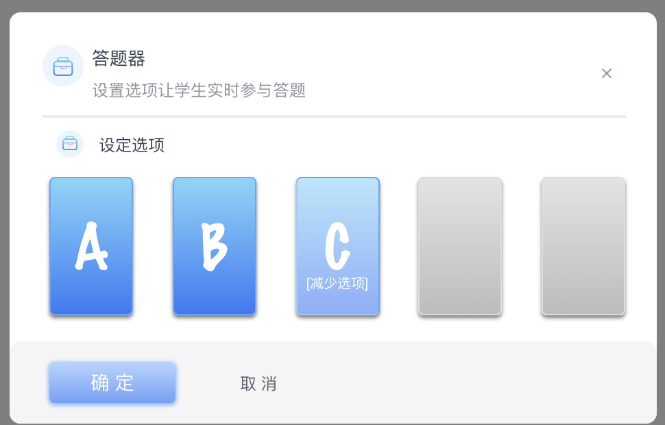
效果如下:
二,展示答题器状态
import React, { useState } from 'react'

import PropTypes from 'prop-types'

import _ from 'lodash'

import CX from 'classnames'

import CloseButtonSmall from '../CloseButtonSmall'

import AnswererStatItem from '../AnswererStatItem'

import './index.less'

// 默认支持5个选项,名称、背景样式和进度条样式

const itemsOption = [

  {

    itemName: 'A',

    iconStyle: { backgroundImage: 'linear-gradient(135deg, #ff758c, #ffb867)' },

    processStyle: { backgroundImage: 'linear-gradient(273deg, #ff758c, #ffb867)' },

  },

  {

    itemName: 'B',

    iconStyle: { backgroundImage: 'linear-gradient(135deg, #ffb867, #fdde74)' },

    processStyle: { backgroundImage: 'linear-gradient(273deg, #ffb867, #fdde74)' },

  },

  {

    itemName: 'C',

    iconStyle: { backgroundImage: 'linear-gradient(135deg, #4cf27d, #6affcc)' },

    processStyle: { backgroundImage: 'linear-gradient(273deg, #4cf27d, #6affcc)' },

  },

  {

    itemName: 'D',

    iconStyle: { backgroundImage: 'linear-gradient(135deg, #63e4e4, #8affff)' },

    processStyle: { backgroundImage: 'linear-gradient(273deg, #63e4e4, #8affff)' },

  },

  {

    itemName: 'E',

    iconStyle: { backgroundImage: 'linear-gradient(135deg, #3977f6, #81d5fa)' },

    processStyle: { backgroundImage: 'linear-gradient(273deg, #3977f6, #81d5fa)' },

  },

]

/**

 * 答题结果展示组件

 * @param {onRestart} 重新开始

 * @param {onClose} 关闭

 * @param {itemNum} 选项的个数

 * @param {statData} 对象,{选项:次数}

 * @param {userCount} 投票人数

 */

function AnswererStat(props) {

  const {

    style, onRestart, onClose, itemNum, statData, userCount,

  } = props

  const wrapperStyle = _.assign({}, style)

  const [isRestarting, setIsRestarting] = useState(false)

  const renderItems = () => {

    return itemsOption.slice(0, itemNum).map((option, index) => {

      return (

        <AnswererStatItem

          style={{

            marginBottom: '12px',

          }}

          key={option.itemName}

          maxValue={userCount}

          value={statData[index]}

          {...option}

        />

      )

    })

  }

  return (

    <div className="answerer-stat-wrap" style={wrapperStyle}>

      <div className="operation">

        <div

          className="restart"

          role="button"

          onClick={() => {

            setIsRestarting(!isRestarting)

            onRestart()

          }}

          tabIndex={0}

        >

          <img

            className={CX({

              'restart-icon': true,

              active: isRestarting,

            })}

            src={require('~/shared/assets/image/loading-icon-circle-50-50.svg')}

            alt=""

          />

          <span className="restart-name">重新答题</span>

        </div>

        <CloseButtonSmall

          theme="dark"

          style={{

            backgroundColor: 'rgba(54, 65, 82, 0.4)',

            boxShadow: '0 2px 4px 0 rgba(51, 51, 51, 0.2)',

          }}

          onClick={onClose}

        />

      </div>

      <div className="item-area">

        {renderItems()}

      </div>

    </div>

  )

}

AnswererStat.propTypes = {

  style: PropTypes.object,

  itemNum: PropTypes.number.isRequired,

  userCount: PropTypes.number,

  statData: PropTypes.object.isRequired,

  onRestart: PropTypes.func,

  onClose: PropTypes.func,

}

AnswererStat.defaultProps = {

  style: {},

  onClose: _.noop,

  onRestart: _.noop,

  userCount: 1,

}

export default AnswererStat
import React from 'react'

import PropTypes from 'prop-types'

import _ from 'lodash'

import './index.less'

/**

 * 答题选项组件

 *

 * @param {选项的名称} itemName

 * @param {名称所在区域的样式} iconStyle

 * @param {进度条的样式} processStyle

 * @param {当前值} value

 * @param {最大值} maxValue

 * @returns

 */

function AnswererStatItem(props) {

  const {

    style, itemName, iconStyle, processStyle, value, maxValue,

  } = props

  const wrapperStyle = _.assign({}, style)

  const wrapperIconStyle = _.assign({}, iconStyle)

  let dataPercentage // 数据计算出来的百分比

  if (maxValue === 0) {

    dataPercentage = 0

  } else {

    dataPercentage = value / maxValue

  }

  const textPercentage = Math.round(dataPercentage * 100) // 在进度条展示的百分比文本

  // 计算进度条样式相关的百分比

  // 根据可见长度的百分比换算符合可见长度比例的全部长度

  // 例,10%的区域被遮挡,此时若数据是50%,则需要填充整体宽度为 10%+50%*90%=55%

  const computeProcessBarOffset = () => {

    if (dataPercentage === 0) {

      return 0

    }

    const visibleLength = 0.9

    return ((dataPercentage * visibleLength + 1 - visibleLength) * 100).toFixed()

  }

  const wrapProcessStyle = _.assign({}, processStyle, { right: `${100 - computeProcessBarOffset()}%` })

  return (

    <div className="answerer-stat-item-wrap" style={wrapperStyle}>

      <div className="answerer-stat-item">

        <div className="stat-item-icon" style={wrapperIconStyle}>

          <div className="item-name-wrap">

            {itemName}

          </div>

        </div>

        <div className="stat-item-present">

          <div className="stat-item-percentage">

            <div className="filler" style={wrapProcessStyle} />

            <div className="stat-item-data">

              <span className="percentage">

                {`${textPercentage}%`}

              </span>

              { ' / ' }

              <span className="numbers">

                {`${value} 次`}

              </span>

            </div>

          </div>

        </div>

      </div>

    </div>

  )

}

AnswererStatItem.propTypes = {

  style: PropTypes.object,

  iconStyle: PropTypes.object,

  processStyle: PropTypes.object,

  itemName: PropTypes.string.isRequired,

  value: PropTypes.number,

  maxValue: PropTypes.number,

}

AnswererStatItem.defaultProps = {

  style: {},

  iconStyle: {},

  processStyle: {},

  value: 0,

  maxValue: 0,

}

export default AnswererStatItem
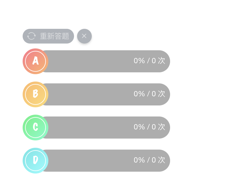
效果如下:
react实现设置答题器选项个数的更多相关文章
- jQuery通过text值来设置选定,以及遍历select的选项个数和遍历
真是醉了,网上搜了很久,全都是千篇一律的. 大家都拷贝来拷贝去,全是错的. 通过text值来设置select选定 $("#CompanyID").find("option ...
- Delphi应用程序的调试(十)调试器选项(在IDE中不要使用异常)
可在两个级别上设置调试选项:工程级和环境级.在前面的讲解中讲解了工程级调试选项,通过主菜单[Project | Options…]打开如下对话框: 可在Debugger Options对话框中设置全局 ...
- curl_setopt — 设置 cURL 传输选项
curl_setopt (PHP 4 >= 4.0.2, PHP 5, PHP 7) curl_setopt — 设置 cURL 传输选项 bool curl_setopt ( resource ...
- Delphi应用程序的调试(十)调试器选项
可在两个级别上设置调试选项:工程级和环境级.在前面的讲解中讲解了工程级调试选项,通过主菜单[Project | Options…]打开如下对话框: 可在Debugger Options对话框中设置全局 ...
- 一个基于chrome扩展的自动答题器
1.写在前面 首先感谢小茗同学的文章-[干货]Chrome插件(扩展)开发全攻略, 基于这篇入门教程和demo,我才能写出这款 基于chrome扩展的自动答题器. git地址: https://git ...
- Windows 8 动手实验系列教程 实验6:设置和首选项
动手实验 实验6:设置和首选项 2012年9月 简介 实验3介绍了合约并演示了应用程序如何轻松地与共享和搜索合约实现集成.合约同样包含设置超级按钮,它对活动的Windows应用商店应用的设置进行修改. ...
- Linker Scripts2--链接器选项概述
1.前言 为了尽可能的与其它链接器兼容,GNU链接器ld涵盖了很多情况.因此,有很多选项可以控制链接器的行为. 2. 命令行选项概述 链接器支持很多命令行选项,在特定的上下文,实际应用中只有很少一部分 ...
- Excel设置下拉选项的方法
前些日子参加提高班组织的数据采集工作,到各个二级学院搜集数据,当然离不开我们常用的Excel表格了.在这次采集数据的过程过程中还真学到了一两招.就比如在Excel中设置下拉选项的方法. 例如我们要在A ...
- React Native 设置RGBA背景色
React Native 设置RGBA背景色: 可以先用Mac自带吸色工具,获取RGB值,然后设置背景如下: backgroundColor: 'rgba(52, 52, 52, 0.8)', 透明度 ...
随机推荐
- file_put_contents 和php://input 实现存储数据进图片中
<?php /** *Recieve p_w_picpath data **/ error_reporting(E_ALL); function get_contents() { $xmlstr ...
- SSA与ASS字幕
SSA字幕与ASS字幕 SSA全称SubStationAlpha,是由CSLow(又称Kotus)创建的一种字幕格式,用以实现比传统字幕诸如srt等格式更为复杂的功能.SSA目前的版本为v4.00.S ...
- springboot+jwt完成登录认证
本demo用于测试jwt,通过登录验证通过后,使用jwt生成token,然后在请求header中携带token完成访问用户列表信息. 准备工作: 1. 实体类SysUser.java package ...
- Nginx http -> https 跳转后 POST 丢失
在 nginx.conf 配置文件中添加如下配置进行 http -> https 跳转 server { listen ; server_name example.org; https://$s ...
- PHP 自动加载类
类的自动加载 (Autoloading Classes) 在编写面向对象(OOP) 程序时,很多开发者为每个类新建一个 PHP 文件. 这会带来一个烦恼:每个脚本的开头,都需要包含(include)一 ...
- pyqt5界面
用pyqt5做了一个小程序,保留一下这个固定格式: import sys from PyQt5 import uic, QtGui from PyQt5.QtGui import QWindow fr ...
- Flutter Offstage、Visibility隐藏/可见
Offstage是控制组件隐藏/可见的组件,如果感觉有些单调功能不全,我们可以使用Visibility,Visibility也是控制子组件隐藏/可见的组件.不同是的Visibility有隐藏状态是否留 ...
- Flutter BottomSheet底部弹窗效果
BottomSheet是一个从屏幕底部滑起的列表(以显示更多的内容).你可以调用showBottomSheet()或showModalBottomSheet弹出 import 'package:flu ...
- 代替ESXI的虚拟机解决方案proxmox
版权声明:本文为博主原创文章,遵循 CC 4.0 BY-SA 版权协议,转载请附上原文出处链接和本声明.本文链接:https://blog.csdn.net/matengbing/article/de ...
- django实战总结2
https://www.jianshu.com/p/9b3bfe934511 https://www.cnblogs.com/1Q84mi/p/xadmin002.html https://blog. ...