CSS 垂直居中的5种实现方法
使用 CSS 实现垂直居中并不容易。有些方法在一些浏览器中无效。下面我们看一下使对象垂直集中的5种不同方法,以及它们各自的优缺点。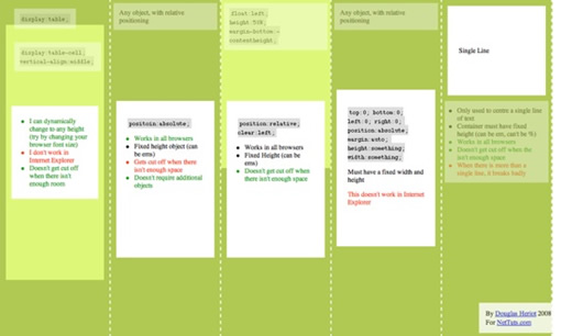
方法一
这个方法把一些 div 的显示方式设置为表格,因此我们可以使用表格的 vertical-align property 属性。
代码如下:
<div id="cell">
<div class="content">
Content goes here</div>
</div>
</div>
css:
#wrapper {display:table;}
#cell {display:table-cell; vertical-align:middle;}
优点:
content 可以动态改变高度(不需在 CSS 中定义)。当 wrapper 里没有足够空间时, content 不会被截断
缺点:
Internet Explorer(甚至 IE8 beta)中无效,许多嵌套标签(其实没那么糟糕,另一个专题)
方法二:
这个方法使用绝对定位的 div,把它的 top 设置为 50%,top margin 设置为负的 content 高度。这意味着对象必须在 CSS 中指定固定的高度。
因为有固定高度,或许你想给 content 指定 overflow:auto,这样如果 content 太多的话,就会出现滚动条,以免content 溢出。
css:
#content {
position:absolute;
top:50%;
height:240px;
margin-top:-120px; /* negative half of the height */
}
优点:
适用于所有浏览器
不需要嵌套标签
缺点:
没有足够空间时,content 会消失(类似div 在 body 内,当用户缩小浏览器窗口,滚动条不出现的情况)
这种方法,在 content 元素外插入一个 div。设置此 div height:50%; margin-bottom:-contentheight;。
content 清除浮动,并显示在中间。
<div id="floater">
<div id="content">
Content here</div>
</div>
代码如下:
#content {clear:both; height:240px; position:relative;}
优点:
适用于所有浏览器
没有足够空间时(例如:窗口缩小) content 不会被截断,滚动条出现
缺点:
唯一我能想到的就是需要额外的空元素了(也没那么糟,又是另外一个话题)
方法四
这个方法使用了一个 position:absolute,有固定宽度和高度的 div。这个div 被设置为 top:0; bottom:0;。但是因为它有固定高度,其实并不能和上下都间距为 0,因此 margin:auto; 会使它居中。使用 margin:auto;使块级元素垂直居中是很简单的。
css:
代码如下:
position:absolute;
top:0;
bottom:0;
left:0;
rightright:0;
margin:auto;
height:240px;
width:70%;
}
优点:简单
缺点:
IE(IE8 beta)中无效
无足够空间时,content 被截断,但是不会有滚动条出现
这个方法只能将单行文本置中。只需要简单地把 line-height 设置为那个对象的 height 值就可以使文本居中了。
css:
代码如下:
优点:
适用于所有浏览器
无足够空间时不会被截断
缺点:
只对文本有效(块级元素无效)
多行时,断词比较糟糕。
这个方法在小元素上非常有用,例如使按钮文本或者单行文本居中。
我最喜欢的是方法三,缺点不多。因为 content 会清除浮动,所以可以在它上面放置别的元素,并且当窗口缩放时, 居中的 content 不会把另外的元素盖住。
<h1>Title</h1>
</div>
<div id="content"> Content Here</div>
代码如下:
#top {float:rightright; width:100%; text-align:center;}
#content {clear:both; height:240px; position:relative;}
现在你知道是怎么回事了,现在我们开始创建一个简单但是有趣的网站。最终的样子是这样的:
步骤一
以语义化标签开始是很好的。下面是我们的页面构成:
#contred/*centre 盒*/
#side
#logo
#nav/*无序列表*/
#content
#bottom/*放置版权等*/
这是我用到的 xhtml 代码:
代码如下:
<div id="centered">
<div id="side">
<div id="logo">
<strong><span>A</span> Company</strong></div>
<ul id="nav">
<li><a href="#">Home</a></li>
<li><a href="#">Products</a></li>
<li><a href="#">Blog</a></li>
<li><a href="#">Contact</a></li>
<li><a href="#">About</a></li>
</ul>
</div>
<div id="content">
<h1>Page Title</h1>
Holisticly re-engineer value-added outsourcing after process-centric collaboration and idea-sharing.
Energistically simplify impactful niche markets via enabled imperatives.
Holisticly predominate premium innovation after compelling scenarios.
Seamlessly recaptiualize high standards in human capital with leading-edge manufactured products.
Distinctively syndicate standards compliant schemas before robust vortals.
Uniquely recaptiualize leveraged web-readiness vis-a-vis out-of-the-box information.
<h2>Heading 2</h2>
Efficiently embrace customized web-readiness rather than customer directed processes.
Assertively grow cross-platform imperatives vis-a-vis proactive technologies.
Conveniently empower multidisciplinary meta-services without enterprise-wide interfaces.
Conveniently streamline competitive strategic theme areas with focused e-markets.
Phosfluorescently syndicate world-class communities vis-a-vis value-added markets.
Appropriately reinvent holistic services before robust e-services.</div>
</div>
<div id="bottom">
Copyright notice goes here</div>
现在我们开始用一些基本的 CSS 来给页面添加样式。把以下代码放入在我们的 html 页面顶部被引入的 style.css。
代码如下:
margin:0; padding:0;
height:100%;
}
body {
background:url('page_bg.jpg') 50% 50% no-repeat #FC3;
font-family:Georgia, Times, serifs;
}
#floater {
position:relative; float:left;
height:50%; margin-bottom:-200px;
width:1px;
}
#centered {
position:relative; clear:left;
height:400px; width:80%; max-width:800px; min-width:400px;
margin:0 auto;
background:#fff;
border:4px solid #666;
}
#bottom {
position:absolute;
bottombottom:0; rightright:0;
}
#nav {
position:absolute; left:0; top:0; bottombottom:0; rightright:70%;
padding:20px; margin:10px;
}
#content {
position:absolute; left:30%; rightright:0; top:0; bottombottom:0;
overflow:auto; height:340px;
padding:20px; margin:10px;
}
在我们能够把 content 垂直居中之前, body 和 html 应该被拉伸到 100% 的高度。由于 height在 padding 和 margin 之内,所以我们要把它们设成 0 以防止因为很小的 margin 出现滚动条。
floater 的 margin-bottom 是 content 高度(400px)的一半,-200px。
现在可以看到一下效果: 
#centred 的宽度为 80%。这可以市网页随着显示器的大小而变化。一般称作流体布局。设置 min-width 和max-width 以避免网页过大或者过小。 但是 IE 不支持 min/max-width。显然可以用固定宽度来代替。
因为 #centred 是相对定位的,在它里面我们可以用绝对定位来定位元素。设置 #content 的 overflow:auto;以避免滚动条的出现。IE 不怎么喜欢 overflow:auto; 除非我们指定高度(不是 top 和 bottom 的定位,也不是 %)因此我们给它指定高度。
步骤三
最后要做的就是再添加点样式,让页面好看点。从目录开始吧。
代码如下:
list-style:none;
padding:0; margin:20px 0 0 0; text-indent:0;
}
#nav li {
padding:0; margin:3px;
}
#nav li a {
display:block;
padding:7px; margin:0;
text-decoration:none; color:#000;
border-bottom:1px solid #bbb;
text-align:rightright;
}
#nav li a::after {
content:'»'; color:#aaa; font-weight:bold;
display:inline; float:rightright;
margin:0 2px 0 5px;
}
#nav li a:hover, #nav li a:focus {
background:#f8f8f8;
border-bottom-color:#777;
}
#nav li a:hover::after {
margin:0 0 0 7px; color:#f93;
}
#nav li a:active {
padding:8px 7px 6px 7px;
}
需要注意的是 #centred 的圆角。 CSS3 中,应该有 border-radius 属性来设定圆角的半径(可参考 CSS3之旅: border-radius(圆角) - 糖伴西红柿)。现在的流行的浏览器都还不支持,除非用 -moz(Molilla Firefox) 或者 -webit(Safari/Webkit) 前缀. 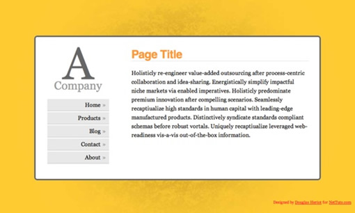
兼容性注意事项
如你所想,IE 是唯一添麻烦的浏览器。
- #floater 必须指定宽度,否则在任意版本 IE 中,它都啥也不干
- IE 6 中目录被周围太多的空间打断
- IE 8 有多余空间(作者遗漏)
更多的想法
利用居中的网页可以做很多有意思的事情。我在重新设计 SWFObject Generator 2.0 (使用 SWFObject2.0 生成代码)使用了这个想法。这里有另外的一个想法。
资料
以下是我参考的一些资料,推荐阅读。
Understanding vertical-align, or “How (Not) To Vertically Center Content”
Vertical centering using CSS
Vertical Centering in CSS
糖伴西红柿说:水平居中经常用,其实垂直居中也很有用的。平时用的最多的应该是方法五了,算是个小技巧吧。
CSS 垂直居中的5种实现方法的更多相关文章
- CSS垂直居中的8种方法
CSS垂直居中的8种方法 1.通过verticle-align:middle实现CSS垂直居中. 通过vertical-align:middle实现CSS垂直居中是最常使用的方法,但是有一点需要格外注 ...
- css指示箭头两种实现方法
<!DOCTYPE html> <html lang="en"> <head> <meta charset="UTF-8&quo ...
- 完美实现CSS垂直居中的11种方法
在做前端项目时CSS的水平居中我们经常使用,但有时还会用到CSS垂直居中,对于小白来说这个就有些难度了,下面看一下我是如何实现的 本人前端小白,正在做一个小程序开发的项目,css样式调整搞的头都大了. ...
- CSS垂直居中的四种方法
写在前面的话 最近在Stack Overflow上看到 一个不错的回答 ,以下是我对其的总结,分享给大家. 垂直居中的四种方法 ①基础的方法 设置父元素的line-height等于height,这种方 ...
- 纯CSS垂直居中的四种解决方案
总结了几种解决方法 但也不是说除了我说的就没有其他方法了 第一个.利用flex布局 代码: 效果: 第二个.利用transform 的 translate属性 代码: 效果: 第三个.使用伪类::af ...
- 解决CSS垂直居中的几种方法(基于绝对定位,基于视口单位,Flexbox方法)
在CSS中对元素进行水平居中是非常简单的:如果它是一个行内元素,就对它的父元素应用 text-align: center ;如果它是一个块级元素,就对它自身应用 margin: auto.然而如果要对 ...
- CSS 水平垂直居中的几种实现方法
前言 项目中经常碰到需要实现水平垂直居中的样式.下面就总结几种常用的方法 水平对齐+行高 [思路一]text-align + line-height实现单行文本水平垂直居中 <style> ...
- CSS垂直居中的11种实现方式
今天是邓呆呆球衣退役的日子,在这个颇具纪念意义的日子里我写下自己的第一篇博客,还望前辈们多多提携,多多指教! 接下来,就进入正文,来说说关于垂直居中的事.(以下这11种垂直居中的实现方式均为笔者在日常 ...
- css颜色的五种表示方法
一.最简单.最古老的颜色类型在CSS颜色的关键词,如red blue等. 二.十六进制值,如#0000. 三.RGB: rgb(255,0,0),这是给定的三个参数表示的红色,绿色和蓝色通道的颜色值每 ...
随机推荐
- 使用LINQ查询非泛型类型
原文地址:http://www.cnblogs.com/buzz/archive/2009/04/23/1442159.html using System;using System.Collectio ...
- linux之SQL语句简明教程---GROUP BY
我们现在回到函数上.记得我们用 SUM 这个指令来算出所有的 Sales (营业额)吧!如果我们的需求变成是要算出每一间店 (Store_Name) 的营业额 (Sales),那怎么办呢?在这个情况下 ...
- UML_用例图
用例图主要用来描述"用户.需求.系统功能单元"之间的关系.它展示了一个外部用户能够观察到的系统功能模型图. [用途]:帮助开发团队以一种可视化的方式理解系统的功能需求. 用例图所包 ...
- 《编写高质量代码 改善Java程序的151个建议》书摘
例子1:三元操作符的陷阱 int i = 80; String str1 = String.valueOf(i < 100 ? 90 : 100); String str2 = String.v ...
- hdu 5621 KK's Point(数学,推理题)
题解: 在圆上点三个点时,除圆上三个交点外,圆内没有交点:在圆上点四个点时,除圆上四个交点外,圆内出现了一个交点,因此,在N个点中每四个点便可以在圆内产生一个交点,因此N个点在圆内形成的点的个数为CN ...
- Longge的问题(欧拉,思维)
Longge的问题 Submit Status Practice HYSBZ 2705 Description Longge的数学成绩非常好,并且他非常乐于挑战高难度的数学问题.现在问题来了:给定一 ...
- 【线段树】【3-21个人赛】【同样的problemB】
同一道题 http://blog.csdn.net/zy691357966/article/details/44680121 区间查询最大值 用线段树 比单调队列慢 #include <cst ...
- Oracle 存储过程之通用分页查询
在数据库中书写通用分页存储过程,有利于代码的维护以及执行效率的提升 create or replace procedure Sp_QueryDatePage ( tableName in varcha ...
- html网页获取php网页数据等知识记录
所有跟php有关的网页都必须在Apache服务器下打开.需要配置好confg.ini的文件路径. AJAX: 通过事件不断的向服务器发送请求,然后服务器会时时返回最新的数据,这就是AJAX的功能 PS ...
- CSS3 过渡
通过 CSS3,我们可以在不使用 Flash 动画或 JavaScript 的情况下,当元素从一种样式变换为另一种样式时为元素添加效果. 请把鼠标移动到右侧的元素上: 浏览器支持 Internet E ...