
Matplotlib学习---用matplotlib画散点图,气泡图(scatter plot, bubble chart)
Matplotlib里有两种画散点图的方法,一种是用ax.plot画,一种是用ax.scatter画。
一. 用ax.plot画
ax.plot(x,y,marker="o",color="black")
二. 用ax.scatter画
ax.scatter(x,y,marker="o",s=sizes,c=colors)
ax.plot和ax.scatter的区别:
ax.plot:各散点彼此复制,因此整个数据集中所有的点只需配置一次颜色和大小。对大型数据集而言,ax.plot方法效率更高。
ax.scatter:灵活性高,可以单独控制每个散点,使其具有不同的属性(大小,填充颜色,边框颜色等)。
下面利用Nathan Yau所著的《鲜活的数据:数据可视化指南》一书中的数据,学习画图。
数据地址:http://datasets.flowingdata.com/flowingdata_subscribers.csv (用于散点图)
http://datasets.flowingdata.com/crimeRatesByState2005.csv(用于气泡图)
准备工作:先导入matplotlib和pandas,用pandas读取csv文件,然后创建一个图像和一个坐标轴
import pandas as pd

from matplotlib import pyplot as plt

subscriber=pd.read_csv(r"http://datasets.flowingdata.com/flowingdata_subscribers.csv")
fig,ax=plt.subplots()
让我们先看看第一个数据文件的前5行:
         Date  Subscribers  Reach  Item Views   Hits

0  01-01-2010        25047   4627        9682  27225

1  01-02-2010        25204   1676        5434  28042

2  01-03-2010        25491   1485        6318  29824

3  01-04-2010        26503   6290       17238  48911

4  01-05-2010        26654   6544       16224  45521
我们把文件中的订阅人数根据日期的推进画出来:
import pandas as pd

from matplotlib import pyplot as plt

subscriber=pd.read_csv(r"http://datasets.flowingdata.com/flowingdata_subscribers.csv")

fig,ax=plt.subplots()

time=[pd.to_datetime(i) for i in subscriber["Date"]]

ax.plot(time,subscriber["Subscribers"],"o",color="blue")

ax.set(xlabel="Date",ylabel="Number of subsribers")

ax.set_title("Growth of subscribers --- Jan 2010")

ax.annotate("2 days where \nit went wrong",xy=(0.43,0.06),xycoords='axes fraction',\

            xytext=(0.56,0.1),textcoords='axes fraction',\

            arrowprops=dict(facecolor='black', shrink=0.05))

ax.annotate("",xy=(0.046,0.8),xycoords='axes fraction',\

            xytext=(0.004,0.68),textcoords='axes fraction',\

            arrowprops=dict(arrowstyle="-"))

ax.annotate("27611\n(+10%)",xy=(0.955,0.92),xycoords='axes fraction',\

            xytext=(0.905,0.76),textcoords='axes fraction',\

            arrowprops=dict(arrowstyle="-"))

ax.spines["left"].set_visible(False)

ax.spines["right"].set_visible(False)

ax.spines["top"].set_visible(False)

plt.show()
图像如下:
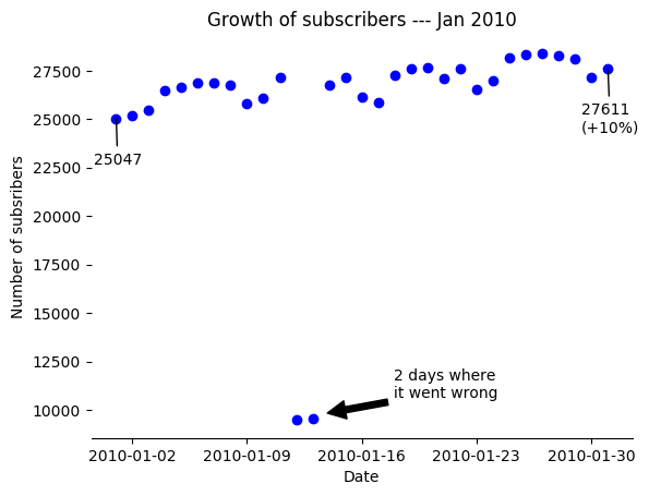
可以看到有两个点情况异常,由于原因未知,添加注释进行说明。
接下来看看第二个数据文件的前5行:
           state  murder  forcible_rape  robbery  aggravated_assault  \

0  United States     5.6           31.7    140.7               291.1

1        Alabama     8.2           34.3    141.4               247.8

2         Alaska     4.8           81.1     80.9               465.1

3        Arizona     7.5           33.8    144.4               327.4

4       Arkansas     6.7           42.9     91.1               386.8

   burglary  larceny_theft  motor_vehicle_theft  population

0     726.7         2286.3                416.7   295753151

1     953.8         2650.0                288.3     4545049

2     622.5         2599.1                391.0      669488

3     948.4         2965.2                924.4     5974834

4    1084.6         2711.2                262.1     2776221
这是美国各州各种犯罪行为的发生率(每10万人口)。
让我们看看各州谋杀率和入室盗窃率之间是否有关联,同时把各州的人口也显示出来,看看人口多的州是否这两种犯罪率同时也高。
首先把第一行United States的平均数据去除,然后把population,state,murder,burglary这几项数据分别拣出。在scatter命令中,以murder为x轴,burglary为y轴,s(气泡面积)按population调整,alpha为透明度。其中有一个州的谋杀率特别高,因此把x轴的上下限调整一下,以便更好地看出谋杀率和入室盗窃率之间的关系。这样,一个三维图像就画了出来。
import pandas as pd

from matplotlib import pyplot as plt

crime=pd.read_csv(r"http://datasets.flowingdata.com/crimeRatesByState2005.csv")

fig,ax=plt.subplots(figsize=(10,5))

crime=crime[1:]

population=crime["population"].values

state=crime["state"].values

murder=crime["murder"].values

burglary=crime["burglary"].values

ax.scatter(murder,burglary,s=population/40000,alpha=0.6)

ax.set(xlim=(0,11),ylim=(200,1300),\

       xlabel="Murder per 100,000 population",\

       ylabel="Burglary per 100,000 population",\

       title="Murder & Burglary in USA")

for i,j,z in zip(murder,burglary,state):

    ax.text(x=i-0.3,y=j-0.1,s=z,fontsize=7)

ax.spines["top"].set_visible(False)

ax.spines["left"].set_visible(False)

ax.spines["right"].set_visible(False)

plt.show()
图像如下:
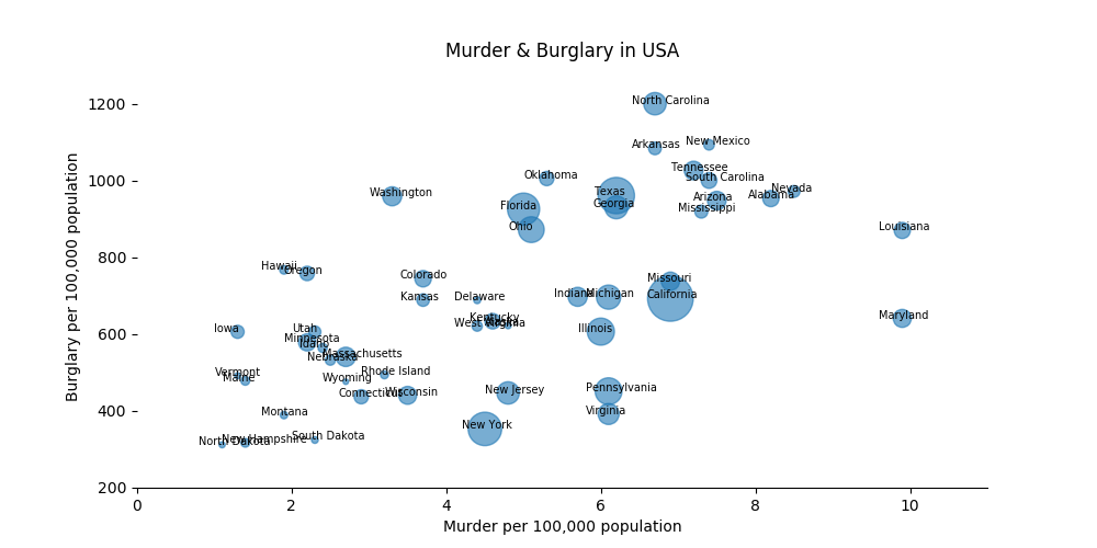
可以看出谋杀率和入室盗窃率之间是呈正比关系的,但是人口多的州并非这两种犯罪率就高。
此外,可以通过设置scatter命令中的c(颜色)参数,进而来展示四维图像。
Matplotlib学习---用matplotlib画散点图,气泡图(scatter plot, bubble chart)的更多相关文章
- Matplotlib学习---用matplotlib画箱线图(boxplot)
箱线图通过数据的四分位数来展示数据的分布情况.例如:数据的中心位置,数据间的离散程度,是否有异常值等. 把数据从小到大进行排列并等分成四份,第一分位数(Q1),第二分位数(Q2)和第三分位数(Q3)分 ...
- Matplotlib学习---用matplotlib画直方图/密度图(histogram, density plot)
直方图用于展示数据的分布情况,x轴是一个连续变量,y轴是该变量的频次. 下面利用Nathan Yau所著的<鲜活的数据:数据可视化指南>一书中的数据,学习画图. 数据地址:http://d ...
- Matplotlib学习---用matplotlib和sklearn画拟合线(line of best fit)
在机器学习中,经常要用scikit-learn里面的线性回归模型来对数据进行拟合,进而找到数据的规律,从而达到预测的目的.用图像展示数据及其拟合线可以非常直观地看出拟合线与数据的匹配程度,同时也可用于 ...
- matplotlib 知识点13:绘制散点图(scatter函数精讲)
散点图是指在回归分析中,数据点在直角坐标系平面上的分布图,散点图表示因变量随自变量而变化的大致趋势,据此可以选择合适的函数对数据点进行拟合. 用两组数据构成多个坐标点,考察坐标点的分布,判断两变量之间 ...
- Matplotlib学习---用seaborn画联合分布图(joint plot)
有时我们不仅需要查看单个变量的分布,同时也需要查看变量之间的联系,这时就需要用到联合分布图. 这里利用Jake Vanderplas所著的<Python数据科学手册>一书中的数据,学习画图 ...
- Matplotlib学习---用matplotlib画误差线(errorbar)
误差线用于显示数据的不确定程度,误差一般使用标准差(Standard Deviation)或标准误差(Standard Error). 标准差(SD):是方差的算术平方根.如果是总体标准差,那么用σ表 ...
- Matplotlib学习---用matplotlib画阶梯图(step plot)
这里利用Nathan Yau所著的<鲜活的数据:数据可视化指南>一书中的数据,学习画图. 数据地址:http://datasets.flowingdata.com/us-postage.c ...
- Matplotlib学习---用matplotlib画面积图(area chart)
这里利用Nathan Yau所著的<鲜活的数据:数据可视化指南>一书中的数据,学习画图. 数据地址:http://book.flowingdata.com/ch05/data/us-pop ...
- Matplotlib学习---用matplotlib画热图(heatmap)
这里利用Nathan Yau所著的<鲜活的数据:数据可视化指南>一书中的数据,学习画图. 数据地址:http://datasets.flowingdata.com/ppg2008.csv ...
随机推荐
- 使用 OpenSSL 创建私有 CA:3 用户证书
OpenSSL 创建私有 CA 三部曲:使用 OpenSSL 创建私有 CA:1 根证书使用 OpenSSL 创建私有 CA:2 中间证书使用 OpenSSL 创建私有 CA:3 用户证书 在前文&l ...
- 我的微信小程序第二篇
在上一篇<我的微信小程序第一篇(入门)>中,很多人问我什么是微信小程序,在这里我要说一下这个是我的失误啦,我默认大家都知道微信小程序,其实可能行内人士都知道小程序,好多非行内朋友可能平时不 ...
- poj2104 主席树裸题
空间大小:n*lgn 复杂度:建树n*lgn 查询lgn #include <cstdio> #include <iostream> #include <algorit ...
- c++入门之文件读取
再次强调这个观念:写文件,读文件和读,写控制台本质上没有区别,意识到这一点是十分重要的.下面给出读文件的代码: #include "iostream" # include &quo ...
- c++入门之再话命名空间的意义
c++中使用了命名空间这一概念,通过下面这个代码,我们将深刻认识到命名空间的重要作用和意义: # include"iostream" using namespace std; na ...
- 实验楼----PHP代码审计(sha1、md5)
地址:http://www.shiyanbar.com/ctf/1787 题目:
- 1px实现方案
JS处理 首先,可以通过 window.devicePixelRatio 拿到设备的像素比,然后给 html 标签加上的相应的样式. function retina () { // 高分辨率屏幕处理 ...
- C++常用宏
宏是由 #define 定义而来,在预处理阶段进行宏展开,它的格式是: #define N 2 + 2 // 仅仅是字符串替换 #define N (2 + 2) // 也是字符串 ,但是是(2 + ...
- 局域网 FTP建立,搭建一个简易的局域网服务器
1.创建用户名以及密码: 右键我的电脑 -> 管理->本地用户和组->右键用户->新用户----设置用户名密码: 2.安装IIS 和FTP :控制面板->程序->打 ...
- Idea批量修改变量名
Idea批量修改变量名.在变量名上进行rename操作,所有的同名变量都会自动更改. 快捷键:ALT+SHIFT+R