HTML5制作新年贺春
<!DOCTYPE html>
<html>
<head>
<meta charset='UTF-8'/>
<meta name='viewport' content='width=device-width, initial-scale=1, minimum-scale=1, maximum-scale=1, user-scalable=no'/>
<meta name='format-detecion' content='telephone=no'/>
<meta http-equiv='X-UA-Compatible' content='IE=edge, chrome=1'/>
<title>2017贺春</title>
</head>
<style>
/* all tag */
*{
margin: 0px;
padding: 0px;
border: none;
font-size: 1.5625vw;
font-family: 'Microsoft Yahei';
}
html,
body{
height: 100%;
overflow: hidden;
}
#music{
position: fixed;
top: 3vw;
right: 4vw;
z-index: 5;
width: 15vw;
height: 15vw;
border: 4px solid #ef1639;
border-radius: 50%;
}
#music > img:first-of-type{
position: absolute;
top: 24%;
right: 2.5%;
width: 28.421%;
z-index: 1;
}
#music > img:last-of-type{
position: absolute;
top: 0;
right: 0;
bottom: 0;
left: 0;
margin: auto;
width: 79%;
z-index: 0;
}
#music > img.play{
-webkit-animation: music_disc 4s linear infinite;
-o-animation: music_disc 4s linear infinite;
animation: music_disc 4s linear infinite; }
@keyframes music_disc{
0%{
-webkit-transform: rotate(0deg);
-ms-transform: rotate(0deg);
-o-transform: rotate(0deg);
transform: rotate(0deg);
}
100%{
-webkit-transform: rotate(360deg);
-ms-transform: rotate(360deg);
-o-transform: rotate(360deg);
transform: rotate(360deg);
}
}
@-webkit-keyframes music_disc{
0%{
-webkit-transform: rotate(0deg);
-ms-transform: rotate(0deg);
-o-transform: rotate(0deg);
transform: rotate(0deg);
}
100%{
-webkit-transform: rotate(360deg);
-ms-transform: rotate(360deg);
-o-transform: rotate(360deg);
transform: rotate(360deg);
}
}
@-o-keyframes music_disc{
0%{
-webkit-transform: rotate(0deg);
-ms-transform: rotate(0deg);
-o-transform: rotate(0deg);
transform: rotate(0deg);
}
100%{
-webkit-transform: rotate(360deg);
-ms-transform: rotate(360deg);
-o-transform: rotate(360deg);
transform: rotate(360deg);
}
}
.page{
position: absolute;
width: 100%;
height: 100%;
}
/* page bg */ .page > .bg{
position: absolute;
width: 100%;
height: 100%;
} /* page1 */
#page1{
display: block;
}
#page1 > .bg{
background: url('image/p1_bg.jpg') no-repeat center center;
background-size: 100%;
}
#page1 > .p1_lantern{
position: absolute;
top: -3.4%;
right: 0;
left: 0;
margin: auto;
color: #fff;
background: url('image/p1_lantern.png') no-repeat center bottom;
background-size: 100%;
width: 45vw;
height: 71.2vh;
font-size: 3.506rem;
padding-top: 31vh;
text-align: center;
z-index:0;
-webkit-box-sizing: border-box;
-moz-box-sizing: border-box;
-ms-box-sizing: border-box;
-o-box-sizing: border-box;
box-sizing: border-box;
}
#page1 > .p1_lantern:before{
position: absolute;
top: 0;
right: 0;
bottom: 0;
left: 0;
content: '';
margin: auto;
width: 30vw;
height: 30vw;
z-index: -1;
background: #d60b3b;
border-radius: 50%;
opacity: .5;
-webkit-box-shadow: 0 0 10vw 10vw #d60b3b;
-moz-box-shadow: 0 0 10vw 10vw #d60b3b;
-ms-box-shadow: 0 0 10vw 10vw #d60b3b;
-o-box-shadow: 0 0 10vw 10vw #d60b3b;
box-shadow: 0 0 10vw 10vw #d60b3b;
-webkit-animation: p1_lantern .5s infinite;
-o-animation: p1_lantern .5s infinite;
animation: p1_lantern .5s infinite; }
@keyframes p1_lantern{
0%{
opacity: .5;
-webkit-transform: scale(.8, .8);
transform: scale(.8, .8);
}
100%{
opacity: 1;
}
}
@-webkit-keyframes p1_lantern{
0%{
opacity: .5;
-webkit-transform: scale(.8, .8);
transform: scale(.8, .8);
}
100%{
opacity: 1;
}
}
@-o-keyframes p1_lantern{
0%{
opacity: .5;
-webkit-transform: scale(.8, .8);
transform: scale(.8, .8);
}
100%{
opacity: 1;
}
}
#page1 > .p1_imooc{
position: absolute;
right: 0;
bottom: 9vh;
left: 0;
background: url('image/p1_imooc.png') no-repeat center center;
background-size: 100%;
width: 27.656vw;
height: 18.63vh;
margin: auto;
}
#page1 > .p1_words{
position: absolute;
font-size: 2.134rem;
right: 0;
bottom: 48px;
left: 0;
text-align: center;
color: #241815;
}
/* page2 */
#page2{
display: none;
-webkit-transition: .5s;
transition: .5s;
}
.fadeOut{
opacity: .3;
-webkit-transform: translate(0, -100%);
transform: translate(0, -100%);
}
#page2 > .bg{
background: url('image/p2_bg.jpg') no-repeat center center;
background-size: 100%;
}
#page2 > .p2_bg_loading{ z-index: 4; background: #ef1639
-webkit-animation: p2_bg_loading 1s linear forwards;
animation: p2_bg_loading 1s linear forwards;
}
@keyframes p2_bg_loading{
0%{ opacity: 1;}
100%{ opacity: 0;}
}
@-webkit-keyframes p2_bg_loading{
0%{ opacity: 1;}
100%{ opacity: 0;}
}
#page2 > .p2_circle{
position: absolute;
top: 0;
right: 0;
bottom: 0;
left: 0;
margin: auto;
border-radius: 50%;
background: url('image/p2_circle_outer.png') no-repeat center;
background-size: 100%;
width: 59.375vw;
height: 59.375vw; -webkit-animation: p2_circle_outer 1s linear 3s infinite;
-o-animation: p2_circle_outer 1s linear 3s infinite;
animation: p2_circle_outer 1s linear 3s infinite;
}
@keyframes p2_circle_outer{
0% {
-webkit-transform: rotate(0deg);
transform: rotate(0deg);
}
100% {
-webkit-transform: rotate(-360deg);
transform: rotate(-360deg);
}
}
@-webkit-keyframes p2_circle_inner{
0%{
-webkit-transform: rotate(0deg);
transform: rotate(0deg);
}
100%{
-webkit-transform: rotate(-360deg);
transform: rotate(-360deg);
}
}
@-o-keyframes p2_circle_inner{
0%{
-webkit-transform: rotate(0deg);
transform: rotate(0deg);
}
100%{
-webkit-transform: rotate(-360deg);
transform: rotate(-360deg);
}
}
#page2 > .p2_circle:before{
position: absolute;
top: 0;
right: 0;
bottom: 0;
left: 0;
margin: auto;
border-radius: 50%;
content: '';
background: url('image/p2_circle_middle.png') no-repeat center;
background-size: 100%;
width: 45.625vw;
height: 45.625vw; -webkit-animation: p2_circle_middle 1s linear 2s infinite;
-o-animation: p2_circle_middle 1s linear 2s infinite;
animation: p2_circle_middle 1s linear 2s infinite;
}
@keyframes p2_circle_middle{
0% {
-webkit-transform: rotate(0deg);
transform: rotate(0deg);
}
100% {
-webkit-transform: rotate(-720deg);
transform: rotate(-720deg);
}
}
@-webkit-keyframes p2_circle_inner{
0%{
-webkit-transform: rotate(0deg);
transform: rotate(0deg);
}
100%{
-webkit-transform: rotate(-720deg);
transform: rotate(-720deg);
}
}
@-o-keyframes p2_circle_inner{
0%{
-webkit-transform: rotate(0deg);
transform: rotate(0deg);
}
100%{
-webkit-transform: rotate(-720deg);
transform: rotate(-720deg);
}
}
#page2 > .p2_circle:after{
position: absolute;
top: 0;
right: 0;
bottom: 0;
left: 0;
margin: auto;
border-radius: 50%;
content: '';
background: url('image/p2_circle_inner.png') no-repeat center;
background-size: 100%;
width: 39.9375vw;
height: 39.9375vw; -webkit-animation: p2_circle_inner 1s linear 1s infinite;
-o-animation: p2_circle_inner 1s linear 1s infinite;
animation: p2_circle_inner 1s linear 1s infinite;
}
@keyframes p2_circle_inner{
0% {
-webkit-transform: rotate(0deg);
transform: rotate(0deg);
}
100% {
-webkit-transform: rotate(-1080deg);
transform: rotate(-1080deg);
}
}
@-webkit-keyframes p2_circle_inner{
0%{
-webkit-transform: rotate(0deg);
transform: rotate(0deg);
}
100%{
-webkit-transform: rotate(-1080deg);
transform: rotate(-1080deg);
}
}
@-o-keyframes p2_circle_inner{
0%{
-webkit-transform: rotate(0deg);
transform: rotate(0deg);
}
100%{
-webkit-transform: rotate(-1080deg);
transform: rotate(-1080deg);
}
}
#page2 > .p2_2017{
position: absolute;
top: 0;
right: 0;
bottom: 0;
left: 0;
margin: auto;
border-radius: 50%;
background: url('image/p2_2016.png') no-repeat center;
background-size: 100%;
width: 30.5vw;
height: 18vh;
}
/* page3 */
#page3{
display: none;
-webkit-transition: .5s;
transition: .5s;
}
.fadeInt{
-webkit-transform: translate(0, -100%);
-ms-transform: translate(0, -100%);
-o-transform: translate(0, -100%);
transform: translate(0, -100%);
}
#page3 > .bg{
background: url('image/p3_bg.jpg') no-repeat center center;
background-size: 100%;
}
#page3 > .p3_logo{
width: 34.6875vw;
height: 6.3275vh;
position: absolute;
top: 12vh;
right: 0;
left: 0;
margin: auto;
background: url('image/p3_logo.png') no-repeat center;
background-size: 100%;
}
#page3 > .p3_title{
width: 48.125vw;
height: 50vh;
position: absolute;
top: 21vh;
right: 0;
left: 0;
margin: auto;
background: url('image/p3_title.png') no-repeat center;
background-size: 100%;
}
#page3 > .p3_second{
width: 22.8125vw;
height: 41.652vh;
position: absolute;
top: 25.48vh;
left: 3.75vw;
background: url('image/p3_couplet_second.png') no-repeat center;
background-size: 100%;
}
#page3 > .p3_first{
width: 22.8125vw;
height: 41.652vh;
position: absolute;
top: 25.48vh;
right: 3.75vw;
background: url('image/p3_couplet_first.png') no-repeat center;
background-size: 100%;
}
#page3 > .p3_blessing{
width: 32vw;
height: 32vw;
position: absolute;
bottom: 10vh;
right: 0;
left: 0;
margin: auto;
border-radius: 50%;
background: url('image/p3_blessing.png') no-repeat center;
background-size: 100%; -webkit-animation: p3_blessing 2s linear infinite;
-o-animation: p3_blessing 2s linear infinite;
animation: p3_blessing 2s linear infinite;
}
@keyframes p3_blessing{
0% {
-webkit-transform: rotate(0deg);
transform: rotate(0deg);
}
100% {
-webkit-transform: rotate(360deg);
transform: rotate(360deg);
}
}
@-webkit-keyframes p3_blessing{
0%{
-webkit-transform: rotate(0deg);
transform: rotate(0deg);
}
100%{
-webkit-transform: rotate(360deg);
transform: rotate(360deg);
}
}
@-o-keyframes p3_blessing{
0%{
-webkit-transform: rotate(0deg);
transform: rotate(0deg);
}
100%{
-webkit-transform: rotate(360deg);
transform: rotate(360deg);
}
}
</style>
<body>
<div id='music'>
<img src='image/music_pointer.png'/>
<img class='play' id='btn' src='image/music_disc.png'/>
</div>
<div class='page' id='page1'>
<div class='bg'></div>
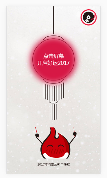
<div class='p1_lantern'>点击屏幕<br>开启好运2017</div>
<div class='p1_imooc'></div>
<div class='p1_words'>2017年阿里瓦新年特献</div>
</div>
<div class='page' id='page2'>
<div class='bg p2_bg_loading'></div>
<div class='bg'></div>
<div class='p2_circle'></div>
<div class='p2_2017'></div>
</div>
<div class='page' id='page3'>
<div class='bg'></div>
<div class='p3_logo'></div>
<div class='p3_title'></div>
<div class='p3_second'></div>
<div class='p3_first'></div>
<div class='p3_blessing'></div>
</div>
<audio autoplay='true'>
<source src='http://www.imooc.com/activity/project/project1/audio/happynewyear.mp3' type='audio/mpeg'>
</audio>
<script type='text/javascript'>
var page1 = document.getElementById('page1');
var page2 = document.getElementById('page2');
var page3 = document.getElementById('page3'); var music = document.getElementById('btn');
var audio = document.getElementsByTagName('audio')[0]; audio.addEventListener('ended', function(){
music.setAttribute('class','');
}, false);
//music.onclick = function(){
// if(audio.paused){
// audio.play();
// this.setAttribute('class','play');
// //this.style.animationPlayState = 'running';
// }else{
// audio.pause();
// this.setAttribute('class',' ');
// //this.style.animationPlayState = 'paused';
// } //}
music.addEventListener('touchstart', function(event){
if(audio.paused){
audio.play();
this.setAttribute('class','play');
}else{
audio.pause();
this.setAttribute('class',' ');
}
}, false);
page1.addEventListener('touchstart', function(){
page1.style.display = 'none';
page2.style.display = 'block';
page3.style.display = 'block';
page3.style.top = '100%'; setTimeout(function(){
page2.setAttribute('class', 'page fadeOut');
page3.setAttribute('class', 'page fadeInt');
}, 5500);
}, false);
</script>
</body>
</html>
效果图如下:
HTML5制作新年贺春的更多相关文章
- 程序员用HTML5制作的爱心树表白动画
体验效果:http://keleyi.com/keleyi/phtml/html5/31.htm 推荐:http://hovertree.com/texiao/css3/18/ HTML代码如下: & ...
- 使用HTML5制作loading图
昨天发了一篇使用HTML5 canvas写的时钟的文章,今天发一篇关于使用HTML5制作loading图的文章. <!DOCTYPE html> <html> <head ...
- 使用HTML5制作时钟
之前看到别人用HTML5制作时钟,自己也写了一个,这是很久以前写的了,没有注释,现在自己看都晕了(注释的重要性就体现在这边了),找时间加上注释,让自己和别人都比较好理解. <!DOCTYPE h ...
- jquery+html5制作超酷的圆盘时钟表
自己封装的一个用HTML5+jQuery写的时钟表 代码: ? 1 2 3 4 5 6 7 8 9 10 11 12 13 14 15 16 17 18 19 20 21 22 23 24 25 26 ...
- html5制作一个时钟
试着用html5写一个时钟 记得开始这个随笔是几天前,一直保存在草稿里面,一直感觉有个东西搁在在那里,所以今天熬夜也要写完这篇博客!!!哈哈...不多说来上代码和思路. --------------- ...
- 基于html5制作3D拳击游戏源码下载
今天给大家分享一款基于HTML5实现的3d拳王游戏源码.这款实例适用浏览器:360.FireFox.Chrome.Safari.Opera.傲游.搜狗.世界之窗. 不支持IE8及以下浏览器. 在线预览 ...
- 用Html5制作的一款数学教学程序Function Graphics(绘制函数图的程序)
最近我不仅对游戏开发感兴趣,还对函数图感兴趣,特此我开发了这个程序.以下是一些介绍和下载演示地址,喜欢的朋友可以看看: 一,产品名片 产品名:Function Graphics 版本: 0.1 开发者 ...
- google web design html5制作工具
Google 推出 Web Designer,帮助你做 HTML 5 设计的免费本地应用,支持 Windows 和 OS X 2013年10月1日 感谢读者 SamRaper 的提醒. ...
- 分享一个利用HTML5制作的海浪效果代码
在前面简单讲述了一下HTML里的Canvas,这次根据Canvas完成了“海浪效果”(水波上升). (O(∩_∩)O哈哈哈~作者我能看这个动画看一下午) 上升水波.gif 动画分析构成:贝塞尔曲线画布 ...
随机推荐
- c#静态变量赋值问题
class Program { static int i = getNum(); int j = getNum(); ; static int getNum() { return num; } sta ...
- LUNA16数据集(三)预处理
在(一)和(二)中简单介绍了LUNA16数据集的组成,以及肺结节的可视化,有了对数据集的基本了解后,还要对数据集进行预处理,计算机视觉中原始数据一般不会直接送入神经网络,这里也是如此. 这篇博客想写已 ...
- VisualSVN的安装使用
1.什么是VisualSVN VisualSVN Server是集成了Subversion和Apache的一种版本管理工具,它简化了手工配置Subversion的繁琐步骤,安装的时候SVN Serve ...
- hdu6229 Wandering Robots 2017沈阳区域赛M题 思维加map
题目传送门 题目大意: 给出一张n*n的图,机器人在一秒钟内任一格子上都可以有五种操作,上下左右或者停顿,(不能出边界,不能碰到障碍物).题目给出k个障碍物,但保证没有障碍物的地方是强联通的,问经过无 ...
- CF653D
题目唯一的坎就是把绝对的权值变为相对的权值,保证cap和flow是整型的同时可以用最小的1表示一只熊 可是迷的地方在于用kuangbin的板子居然能找出比答案更大的流(Wrong Answer on ...
- 创建第一个vue工程
vue创建项目(npm安装→初始化项目) 第一步npm安装 首先:先从nodejs.org中下载nodejs 图1 双击安装,在安装界面一直Next 图2 图3 图4 直到Finish ...
- sf04_操作系统中 heap 和 stack 的区别
概述 本文分三部分,描述有所重叠,但可以让你对栈与堆有一个比较清晰.全面的认识 heap 和 stack是什么 堆栈是两种数据结构.堆栈都是一种数据项按序排列的数据结构,只能在一端(称为栈顶(top) ...
- mysql 操作数据库创建,增删改查
创建数据库 默认字符编码 默认排序CREATE DATABASE IF NOT EXISTS day11 DEFAULT CHARSET utf8 COLLATE utf8_general_ci; / ...
- @Value("#{}")与@Value("${}")的区别
原文:https://blog.csdn.net/u012925172/article/details/84926064 @Value("#{}") SpEL表达式@Value ...
- Linux 进程间通信之管道(pipe),(fifo)
无名管道(pipe) 管道可用于具有亲缘关系进程间的通信,有名管道克服了管道没有名字的限制,因此,除具有管道所具有的功能外,它还允许无亲缘关系进程间的通信: 定义函数: int pipe(int f ...