CSS图形
1、正方形
最终效果:

CSS代码如下:
width: 100px;
height: 100px;
background: red;
}
2、长方形
最终效果:

CSS代码如下:
width: 200px;
height: 100px;
background: red;
}
3、圆形
最终效果:

CSS代码如下:
width: 100px;
height: 100px;
background: red;
-moz-border-radius: 50px;
-webkit-border-radius: 50px;
border-radius: 50px;
}
4、椭圆
最终效果:
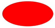
CSS代码如下:
width: 200px;
height: 100px;
background: red;
-moz-border-radius: 100px / 50px;
-webkit-border-radius: 100px / 50px;
border-radius: 100px / 50px;
}
5、上三角
最终效果:

CSS代码如下:
width: 0;
height: 0;
border-left: 50px solid transparent;
border-right: 50px solid transparent;
border-bottom: 100px solid red;
}
6、下三角
最终效果:
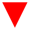
CSS代码如下:
width: 0;
height: 0;
border-left: 50px solid transparent;
border-right: 50px solid transparent;
border-top: 100px solid red;
}
7、左三角
最终效果:
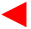
CSS代码如下:
width: 0;
height: 0;
border-top: 50px solid transparent;
border-right: 100px solid red;
border-bottom: 50px solid transparent;
}
8、右三角
最终效果:

CSS代码如下:
width: 0;
height: 0;
border-top: 50px solid transparent;
border-left: 100px solid red;
border-bottom: 50px solid transparent;
}
9、左上三角
最终效果:

CSS代码如下:
width: 0;
height: 0;
border-top: 100px solid red;
border-right: 100px solid transparent;
}
10、右上三角
最终效果:

CSS代码如下:
width: 0;
height: 0;
border-top: 100px solid red;
border-left: 100px solid transparent;
}
11、左下三角
最终效果:

CSS代码如下:
width: 0;
height: 0;
border-bottom: 100px solid red;
border-right: 100px solid transparent;
}
12、右下三角
最终效果:

CSS代码如下:
width: 0;
height: 0;
border-bottom: 100px solid red;
border-left: 100px solid transparent;
}
13、平行四边形
最终效果:
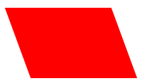
CSS代码如下:
width: 150px;
height: 100px;
margin-left:20px;
-webkit-transform: skew(20deg);
-moz-transform: skew(20deg);
-o-transform: skew(20deg);
background: red;
}
14、梯形
最终效果:
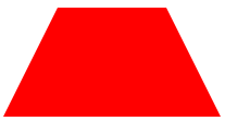
CSS代码如下:
border-bottom: 100px solid red;
border-left: 50px solid transparent;
border-right: 50px solid transparent;
height: 0;
width: 100px;
}
15、六角星
最终效果:

CSS代码如下:
width: 0;
height: 0;
border-left: 50px solid transparent;
border-right: 50px solid transparent;
border-bottom: 100px solid red;
position: relative;
}
#star-six:after {
width: 0;
height: 0;
border-left: 50px solid transparent;
border-right: 50px solid transparent;
border-top: 100px solid red;
position: absolute;
content: "";
top: 30px;
left: -50px;
}
16、五角星
最终效果:
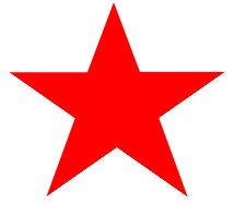
CSS代码如下:
margin: 50px 0;
position: relative;
display: block;
color: red;
width: 0px;
height: 0px;
border-right: 100px solid transparent;
border-bottom: 70px solid red;
border-left: 100px solid transparent;
-moz-transform: rotate(35deg);
-webkit-transform: rotate(35deg);
-ms-transform: rotate(35deg);
-o-transform: rotate(35deg);
}
#star-five:before {
border-bottom: 80px solid red;
border-left: 30px solid transparent;
border-right: 30px solid transparent;
position: absolute;
height: 0;
width: 0;
top: -45px;
left: -65px;
display: block;
content: '';
-webkit-transform: rotate(-35deg);
-moz-transform: rotate(-35deg);
-ms-transform: rotate(-35deg);
-o-transform: rotate(-35deg);
}
#star-five:after {
position: absolute;
display: block;
color: red;
top: 3px;
left: -105px;
width: 0px;
height: 0px;
border-right: 100px solid transparent;
border-bottom: 70px solid red;
border-left: 100px solid transparent;
-webkit-transform: rotate(-70deg);
-moz-transform: rotate(-70deg);
-ms-transform: rotate(-70deg);
-o-transform: rotate(-70deg);
content: '';
}
17、五角大楼
最终效果:
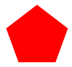
CSS代码如下:
position: relative;
width: 54px;
border-width: 50px 18px 0;
border-style: solid;
border-color: red transparent;
}
#pentagon:before {
content: "";
position: absolute;
height: 0;
width: 0;
top: -85px;
left: -18px;
border-width: 0 45px 35px;
border-style: solid;
border-color: transparent transparent red;
}
18、六边形
最终效果:
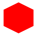
CSS代码如下:
width: 100px;
height: 55px;
background: red;
position: relative;
}
#hexagon:before {
content: "";
position: absolute;
top: -25px;
left: 0;
width: 0;
height: 0;
border-left: 50px solid transparent;
border-right: 50px solid transparent;
border-bottom: 25px solid red;
}
#hexagon:after {
content: "";
position: absolute;
bottom: -25px;
left: 0;
width: 0;
height: 0;
border-left: 50px solid transparent;
border-right: 50px solid transparent;
border-top: 25px solid red;
}
19、八角形
最终效果:

CSS代码如下:
width: 100px;
height: 100px;
background: red;
position: relative;
}
#octagon:before {
content: "";
position: absolute;
top: 0;
left: 0;
border-bottom: 29px solid red;
border-left: 29px solid #eee;
border-right: 29px solid #eee;
width: 42px;
height: 0;
}
#octagon:after {
content: "";
position: absolute;
bottom: 0;
left: 0;
border-top: 29px solid red;
border-left: 29px solid #eee;
border-right: 29px solid #eee;
width: 42px;
height: 0;
}
20、爱心
最终效果:
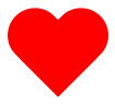
CSS代码如下:
position: relative;
width: 100px;
height: 90px;
}
#heart:before,
#heart:after {
position: absolute;
content: "";
left: 50px;
top: 0;
width: 50px;
height: 80px;
background: red;
-moz-border-radius: 50px 50px 0 0;
border-radius: 50px 50px 0 0;
-webkit-transform: rotate(-45deg);
-moz-transform: rotate(-45deg);
-ms-transform: rotate(-45deg);
-o-transform: rotate(-45deg);
transform: rotate(-45deg);
-webkit-transform-origin: 0 100%;
-moz-transform-origin: 0 100%;
-ms-transform-origin: 0 100%;
-o-transform-origin: 0 100%;
transform-origin: 0 100%;
}
#heart:after {
left: 0;
-webkit-transform: rotate(45deg);
-moz-transform: rotate(45deg);
-ms-transform: rotate(45deg);
-o-transform: rotate(45deg);
transform: rotate(45deg);
-webkit-transform-origin: 100% 100%;
-moz-transform-origin: 100% 100%;
-ms-transform-origin: 100% 100%;
-o-transform-origin: 100% 100%;
transform-origin :100% 100%;
}
21、无穷大符号
最终效果:

CSS代码如下:
position: relative;
width: 212px;
height: 100px;
}
#infinity:before,
#infinity:after {
content: "";
position: absolute;
top: 0;
left: 0;
width: 60px;
height: 60px;
border: 20px solid red;
-moz-border-radius: 50px 50px 0 50px;
border-radius: 50px 50px 0 50px;
-webkit-transform: rotate(-45deg);
-moz-transform: rotate(-45deg);
-ms-transform: rotate(-45deg);
-o-transform: rotate(-45deg);
transform: rotate(-45deg);
}
#infinity:after {
left: auto;
right: 0;
-moz-border-radius: 50px 50px 50px 0;
border-radius: 50px 50px 50px 0;
-webkit-transform: rotate(45deg);
-moz-transform: rotate(45deg);
-ms-transform: rotate(45deg);
-o-transform: rotate(45deg);
transform: rotate(45deg);
}
22、鸡蛋

最终效果
CSS代码如下:
display:block;
width: 126px;
height: 180px;
-webkit-border-radius: 63px 63px 63px 63px / 108px 108px 72px 72px;
border-radius: 50% 50% 50% 50% / 60% 60% 40% 40%;
}
23、食逗人(Pac-Man)
最终效果:

CSS代码如下:
width: 0px;
height: 0px;
border-right: 60px solid transparent;
border-top: 60px solid red;
border-left: 60px solid red;
border-bottom: 60px solid red;
border-top-left-radius: 60px;
border-top-right-radius: 60px;
border-bottom-left-radius: 60px;
border-bottom-right-radius: 60px;
}
24、提示对话框
最终效果:

CSS代码如下:
width: 120px;
height: 80px;
background: red;
position: relative;
-moz-border-radius: 10px;
-webkit-border-radius: 10px;
border-radius: 10px;
}
#talkbubble:before {
content:"";
position: absolute;
right: 100%;
top: 26px;
width: 0;
height: 0;
border-top: 13px solid transparent;
border-right: 26px solid red;
border-bottom: 13px solid transparent;
}
25、12角星
最终效果:

CSS代码如下:
background: red;
width: 80px;
height: 80px;
position: relative;
text-align: center;
}
#burst-12:before, #burst-12:after {
content: "";
position: absolute;
top: 0;
left: 0;
height: 80px;
width: 80px;
background: red;
}
#burst-12:before {
-webkit-transform: rotate(30deg);
-moz-transform: rotate(30deg);
-ms-transform: rotate(30deg);
-o-transform: rotate(30deg);
transform: rotate(30deg);
}
#burst-12:after {
-webkit-transform: rotate(60deg);
-moz-transform: rotate(60deg);
-ms-transform: rotate(60deg);
-o-transform: rotate(60deg);
transform: rotate(60deg);
}
26、8角星
最终效果:

CSS代码如下:
background: red;
width: 80px;
height: 80px;
position: relative;
text-align: center;
-webkit-transform: rotate(20deg);
-moz-transform: rotate(20deg);
-ms-transform: rotate(20deg);
-o-transform: rotate(20eg);
transform: rotate(20deg);
}
#burst-8:before {
content: "";
position: absolute;
top: 0;
left: 0;
height: 80px;
width: 80px;
background: red;
-webkit-transform: rotate(135deg);
-moz-transform: rotate(135deg);
-ms-transform: rotate(135deg);
-o-transform: rotate(135deg);
transform: rotate(135deg);
}
27、钻石
最终效果:
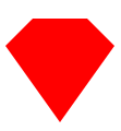
CSS代码如下:
border-style: solid;
border-color: transparent transparent red transparent;
border-width: 0 25px 25px 25px;
height: 0;
width: 50px;
position: relative;
margin: 20px 0 50px 0;
}
#cut-diamond:after {
content: "";
position: absolute;
top: 25px;
left: -25px;
width: 0;
height: 0;
border-style: solid;
border-color: red transparent transparent transparent;
border-width: 70px 50px 0 50px;
}
28、阴阳八卦(霸气的这个)
最终效果:
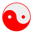
CSS代码如下:
width: 96px;
height: 48px;
background: #eee;
border-color: red;
border-style: solid;
border-width: 2px 2px 50px 2px;
border-radius: 100%;
position: relative;
}
#yin-yang:before {
content: "";
position: absolute;
top: 50%;
left: 0;
background: #eee;
border: 18px solid red;
border-radius: 100%;
width: 12px;
height: 12px;
}
#yin-yang:after {
content: "";
position: absolute;
top: 50%;
left: 50%;
background: red;
border: 18px solid #eee;
border-radius:100%;
width: 12px;
height: 12px;
}
CSS图形的更多相关文章
- 奇妙的 CSS shapes(CSS图形)
CSS 发展到今天已经越来越强大了.其语法的日新月异,让很多以前完成不了的事情,现在可以非常轻松的做到.今天就向大家介绍几个比较新的强大的 CSS 功能: clip-path shape-outsid ...
- 美丽的CSS图形和HTML5
1.HTML5基础 文档类型 <!DOCTYPE HTML PUBLIC "-//W3C//DTD HTML 4.01 Transitional//EN" "htt ...
- css图形——三角形
1.css图形简介 在浏览网页的时候,我们经常看见各种图形的效果,而但凡涉及到图形效果,我们第一个想到的就是用图片来实现.但是在前端开发中,为了网站的性能速度,我们都是秉承着少用图片的原生质. 因为图 ...
- 奇妙的 CSS shapes(CSS图形) 【css 图形,绘图,CSS 几何图形)】
http://www.cnblogs.com/coco1s/p/6992177.html <!DOCTYPE html> <html> <head> <met ...
- 有趣的css图形实现
css通过 border .border-radius .transform,实现各种图形. <!DOCTYPE html> <html lang="en"> ...
- CSS图形基础:纯CSS绘制图形
为了在页面中利用CSS3绘制图形,在页面中定义 <div class="container"> <div class="shape"> ...
- 利用噪声构建美妙的 CSS 图形
在平时,我非常喜欢利用 CSS 去构建一些有意思的图形. 我们首先来看一个简单的例子.首先,假设我们实现一个 10x10 的格子: 此时,我们可以利用一些随机效果,优化这个图案.譬如,我们给它随机添加 ...
- CSS图形形状大全
The Shapes of CSS All of the below use only a single HTML element. Any kind of CSS goes, as long as ...
- css图形——椭圆
在css中,我们也使用border-radius属性来实现椭圆 语法 border-radius:x/y; 说明: x表示圆角的水平半径,y表示圆角的垂直半径. 例如:border-radius:30 ...
随机推荐
- 牛刀小试之用pytorch实现LSTM
https://www.itcodemonkey.com/article/9008.html 要看一看
- Java逆向武器库_反编译工具
1.反编译工具之_jd-gui 官网下载地址:http://java-decompiler.github.io/#jd-gui-download 使用: 下载后解压直接使用即可. jd-gui的优势是 ...
- PC_官网设计
1. 头部 header 固定 的两种方式 固定定位 内容区 包裹,使用 overflow: hidden; 2. 动画第二次起效 缺少动画初始参数 3. 隐藏元素 display: none; vi ...
- Jvm 中的 重排序、主存、原子操作
一.重排序 好处:重排序可以提升性能,避免在一个耗时很长的指令在“执行”阶段呆很长时间,而导致后续的指令都卡在“执行”之前的阶段上. 坏处:重排序对多线程的影响 class ReorderExampl ...
- 甘特图dhtmlx Gantt入门
(以下截图来自别人的博客,来源地址已经忘记了,若后期找到会补充上来!) API地址:https://docs.dhtmlx.com/gantt/desktop__guides.html,这是英文的网页 ...
- corefx 源码追踪:找到引起 SqlDataReader.ReadAsync 执行延迟的那行代码
最近遇到一个非常诡异的问题,在一个 ASP.NET Core 2.2 项目中,从 SQL Server 数据库查询 100 条数据记录,会出现 16-22s 左右的延迟.延迟出现在执行 SqlData ...
- 内置函数-max、min、round、sorted、ord、chr、any、all、dir、eval、exec、map、filter、reduce
http://www.nnzhp.cn/archives/152 1.max,min,round print(max([3,4.563,3,6,2.5])) #取最大值,可循环参数即可,int类型的, ...
- Json对象扩展
1.JSON.stringify(obj/arr) js对象(数组)转换为json对象(数组) 2.JSON.parse(json) json对象(数组)转换为js对象(数组)
- MySQL 8.0 InnoDB新特性
MySQL 8.0 InnoDB新特性 1.数据字典全部采用InnoDB引擎存储,支持DDL原子性.crash safe,metadata管理更完善 2.快速在线加新列(腾讯互娱DBA团队贡献) 3. ...
- 图解:window与BOM的关系
window与BOM的关系: 1.https://www.jianshu.com/p/f5409202a835