《CSS动画实用技巧》课程笔记
概述
这是我学习CSS动画实用技巧的课程笔记
常用动画属性——transition
		.change img{

		  display:block;

		  width:300px;

		  height:284px;

		  opacity:0;

		  -webkit-transform:translate(-100px,-100px);

		  -webkit-transition:opacity 1s ease-in-out 0.5s,-webkit-transform 1s ease-in-out;

		  transition: opacity 1s ease-in-out 0.5s,transform 1s ease-in-out;

		}

		.change:hover img{

		  -webkit-transform:translate(0px,0px);

		  opacity:1;

		  -webkit-transition: opacity 1s ease-in-out,-webkit-transform 1s ease-in-out .1s;

		  transition: opacity 1s ease-in-out,transform 1s ease-in-out .1s;

		}
主要是移动和透明渐变同时进行(有延迟)。
常用动画属性——animation

@keyframes shake-hard {

  2% {

    transform: translate(1px, -2px) rotate(3.5deg); }

  4% {

    transform: translate(-7px, -6px) rotate(3.5deg); }

  6% {

    transform: translate(2px, -6px) rotate(-0.5deg); }

  8% {

    transform: translate(1px, 2px) rotate(2.5deg); }

  10% {

    transform: translate(1px, 7px) rotate(1.5deg); }

  12% {

    transform: translate(0px, 2px) rotate(-0.5deg); }

  14% {

    transform: translate(9px, 2px) rotate(1.5deg); }

  16% {

    transform: translate(-4px, 2px) rotate(3.5deg); }

  18% {

    transform: translate(-9px, 5px) rotate(1.5deg); }

  20% {

    transform: translate(-9px, -8px) rotate(1.5deg); }

  22% {

    transform: translate(-2px, 3px) rotate(-0.5deg); }

  24% {

    transform: translate(3px, 2px) rotate(-2.5deg); }

  26% {

    transform: translate(8px, -7px) rotate(2.5deg); }

  28% {

    transform: translate(-7px, 9px) rotate(-2.5deg); }

  30% {

    transform: translate(-9px, 3px) rotate(-0.5deg); }

  32% {

    transform: translate(-7px, 2px) rotate(3.5deg); }

  34% {

    transform: translate(-1px, -6px) rotate(0.5deg); }

  36% {

    transform: translate(5px, -1px) rotate(3.5deg); }

  38% {

    transform: translate(2px, 6px) rotate(3.5deg); }

  40% {

    transform: translate(-4px, -2px) rotate(-1.5deg); }

  42% {

    transform: translate(1px, -7px) rotate(-2.5deg); }

  44% {

    transform: translate(6px, 7px) rotate(-1.5deg); }

  46% {

    transform: translate(-3px, 6px) rotate(2.5deg); }

  48% {

    transform: translate(-6px, 6px) rotate(2.5deg); }

  50% {

    transform: translate(4px, -6px) rotate(1.5deg); }

  52% {

    transform: translate(-8px, 9px) rotate(-2.5deg); }

  54% {

    transform: translate(-7px, 5px) rotate(-0.5deg); }

  56% {

    transform: translate(-4px, 9px) rotate(2.5deg); }

  58% {

    transform: translate(-6px, -8px) rotate(-0.5deg); }

  60% {

    transform: translate(6px, -9px) rotate(2.5deg); }

  62% {

    transform: translate(2px, 9px) rotate(1.5deg); }

  64% {

    transform: translate(7px, -7px) rotate(1.5deg); }

  66% {

    transform: translate(1px, -3px) rotate(0.5deg); }

  68% {

    transform: translate(9px, -2px) rotate(-0.5deg); }

  70% {

    transform: translate(9px, -3px) rotate(-1.5deg); }

  72% {

    transform: translate(2px, -3px) rotate(-0.5deg); }

  74% {

    transform: translate(6px, -9px) rotate(1.5deg); }

  76% {

    transform: translate(-3px, 6px) rotate(3.5deg); }

  78% {

    transform: translate(1px, 8px) rotate(-0.5deg); }

  80% {

    transform: translate(10px, -2px) rotate(1.5deg); }

  82% {

    transform: translate(-5px, 5px) rotate(3.5deg); }

  84% {

    transform: translate(7px, -5px) rotate(-0.5deg); }

  86% {

    transform: translate(-3px, -7px) rotate(-0.5deg); }

  88% {

    transform: translate(-2px, -1px) rotate(-1.5deg); }

  90% {

    transform: translate(5px, 0px) rotate(-2.5deg); }

  92% {

    transform: translate(10px, -5px) rotate(-0.5deg); }

  94% {

    transform: translate(2px, 9px) rotate(0.5deg); }

  96% {

    transform: translate(4px, -8px) rotate(0.5deg); }

  98% {

    transform: translate(2px, 8px) rotate(-0.5deg); }

  0%, 100% {

    transform: translate(0, 0) rotate(0); } }
其实就是把抖动分隔成一帧帧,然后用keyframes连接起来。
常用动画属性——transform###

.cardfan > img{

		  position:absolute;

		  border:10px solid #fff;

		  box-sizing:border-box;

		  box-shadow: 4px 4px 3px rgba(0, 0, 0, 0.2);

		  -webkit-transform-origin: center 400px;

		  transform-origin: center 400px;

		  -webkit-transition: -webkit-transform .7s ease;

		  transition: transform .7s ease;

		}

		.cardfan img:first-child{

		  -webkit-transform:rotate(5deg);

		  transform:rotate(5deg);

		}

		.cardfan img:last-child{

		  -webkit-transform:rotate(-5deg);

		  transform:rotate(-5deg);

		}

		.cardfan:hover img:first-child{

		  -webkit-transform:rotate(25deg);

		  transform:rotate(25deg);

		}

		.cardfan:hover img:last-child{

		  -webkit-transform:rotate(-25deg);

		  transform:rotate(-25deg);

		}
其实就是在鼠标接触之后第1,3张图旋转一下。
常用动画属性——animation-delay为负值
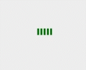
.spinner > div{

		  display:inline-block;

		  width:6px;

		  height:100%;

		  background:green;

		  -webkit-animation: strechdelay 1.2s infinite ease-in-out ;

		}

		.spinner .line2{

		  -webkit-animation-delay:-1.1s;

		}

		.spinner .line3{

		  -webkit-animation-delay:-1.0s;

		}

		.spinner .line4{

		  -webkit-animation-delay:-0.9s;

		}

		.spinner .line5{

		  -webkit-animation-delay:-0.8s;

		}/**/

		@-webkit-keyframes strechdelay{

		  0%,40%,100%{

		    -webkit-transform:scaleY(.4);

		  }

		  20%{

		    -webkit-transform:scaleY(1);

		  }

		}
比如:animation-delay为-2s,效果是使动画马上开始,但跳过 2 秒进入动画。
常用动画属性——妙用border颜色
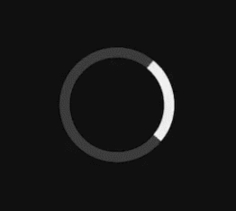
.spinner{

		  width:10em;

		  height:10em;

		  border-radius:100%;

		  margin:100px auto;

		  border:1.1em solid rgba(255,255,255,.2);

		  border-left-color:#fff;

		}
主要是先让一个边框颜色不同,然后让它旋转。
常用动画属性——巧用border宽度

.image-layer:before {

		  content: '';

		  position: absolute;

		  top: 0;

		  right: 0;

		  border-style: solid;

		  border-width: 0;

		  border-color: rgba(0,0,0,0.2) #fff;

		  border-radius: 0 0 0 4px;

		  box-shadow: 0 1px 1px rgba(0,0,0,0.3), -1px 1px 1px rgba(0,0,0,0.2);

		  -webkit-transition: all 0.4s ease-out;

		  transition:all 0.4s ease-out;

		}

		.image-layer:hover:before{

		  border-right-width:80px;

		  border-bottom-width:80px;

		}

		.paper-flip.folded .image-layer:before{

		  border-right-width:1000px;

		  border-bottom-width:600px;

		}
利用宽度做成折角效果。翻页效果有点看不懂。
常用动画属性——实现运动动画

.stage{

		  width:120px;

		  height:auto;

		  margin:0 auto;

		  position:relative;

		  -webkit-transform-origin:center top;

		  -webkit-transform:rotate(-30deg);

		  -webkit-animation:sway 2.2s infinite alternate ease-in-out;

		}

		.watch{

		  width:100%;

		  height:auto;

		}

		.seconds{

		  position:absolute;

		  width:8%;

		  height:auto;

		  bottom:11.5%;

		  left:45.5%;

		  -webkit-transform-origin:center 72.4%;

		  -webkit-animation:second 60s infinite linear;

		}

		@-webkit-keyframes second{

		  to{

		    -webkit-transform:rotate(355deg);

		  }

		}

		@-webkit-keyframes sway{

		  to{

		   -webkit-transform:rotate(30deg);

		  }

		}
其实就是利用rotate来进行弧形运动,注意animation-direction:alternate和center:top。
《CSS动画实用技巧》课程笔记的更多相关文章
- 《css定位 position》课程笔记
这是我学习课程css定位 position时做的笔记! 本节内容 html的三种布局方式 position可选参数 z-index 盒子模型和定位的区别 侧边栏导航跟随实例 html的三种布局方式 三 ...
- div+css定位position详解
div+css定位position详解 1.div+css中的定位position 最主要的两个属性:属性 absolute(绝对定位) relative(相对定位),有他们才造就了div+css布局 ...
- web前端css定位position和浮动float
最近做了几个项目:配资公司,ecmal商城等,客户对前台要求都很高.所以,今天来谈谈css的基础,以及核心,定位问题. div.h1或p元素常常被称为块级元素.这意味着这些元素显示为一块内容,即“块框 ...
- css定位position认识
1.绝对定位(position: absolute) 2.相对定位(position: relative) 3.固定定位(position: fixed) 绝对定位 设置position:absolu ...
- CSS定位position
position选项来定义元素的定位属性,选项有5个可选值:static.relative.absolute.fixed.inherit 属性值为relative.absolute.fixed时top ...
- css 定位position总结
在CSS中,Position 属性经常会用到,主要是绝对定位和相对定位,简单的使用都没有问题,尤其嵌套起来,就会有些混乱,今记录总结一下,防止久而忘之. CSS position 属性值: absol ...
- css定位position属性深究
1.static:对象遵循常规流.此时4个定位偏移属性不会被应用. 2.relative:对象遵循常规流,并且参照自身在常规流中的位置通过top,right,bottom,left这4个定位偏移属性进 ...
- 【前段开发】10步掌握CSS定位: position static relative absolute float
希望能帮到须要的人,转自:http://www.see-design.com.tw/i/css_position.html 1. position:static 元素的 position 屬性默認值為 ...
- css定位-position
前言 定位的目的就是把元素摆放到指定的位置. 定位上下文:定位元素的大小,位置都是相对于定位上下文的. position属性值有5个值 static:所有有元素定位默认的初始值都是static.就是不 ...
- CSS - 定位(position),难点
元素的定位属性主要包括定位模式和边偏移两部分. 1. 边偏移 边偏移属性 描述 top 顶端偏移量,定义元素相对于其父元素上边线的距离 bottom 底部偏移量,定义元素相对于其父元素下边线的距离 l ...
随机推荐
- golang 类型断言的学习
在php中有一个 serialize() 函数 可以把数组序列化成字符串进行存储和传输 如果想反序列化这种字符串,在php中只需要一个简单的unserialize() 函数就可以完成了.但是在gola ...
- ComboBox 中 DisplayMember 和 ValueMember 都是具体干什么的?
ComboBox组件的数据绑定,在得到数据集后,只有设定好ComboBox组件的的三个属性就可以完成数据绑定了,这三个属性是:"DisplayMember". "Valu ...
- Talking appsettings.json in Asp.Net Core
在ASP.NET Core中,默认提供了三个运行时环境变量,通过查看Hosting源代码我们可以看到,分别是Development.Staging.Production public static c ...
- LeetCode第[15]题(Java):3Sum 标签:Array
题目难度:Medium 题目: Given an array S of n integers, are there elements a, b, c in S such that a + b + c ...
- Spring boot(三)整合mybaties+thymeleaf实现基础crud
工程结构: 首先在pom文件中引入依赖 <?xml version="1.0" encoding="UTF-8"?> <project xml ...
- 【Java】静态代码块使用
一.java静态代码块与静态方法区别一般情况下,如果有些代码必须在项目启动的时候就执行的时候,需要使用静态代码块,这种代码是主动执行的;需要在项目启动的时候就初始化,在不创建对象的情况下,其他程序来调 ...
- python写unix口令破解器
看了python绝技做出来的unix口令破解器 首先需要crypt. python并不自带!! windows下pip安装失败= = 后来直接去kali敲了 附件:jiami.txt #假设是unix ...
- 2017广东工业大学程序设计竞赛初赛 题解&源码(A,水 B,数学 C,二分 D,枚举 E,dp F,思维题 G,字符串处理 H,枚举)
Problem A: An easy problem Description Peter Manson owned a small house in an obscure street. It was ...
- Codeforces Round #404 (Div. 2)(A.水,暴力,B,排序,贪心)
A. Anton and Polyhedrons time limit per test:2 seconds memory limit per test:256 megabytes input:sta ...
- hihoCoder #1053 : 居民迁移(贪心,二分搜索,google在线技术笔试模拟)
#1053 : 居民迁移 时间限制:3000ms 单点时限:1000ms 内存限制:256MB 描述 公元2411年,人类开始在地球以外的行星建立居住点.在第1326号殖民星上,N个居住点分布在一条直 ...