Vue 提示框组件
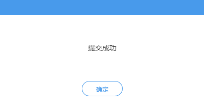
OK,首先看看效果:
一、子组件(alert.vue)
<template>

  <transition name="alert">

    <div class="alert-all">

      <div class="alert-wraper determine">

        <p class="close-alert">

          <!-- <i class="fa fa-times" aria-hidden="true" title="关闭" @click="close()"></i> -->

        </p>

        <p :class="[{fail: ifFail}, 'title']">{{title}}</p>

        <div class="btn_wrapper">

          <!--<div class="cancel" @click="ok(false)">取消</div>-->

          <div class="ok" @click="ok(true)">确定</div>

        </div>

      </div>

    </div>

  </transition>

</template>

<script>

  export default {

    name: 'alert',

    props: {

      title: {

        type: String,

        default () {

          return {}

        }

      },

      type: {

        type: String,

        default () {

          return {}

        }

      },

      autoHide: {

        type: Boolean,

        default () {

          return true

        }

      }

    },

    data () {

      return {

        ifFail: ''

      }

    },

    methods: {

      ok: function (flag) {

        let data = {

          show: flag,

          type: this.type

        }

        this.$emit('okAlert', data)

      }

    },

    mounted () {

      if (this.type === 'fail') {

        this.ifFail = true

      } else {

        this.ifFail = false

      }

    }

  }

</script>

<style lang="less" scoped>

  .alert-all{

    position:fixed;

    width:%;

    height:%;

    top:;

    left:;

    z-index:;

    .alert-wraper{

      width:400px;

      height:160px;

      background:#fff;

      position:absolute;

      top:;

      left:;

      right:;

      bottom:;

      margin:auto;

      box-shadow:0px 0px 20px #ddd;

      .close-alert{

        height:30px;

        height:30px;

        width:%;

        background:#4499ee;

        position:relative;

        z-index:;

        i{

          position:absolute;

          right:;

          width:30px;

          height:30px;

          font-size: 20px;

          cursor:pointer;

          color:#fff;

        }

        i::before{

          position:absolute;

          left:6px;

          top:4px;

        }

        i:hover{

          background:#6db2f8;

        }

      }

      .fail{

        color:red;

      }

      .title{

        box-sizing: border-box;

        padding:  10px;

        width:%;

        height:130px;

        line-height: 25px;

        font-size:14px;

        font-weight: normal;

        text-align:center;

        display: flex;

        justify-content: center;

        align-items: center;

      }

    }

    .determine{

      height: 220px;

    }

    .btn_wrapper{

      text-align: center;

    }

    .cancel, .ok{

      display: inline-block;

      width: 80px;

      height: 30px;

      border-radius: 20px;

      border: 1px solid #4499ee;

      text-align: center;

      line-height: 30px;

      color: #4499ee;

      margin: 20px;

    }

    .cancel:hover, .ok:hover{

      cursor: pointer;

      box-shadow:   4px #4499ee;

    }

  }

  .alert-enter-active,.alert-leave-active{

    transition: all .4s

  }

  .alert-enter, .alert-leave-to{

    opacity: ;

    transform: translateY(-60px);

  }

</style>
二、父组件中引用子组件(alert.vue)
<template>

  <div class="container">

      <alerter

      v-if="alertManager.show"

      :type="alertManager.type"

      :title="alertManager.title">

    </alerter>

  </div>

</template>
三、父组件中定义变量
export default {

  data () {

    return {

     alertManager: {

        show: false,

        type: '',

        title: ''

      }

    }

}
四、父组件中写弹出框方法
 methods: {

    alert (show, type, title, autoHide) {

      this.alertManager = {

        show: show,

        type: type,

        title: title

      }

      if (autoHide === true) {

        let that = this

        setTimeout(function () {

          that.alertManager.show = false

        }, 2000)

      }

    }

}
五、调用方法
that.alert(true, 'success', '提交成功', true)
Vue 提示框组件的更多相关文章
- tooltip提示框组件
Tooltip 提示框组件 可独立于其他组件通过$.fn.tooltip.defaults重写默认的defaults.当用户移动鼠标指针在某个元素上时,出现提示信息窗口来显示额外信息.提示内容可以包含 ...
- 第一百九十六节,jQuery EasyUI,Tooltip(提示框)组件
jQuery EasyUI,Tooltip(提示框)组件 学习要点: 1.加载方式 2.属性列表 3.事件列表 4.方法列表 本节课重点了解 EasyUI 中 Tooltip(提示框)组件的使用方法, ...
- 学习EXTJS6(4)基本功能-信息提示框组件
1.使用组件,主要配置表现形式有二种(是否可以说参数) 用逗号分隔的传统参数列表方式: <script type="text/javascript"> Ext.onRe ...
- 一个vue的全局提示框组件
<template> <!-- 全局提示框 --> <div v-show="visible" class="dialog-tips dia ...
- jQuery Easy UI Tooptip(提示框)组件
我们都知道DOM节点的title属性.Tooptip组件就是比較强大的title,它能够自由的设置自己的样式.位置以及有自己相关的触发事件. 演示样例: <!DOCTYPE html> & ...
- Tooltip(提示框)组件
一.加载方式 //class加载方式 <a href="http://www.ycku.com" title="这是一个提示信息!" class=&quo ...
- vue 自定义 提示框(Toast)组件
1.自定义 提示框 组件 src / components / Toast / index.js /** * 自定义 提示框( Toast )组件 */ var Toast = {}; var sho ...
- 在vue项目中添加全局提示框
1.写一个提示框组件:msg.vue (注明:这里用两个div的原因是成功和失败的提示不能用同一个div,因为他们可能紧接着出现,所以不能从始至终只有一个提示框在工作) 2.写一个调用此组建的js : ...
- vue2.0 自定义 提示框(Toast)组件
1.自定义 提示框 组件 src / components / Toast / index.js /** * 自定义 提示框( Toast )组件 */ var Toast = {}; var sho ...
随机推荐
- linxu(centos)安装php-fpm
编译安装php-fpm 安装前准备 yum -y install gcc automake autoconf libtool make yum -y install gcc gcc-c++ glibc ...
- 在.net core上,Web网站调用微信支付-统一下单接口(xml传参)一直返回错误:mch_id参数格式错误
这是 微信支付-统一下单 接口文档 一.问题描述 在调用统一下单接口时,报mch_id参数格式错误,但商户ID确实是10位数字正确的,可就是一直报这个错误 返回的错误xml如下: 二.排错过程 1.多 ...
- PAT甲级——A1111 Online Map【30】
Input our current position and a destination, an online map can recommend several paths. Now your jo ...
- python 安装bs4
1, 下载地址https://www.crummy.com/software/BeautifulSoup/#Download ------------------------------------- ...
- 第六篇:fastJson常用方法总结
1.了解json json就是一串字符串 只不过元素会使用特定的符号标注. {} 双括号表示对象 [] 中括号表示数组 "" 双引号内是属性或值 : 冒号表示后者是前者的值(这个值 ...
- springboot启动器:spring-boot-starter
今天想要导入thymeleaf的依赖,但是又不想从其他博复制粘贴,于是去spring官方文档找一找 在idea新建的springbootweb项目中,有一个HELP.md文件,里面包含spring w ...
- 快速搭建Bootstrap
粘贴下面代码,快速开启Bootstrap的搭建: <!DOCTYPE html> <html lang="en"> <head> <met ...
- JS 标签页切换
一 <!DOCTYPE html><html><head><meta charset="utf-8"/><title>自 ...
- sort的cmp函数
sort的cmp函数只能写return a>b;或者return a<b;
- LoadRunner中字符串的操作
LoadRunner中字符串的操作 LoadRunner中常用的字符串操作函数有: strcpy(destination_string, source_string); ...