[UI] 01 - CSS
前言
一、认识
From: http://www.runoob.com/css/css-tutorial.html
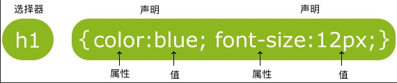
CSS 指层叠样式表 (Cascading Style Sheets)
解决内容与表现分离的问题。
二、结构
- 形式:属性-值
- class 选择器
<style>

body {background-color:tan;}

h1   {color:maroon;font-size:20pt;}

hr   {color:navy;}

p    {font-size:11pt;margin-left:15px;}

a:link    {color:green;}

a:visited {color:yellow;}

a:hover   {color:black;}

a:active  {color:blue;}

</style>
- id 选择器
<style>

#para1

{

    text-align:center;

    color:red;

}

</style>

</head>

<body>

<p id="para1">Hello World!</p>

</body>
- 分组 选择器
为了尽量减少代码,你可以使用分组选择器。
h1

{

    color:green;

}

h2

{

    color:green;

}

p

{

    color:green;

}

----------------> 简写为如下

h1,h2,p

{

    color:green;

}
- 嵌套 选择器
<!DOCTYPE html>

<html>

<head>

  <meta charset="utf-8">

  <title>菜鸟教程(runoob.com)</title>

  <style>

  p

  {

      color:blue;

      text-align:center;

  }

  .marked

  {

      background-color:red;

  }

  .marked p

  {

      color:white;

  }

  p.marked{

      text-decoration:underline;

  }

  </style>

</head>

<body>

  <p>这个段落是蓝色文本,居中对齐。</p>

  <div class="marked">

    <p>这个段落不是蓝色文本。</p>

  </div>

  <p>所有 class="marked"元素内的 p 元素指定一个样式,但有不同的文本颜色。</p>

  <p class="marked">带下划线的 p 段落。</p>

</body>

</html>
p{ }: 为所有 p 元素指定一个样式。

.marked{ }: 为所有 class="marked" 的元素指定一个样式。

.marked p{ }: 为所有 class="marked" 元素内的 p 元素指定一个样式。

p.marked{ }: 为所有 class="marked" 的 p 元素指定一个样式。
设置了三个样式
- 组合选择符
Ref: http://www.runoob.com/css/css-combinators.html
(1) 后代选择器(以空格分隔)
div p

{

  background-color:yellow;

}
(2) 子元素选择器【必须有父元素,也体现了 '伪类' 的效果】
div>p

{

  background-color:yellow;

}
(3) 相邻兄弟选择器【既然相邻,就只能有一个】
div+p

{

  background-color:yellow;

}
(4) 后续兄弟选择器
div~p

{

  background-color:yellow;

}
三、样式表
- 内部样式表
上述例子。
- 外部样式表
浏览器会从文件 mystyle.css 中读到样式声明,并根据它来格式文档。
<head>

  <link rel="stylesheet" type="text/css" href="mystyle.css">

</head>
- 内联样式
写在html内部,有点箭头函数的意思。
<p style="color:sienna;margin-left:20px">这是一个段落。</p>
多重样式 - 优先级
优先内部样式。
(内联样式)Inline style > (内部样式)Internal style sheet >(外部样式)External style sheet > 浏览器默认样式
属性详谈
一、背景
- 纯色背景
body {background-color:#b0c4de;}

h1   {background-color:#6495ed;}
- 图片背景
body

{

  background-image:url('gradient2.png');
  # 平铺设置

  background-repeat:repeat-x;
  # 不平铺
  background-repeat:no-repeat;
  background-position:right top;
}
等价于:
为了简化这些属性的代码,我们可以将这些属性合并在同一个属性中.
<style>

body

{

    background:#ffffff url('img_tree.png') no-repeat right top;

    margin-right:200px;

}

</style>
当使用简写属性时,属性值的顺序为:
 background-color

 background-image

 background-repeat

 background-attachment

 background-position
二、文本
- 基本属性
#三种写法

body {color:red;}

h1 {color:#00ff00;}

h2 {color:rgb(255,0,0);}

#对齐方式

h1 {text-align:center;}

p.date {text-align:right;}

p.main {text-align:justify;}

#缩进
p {text-indent:50px;}
- 高级属性
# 划线

a {text-decoration:none;}

h1 {text-decoration:overline;}

h2 {text-decoration:line-through;}

h3 {text-decoration:underline;}

# 文本转换

p.uppercase {text-transform:uppercase;}

p.lowercase {text-transform:lowercase;}

p.capitalize {text-transform:capitalize;}
其他详见:http://www.runoob.com/css/css-text.html
- 字体样式、大小
font-family 属性应该设置几个字体名称作为一种"后备"机制,如果浏览器不支持第一种字体,他将尝试下一种字体。
p{font-family:"Times New Roman", Times, serif;}

p.normal  {font-style:normal;}

p.italic  {font-style:italic;}

p.oblique {font-style:oblique;}
大小,外层body的百分比控制内部所有文字缩放比例。
body {font-size:100%;}

h1  {font-size:2.5em;}

h2  {font-size:1.875em;}

p   {font-size:0.875em;}
- 链接
设置同一个链接的四个不同状态。
这里使用了 “伪类” 的概念。
a:link {color:#000000;}      /* 未访问链接*/

a:visited {color:#00FF00;}   /* 已访问链接 */

a:hover {color:#FF00FF;}     /* 鼠标移动到链接上 */

a:active {color:#0000FF;}    /* 鼠标点击时 */

a:link {text-decoration:none;}
a:link {background-color:#B2FF99;}
a:hover 必须跟在 a:link 和 a:visited后面

a:active 必须跟在 a:hover后面
注意顺序
- 文字框
Goto: http://www.runoob.com/css/css-border.html
文字边框属性。
- 轮廓(outline)
Goto: http://www.runoob.com/css/css-outline.html

<style>

p

{

    border:1px solid red;

    outline:green dotted thick;

}

</style>
- margin(外边距)与 padding(内边距)
margin-top    :100px;

margin-bottom :100px;

margin-right  :50px;

margin-left   :50px;

padding-top   :25px;

padding-bottom:25px;

padding-right :50px;

padding-left  :50px;
'简写形式' 以及 '顺序' 请见:
Goto: http://www.runoob.com/css/css-margin.html
Goto: http://www.runoob.com/css/css-padding.html
- 尺寸 (Dimension)
控制元素的高度和宽度。
Goto: http://www.runoob.com/css/css-dimension.html
三、列表
- 常规标记
每一条前加个 ‘点’。
<head>
<style>

  ul.a {list-style-type:circle;}

</style>

</head>

<body>

<p>无序列表实例:</p>

<ul class="a">

  <li>Coffee</li>

  <li>Tea</li>

  <li>Coca Cola</li>

</ul>
<body>
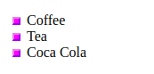
- 图片标记
<style>

  ul   #这里竟然没有考虑<li>

  {

      list-style-image:url('sqpurple.gif');

  }

</style>

</head>

<body>

<ul>

  <li>Coffee</li>

  <li>Tea</li>

  <li>Coca Cola</li>

</ul>

</body>
- 浏览器兼容性解决方案
其实就是不采用浏览器默认处理方式,而改为直接设置各个属性,达到显示一致的效果。
详见:http://www.runoob.com/css/css-list.html
四、表格
使用 CSS 可以使 HTML 表格更美观。
- 边框
<!DOCTYPE html>

<html>

<head>

  <meta charset="utf-8">

  <title>菜鸟教程(runoob.com)</title>

  <style>

    table,th,td

    {

        border:1px solid black;

    }

  </style>

</head>

<body>

  <table>

    <tr>

      <th>Firstname</th>  # <th>在单元格中加粗显示

      <th>Lastname</th>

    </tr>

    <tr>

      <td>Peter</td>

      <td>Griffin</td>

    </tr>

    <tr>

      <td>Lois</td>

      <td>Griffin</td>

    </tr>

  </table>

</body>

</html>
不要空隙:
table

{

  border-collapse:collapse;  # 去掉边框间空隙

}

table,th, td

{

  border: 1px solid black;

}
- 宽度和高度
table

{

    width:100%;

}

th

{

    height:50px;

}
- 文字对齐
td

{

    text-align:right;      # 水平对齐
    height:50px;
    vertical-align:bottom;     # 垂直对齐
}
内部间距:
td

{

    padding:15px;

}
- 颜色
# 边框颜色

table, td, th

{

  border:1px solid green;

}

# 背景填充颜色
th

{

  background-color:green;

  color:white;

}
五、Display(显示) 与 Visibility(可见性)
- Display
注意, 实例中的隐藏标题不占用空间。
h1.hidden {display:none;}
- Visibility
注意, 实例中的隐藏标题仍占用空间。
h1.hidden {visibility:hidden;}
六、内联方式
- 内联元素
Ref: HTML 内联元素
内联元素在显示时通常不会以新行开始。
例子:<b>, <td>, <a>, <img>
- HTML <div> 元素是块级元素,它是可用于组合其他 HTML 元素的容器。
- HTML <span> 元素是内联元素,可用作文本的容器。
(1) 变为内联,变得没换行。
<style>

  li{display:inline;}

</style>
(2) 变为block,变得有换行。
span

{

    display:block;

}
空间位置
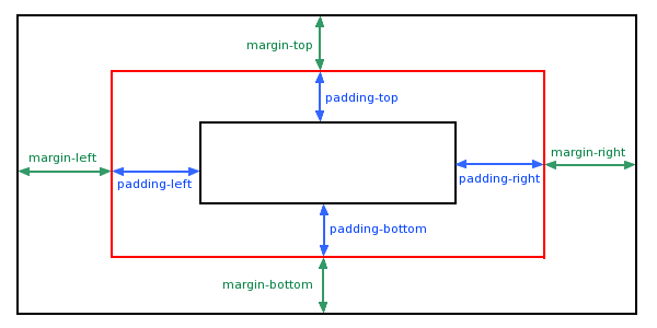
一、盒子模型 (Box Model)
- 概念
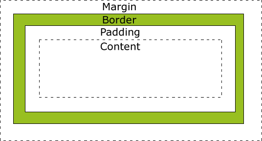
- 代码
div {

    background-color: lightgrey;

    width: 300px;

    border: 25px solid green;

    padding: 25px;

    margin: 25px;

}
- 效果
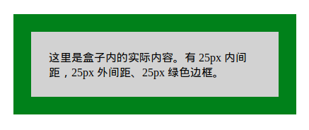
- 计算方法
# 求显示的总宽度

300px (宽)

+ 50px (左 + 右填充)

+ 50px (左 + 右边框)

+ 50px (左 + 右边距)

= 450px
二、Position 定位
- 相对位置
<style>

h2.pos_left

{

    position:relative;

    left:-20px;

}

h2.pos_right

{

    position:relative;

    left:20px;

}

</style>

</head>

<body>

<h2>这是位于正常位置的标题</h2>  # 注意,都是以这个作为‘位置参照’,而不是上一条。

<h2 class="pos_left">这个标题相对于其正常位置向左移动</h2>

<h2 class="pos_right">这个标题相对于其正常位置向右移动</h2>
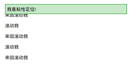
- sticky属性
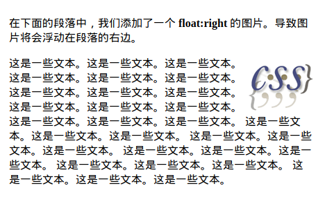
三,图片位置浮动
- 图片在文字中的浮动
<style>

img

{

    float:right;

}

</style>
<p>

<img src="logocss.gif" width="95" height="84" />

这是一些文本。这是一些文本。这是一些文本。

这是一些文本。这是一些文本。这是一些文本。

这是一些文本。这是一些文本。这是一些文本。

这是一些文本。这是一些文本。这是一些文本。

这是一些文本。这是一些文本。这是一些文本。

这是一些文本。这是一些文本。这是一些文本。

这是一些文本。这是一些文本。这是一些文本。

这是一些文本。这是一些文本。这是一些文本。

这是一些文本。这是一些文本。这是一些文本。

这是一些文本。这是一些文本。这是一些文本。

</p>
【效果】
- mix组件的浮动
img与string通过div构成了一个组件。浮动时作为整体处理。浮动的布局考虑同级目录即可。
<div>

<img src="logocss.gif" width="95" height="84" /><br>

CSS is fun!

</div>

<p>

This is some text. This is some text. This is some text.

This is some text. This is some text. This is some text.

This is some text. This is some text. This is some text.

This is some text. This is some text. This is some text.

This is some text. This is some text. This is some text.

This is some text. This is some text. This is some text.

This is some text. This is some text. This is some text.

This is some text. This is some text. This is some text.

This is some text. This is some text. This is some text.

This is some text. This is some text. This is some text.

This is some text. This is some text. This is some text.

This is some text. This is some text. This is some text.

This is some text. This is some text. This is some text.

</p>
【效果】

- 图片们的浮动
<style>

.thumbnail

{

    float:left;

    width:110px;

    height:90px;

    margin:5px;

}

</style>
<body>

<h3>图片库</h3>

<p>试着调整窗口,看看当图片没有足够的空间会发生什么。</p>

<img class="thumbnail" src="/images/klematis_small.jpg" width="107" height="90">

<img class="thumbnail" src="/images/klematis2_small.jpg" width="107" height="80">

<img class="thumbnail" src="/images/klematis3_small.jpg" width="116" height="90">

<img class="thumbnail" src="/images/klematis4_small.jpg" width="120" height="90">

</body>
【效果】

- 清除浮动 - 使用 clear
.text_line

{

    clear:both;

}
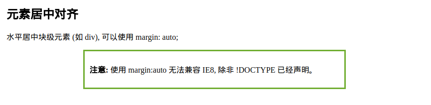
四、对齐
- 【元素居中】:从整体看去
<style>

.center { margin: auto;

    width: 60%;  # 必须设置

    border: 3px solid #73AD21;

    padding: 10px;

}

</style>
显示效果:
- 【文本居中】:文本在元素内居中对齐
<style>

.center { text-align: center;

    border: 3px solid green;

}

</style>
- 【图片居中】:可以使用 margin: auto; 并将它放到 块 元素中
<style>
img {

    display: block;

    margin: auto;

    width: 40%;

}
</style>
- 【左右对齐】- Position + left/right
.right {
 position: absolute;
 right: 0px;

    width: 300px;

    border: 3px solid #73AD21;

    padding: 10px;

}
也可以使用下面介绍的 float 的方式。
- 【嵌套布局】- body -> container -> right
当使用 position 来对齐元素时, 通常 <body> 元素会设置 margin 和 padding 。
这样可以避免在不同的浏览器中出现可见的差异。
body {

    margin:;

    padding:;

}

.container {

    position: relative;

    width: 100%;

}

.right {

    position: absolute;

    right: 0px;

    width: 300px;

    background-color: #b0e0e6;

}
嵌套代码结构:
<body>

  <div class="container">

      <div class="right">

      <p><b>注意: </b>当使用浮动属性对齐,总是包括 !DOCTYPE 声明!如果丢失,它将会在 IE 浏览器产生奇怪的结果。</p>

      </div>

  </div>

</body>
- 【Float对齐】
<style>

.right { float: right;

    width: 300px;

    border: 3px solid #73AD21;

    padding: 10px;

}

</style>
可见,也可以使用 float 属性来对齐元素:
float: right


-- 类似于 --

position: absolute;

right: 0px;
- 【溢出问题】
在父元素上添加 overflow: auto; 来解决子元素溢出的问题。
.clearfix {

    overflow: auto;

}
<div>

<img class="img1" src="pineapple.jpg" alt="Pineapple" width="170" height="170">

菜鸟教程 - 学的不仅是技术,更是梦想!!!</div>

<p style="clear:right">在父元素上通过添加 clearfix 类,并设置 overflow: auto; 来解决该问题:</p>

<div class="clearfix">

<img class="img2" src="pineapple.jpg" alt="Pineapple" width="170" height="170">

菜鸟教程 - 学的不仅是技术,更是梦想!!!</div>
溢出效果:

- 【垂直居中对齐】 - 使用 padding
.center {

    padding: 70px 0;

    border: 3px solid green;

}
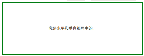
- 【水平垂直居中】
在垂直居中基础上添加水平居中即可。
.center {

    padding: 70px 0;

    border: 3px solid green;
 text-align: center;

}
- 【垂直居中 - 番外篇】
* 通过行高设置,达到垂直居中效果。
<style>

.center { line-height: 200px; height: 200px;

    border: 3px solid green;

    text-align: center;

}

/* 如果有多行文本,可以设置如下 */

.center p {

    line-height: 1.5;

    display: inline-block;

    vertical-align: middle;

}

</style>
* 垂直居中 - 使用 position 和 transform
.center {

    height: 200px;

    position: relative;

    border: 3px solid green;

}

.center p {

    margin:;

    position: absolute;

    top: 50%;

    left: 50%;

    transform: translate(-50%, -50%);

}
伪类、伪元素
From: http://www.runoob.com/css/css-pseudo-classes.html
From: http://www.runoob.com/css/css-pseudo-elements.html
一、啥是伪类
- anchor伪类
a:link {color:#FF0000;}    /* 未访问的链接 */

a:visited {color:#00FF00;} /* 已访问的链接 */

a:hover {color:#FF00FF;}   /* 鼠标划过链接 */

a:active {color:#0000FF;}  /* 已选中的链接 */
- 伪类的语法
selector:pseudo-class {property:value;}


# CSS类也可以使用伪类

selector.class:pseudo-class {property:value;}
二、first-child 伪类
- 匹配第一个 <p> 元素
p:first-child

{

    color:blue;

}
- 匹配所有<p> 元素中的第一个 <i> 元素
<head>

  <meta charset="utf-8">

  <title>菜鸟教程(runoob.com)</title>

  <style>

  p > i:first-child

  {

      color:blue;

  }

  </style>

</head>

<body>

  <p>I am a <i>strong</i> man. I am a <i>strong</i> man.</p>

  <p>I am a <i>strong</i> man. I am a <i>strong</i> man.</p>

  <p><b>注意:</b> 当 :first-child 作用于 IE8 以及更早版本的浏览器, !DOCTYPE 必须已经定义.</p>

</body>
- 匹配所有作为第一个子元素的 <p> 元素中的所有 <i> 元素
<head>

  <meta charset="utf-8">

  <title>菜鸟教程(runoob.com)</title>

  <style>

  p:first-child i

  {

      color:blue;

  }

  </style>

</head>

<body>

  <p>I am a <i>strong</i> man. I am a <i>strong</i> man.</p>

  <p>I am a <i>strong</i> man. I am a <i>strong</i> man.</p>

  <p><b>注意:</b> 当:first-child 作用于 IE8 及更早版本的浏览器, DOCTYPE 必须已经定义.</p>

</body>
Goto: 所有CSS伪类/元素,请见原链接。
三、CSS 伪元素
- 语法
CSS伪元素是用来添加一些选择器的特殊效果。
# 伪元素的语法:

selector:pseudo-element {property:value;}

# CSS类也可以使用伪元素:

selector.class:pseudo-element {property:value;}
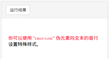
- first-line 伪元素
<head>

  <meta charset="utf-8">

  <title>菜鸟教程(runoob.com)</title>

  <style>

  p:first-line

  {

  color:#ff0000;

  font-variant:small-caps;

  }

  </style>

</head>

<body>

  <p>你可以使用 "first-line" 伪元素向文本的首行设置特殊样式。</p>

</body>
效果图:
- first-letter 伪元素
<style>

p:first-letter

{

    color:#ff0000;

    font-size:xx-large;

}

</style>
效果图:

- 多个伪元素
<style>

  p:first-letter

  {

      color:#ff0000;

      font-size:xx-large;

  }

  p:first-line

  {

      color:#0000ff;

      font-variant:small-caps;

  }

</style>
- before 伪元素
<style>

  h1:before {content:url(smiley.gif);}

</style>
- after 伪元素
<style>

  h1:after {content:url(smiley.gif);}

</style>
Goto: 所有CSS伪类/元素,请见原链接。
[UI] 01 - CSS的更多相关文章
- jquery ui的css设计
jquery ui 是当前最强大的UI库之一,其两大卖点是对IE6的良好支持与换肤功能.为了构建avalon ui,今天起我将投入一部分精力来研究时下最流行的几个CSS框架.它是首当其冲. jquer ...
- AmazeUI(妹子UI)中CSS组件、JS插件、Web组件的区别
AmazeUI(妹子UI)是非常优秀的国产前端UI,现在来介绍一下AmazeUI中CSS组件.JS插件与Web组件的区别. CSS组件顾名思义就是仅使用CSS渲染而成的组件,而JS插件也很容易理解,就 ...
- amaze UI 笔记 - CSS
导航添加依据 http://amazeui.org/css/ 下面内容属学习笔记,如有理解偏差和错误请留言相告,感谢!* =(官网这块写的很详细) 一.基本样式 1.统一样式 说明了为什么使用Nor ...
- jquery ui的css设计二
上一篇见这里 本篇重点说一下其换肤功能 换肤一般是指改变控件的字体颜色,背景颜色,边框颜色,hover上去的颜色,背景图片,很少再会涉及修改其长宽,字体类型什么的. 以这个版本的CSS为观察对象,可以 ...
- (0-1)CSS 标签语法的属性
CSS text-decoration 属性 display display 属性规定元素应该生成的框的类型
- CSS学习笔记01 CSS简介
1.CSS定义 CSS 指层叠样式表 (Cascading Style Sheets),是一种样式表语言,用来描述 HTML 或 XML(包括如 SVG.XHTML 之类的 XML 分支语言)文档的呈 ...
- 01. css sprite是什么,有什么优缺点?
1.css sprite是什么,有什么优缺点? 通常被意译为“CSS图像拼合”或“CSS贴图定位” 1)CSS Sprites的优点 利用CSS Sprites能很好地减少网页的http请求,从而大大 ...
- CSS Secrets 翻译笔记 01: CSS coding tips
.firDemoButton{ padding: 6px 16px; border: 1px solid #446d88; background: #58a linear-gradient(#77a0 ...
- CRM WEB UI 01 BOL向导创建的搜索
创建BOL的步骤就不说了,自己找,学习这个之前,需要自己先找个SAP CRM资料预习一下 T-CODE:BSP_WD_CMPWB 1.创建组件:输入组件名:ZLYTEST03,点击创建按钮,回车,选择 ...
随机推荐
- nohup和disown
Many system administrators make a practice of using GNU Screen or tmux to manage jobs running in the ...
- FXAA,FSAA与MSAA有什么区别?效果和性能上哪个好
而MSAA基本上只对画面中物体的边缘进行放大.混合的抗锯操作,因为边缘是锯齿最明显的地方(注意不是所有的边缘).提取边缘,主要是结合深度技术.MSAA是种硬件AA.我们一般说的4x.8x,就是放大倍数 ...
- Docker修改daemon.json后无法启动的问题
本文的运行环境为Centos 7.3,Docker与Kubernetes的安装方式见kubeadm安装kubernetes V1.11.1 集群 最近在整理Docker和Kubernetes中的日志与 ...
- Cassandra的数据模型的理解
Cassandra属于NoSQL数据库,NoSQL和传统关系型数据库不同,NOSQL偏好数据冗余,因为NoSQL一般无法做表关联查询. (1) keySpace 基本上可以将Keyspa ...
- mac下最简单的删除node方法是什么
sudo rm -rf /usr/local/{bin/{node,npm},lib/node_modules/npm,lib/node,share/man/*/node.*}
- Chrome禁止http自动转为https
解决方法 在Chrome浏览器地址栏输入chrome://net-internals/#hsts 在Delete domain security policies 中输入要删除自动转换的域名 原因 将 ...
- 基于ubuntu搭建 Discuz 论坛
系统要求:Ubuntu 16.04.1 LTS 64 位操作系统 安装 Apache2 ubuntu 需要安装 Apache2 ,使用 apt-get 安装 Apache2(安装好后,您可以通过访问实 ...
- 【java】解析java网络
目录结构: contents structure [+] 模拟Post与Get请求 设置Authorization头信息 基于TCP的网络编程 TCP协议简介 半关闭的Socket TCP长链接 TC ...
- LightCapture for Mac(流程化截图工具)破解版安装
1.软件简介 LightCapture 是 macOS 系统上的截图软件.LightCapture Mac 版号称是用最简洁的方式来截图,其的界面也确实非常简单整洁,不过功能同样出色,一键截屏. ...
- Asp.Net MVC4中的全局过滤器
可以对整个项目进行全局监控. 新建一个MVC4项目,可以在global.asax文件中看到如下代码: FilterConfig.RegisterGlobalFilters(GlobalFilters ...