
matplotlib学习日记(九)-图形样式
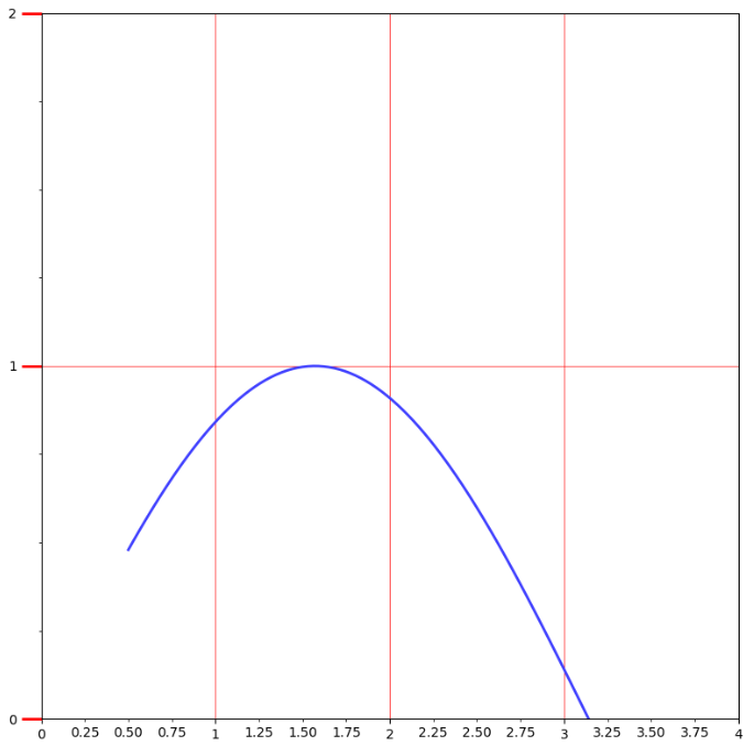
(一)刻度线定位器和刻度格式器的使用方法
import matplotlib.pyplot as plt

import numpy as np

from matplotlib.ticker import AutoMinorLocator, MultipleLocator, FuncFormatter

x = np.linspace(0.5, 3.5, 100)

y = np.sin(x)

fig = plt.figure(figsize=(8, 8)) #生成8x8的画布

ax = fig.add_subplot(111)  #向画布添加1行1列的子区,并且生成Axes实例ax

ax.xaxis.set_major_locator(MultipleLocator(1.0))

'''ax.xaxis是ax的x轴实例,语句会在x轴的1倍处

分别设置主刻度线,其中参数MultipleLocator(1.0)

就是设置主刻度线的显示位置

'''

ax.yaxis.set_major_locator(MultipleLocator(1.0))

'''

次刻度线的显示位置,MultipleLocator(1.0)表示

将每一份主刻度线区间等分4份

'''

ax.xaxis.set_minor_locator(AutoMinorLocator(4))

ax.yaxis.set_minor_locator(AutoMinorLocator(4))

#函数是控制次要刻度线显示精度的

def minor_tick(x, pos):

    if not x %1.0:

        return ""

    return "%.2f" % x

ax.xaxis.set_minor_formatter(FuncFormatter(minor_tick))

#set_minor_formatter设置次刻度线精度,FuncFormatter(minor_tick)控制位置精度

ax.tick_params("y", which="major", length = 15, width=2.0, color="r")#刻度线样式的设置

ax.tick_params(which="manor", length = 5, width=1.0, labelsize=10, labelcolor="0.25")

ax.set_xlim(0, 4)

ax.set_ylim(0, 2)

ax.plot(x, y, c=(0.25, 0.25, 1.00), lw=2, zorder=10)

ax.grid(linestyle="-", linewidth=0.5, color="r", zorder=0)

plt.show()
(二)刻度标签和刻度线样式的定制化
import matplotlib.pyplot as plt

import numpy as np

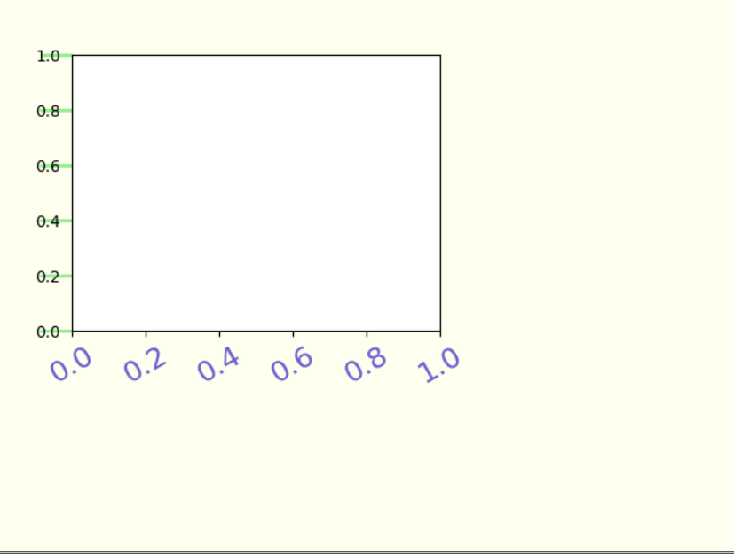
fig = plt.figure(facecolor=(1.0, 1.0, 0.9412))

ax = fig.add_axes([0.1, 0.4, 0.5, 0.5])

for ticklabel in ax.xaxis.get_ticklabels():

#ax.xaxis.get_ticklabels()是使用get_ticklabels()方法获得Text实例列表,用for循环遍历设置

    ticklabel.set_color("slateblue")

    ticklabel.set_fontsize(18)

    ticklabel.set_rotation(30)

for tickline in ax.yaxis.get_ticklines():

    tickline.set_color("lightgreen")

    tickline.set_markersize(20)

    tickline.set_markeredgewidth(2)

plt.show()
(三)货币和时间序列样式的刻度标签
import matplotlib.pyplot as plt

import numpy as np

from calendar import month_name, day_name

#日期标签通过导入标准库calender中的day_name实现日期的刻度标签

from matplotlib.ticker import FormatStrFormatter

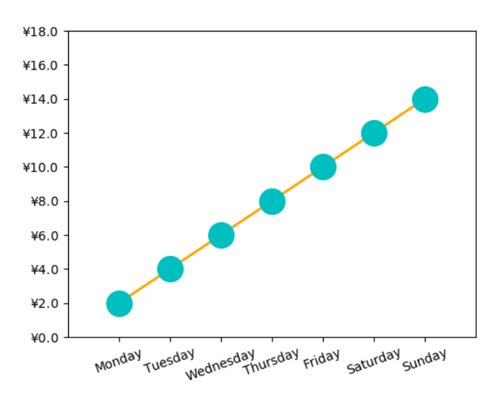
'''货币标签是通过FormatStrFormatter(r"$\yen%1.1f$")

作为参数值代入实例方法Axes.set_major_formmatter()中

实现格式化坐标轴标签,r"$\yen%1.1f$"是用来生成保留两位有效数字的人民币计量的刻度标签'''

fig = plt.figure()

ax = fig.add_axes([0.2, 0.2, 0.7, 0.7])

x = np.arange(1, 8, 1)

y = 2*x

ax.plot(x, y, ls="-", lw=2, color="orange", marker="o", ms=20, mfc="c",mec="c")

ax.yaxis.set_major_formatter(FormatStrFormatter(r"$\yen%1.1f$"))

plt.xticks(x, day_name[0:7], rotation =20)

ax.set_xlim(0, 8)

ax.set_ylim(0, 18)

plt.show()
(四)有指示注释与无指示注解(annotate)
import matplotlib.pyplot as plt

import numpy as np

x = np.linspace(0.5, 3.5, 100)

y = np.sin(x)

fig = plt.figure(figsize=(8, 8))

ax = fig.add_subplot(111)

ax.plot(x, y, c="b", ls="--", lw=2)

ax.annotate("maximum", xy=(np.pi/2, 1.0), xycoords="data",

            xytext=((np.pi/2)+0.15, 0.8), textcoords="data",

            weight="bold", color="r", arrowprops=dict(arrowstyle="->", connectionstyle="arc3",color="r"))

'''

有指示注释使用annotate函数,ax.annotate(str, xy, xycoords, xytext, textcoords, weight, color, arrowprops)

s------>注释内容

xy------>被解释内容的位置

xycoords------>xy的坐标系统,参数值“data”表示与折线图使用相同坐标系统

xytext-------->注释内容所在位置,如果是矩形,左下角所在位置

textcoords----->xytext的坐标系统

weight--------->注释内容的显示风格

color--------->注释内容的颜色

arrowprops---->指示箭头的属性,箭头风格,颜色等等

'''

ax.text(2.8, 0.4, "$y=\sin(x)$", fontsize=20, color="b",

        bbox=dict(facecolor="y", alpha=.5))

#无指示注释

plt.show()

(五)圆角文本框的设置
import matplotlib.pyplot as plt

import numpy as np

x = np.linspace(0.0, 10, 40)

y = np.random.randn(40)

plt.plot(x, y, ls="-", lw=2, marker="o", ms=20, mfc="orange", alpha=.6)

plt.grid(ls=":", color="gray", alpha=.5)

plt.text(6, 0, "Matplotlib", size=30, rotation=30,

         bbox=dict(boxstyle="round", ec="#8968CD", fc="#FFE1FF"))

#boxstyle="round"控制着圆角,还可改成square,circle等

plt.show()

(六)文本的水印效果
import matplotlib.pyplot as plt

import numpy as np

x = np.linspace(0.0, 10, 40)

y = np.random.randn(40)

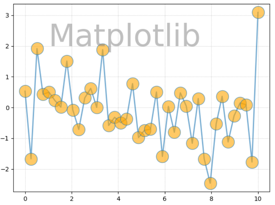
plt.plot(x, y, ls="-", lw=2, marker="o", ms=20, mfc="orange", alpha=.6)

plt.grid(ls=":", color="gray", alpha=.5)

plt.text(1, 2, "Matplotlib", fontsize=50, color="gray",alpha=.5)

#水印通过alpha控制

plt.show
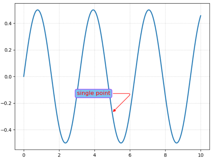
(七)圆角线框的有弧度指示注解
import matplotlib.pyplot as plt

import numpy as np

x = np.linspace(0, 10, 2000)

y = np.sin(x)*np.cos(x)

fig = plt.figure()

ax = fig.add_subplot(111)

ax.plot(x, y, ls="-", lw=2)

bbox = dict(boxstyle="round", fc="#7EC0EE", ec="#9B30FF")

arrowprops = dict(arrowstyle="-|>", connectionstyle="angle, angleA=0, angleB=45, rad=10", color="r")

#connectionstyle控制着箭头的走向

ax.annotate("single point", (5, np.sin(5)*np.cos(5)), xytext=(3, np.sin(3)*np.cos(3)),

            fontsize=12, color = "r", bbox=bbox, arrowprops=arrowprops)

ax.grid(ls=":", color="gray", alpha=.5)

plt.show()
(八)有箭头指示的趋势线
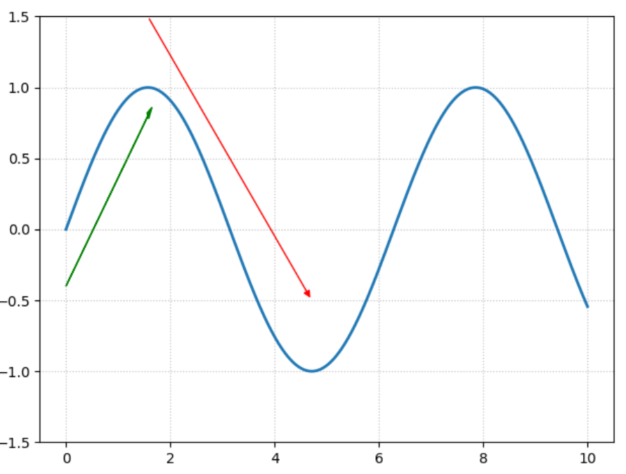
import matplotlib.pyplot as plt

import numpy as np

x = np.linspace(0, 10, 2000)

y = np.sin(x)

fig = plt.figure()

ax = fig.add_subplot(111)

ax.plot(x, y, ls="-", lw=2)

ax.set_ylim(-1.5, 1.5)

arrowprops = dict(arrowstyle="-|>", color="r")

#connectionstyle控制着箭头的走向

ax.annotate("", (3*np.pi/2, np.sin(3*np.pi/2)+0.5), xytext=(np.pi/2, np.sin(np.pi/2)+0.5),

            color = "r", arrowprops=arrowprops)

ax.arrow(0.0, -0.4, np.pi/2, 1.2, head_width=0.05, head_length=0.1,

         fc="g", ec="g")

#arrow(起点,xy增量,样式)

ax.grid(ls=":", color="gray", alpha=.5)

plt.show()
matplotlib学习日记(九)-图形样式的更多相关文章
- matplotlib学习日记(四)-绘制直方统计图形
(一)柱状图-应用在定性数据的可视化场景或者离散型数据,条形图和柱状图相似,只不过是函数barh import matplotlib as mpl import matplotlib.pyplot a ...
- matplotlib学习日记(三)------简单统计图
(一)函数bar()---------绘制柱状图 import matplotlib as mpl import matplotlib.pyplot as plt mpl.rcParams[" ...
- matplotlib学习日记(一)------图表组成元素
1.使用函数绘制matplotlib的图表组成元素 (1)函数plot---变量的变化趋势 import matplotlib.pyplot as plt import numpy as np x ...
- matplotlib学习日记(十)-划分画布的主要函数
(1)函数subplot()绘制网格区域中的几何形状相同的子区布局 import matplotlib.pyplot as plt import numpy as np '''函数subplot的介绍 ...
- matplotlib学习日记(十)-共享绘图区域的坐标轴
(1)共享单一绘图区域的坐标轴 ''' 上一讲介绍了画布的划分,有时候想将多张图放在同一个绘图区域, 不想在每个绘图区域只绘制一幅图形,这时候借助共享坐标轴的方法实现在一个绘图区 绘制多幅图形的目的. ...
- matplotlib学习日记(七)---误差棒图
(一)误差棒图----误差置信区间的表示 import matplotlib.pyplot as plt import numpy as np x = np.linspace(0.1, 0.6, 10 ...
- matplotlib学习日记(二)----图表组成练习
''' 将前面的知识进行练习 plot,scatter,legend等 ''' import matplotlib.pyplot as plt import numpy as np from matp ...
- matplotlib学习日记(十一)---坐标轴高阶应用
(一)设置坐标轴的位置和展示形式 (1)向画布中任意位置添加任意数量的坐标轴 ''' 通过在画布的任意位置和区域,讲解设置坐标轴的位置和坐标轴的展示形式的实现方法, 与subplot,subplots ...
- matplotlib学习日记(八)----完善统计图
(一)再说legend() import matplotlib.pyplot as plt import numpy as np x = np.arange(0, 2.1, 0.1) y = np.p ...
随机推荐
- Snap Build Your Own Blocks输入中文解决办法
Snap Build Your Own Blocks输入中文解决办法 Snap! (formerly BYOB) is a visual, drag-and-drop programming lang ...
- 【线程池】toString
java.util.concurrent.RejectedExecutionException: Task com.personal.practice.jvm.Jstacktest$1@7d605a5 ...
- 详解docker部署SpringBoot及如何替换jar包
关于docker的安装和使用,可以看看之前这两篇文章.Docker从安装部署到Hello World和Docker容器的使用和连接.这篇文章主要介绍如何在docker上部署springboot项目.关 ...
- IntelliJ IDEA 配置《算法》(第四版)
红皮的算法一书,内部代码的实现调用了作者写的一个包.为了运行书内代码,需要配置相应的环境. 准备 网站:https://algs4.cs.princeton.edu/code/ 工具:IntelliJ ...
- 自动化运维工具之Puppet常用资源(二)
前文我们了解了部分puppet的资源的使用,以及资源和资源的依赖关系的定义,回顾请参考https://www.cnblogs.com/qiuhom-1874/p/14071459.html:今天我们继 ...
- synchronized的底层原理?
最近更新的XX必备系列适合直接背答案,不深究,不喜勿喷. 你能说简单说一下synchronize吗? 可别真简单一句话就说完了呀~ 参考回答: synchronize是java中的关键字,可以用来修饰 ...
- nginx反向代理docker容器化django
1.新建Dockerfile FROM python:3.8.5 MAINTAINER ChsterChen ENV PYTHONUNBUFFERED 1 COPY pip.conf /root/.p ...
- 使用cmd制作图片木马
我们可以使用windows下自带的cmd制作图片木马,配合文件包含漏洞可以达到getshell的目的 我们找到一张图片:kiss.jpg 如图: 写好一句话木马:chopper.php 将两者放在同一 ...
- 降本增效利器!趣头条Spark Remote Shuffle Service最佳实践
王振华,趣头条大数据总监,趣头条大数据负责人 曹佳清,趣头条大数据离线团队高级研发工程师,曾就职于饿了么大数据INF团队负责存储层和计算层组件研发,目前负责趣头条大数据计算层组件Spark的建设 范振 ...
- IAR FOR STM8 同一个工程芯片选择003F3可以编译003K3提示空间不足
同一个工程文件,选择103F3可以编译通过,但是选择103K3便提示空间不足 百思不得其解,查阅大量资料无果.最后在IAR工程里面找到了配置文件 打开003f3的配置文件和003K3配置文件进行对比, ...