
经常问到的 BFC 和 IFC 是什么?
什么是BFC?什么作用?
Block Formatting Context
块盒子布局发生的区域,浮动元素和其他元素交互的区域
浮动定位和清除浮动的时候只会应用于同一个BFC内的元素。浮动不会影响其他BFC中元素的布局,而清除浮动只能清除同一BFC中在它前面的元素的浮动。
外边距的折叠也只会发生在同一BFC中的块级元素之间。可以创建新的BFC来消除外边距的折叠问题。
常见的定位布局方案有,普通流,浮动和绝对定位。
BFC 是一块渲染区域,有一套渲染定位规则。决定子元素定位其他元素的关系和相互作用,是属于普通流的。具有 BFC 特性的元素可以看作是隔离了的独立容器,容器里面的元素不会在布局上影响到外面的元素,并且 BFC 具有普通容器所没有的一些特性。
其实也不是什么新鲜东西,可能都在用但不知道这个概念。
案例1:使浮动元素和周围内容等高
对于以下代码:
<style>

  .box {

    background-color: rgb(224, 206, 247);

    border: 5px solid rebeccapurple;

    /* overflow: auto; */

    /* display: flow-root; */

  }

  .float {

    float: left;

    width: 400px;

    height: 150px;

    background-color: white;

    border: 1px solid black;

    padding: 10px;

  }

</style>

<div>

  <div class="box">

    <div class="float">I am a floated box!</div>

    <p>I am content inside the container.</p>

  </div>

</div>
显示的效果如下:
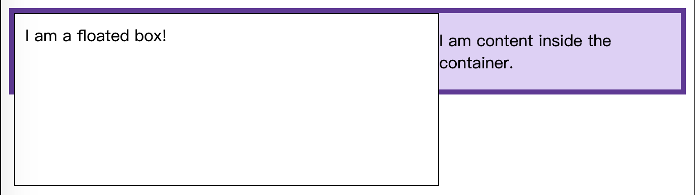
因为浮动盒子脱离了文档流。浮动的div元素更大,就穿出了边框。
一般是需要将盒子和浮动元素做成等高的,即浮动元素应该包含在box内部,要达到这个效果,可以这样:
使用
display: flow-root一个新的
display属性值,可以创建无副作用的BFC。在父级元素中使用display: flow-root就可以创建新的BFC。可以理解为和创建根元素一样,创建一个文档流的上下文。
使用overflow:auto
只要设置overflow为一个非visible的值就可以。使用
overflow创建一个新的BFC,overflow会告诉浏览器如何处理超出部分的内容。但是如果只是用来创建BFC的话,可能引发其他情况。
案例2: 清除外部浮动
对于以下代码:
<style>

  section {

    height: 150px;

  }

  .box {

    background-color: rgb(224, 206, 247);

    border: 5px solid rebeccapurple;

  }

  .box[style] {

    background-color: aliceblue;

    border: 5px solid steelblue;

  }

  .float {

    float: left;

    overflow: hidden; /* required by resize:both */

    resize: both;

    margin-right: 25px;

    width: 200px;

    height: 100px;

    background-color: rgba(255, 255, 255, 0.75);

    border: 1px solid black;

    padding: 10px;

  }

</style>

<section>

  <div class="float">Try to resize this outer float</div>

  <div class="box"><p>Normal</p></div>

</section>

<section>

  <div class="float">Try to resize this outer float</div>

  <div class="box" style="display:flow-root"><p>

    <code>display:flow-root</code><p>

  </div>

</section>
这里需要关注的是float元素上的margin-right这个属性。
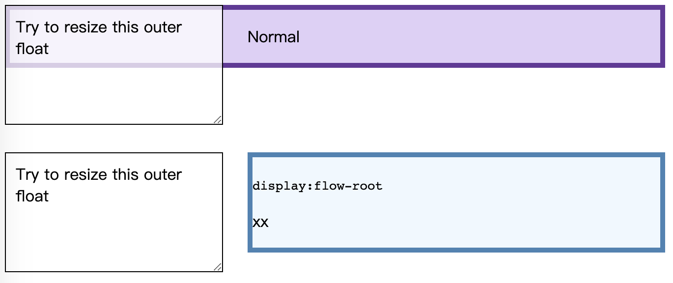
上面的两个元素之间,margin-right 没有生效。但是对box添加display:flow-root属性之后,margin-right 属性就生效了,左边的元素缩放的时候始终都保持有25px的距离。也就是display:flow-root对同级的外部元素的浮动也清除了。
如果对HTML部分写成这样:
<section>

  <div class="float">Try to resize this outer float</div>

  <div class="float">Try to resize this outer float</div>

  <div class="box"><p>Normal</p></div>

</section>

<section>

  <div class="float">Try to resize this outer float</div>

  <div class="float">Try to resize this outer float</div>

  <div class="box" style="display: flow-root">

    <p><code>display:flow-root</code></p>

    <p>xx</p>

  </div>

</section>
消除同级元素的float, 显示出 margin-right 的效果就更明显了。
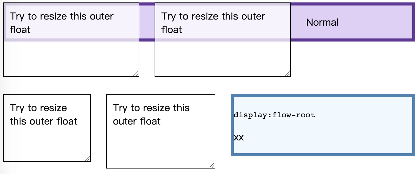
需要注意的是:清除同一BFC中的浮动,只能清除在它前面元素的浮动。
案例3: 外边距塌陷问题
对于如下代码:
<style>

  .blue,

  .red-inner {

    height: 50px;

    margin: 50px 0;

    background: blue;

  }

  .red-outer {

    /* display: flow-root; */

    /* overflow: hidden; */

    background: red;

  }

</style>

<body>

  <div class="blue"></div>

  <div class="red-outer">

    <div class="red-inner">red inner</div>

  </div>

</body>
显示的效果如下:
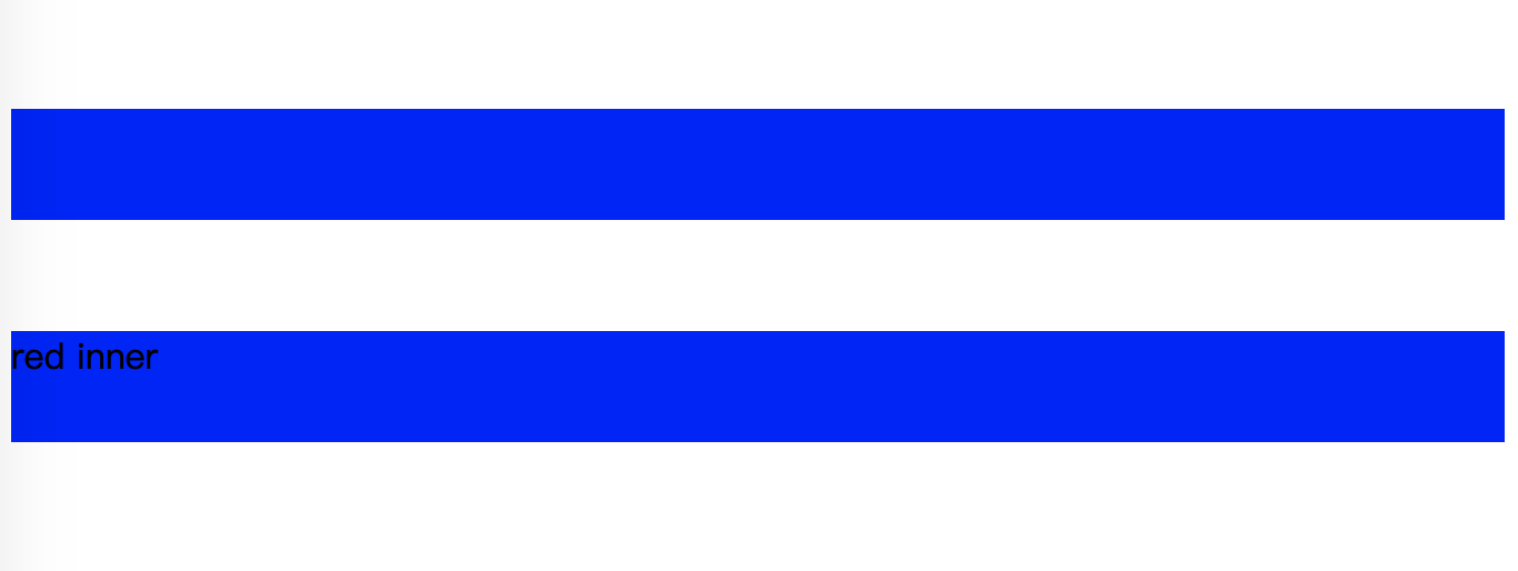
可以看到,对red-inner的margin没法撑起盒子,两个蓝色盒子之间的距离是50px.
使用display: flow-root;
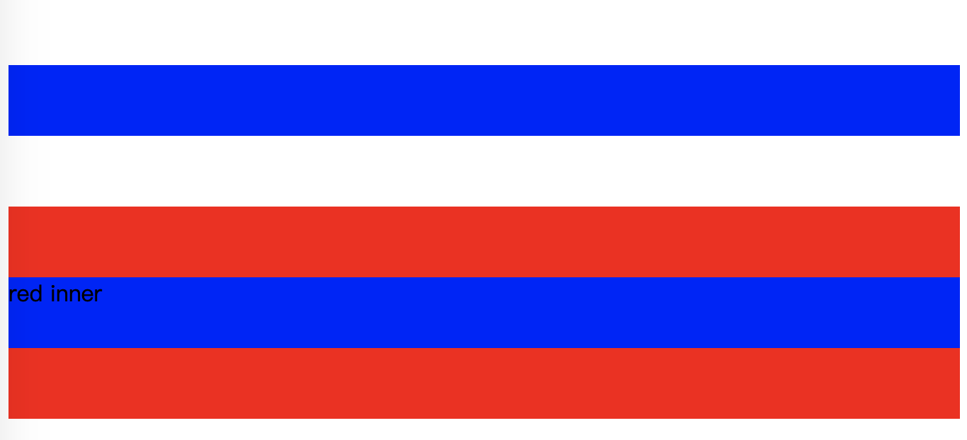
两个蓝色盒子就距离100px了,而且margin也完全显示了出来。
创建BFC的方法
使用这些BFC的特性,需要创建出BFC:
- 根元素(
<html>) - 浮动元素(元素的
float不是none) - 绝对定位元素(元素的
position为absolute或fixed) - 行内块元素(元素的
display为inline-block) - 表格单元格(元素的
display为table-cell,HTML表格单元格默认为该值) - 表格标题(元素的
display为table-caption,HTML表格标题默认为该值) - 匿名表格单元格元素(元素的
display为table、``table-row、table-row-group、``table-header-group、``table-footer-group(分别是HTML table、row、tbody、thead、tfoot 的默认属性)或inline-table) overflow计算值(Computed)不为visible的块元素display值为flow-root的元素contain值为layout、content或 paint 的元素- 弹性元素(
display为flex或inline-flex元素的直接子元素) - 网格元素(
display为grid或inline-grid元素的直接子元素) - 多列容器(元素的
column-count或column-width(en-US) 不为auto,包括 ``column-count为1) column-span为all的元素始终会创建一个新的BFC,即使该元素没有包裹在一个多列容器中(标准变更,Chrome bug)
什么又是 IFC?
相对于块级格式化上下文,还有行内格式化上下文,Inline formatting context。
对于IFC,行内框一个接一个地排列,排列顺序和书写方向一致。
- 水平书写模式,行内框从左边开始水平排列
- 垂直书写模式,行内框从顶部开始水平排列
一个行内框在被分割到多行中的时候,margin,border以及padding的设定不会在断裂处生效(边框跨行连续,不会产生两块border)
Margin,border和padding的设置在行方向上生效。
垂直方向上对齐
垂直方向上的位置主要是用vertical-align
<style>

  .horizontal {

    writing-mode: horizontal-tb;

   }

  .vertical {

    writing-mode: vertical-rl;

   }

	span {

    font-size: 200%;

    /* vertical-align: top; */

    vertical-align: bottom;

   }

</style>

<div class="example horizontal">

      Before that night—<span>a memorable night</span>, as it was to prove—hundreds of millions of

      people had watched the rising smoke-wreaths of their fires without drawing any special

      inspiration from the fact.”

</div>
显示效果:

而如果将vertical-align: bottom设置为top,效果则是顶部对齐:

需要注意的是,如果文字方向是垂直书写模式的话,对齐方式不变,但实际上应该是左右对齐,与vertical-align的字面意思稍有出入。在
vertical-align:top再加上writing-mode: vertical-rl。

水平方向上对齐
行内元素在水平方向上的位置主要是用text-align
<style>

   .horizontal {

    writing-mode: horizontal-tb;

   }

  .vertical {

    writing-mode: vertical-rl;

   }

	.example {

    text-align: center;

  }

</style>

<div class="example horizontal" style="border: 1px solid">One Two Three</div>

<div class="example vertical">One Two Three</div>
显示效果:

参考:
经常问到的 BFC 和 IFC 是什么?的更多相关文章
- 你知道BFC、IFC、FFC、GFC及多栏自适应布局吗?
FC(Formatting Context)格式化内容,常见的FC有BFC.IFC.FFC.GFC四种类型,BFC和IFC是W3C CSS2.1规范提出的概念,FFC和GFC是W3C CSS3规范提出 ...
- 前端人员不要只知道KFC,你应该了解 BFC、IFC、GFC 和 FFC
前言 说起KFC,大家都知道是肯德基,但面试官问你什么是BFC.IFC.GFC和FFC的时候,你是否能够像回答KFC是肯德基时的迅速,又或者说后面这些你根本就没听说过,作为一名前端开发工程师,以上这些 ...
- 浅析CSS中的BFC和IFC
1. 为什么会有BFC和IFC 首先要先了解两个概念:Box和formatting context: Box:CSS渲染的时候是以Box作为渲染的基本单位.Box的类型由元素的类型和display属性 ...
- BFC与IFC
在我们做的网页上通常最重要的其中一点就是美观度,bfc他是一个块级格式化上下文,它是一个独立的渲染区域,只有Block-level box参与, 它规定了内部的Block-level Box如何布局, ...
- 初识 BFC、 IFC、GFC、FFC
首先本文中介绍的 BFC. IFC.GFC.FFC 均为 CSS 中常见问题的解读,如没兴趣,可以绕道了. 然后在介绍这么多的 *FC 之前,我们得了解 一下 Box 和 Formatting Con ...
- 【转】前端的BFC、IFC、GFC和FFC
什么是BFC.IFC.GFC和FFC CSS2.1中只有BFC和IFC, CSS3中才有GFC和FFC. FC的全称是:Formatting Contexts,是W3C CSS2.1规范中的一个概念. ...
- 什么是BFC、IFC、GFC和FFC
什么是BFC.IFC.GFC和FFC CSS2.1中只有BFC和IFC, CSS3中才有GFC和FFC. FC的全称是:Formatting Contexts,是W3C CSS2.1规范中的一个概念. ...
- 重拾 BFC、IFC、GFC、FFC
温故知新,巩固基础 从 FC 开始 FC,Formatting Context,格式化上下文,是 W3C CSS2.1 规范中的一个概念,定义的是页面中一块渲染区域,并且有一套渲染规则,它决定了其子元 ...
- 浅谈BFC和IFC
先说说FC,FC的含义就是Fomatting Context.它是CSS2.1规范中的一个概念. 它是页面中的一块渲染区域.而且有一套渲染规则,它决定了其子元素将怎样定位.以及和其它元素的关系和相互作 ...
随机推荐
- 如何正确的阅读 js 源码
如何正确的阅读 js 源码 https://astexplorer.net/ AST Abstract Syntax Trees https://alligator.io/js/traversing- ...
- c++ winapi 在当前程序(local)调用目标程序(target)的函数
GameCheat stackoverflow 如果你的目标程序是x86/x64, 那么当前程序也需要编译为x84/x64 #include <iostream> #include < ...
- fetch & form-data & upload & image file
fetch & form-data & upload & image file no need multipart/form-data https://blog.xinshan ...
- 「NGK每日快讯」12.11日NGK公链第38期官方快讯!
- C++算法代码——你要乘坐的飞碟在这里[usaco]
题目来自:http://218.5.5.242:9018/JudgeOnline/problem.php?id=1056 题目描述 一个众所周知的事实,在每一慧星后面是一个不明飞行物UFO. 这些不明 ...
- 手把手教你Centos7 部署 gitlab社区版
一.前置说明: 操作系统:Centos 7 物理内存:>=2G 本人亲测,如果安装低版本的gitlab,比如我这里所使用的v8.17.0,物理内存1G,swap 2G虚拟内存即可部署.高版本的所 ...
- javascript中的内置对象和数据结构
目录 简介 基础类型 undefined Boolean和Boolean对象 Number和BigInt String Symbol null Object Function Date Array K ...
- JVM相关 - 深入理解 System.gc()
本文基于 Java 17-ea,但是相关设计在 Java 11 之后是大致一样的 我们经常在面试中询问 System.gc() 究竟会不会立刻触发 Full GC,网上也有很多人给出了答案,但是这些答 ...
- Kubernetes-3.安装
docker version:19.03.14 kubernetes version:1.19.4 本文介绍使用kubeadm安装Kubernetes集群的简单过程. 目录 使用kubeadm安装k8 ...
- 后端程序员之路 33、Index搜索引擎实现分析2-对外接口和大体流程
# index_manager的单例是index server对外的唯一接口,part_indexer是index搜索的核心部分,index_manager持有了一组part_indexer. typ ...