How To Build Compelling Stories From Your Data Sets
How To Build Compelling Stories From Your Data Sets
Every number has a story. As a data scientist, you have the incredible job of digging in and analyzing massive sets of numbers to find what that story is. The challenge can be that while you may have an artistic bent, you may not know how to turn that beautiful visualization into something more meaningful. Is it even possible?
Even the most mundane datasets can be compelling to an audience; it’s simply a matter of presentation. This post will aim to guide you through just how you can make a statistical analysis into a compelling narrative.
Visualization Is Your Friend
From the start, visualization is already helping you to make a compelling story—so you’re starting from a winning standpoint. In fact, one study shows that people who use visual aids in presentations are 43% more persuasive in their arguments.
Now, your job is to take that visualization and make it something that’s truly compelling. To do that, we’re going to focus less on the actual visualization, and more of what’s behind it: a well-crafted story.
Create a Narrative
Whatever the dataset you’re visualizing, there’s a story that comes out of it. This can be represented in something as simple as the change over time—what is important to realize is that it’s not just numbers. The visualization isn’t simply a representation of the numbers; it’s representing a point in a larger narrative. You just need to figure out exactly what that narrative is.
Narrative Structure 101: Every Story Needs Conflict
Based on this interview from The Atlantic, it becomes clear very quickly that a compelling story hinges on conflict. There needs to be some sort of tension in the story. While that might not play out in terms of “character development” or a plot arc, there is still a way to convey this tension—that something is wrong, or broken, or being fixed. There is significance to the data beyond it simply presenting something new.
The Different Types of Plots
According to Christopher Booker, there are seven basic plot types: overcoming the monster, rags to riches, the quest, voyage and return, comedy, tragedy, and rebirth. Most commonly, we see overcoming the monster—but we don’t get the full story. That’s the beauty of data visualization: you don’t have to tell the story, but you have to present some sort of tension that compels your audience to dive into your visualization.

In this video, surrounding U.S. gun death statistics, the monster is clearly gun violence. They do not present a solution, but rather simply show us the monster. But it’s not just the monster that makes this video compelling, they include several other narrative elements that draw the audience in.
Identifying The Narrative Elements
The five main elements of a narrative are the character, setting, conflict, plot, and theme. In the above example, it’s extremely easy to identify every single one: the characters are the victims of gun violence; the setting is the U.S.; the conflict is that they’re losing years they could have had; the plot is that every day, someone in the U.S. is losing their life to gun violence; and the theme is that gun violence in the U.S. is stealing lives.
They do not present a solution, that’s for the audience to conclude themselves, but rather than simply presenting the statistic that 9,595 people were killed because of gun violence, totally 413,342 stolen years, they used a beautiful visual presentation of each life up to the point of death and then the years that were stolen to make the numbers both tangible and significant.
Build On Your Story
The challenge for most data storytellers, however is that they’re not working with “compelling” data. You could be working with cell phone customer data in China, or consumer behavior based on eCommerce search queries. So how do you make that into something persuasive and beautiful?
Keep It Simple, Keep It Safe
The key is in simplicity and patience. Arguably the greatest teacher of non-fiction writing, William Zinsser, had a lot to say about simplicity that apply to data visualization, notably: “writing improves in direct ratio to the number of things we keep out of it that shouldn’t be there.
Here’s a great example: highway data, and what it’s costing us.

In this first chart, we see an easy to read, heatmapped map of the country, setting up the basics of our narrative. We’ve got a plot, a setting, and characters, and we’re even starting to see the beginnings of the conflict and theme: The roads in the U.S. are bad, and a lot of them need serious repairs.
In a basic conversation, highway data isn’t the most compelling thing in the world. And even then, it’s kind of a two-sentence conversation: “Yeah, the roads really suck, huh?” “Yeah, hopefully that damned government will fix them.”
Now enter the real driving point of this data story:

As it turns out, those roads aren’t just bad, they’re costly. Using the same heatmapping format, we now see what those bad roads are actually costing individual drivers. This information went from theoretical, and kind of boring, to a totally compelling story with a real conflict: every day that goes by where the roads aren’t getting fixed, it’s costing you dollars.
Start With a Kernel
Most often, you’re taking complex information and making a compelling presentation, so layer what you’re trying to say. The idea is that you have a kernel, and that kernel becomes a more complicated idea. You have to get people on board with a basic principle—in science, it’s a thesis statement.
From there you can develop the kernel, and begin to focus on “minor plot lines” and other information that in and of itself may not be compelling, but in the greater context adds value to the story. That kernel can work in two different ways.
Enhance: Start Big and Narrow In
Whether you’re using a series of visuals, a graph, a chart, or something completely new and different, you can layer the delivery of your information. The first method of layering is to put all the layers on at once, and then begin to highlight more specific, targeted areas of information predicated on the overall picture. We’ll call this the “enhance” method.

In this example from Jacob Vigdor over at Tableau, he presents an extremely full picture, and from there, allows the reader to explore different enhanced parts of the narrative that can lead them to a number of different, more specific conclusions based on the initial theme: immigration has boosted the housing wealth per homeowner in many different parts of the country.
He allows you, after seeing the full picture, to zoom in and find out how that plays out in specific parts of the country. Done in reverse, it would be much harder to identify the theme and conflict.
Snowball: Start Small and Build
The other option is to smart small and build out. By doing this, you may have a great effect on the delivery of the conflict, showing what may seemingly only be an isolated incident is actually affecting a more broader range.
This is a fantastic example, created by Ben Jones:
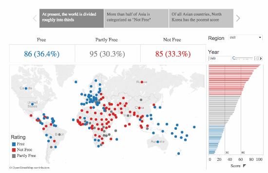
The gif here builds in three different stages. It starts by showing the zone in Europe which contains only “free countries.” Building out, it adds on a larger region where there are a few less- or totally not-free countries. Finally, showing the global map, continuing to lower the ratio of Free to Not-Free countries.
While these numbers might not stick out to the ordinary informed citizen as surprising, when put into a sequence that shows the contrast, and presents the reality in a straightforward visual manner, it shows just how startling the reality of the story can be.
Whatever data it is that you’re presenting, you have the ability to make it interesting. It’s a matter of discovering the conflict that’s within the numbers—taking the time in your analysis to decide not just what the conclusions are, but also the implications of the conflict for your audience.
How To Build Compelling Stories From Your Data Sets的更多相关文章
- 【Unity3D】生成工程报错解决—UnityEditor.HostView:OnGUI() Error building Player: Couldn't build player because of unsupported data on target platform.
错误 错误1:An asset is marked as dont save, but is included in the build: unityEditor.HostView:OnGUI() 错 ...
- Working with large data sets in MySQL
What does working with large data sets in mySQL teach you ? Of course you have to learn a lot about ...
- Result window is too large, from + size must be less than or equal to: [10000] but was [78440]. See the scroll api for a more efficient way to request large data sets
{"error":{"root_cause":[{"type":"query_phase_execution_exception& ...
- Interviews3D: APlatform for Interactive Handing of Massive Data Sets 读后感
横向比较: Inadequacy of current system design( 现代系统和一些软件的不足) 软件特点: Output sensitivity Out-of core data h ...
- machine learning data sets
http://archive.ics.uci.edu/ml/datasets.html 例如 3 分类 鸢尾花 数据集: http://archive.ics.uci.edu/ml/datasets/ ...
- 最大信息系数(MIC)——Detecting Novel Associations in Large Data Sets
本文介绍了一种发现两个随机变量之间依赖关系强度的度量MIC(最大信息系数,类似于相关系数的作用).MIC具有以下性质和优势: MIC度量具有普适性.其不仅可以发现变量间的线性函数关系,还能发现非线性函 ...
- My journey introducing the data build tool (dbt) in project’s analytical stacks
转自:https://www.lantrns.co/my-journey-introducing-the-data-build-tool-dbt-in-projects-analytical-stac ...
- 【转】The most comprehensive Data Science learning plan for 2017
I joined Analytics Vidhya as an intern last summer. I had no clue what was in store for me. I had be ...
- 深数据 - Deep Data
暂无中文方面的信息,E文的也非常少,原文连接: A lot of great pieces have been written about the relatively recent surge in ...
随机推荐
- Codeforces Beta Round #14 (Div. 2) D. Two Paths 树的直径
题目链接: http://codeforces.com/contest/14/problem/D D. Two Paths time limit per test2 secondsmemory lim ...
- 第七次java作业
interface Pet{public String getName();public String getColor();public int getAge();}class Cat imple ...
- Privoxy
Privoxy 前沿: 这个玩意我以前都没听说过,今天在别人的帮助下试了试,只想说:谁还能阻挡我,我就是要USA....ps:在此感谢每一个帮助我的人 介绍: Privoxy是一款带过滤功能的代理服务 ...
- 实现全站 HTTPS ,为什么国内网站总是那么slow&&low呀!
1 https://konklone.com/post/switch-to-https-now-for-free# https://theintercept.com/2014/11/20/non-pr ...
- jenkins 配置git 学习
由于Jenkins没有默认安装Git插件,需要Git库同步时候,需要手动选择安装git插件 在“系统管理”->“管理插件”中找到,“可选插件”选项卡.“过滤“(一个名为过滤的搜素窗口)中可以用键 ...
- 【前端学习笔记】利用iframe实现表单的无刷新提交案例
<!DOCTYPE html> <html lang="en"> <head> <meta charset="UTF-8&quo ...
- apache server-status配置
引言 自己配置LAMP服务器时(xwamp),获取状态信息出现错误: You don't have permission to access /server-status on this server ...
- JavaScript常用方法(工具类的封装)
日期格式化 function formatDateTime(timeStamp) { var date = new Date(); date.setTime(timeStamp); var y = d ...
- BZOJ 2299 向量(裴蜀定理)
题意:给你一对数a,b,你可以任意使用(a,b), (a,-b), (-a,b), (-a,-b), (b,a), (b,-a), (-b,a), (-b,-a)这些向量,问你能不能拼出另一个向量(x ...
- 跟我学Spring Cloud(Finchley版)-17-Zuul路由配置详解
但在实际项目中,往往需要自己定义路由规则,Zuul的路由配置非常灵活.简单,本节详细讲解Zuul的路由配置. 一.自定义指定微服务的访问路径 配置zuul.routes.指定微服务的serviceId ...