python写入excel(xlswriter)--生成图表
一、折线图:
# -*- coding:utf-8 -*-

import xlsxwriter

# 创建一个excel

workbook = xlsxwriter.Workbook("chart_line.xlsx")

# 创建一个sheet

worksheet = workbook.add_worksheet()

# worksheet = workbook.add_worksheet("bug_analysis")

# 自定义样式,加粗

bold = workbook.add_format({'bold': 1})

# --------1、准备数据并写入excel---------------

# 向excel中写入数据,建立图标时要用到

headings = ['Number', 'testA', 'testB']

data = [

    ['2017-9-1', '2017-9-2', '2017-9-3', '2017-9-4', '2017-9-5', '2017-9-6'],

    [10, 40, 50, 20, 10, 50],

    [30, 60, 70, 50, 40, 30],

]

# 写入表头

worksheet.write_row('A1', headings, bold)

# 写入数据

worksheet.write_column('A2', data[0])

worksheet.write_column('B2', data[1])

worksheet.write_column('C2', data[2])

# --------2、生成图表并插入到excel---------------

# 创建一个柱状图(line chart)

chart_col = workbook.add_chart({'type': 'line'})

# 配置第一个系列数据

chart_col.add_series({

    # 这里的sheet1是默认的值,因为我们在新建sheet时没有指定sheet名

    # 如果我们新建sheet时设置了sheet名,这里就要设置成相应的值

    'name': '=Sheet1!$B$1',

    'categories': '=Sheet1!$A$2:$A$7',

    'values':   '=Sheet1!$B$2:$B$7',

    'line': {'color': 'red'},

})

# 配置第二个系列数据

chart_col.add_series({

    'name': '=Sheet1!$C$1',

    'categories':  '=Sheet1!$A$2:$A$7',

    'values':   '=Sheet1!$C$2:$C$7',

    'line': {'color': 'yellow'},

})

# 配置第二个系列数据(用了另一种语法)

# chart_col.add_series({

#     'name': ['Sheet1', 0, 2],

#     'categories': ['Sheet1', 1, 0, 6, 0],

#     'values': ['Sheet1', 1, 2, 6, 2],

#     'line': {'color': 'yellow'},

# })

# 设置图表的title 和 x,y轴信息

chart_col.set_title({'name': 'The xxx site Bug Analysis'})

chart_col.set_x_axis({'name': 'Test number'})

chart_col.set_y_axis({'name':  'Sample length (mm)'})

# 设置图表的风格

chart_col.set_style(1)

# 把图表插入到worksheet并设置偏移

worksheet.insert_chart('A10', chart_col, {'x_offset': 25, 'y_offset': 10})

workbook.close()
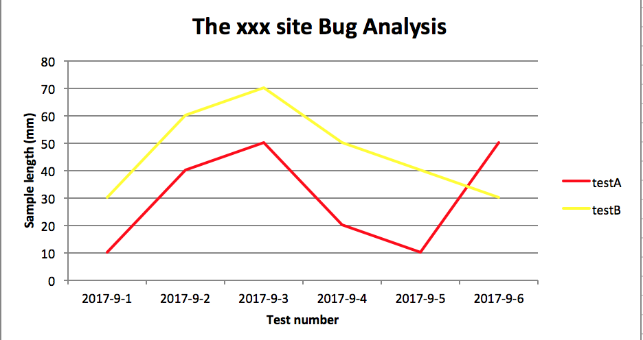
效果图:
二、柱状图:
# -*- coding:utf-8 -*-

import xlsxwriter

# 创建一个excel

workbook = xlsxwriter.Workbook("chart_column.xlsx")

# 创建一个sheet

worksheet = workbook.add_worksheet()

# worksheet = workbook.add_worksheet("bug_analysis")

# 自定义样式,加粗

bold = workbook.add_format({'bold': 1})

# --------1、准备数据并写入excel---------------

# 向excel中写入数据,建立图标时要用到

headings = ['Number', 'testA', 'testB']

data = [

    ['2017-9-1', '2017-9-2', '2017-9-3', '2017-9-4', '2017-9-5', '2017-9-6'],

    [10, 40, 50, 20, 10, 50],

    [30, 60, 70, 50, 40, 30],

]

# 写入表头

worksheet.write_row('A1', headings, bold)

# 写入数据

worksheet.write_column('A2', data[0])

worksheet.write_column('B2', data[1])

worksheet.write_column('C2', data[2])

# --------2、生成图表并插入到excel---------------

# 创建一个柱状图(column chart)

chart_col = workbook.add_chart({'type': 'column'})

# 配置第一个系列数据

chart_col.add_series({

    # 这里的sheet1是默认的值,因为我们在新建sheet时没有指定sheet名

    # 如果我们新建sheet时设置了sheet名,这里就要设置成相应的值

    'name': '=Sheet1!$B$1',

    'categories': '=Sheet1!$A$2:$A$7',

    'values':   '=Sheet1!$B$2:$B$7',

    'line': {'color': 'red'},

})

# 配置第二个系列数据(用了另一种语法)

chart_col.add_series({

    'name': '=Sheet1!$C$1',

    'categories':  '=Sheet1!$A$2:$A$7',

    'values':   '=Sheet1!$C$2:$C$7',

    'line': {'color': 'yellow'},

})

# 配置第二个系列数据(用了另一种语法)

# chart_col.add_series({

#     'name': ['Sheet1', 0, 2],

#     'categories': ['Sheet1', 1, 0, 6, 0],

#     'values': ['Sheet1', 1, 2, 6, 2],

#     'line': {'color': 'yellow'},

# })

# 设置图表的title 和 x,y轴信息

chart_col.set_title({'name': 'The xxx site Bug Analysis'})

chart_col.set_x_axis({'name': 'Test number'})

chart_col.set_y_axis({'name':  'Sample length (mm)'})

# 设置图表的风格

chart_col.set_style(1)

# 把图表插入到worksheet以及偏移

worksheet.insert_chart('A10', chart_col, {'x_offset': 25, 'y_offset': 10})

workbook.close()
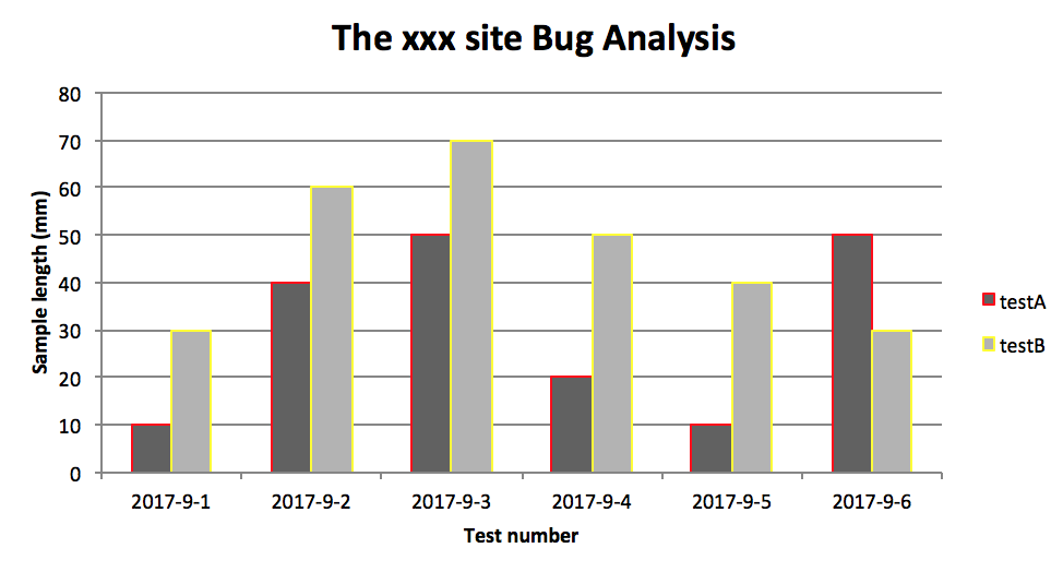
效果图:
PS:
其实前面两个图只变动一点:把 line 个性为 column
chart_col = workbook.add_chart({'type': 'column'})
三、饼图:
# -*- coding:utf-8 -*-

import xlsxwriter

# 创建一个excel

workbook = xlsxwriter.Workbook("chart_pie.xlsx")

# 创建一个sheet

worksheet = workbook.add_worksheet()

# 自定义样式,加粗

bold = workbook.add_format({'bold': 1})

# --------1、准备数据并写入excel---------------

# 向excel中写入数据,建立图标时要用到

data = [

    ['closed', 'active', 'reopen', 'NT'],

    [1012, 109, 123, 131],

]

# 写入数据

worksheet.write_row('A1', data[0], bold)

worksheet.write_row('A2', data[1])

# --------2、生成图表并插入到excel---------------

# 创建一个柱状图(pie chart)

chart_col = workbook.add_chart({'type': 'pie'})

# 配置第一个系列数据

chart_col.add_series({

    'name': 'Bug Analysis',

    'categories': '=Sheet1!$A$1:$D$1',

    'values': '=Sheet1!$A$2:$D$2',

    'points': [

        {'fill': {'color': '#00CD00'}},

        {'fill': {'color': 'red'}},

        {'fill': {'color': 'yellow'}},

        {'fill': {'color': 'gray'}},

    ],

})

# 设置图表的title 和 x,y轴信息

chart_col.set_title({'name': 'Bug Analysis'})

# 设置图表的风格

chart_col.set_style(10)

# 把图表插入到worksheet以及偏移

worksheet.insert_chart('B10', chart_col, {'x_offset': 25, 'y_offset': 10})

workbook.close()
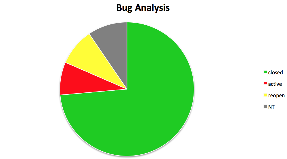
效果图:
参考资料:
http://xlsxwriter.readthedocs.io/chart_examples.html
http://xlsxwriter.readthedocs.io/chart.html
python写入excel(xlswriter)--生成图表的更多相关文章
- python 写入Excel
一.安装xlrd模块: 1.mac下打开终端输入命令: pip install XlsxWriter 2.验证安装是否成功: 在mac终端输入 python 进入python环境 然后输入 imp ...
- 【python】使用plotly生成图表数据
安装 在 ubuntu 环境下,安装 plotly 很简单 python 版本2.7+ pip install plotly 绘图 在 plotly 网站注册后,可以直接将生成的图片保存到网站上,便于 ...
- python写入Excel
一.dataframe存入Excel中: 注意:openpyxl打开的文件需是xlsx的后缀,因为比较新的. from openpyxl import load_workbook import pan ...
- python读取excel表格生成sql语句 第一版
由于单位设计数据库表·,都用sql.不知道什么原因不用 powerdesign或者ermaster工具,建表很痛苦 作为程序猿当然要想办法解决,用Python写一个程序解决 需要用到 xlrd li ...
- python 写入excel数据而不改变excel原有样式
目标:python写数据到excel,不改变原有样式 解决:在打开excel时,加入该参数formatting_info=True
- python写入excel(方式1)
import xlsxwriter li=["张三","李四","王五","周六","王琪",&qu ...
- python写入excel(方式二待完善)
import xlsxwriter #创建一个工作簿并添加一张工作表,当然工作表是可以命名的# workbook = xlsxwriter.Workbook('Expenses01.xlsx')# w ...
- Python 写入excel时的字体格式设置
转自:https://blog.csdn.net/kuangzhi9124/article/details/81940919 下面代码设置了单元格的字体.位置居中.框线,可以将格式调成自己需要的 im ...
- Python操作excel,及图表展示
学习:http://www.cnblogs.com/Lands-ljk/p/5444619.html
随机推荐
- 01. Numpy模块
1.科学计算工具-Numpy基础数据结构 1.1.数组ndarray的属性 NumPy数组是一个多维数组对象,称为ndarray.其由两部分组成:① 实际的数据② 描述这些数据的元数据 注意数组格式, ...
- 042 spring boot在启动之后,自动关闭
在学校数据源的时候,还没有开始使用数据源,项目就关闭了. 为了学习数据源,就只能使用测试类. 但是,最近需要使用restful进行测试的时候,项目是关闭的,就很糟糕,不好进行测试. 1.日志如下: D ...
- 054 kafka内部机制
一:数据格式与数据存储 1.总结 存储在磁盘文件中(index+log) 顺序读写的 基于offset偏移量来管理数据的(主要是读操作) 由分区器根据key值决定数据分布到哪个分区,默认使用hash ...
- 深入理解Python中赋值、深拷贝(deepcopy)、浅拷贝(copy)
赋值 python跟java中的变量本质是不一样的,Python的变量实质上是一个指针(int型或str型),而java的变量是一个可操作的存储空间. a = 123b = a print(id(a) ...
- MongDB-高级
No1: 聚合 聚合(aggregate)主要用于计算数据,类似sql中的sum().avg() ---语法 db.集合名称.aggregate([{管道:{表达式}}]) No2: 管道 管道在Un ...
- 关于pycharm中安装第三方库时报错的解决办法(一)
记录自己的生活! 一.事发背景 在pycharm中直接安装第三方库时因为版本问题总是无法安装成功,事情不大,但是很重要. 二.经过 最开始我自己电脑上安装了Python3.6和Python2. ...
- PostgreSQL 在Ubuntu下如何修改postgres默认密码
Step1: 切换用户为postgres sudo su postgres Step2: 用postgres连接postgreSQL psql -U postgres Step3: 修改postgre ...
- VBA中FIND方法的使用说明zz
Find 方法在区域中查找特定信息. 语法 表达式.Find(What, After, LookIn, LookAt, SearchOrder, SearchDirection, MatchCase, ...
- BZOJ.5339.[TJOI2018]教科书般的亵渎(拉格朗日插值) & 拉格朗日插值学习笔记
BZOJ 洛谷 题意的一点说明: \(k\)次方这个\(k\)是固定的,也就是最初需要多少张亵渎,每次不会改变: 因某个怪物死亡引发的亵渎不会计分. 不难发现当前所需的张数是空格数+1,即\(m+1\ ...
- Java并发编程(一)-- 多线程的基本概念
多线程发展进程 在过去单CPU时代,单任务在一个时间点只能执行单一程序:发展到多任务阶段,计算机能在同一时间点并行执行多任务或多进程--虽然并不是真正意义上的“同一时间点”,而是多个任务或进程共享一个 ...