无需图片,使用CSS3实现圆角按钮[转]
原文地址:http://www.open-open.com/home/space-37924-do-blog-id-5789.html
首先来看看效果:
事例HTML代码:
<a href="#" class="button green">button</a>

<a href="#" class="button blue">button</a>

<a href="#" class="button gray">button</a>
如果没有 CSS ,那么上面的 HTML 执行起来是这样的:

开始 CSS3 的编写:
.button {

    display: inline-block;

    position: relative;

    margin: 10px;

    padding: 0 20px;

    text-align: center;

    text-decoration: none;

    font: bold 12px/25px Arial, sans-serif;

}
一些不同颜色的按钮样式:
.green {

    color: #3e5706;

    background: #a5cd4e;

}

/* Blue Color */

.blue {

    color: #19667d;

    background: #70c9e3;

}

/* Gray Color */

.gray {

    color: #515151;

    background: #d3d3d3;

}
接下来开始用 CSS 处理圆角:
.button {

    display: inline-block;

    position: relative;

    margin: 10px;

    padding: 0 20px;

    text-align: center;

    text-decoration: none;

    font: bold 12px/25px Arial, sans-serif;

    text-shadow: 1px 1px 1px rgba(255,255,255, .22);

    -webkit-border-radius: 30px;

    -moz-border-radius: 30px;

    border-radius: 30px;

    -webkit-box-shadow: 1px 1px 1px rgba(0,0,0, .29), inset 1px 1px 1px rgba(255,255,255, .44);

    -moz-box-shadow: 1px 1px 1px rgba(0,0,0, .29), inset 1px 1px 1px rgba(255,255,255, .44);

    box-shadow: 1px 1px 1px rgba(0,0,0, .29), inset 1px 1px 1px rgba(255,255,255, .44);

    -webkit-transition: all 0.15s ease;

    -moz-transition: all 0.15s ease;

    -o-transition: all 0.15s ease;

    -ms-transition: all 0.15s ease;

    transition: all 0.15s ease;

}
现在的按钮圆润多了,看看:

还不够啊,没有立体效果,再完善完善:
/* Green Color */

.green {

    color: #3e5706;

    background: #a5cd4e; /* Old browsers */

    background: -moz-linear-gradient(top,  #a5cd4e 0%, #6b8f1a 100%); /* FF3.6+ */

    background: -webkit-gradient(linear, left top, left bottom, color-stop(0%,#a5cd4e), color-stop(100%,#6b8f1a)); /* Chrome,Safari4+ */

    background: -webkit-linear-gradient(top,  #a5cd4e 0%,#6b8f1a 100%); /* Chrome10+,Safari5.1+ */

    background: -o-linear-gradient(top,  #a5cd4e 0%,#6b8f1a 100%); /* Opera 11.10+ */

    background: -ms-linear-gradient(top,  #a5cd4e 0%,#6b8f1a 100%); /* IE10+ */

    background: linear-gradient(top,  #a5cd4e 0%,#6b8f1a 100%); /* W3C */

}

/* Blue Color */

.blue {

    color: #19667d;

    background: #70c9e3; /* Old browsers */

    background: -moz-linear-gradient(top,  #70c9e3 0%, #39a0be 100%); /* FF3.6+ */

    background: -webkit-gradient(linear, left top, left bottom, color-stop(0%,#70c9e3), color-stop(100%,#39a0be)); /* Chrome,Safari4+ */

    background: -webkit-linear-gradient(top,  #70c9e3 0%,#39a0be 100%); /* Chrome10+,Safari5.1+ */

    background: -o-linear-gradient(top,  #70c9e3 0%,#39a0be 100%); /* Opera 11.10+ */

    background: -ms-linear-gradient(top,  #70c9e3 0%,#39a0be 100%); /* IE10+ */

    background: linear-gradient(top,  #70c9e3 0%,#39a0be 100%); /* W3C */

}

/* Gray Color */

.gray {

    color: #515151;

    background: #d3d3d3; /* Old browsers */

    background: -moz-linear-gradient(top,  #d3d3d3 0%, #8a8a8a 100%); /* FF3.6+ */

    background: -webkit-gradient(linear, left top, left bottom, color-stop(0%,#d3d3d3), color-stop(100%,#8a8a8a)); /* Chrome,Safari4+ */

    background: -webkit-linear-gradient(top,  #d3d3d3 0%,#8a8a8a 100%); /* Chrome10+,Safari5.1+ */

    background: -o-linear-gradient(top,  #d3d3d3 0%,#8a8a8a 100%); /* Opera 11.10+ */

    background: -ms-linear-gradient(top,  #d3d3d3 0%,#8a8a8a 100%); /* IE10+ */

    background: linear-gradient(top,  #d3d3d3 0%,#8a8a8a 100%); /* W3C */

}
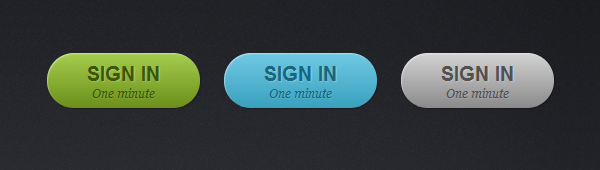
现在爽了,漂亮了,你喜欢这样的按钮吗?

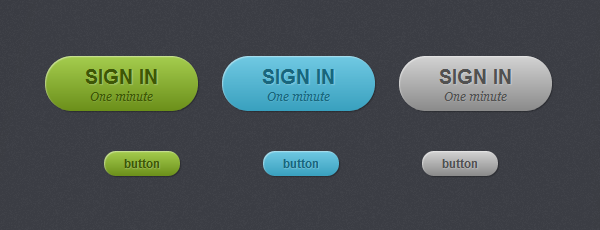
为了让按钮更大一点,我们增加了个 big 样式:
<a href="#" class="button big green">sign in <span>One minute</span></a>

<a href="#" class="button big blue">sign in <span>One minute</span></a>

<a href="#" class="button big gray">sign in <span>One minute</span></a>
/* Big Button Style */

.big {

    padding: 0 40px;

    padding-top: 10px;

    height: 45px;

    text-transform: uppercase;

    font: bold 20px/22px Arial, sans-serif;

}

.big span {

    display: block;

    text-transform: none;

    font: italic normal 12px/18px Georgia, sans-serif;

    text-shadow: 1px 1px 1px rgba(255,255,255, .12);

}
大按钮的效果:
我们还需要处理下当鼠标移到按钮上方时显示不同的效果:
.button:hover {

    -webkit-box-shadow: 1px 1px 1px rgba(0,0,0,.29), inset 0px 0px 2px rgba(0,0,0, .5);

    -moz-box-shadow: 1px 1px 1px rgba(0,0,0,.29), inset 0px 0px 2px rgba(0,0,0, .5);

    box-shadow: 1px 1px 1px rgba(0,0,0,.29), inset 0px 0px 2px rgba(0,0,0, .5);

}

.button:active {

    -webkit-box-shadow: inset 0px 0px 3px rgba(0,0,0, .8);

    -moz-box-shadow: inset 0px 0px 3px rgba(0,0,0, .8);

    box-shadow: inset 0px 0px 3px rgba(0,0,0, .8);

}
效果如下:

好了,完美的CSS3按钮解决方案。
无需图片,使用CSS3实现圆角按钮[转]的更多相关文章
- 【转载】无需图片,使用CSS3实现圆角按钮
原文地址:http://www.open-open.com/home/space-37924-do-blog-id-5789.html 首先来看看效果: 事例HTML代码: <a href=&q ...
- 使用HTML5+CSS3制作圆角内发光按钮----示例
<!doctype html> <html> <head> <meta charset="utf-8" /> <title&g ...
- 超简单CSS3实现圆角、阴影、透明效果
CSS实现圆角,阴影,透明的方法很多,传统的方法都比较复杂,用CSS3就方便很多了,虽然现在各浏览器对CSS3的支持还不是很好,但不久的将来CSS3就会普及. 1.圆角 CSS3实现圆角有两种方法. ...
- android 圆角按钮和按钮颜色
1. android 设置圆角按钮后,按下按钮后,还能改变按钮的颜色 <?xml version="1.0" encoding="UTF-8"?> ...
- 9款精美别致的CSS3菜单和按钮
1.超具立体感的CSS3 3D菜单 菜单项带小图标 记得之前向大家分享过不少CSS3 3D菜单,比如CSS3 3D动画菜单 3D立方体菜单项和HTML5/CSS3自定义下拉框 3D卡片折叠动画,效果都 ...
- win10 uwp 圆角按钮
本文讲的是如何做圆角按钮,我们在UWP本来的按钮都是矩形,圆角Radius没有,所以本文就用简单方法去做圆角按钮. 我们按钮需要圆角,而自带没有,其实做一个很简单,把原来的按钮变为背景透明,然后使用矩 ...
- DDGScreenShot--iOS 图片裁剪,切圆角,加边框,你还用cornerRadius,还有更高级的用法
写在前面 我们肯定做过这样的需求,给一个图片切圆角, 当然我们大多采用简单粗暴的方法 myIcon.layer.cornerRadius = 16.5 myIcon.layer.masksToBoun ...
- 一款基于css3的动画按钮
之前为大家分享了 推荐10款纯css3实现的实用按钮.今天给大家带来一款基于css3的动画按钮.实现的效果图如下: 在线预览 源码下载 实现的代码. html代码: <div class=& ...
- [CSS3] 动画暗角按钮
<!DOCTYPE html> <html lang="en"> <head> <meta charset="UTF-8&quo ...
随机推荐
- 详解WPF Blend工具中的复合路径功能 ( 含路径标记语法 )
写此文章的目的是为了简单分析一下 Blend工具中提供的"复合路径"功能.有人在我的博文中留言问我复合路径的问题. 稍微琢磨一下,觉得应该是对的.因此贴出来和大家分享.有不对的说 ...
- yum 安装 php5.6 和 mysql5.6
安装 PHP rpm -Uvh http://ftp.iij.ad.jp/pub/linux/fedora/epel/6/i386/epel-release-6-8.noarch.rpm; rpm - ...
- 代理(Proxy)模式简介
Proxy 模式简介 代理模式的两个应用: 打开文档时加载大图片 例如:如果有个对象是一张很大的图片,而这张图片需要花费很长时间才能显示出来,那么当这个图片包含在文档中的后面时,使用编辑器或浏览器打开 ...
- Working with Sprites
[Working with Sprites] 1.An SKSpriteNode object can be drawn either as a rectangle with a texture ma ...
- java之四大皆空
SE中的所有空的情况: 第一空:定义变量,变量没有值不能使用,不能打印 public class DiDaJieKong01 { public static void main(String[] ar ...
- 红米手机拍照效果测评(对比小米2A)
小米相关的产品一向都很很受用户的欢迎,一个就是实惠,另一个就是配置还不错.近期小米推出的红米手机可谓是先声夺人,关注度异常火爆.今天刚抢的红米快递寄到了,来测试下红米手机的拍照表现,800万像素怎么样 ...
- Codeforces Round #365 (Div. 2) D. Mishka and Interesting sum (离线树状数组+前缀xor)
题目链接:http://codeforces.com/contest/703/problem/D 给你n个数,m次查询,每次查询问你l到r之间出现偶数次的数字xor和是多少. 我们可以先预处理前缀和X ...
- C#与C++对应的类型
//c++:HANDLE(void *) ---- c#:System.IntPtr //c++:Byte(unsigned char) ---- c ...
- Tomcat设置自己的项目为默认项目(用IP访问的是自己的项目)
方法一:将项目拷贝到webapps下,并更名为ROOT; 方法二:在tomcat/conf/service.xml的<host></host>中配置 <Context p ...
- 3DSlicer源代码编译过程vs2008+windows xp [转]
一 下载QT源代码编译 1. 简述 在 Windows2000/xp/vista 下,安装 VS2008, QT 4.7.2 :并在 VS2008上建立 QT 的集成开发环境,利用 VS2008 ...