关于H5页面在iPhoneX适配(转)
1. iPhoneX的介绍
屏幕尺寸
我们熟知的iPhone系列开发尺寸概要如下:
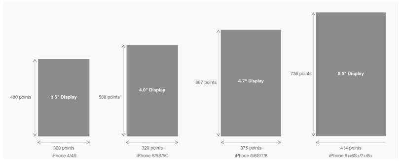
△ iPhone各机型的开发尺寸
转化成我们熟知的像素尺寸:

△ 每个机型的多维度尺寸
倍图其实就是像素尺寸和开发尺寸的倍率关系,但这只是外在的表现。倍图核心的影响因素在于PPI(DPI),了解屏幕密度与各尺寸的关系有助于我们深度理解倍率的概念:《基础知识学起来!为设计师量身打造的DPI指南》
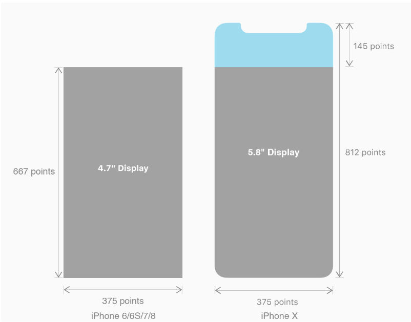
iPhone8在本次升级中,屏幕尺寸和分辨率都遗传了iPhone6以后的优良传统;
然而iPhone X 无论是在屏幕尺寸、分辨率、甚至是形状上都发生了较大的改变,下面以iPhone 8作为参照物,看看到底iPhone X的适配我们要怎么考虑。
我们看看iPhone X尺寸上的变化:
2. iPhoneX的适配---安全区域(safe area)
苹果对于 iPhone X 的设计布局意见如下:
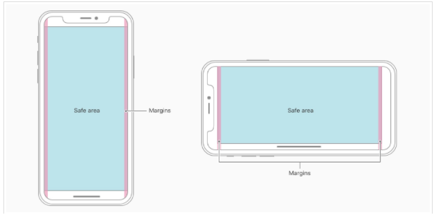
核心内容应该处于 Safe area 确保不会被设备圆角(corners),传感器外壳(sensor housing,齐刘海) 以及底部的 Home Indicator 遮挡。也就是说 我们设计显示的内容应该尽可能的在安全区域内;
3. iPhoneX的适配---适配方案viewport-fit
3.1 PhoneX的适配,在iOS 11中采用了viewport-fit的meta标签作为适配方案;viewport-fit的默认值是auto。
viewport-fit取值如下:
| auto | 默认:viewprot-fit:contain;页面内容显示在safe area内 |
| cover | viewport-fit:cover,页面内容充满屏幕 |
viewport-fit meta标签设置(cover时)
<meta name="viewport" content="width=device-width,initial-scale=1.0, minimum-scale=1.0, maximum-scale=1.0, user-scalable=no, viewport-fit=cover">
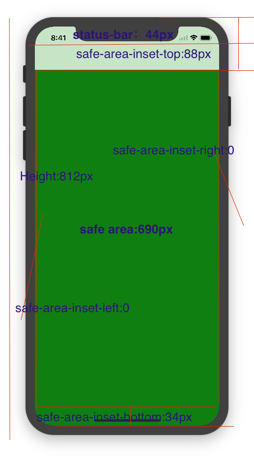
3.2 css constant()函数 与safe-area-inset-top & safe-area-inset-left & safe-area-inset-right & safe-area-inset-bottom的介绍
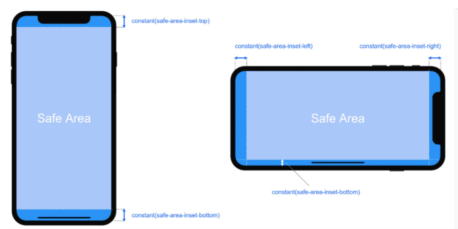
如上图所示 在iOS 11中的WebKit包含了一个新的CSS函数constant(),以及一组四个预定义的常量:safe-area-inset-left, safe-area-inset-right, safe-area-inset-top和 safe-area-inset-bottom。当合并一起使用时,允许样式引用每个方面的安全区域的大小。
3.1当我们设置viewport-fit:contain,也就是默认的时候时;设置safe-area-inset-left, safe-area-inset-right, safe-area-inset-top和 safe-area-inset-bottom等参数时不起作用的。
3.2当我们设置viewport-fit:cover时:设置如下

body {

    padding-top: constant(safe-area-inset-top);   //为导航栏+状态栏的高度 88px

    padding-left: constant(safe-area-inset-left);   //如果未竖屏时为0

    padding-right: constant(safe-area-inset-right); //如果未竖屏时为0

    padding-bottom: constant(safe-area-inset-bottom);//为底下圆弧的高度 34px

}
4. iPhoneX的适配---高度统计
viewport-fit:cover + 导航栏
5.iPhoneX的适配---媒体查询
注意这里采用的是690px(safe area高度),不是812px;
|
1
2
3
4
5
|
@media only screen and (width: 375px) and (height: 690px){ body { background: blue; }} |
6.iphoneX viewport-fit 问题总结
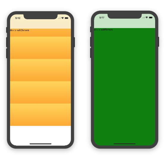
1.关于iphoneX 页面使用了渐变色时;如果viewport-fit:cover;
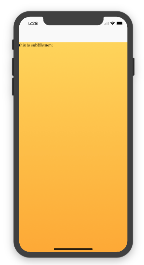
1.1在设置了背景色单色和渐变色的区别,如果是单色时会填充整个屏幕,如果设置了渐变色 那么只会更加子元素的高度去渲染;而且页面的高度只有690px高度,上面使用了padding-top:88px;
body固定为:
|
1
|
<body><div class="content">this is subElement</div></body> |
1.单色时:
       * {

           padding: 0;

           margin: 0;

       }

       body {

           background:green;

           padding-top: constant(safe-area-inset-top); //88px

           /*padding-left: constant(safe-area-inset-left);*/

           /*padding-right: constant(safe-area-inset-right);*/

           /*padding-bottom: constant(safe-area-inset-bottom);*/

       }
2.渐变色
       * {

           padding: 0;

           margin: 0;

       }

       body {

           background:-webkit-gradient(linear, 0 0, 0 bottom, from(#ffd54f), to(#ffaa22));

           padding-top: constant(safe-area-inset-top); //88px

           /*padding-left: constant(safe-area-inset-left);*/

           /*padding-right: constant(safe-area-inset-right);*/

           /*padding-bottom: constant(safe-area-inset-bottom);*/

       }
解决使用渐变色 仍旧填充整个屏幕的方法;CSS设置如下
<!DOCTYPE html>

<html>

<head>

   <meta name="viewport" content="initial-scale=1, viewport-fit=cover">

   <title>Designing Websites for iPhone X: Respecting the safe areas</title>

   <style>        * {

       padding: 0;

       margin: 0;

   }

   html, body {

       height: 100%;

   }

   body {

       padding-top: constant(safe-area-inset-top);

       padding-left: constant(safe-area-inset-left);

       padding-right: constant(safe-area-inset-right);

       padding-bottom: constant(safe-area-inset-bottom);

   }

   .content {

       background: -webkit-gradient(linear, 0 0, 0 bottom, from(#ffd54f), to(#ffaa22));

       width: 100%;

       height: 724px;

   }    </style>

</head>

<body>

<div class="content">this is subElement</div>

</body>

</html>
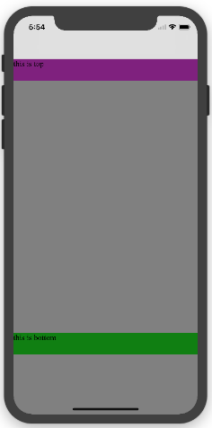
2.页面元素使用了固定定位的适配即:{position:fixed;}
2.1 子元素页面固定在底部时;使用viewport-fit:contain时;可以看到bottom:0时只会显示在安全区域内;

<!DOCTYPE html>

<html>

<head>

   <meta name="viewport" content="initial-scale=1">

   <!--<meta name="viewport" content="initial-scale=1, viewport-fit=cover">-->

   <title>Designing Websites for iPhone X: Respecting the safe areas</title>

   <style>

       * {

           padding: 0;

           margin: 0;

       }

       /*html,body {*/

           /*height: 100%;*/

       /*}*/

       body {

           background: grey;

           /*padding-top: constant(safe-area-inset-top);*/

           /*padding-left: constant(safe-area-inset-left);*/

           /*padding-right: constant(safe-area-inset-right);*/

           /*padding-bottom: constant(safe-area-inset-bottom);*/

       }

       .top {

           width: 100%;

           height: 44px;

           background: purple;

       }

       .bottom {

           position: fixed;

           bottom: 0;

           left: 0;

           right: 0;

           height: 44px;

           color: black;

           background: green;

       }

   </style>

</head>

<body>

   <div class="top">this is top</div>

   <div class="bottom">this is bottom</div>

</body>

</html>
2.1 子元素页面固定在底部时;使用viewport-fit:cover时;可以看到bottom:0时只会显示在安全区域内;
|
1
2
3
4
5
6
7
8
9
10
11
12
13
14
15
16
17
18
19
20
21
22
23
24
25
26
27
28
|
* { padding: 0; margin: 0;}/*html,body {*/ /*height: 100%;*//*}*/body { background: grey; padding-top: constant(safe-area-inset-top); /*padding-left: constant(safe-area-inset-left);*/ /*padding-right: constant(safe-area-inset-right);*/ /*padding-bottom: constant(safe-area-inset-bottom);*/}.top { width: 100%; height: 44px; background: purple;}.bottom { position: fixed; bottom: 0; left: 0; right: 0; height: 44px; color: black; background: green;} |
添加html,body {width:100%;heigth:100%}
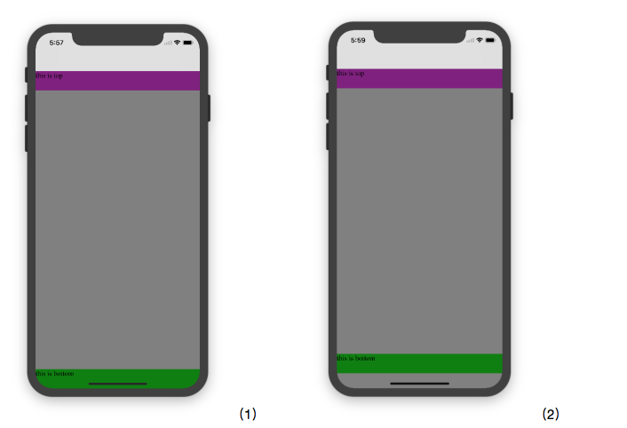
图1:
 * {

           padding: 0;

           margin: 0;

       }

       html,body {

           height: 100%;

       }

       body {

           background: grey;

           padding-top: constant(safe-area-inset-top);

           padding-left: constant(safe-area-inset-left);

           padding-right: constant(safe-area-inset-right);

           padding-bottom: constant(safe-area-inset-bottom);

       }

       .top {

           width: 100%;

           height: 44px;

           background: purple;

       }

       .bottom {

           position: fixed;

           bottom: 0;

           left: 0;

           right: 0;

           height: 44px;

           color: black;

           background: green;

       }
图2:
       * {

           padding: 0;

           margin: 0;

       }

       html,body {

           height: 100%;

       }

       body {

           background: grey;

           padding-top: constant(safe-area-inset-top);

           padding-left: constant(safe-area-inset-left);

           padding-right: constant(safe-area-inset-right);

           /*padding-bottom: constant(safe-area-inset-bottom);*/

       }

       .top {

           width: 100%;

           height: 44px;

           background: purple;

       }

       .bottom {

           position: fixed;

           bottom: 0;

           left: 0;

           right: 0;

           height: 44px;

           color: black;

           background: green;

       }
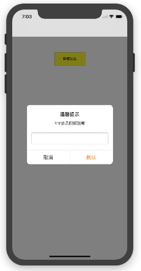
2.3 关于alertView弹框 遮罩层的解决方案
<!DOCTYPE html>

<html lang="en">

<head>

   <meta charset="UTF-8">

   <!--<meta name="viewport" content="width=device-width, initial-scale=1.0, minimum-scale=1.0, maximum-scale=1.0, user-scalable=no">-->

   <meta name="viewport" content="width=device-width,initial-scale=1.0, minimum-scale=1.0, maximum-scale=1.0, user-scalable=no, viewport-fit=cover">

   <meta http-equiv="pragma" content="no-cache">

   <meta http-equiv="cache-control" content="no-cache">

   <meta http-equiv="expires" content="0">

   <title>alertView</title>

   <script data-res="eebbk">

       document.documentElement.style.fontSize = window.screen.width / 7.5 + 'px';

   </script>

   <style>

       * {

           margin: 0;

           padding: 0;

       }

       html,body {

           width: 100%;

           height: 100%;

       }

       body {

           font-size: 0.32rem;

           padding-top: constant(safe-area-inset-top);

           padding-left: constant(safe-area-inset-left);

           padding-right: constant(safe-area-inset-right);

           padding-bottom: constant(safe-area-inset-bottom);

       }

       .content {

           text-align: center;

       }

       .testBut {

           margin: 50px auto;

           width: 100px;

           height: 44px;

           border: 1px solid darkgray;

           outline:none;

           user-select: none;

           background-color: yellow;

       }

   </style>

   <link href="alertView.css" rel="stylesheet" type="text/css">

</head>

<body>

   <section class="content">

       <button class="testBut" onclick="showLoading()">弹框加载</button>

   </section>

   <script type="text/javascript" src="alertView.js"></script>

   <script>

       function showLoading() {

           UIAlertView.show({

               type:"input",

               title:"温馨提示",              //标题

               content:"VIP会员即将到期",     //获取新的

               isKnow:false

           });

           var xx = new UIAlertView();

          console.log(xx);

       }

   </script>

</body>

</html>
@media only screen and (device-width: 375px) and (device-height: 812px) and

(-webkit-device-pixel-ratio: 3) {

    /*增加头部适配层*/

    .has-topbar {

        height: 100%;

        box-sizing: border-box;

        padding-top: 44px;

        &:before {

            content: '';

            position: fixed;

            top:;

            left:;

            width: 100%;

            height: 44px;

            background-color: #000000;

            z-index:;

        }

    }

    /*增加底部适配层*/

    .has-bottombar {

        height: 100%;

        box-sizing: border-box;

        padding-bottom: 34px;

        &:after {

            content: '';

            z-index:;

            position: fixed;

            left:;

            bottom:;

            width: 100%;

            height: 34px;

            background: #f7f7f8;

        }

    }

    /*导航操作栏上移*/

    .bottom-menu-fixed {

        bottom: 34px;

    }

}
关于H5页面在iPhoneX适配(转)的更多相关文章
- 关于H5页面在iPhoneX适配
1. iPhoneX的介绍 屏幕尺寸 我们熟知的iPhone系列开发尺寸概要如下: △ iPhone各机型的开发尺寸 转化成我们熟知的像素尺寸: △ 每个机型的多维度尺寸 倍图其实就是像素尺寸和开 ...
- 使用Flexible实现手淘H5页面的终端适配【转】
曾几何时为了兼容IE低版本浏览器而头痛,以为到Mobile时代可以跟这些麻烦说拜拜.可没想到到了移动时代,为了处理各终端的适配而乱了手脚.对于混迹各社区的偶,时常发现大家拿手机淘宝的H5页面做讨论—— ...
- 使用Flexible实现手淘H5页面的终端适配(转)
曾几何时为了兼容IE低版本浏览器而头痛,以为到Mobile时代可以跟这些麻烦说拜拜.可没想到到了移动时代,为了处理各终端的适配而乱了手脚.对于混迹各社区的偶,时常发现大家拿手机淘宝的H5页面做讨论—— ...
- (转)使用Flexible实现手淘H5页面的终端适配
原文链接 曾几何时为了兼容IE低版本浏览器而头痛,以为到Mobile时代可以跟这些麻烦说拜拜.可没想到到了移动时代,为了处理各终端的适配而乱了手脚.对于混迹各社区的偶,时常发现大家拿手机淘宝的H5页面 ...
- [转]使用Flexible实现手淘H5页面的终端适配
曾几何时为了兼容IE低版本浏览器而头痛,以为到Mobile时代可以跟这些麻烦说拜拜.可没想到到了移动时代,为了处理各终端的适配而乱了手脚.对于混迹各社区的偶,时常发现大家拿手机淘宝的H5页面做讨论—— ...
- vue移动端h5页面根据屏幕适配的四种方案
最近做了两个关于h5页面对接公众号的项目,不得不提打开微信浏览器内置地图导航的功能确实有点恶心.下次想起来了的话,进行总结分享一下如何处理.在vue移动端h5页面当中,其中适配是经常会遇到的问题,这块 ...
- ios下app内嵌h5页面是video适配问题
ios下做新闻详情用h5页面实现然后打包到app中,其中新闻详情页会有视频,安卓下video的poster可以做到适应video大小,但是ios下会按照poster图片大小将video等比撑大,但是视 ...
- 使用Flexible实现手淘H5页面的终端适配
拿到设计师给的设计图之后,剩下的事情是前端开发人员的事了.而手淘经过多年的摸索和实战,总结了一套移动端适配的方案--flexible方案. 这种方案具体在实际开发中如何使用,暂时先卖个关子,在继续详细 ...
- 使用Flexible 实现手淘H5 页面的终端适配学习
Amfe阿里无线前端团队双11技术连载之际,一个实战案例来展示多终端适配. Device metrics 1.0 mdpi 2.0 xhdpi 3.0xxhdpi(iphone 6 plus) 手淘h ...
随机推荐
- hdu4607Park Visit 树的直径
//给一棵双向树,数中边的权值为1,问对于这颗树中走k个节点的最短路径 //假设k小于这颗数的直径加1,那么走k个节点就没有反复的路,假设大于 //那么大于的节点都须要走两遍 #include< ...
- LeetCode题库13. 罗马数字转整数(c++实现)
问题描述: 罗马数字包含以下七种字符: I, V, X, L,C,D 和 M. 字符 数值 I 1 V 5 X 10 L 50 C 100 D 500 M 1000 例如, 罗马数字 2 写做 II ...
- 救基友3(三维BFS)
救基友记3 Time Limit: 1000ms Memory limit: 65536K 有疑问?点这里^_^ 题目描写叙述 话说CZ因为不守基道.被妖怪抓走了.好基友WP在努力讨好高富帅 ...
- 【LeetCode】238. Product of Array Except Self
Product of Array Except Self Given an array of n integers where n > 1, nums, return an array outp ...
- JVM源码分析之Object.wait/notify实现(转载)
最简单的东西,往往包含了最复杂的实现,因为需要为上层的存在提供一个稳定的基础,Object作为java中所有对象的基类,其存在的价值不言而喻,其中wait和notify方法的实现多线程协作提供了保证. ...
- 严苛模式 strictmode
参考链接 http://blog.csdn.net/brokge/article/details/8543145 一.严苛模式-虚拟机策略 虚拟机策略(VmPolicy)能检查内存泄漏,譬如,当关闭一 ...
- react.js map遍历的问题
React遍历多个Ant Design中的Upload组件时,随意删除任一个Upload出现了bug,依次点击上传图片后,当点击删除时,倒着删除没有问题,从中间和从开头删问题出现了,出现了类似塌方的效 ...
- pandas DataFrame(1)
之前介绍了numpy的二维数组,但是numpy二维数组有一些局限性,比如,它数组里所有的值的类型必须相同,不能某一列是数值型,某一列是字符串型,这样会导致无法使用 mean() , std() 等方法 ...
- vue手写的轮播图片,解决已经修改data中的值,页面标签已绑定,但页面没效果
1.效果 2.index.html <!DOCTYPE html> <html lang="en"> <link> <meta chars ...
- requestNextAnimationFrame兼容主浏览器方法
window.requestNextAnimationFrame = (function () { var originalRequestAnimationFrame = undefined, wra ...