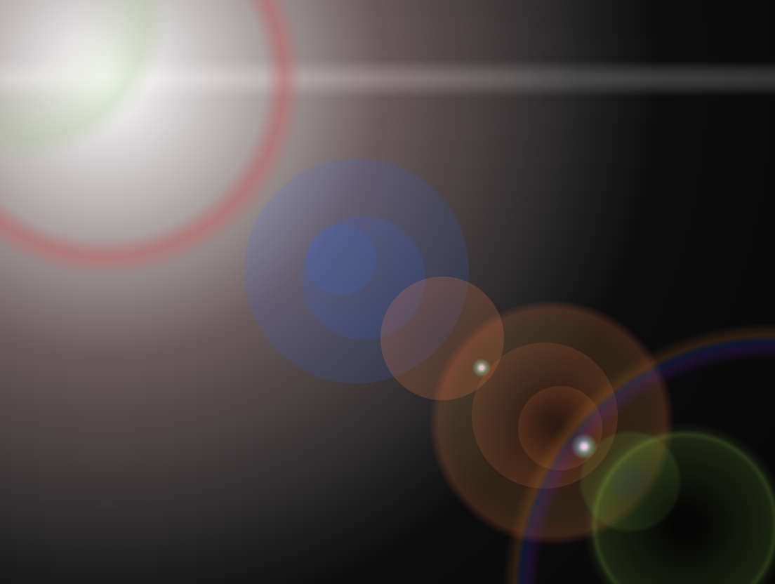
css+html 实现 光晕 光圈
<style>
html {
height: 100%;
}
body {
height: 100%;
background-color: #000;
margin: 0;
padding: 0;
}
.lensflare {
position: relative;
overflow: hidden;
width: 100%;
min-height: 100%;
overflow: hidden;
}
.source-spread {
position: absolute;
background: radial-gradient(rgba(255, 225, 255, .05) 10%, rgba(255, 225, 255, .05) 30%, rgba(0, 0, 0, 0) 60%);
border-radius: 50%;
width: 2000px;
height: 2000px;
margin-top: -1000px;
margin-left: -1000px;
top: 14%;
left: 14%;
z-index: 0;
}
.source {
position: absolute;
background: radial-gradient(#fff 0%, rgba(243, 206, 205, .4) 35%, rgba(88, 88, 88, .3) 60%, rgba(0, 0, 0, 0) 70%);
border-radius: 50%;
width: 800px;
height: 800px;
margin-top: -400px;
margin-left: -400px;
top: 14%;
left: 14%;
z-index: 2;
}
.source-beam {
position: absolute;
background: radial-gradient(rgba(255, 255, 255, .3) 0%, rgba(0, 0, 0, 0) 70%);
border-radius: 50%;
width: 2200px;
height: 28px;
margin-top: -14px;
margin-left: -1100px;
top: 14%;
left: 14%;
z-index: 1;
}
.c1 {
position: absolute;
background: radial-gradient(ellipse at center, rgba(189, 91, 87, 0) 40%, rgba(189, 91, 87, 0.5) 45%, rgba(189, 91, 87, 0) 50%, rgba(189, 91, 87, 0) 100%);
border-radius: 50%;
width: 400px;
height: 400px;
margin-top: -200px;
margin-left: -200px;
top: 14%;
left: 14%;
z-index: 3;
}
.c2 {
position: absolute;
background: radial-gradient(ellipse at center, rgba(162, 196, 134, 0) 20%, rgba(162, 196, 134, 0.3) 43%, rgba(67, 85, 52, 0) 50%, rgba(67, 85, 52, 0) 100%);
border-radius: 50%;
width: 300px;
height: 300px;
margin-top: -150px;
margin-left: -150px;
top: 3%;
left: 3%;
z-index: 4;
}
.c3 {
position: absolute;
background: radial-gradient(ellipse at center, rgba(31, 99, 255, .1) 1%, rgba(31, 99, 255, .13) 100%);
border-radius: 50%;
width: 160px;
height: 160px;
margin-top: -80px;
margin-left: -80px;
top: 46%;
left: 46%;
z-index: 5;
}
.c4 {
position: absolute;
background: radial-gradient(ellipse at center, rgba(31, 99, 255, .1) 1%, rgba(31, 99, 255, .13) 100%);
border-radius: 50%;
width: 50px;
height: 50px;
margin-top: -25px;
margin-left: -25px;
top: 44%;
left: 44%;
z-index: 6;
}
.c5 {
position: absolute;
background: radial-gradient(ellipse at center, rgba(31, 99, 255, .1) 1%, rgba(31, 99, 255, .13) 100%);
border-radius: 50%;
width: 88px;
height: 88px;
margin-top: -44px;
margin-left: -44px;
top: 47%;
left: 47%;
z-index: 7;
}
.c6 {
position: absolute;
background: radial-gradient(ellipse at center, rgba(255, 129, 57, .15) 1%, rgba(255, 129, 57, .2) 100%);
border-radius: 50%;
width: 88px;
height: 88px;
margin-top: -44px;
margin-left: -44px;
top: 57%;
left: 57%;
z-index: 8;
}
.c7 {
position: absolute;
background: radial-gradient(rgba(255, 225, 255, .9) 10%, rgba(137, 255, 220, .4) 30%, rgba(0, 0, 0, 0) 60%);
border-radius: 50%;
width: 16px;
height: 16px;
margin-top: -8px;
margin-left: -8px;
top: 62%;
left: 62%;
z-index: 9;
}
.c8 {
position: absolute;
background: radial-gradient(ellipse at center, rgba(255, 129, 57, .15) 10%, rgba(187, 129, 57, .20) 50%, rgba(255, 129, 57, .2) 60%, rgba(0, 0, 0, 0) 65%);
border-radius: 50%;
width: 190px;
height: 190px;
margin-top: -95px;
margin-left: -95px;
top: 71%;
left: 71%;
z-index: 10;
}
.c9 {
position: absolute;
background: radial-gradient(ellipse at center, rgba(0, 0, 0, .15) 1%, rgba(255, 129, 57, .2) 100%);
border-radius: 50%;
width: 104px;
height: 104px;
margin-top: -52px;
margin-left: -52px;
top: 70%;
left: 70%;
z-index: 11;
}
.c10 {
position: absolute;
background: radial-gradient(ellipse at center, rgba(0, 0, 0, .15) 1%, rgba(255, 129, 57, .2) 100%);
border-radius: 50%;
width: 60px;
height: 60px;
margin-top: -30px;
margin-left: -30px;
top: 72%;
left: 72%;
z-index: 12;
}
.c11 {
position: absolute;
background: radial-gradient(rgba(255, 225, 255, .9) 10%, rgba(137, 255, 220, .4) 30%, rgba(0, 0, 0, 0) 60%);
border-radius: 50%;
width: 22px;
height: 22px;
margin-top: -11px;
margin-left: -11px;
top: 75%;
left: 75%;
z-index: 13;
}
.c12 {
position: absolute;
background: radial-gradient(ellipse at center, rgba(73, 168, 199, .15) 10%, rgba(100, 145, 42, .20) 30%, rgba(100, 145, 42, .2) 60%, rgba(0, 0, 0, 0) 65%);
border-radius: 50%;
width: 80px;
height: 80px;
margin-top: -40px;
margin-left: -40px;
top: 81%;
left: 81%;
z-index: 14;
}
.c13 {
position: absolute;
background: radial-gradient(ellipse at center, rgba(0, 0, 0, .5) 4%, rgba(100, 145, 42, .2) 36%, rgba(163, 240, 63, .2) 38%, rgba(100, 145, 42, .1) 40%, rgba(189, 91, 87, 0) 43%);
border-radius: 50%;
width: 240px;
height: 240px;
margin-top: -120px;
margin-left: -120px;
top: 88%;
left: 88%;
z-index: 15;
}
.c14 {
position: absolute;
background: radial-gradient(ellipse at center, rgba(189, 91, 87, 0) 39%, rgba(94, 29, 191, 0.2) 41%, rgba(29, 71, 191, 0.2) 42%, rgba(191, 113, 29, 0.2) 43%, rgba(189, 91, 87, 0) 45%, rgba(189, 91, 87, 0) 100%);
border-radius: 50%;
width: 600px;
height: 600px;
margin-top: -300px;
margin-left: -300px;
top: 99%;
left: 99%;
z-index: 16;
}
</style>
<div class="lensflare">
<div class="source-spread"></div>
<div class="source"></div>
<div class="source-beam"></div>
<div class="c1"></div>
<div class="c2"></div>
<div class="c3"></div>
<div class="c4"></div>
<div class="c5"></div>
<div class="c6"></div>
<div class="c7"></div>
<div class="c8"></div>
<div class="c9"></div>
<div class="c10"></div>
<div class="c11"></div>
<div class="c12"></div>
<div class="c13"></div>
<div class="c14"></div>
</div>
css+html 实现 光晕 光圈的更多相关文章
- css 实现头像周围光圈动态效果
效果: html文件: <img class="userHead" src="xx/user.jpg"> css文件: .userHead{ wid ...
- Matplotlib数据可视化(3):文本与轴
在一幅图表中,文本.坐标轴和图像的是信息传递的核心,对着三者的设置是作图这最为关心的内容,在上一篇博客中虽然列举了一些设置方法,但没有进行深入介绍,本文以围绕如何对文本和坐标轴进行设置展开(对图像 ...
- 【原创】CSS高效开发实战:CSS 3、LESS、SASS、Bootstrap、Foundation --读书笔记(5)使用放射渐变制作光影效果
阴影效果通常用来表现光线投射在物体上的感觉,如果想制作一个如图5.19所示的文字光影效果,就可以使用背景的线性渐变进行构建. 图5.19可以看到有类似光束照射文字的效果,很好地突出了文字.这实现起来很 ...
- CSS中伪类及伪元素用法详解
CSS中伪类及伪元素用法详解 伪类的分类及作用: 注:该表引自W3School教程 伪元素的分类及作用: 接下来让博主通过一些生动的实例(之前的作业或小作品)来说明几种常用伪类的用法和效果,其他的 ...
- 快速学习html、css的经典笔记
HTML语言剖析 Html简介-目录 全写: HyperText Mark-up Language 译名: 超文本标识语言 简释:一种为普通文件中某些字句加上标示的语言,其目的在于运用标签(tag ...
- css中的大小、定位、轮廓相关属性
css中的大小.定位.轮廓相关属性 1.通过height.width属性控制组件大小 height:高度,可以设置任何有效的距离值: width:宽度,可以设置任何有效的属性值: max-height ...
- CSS3按钮鼠标悬浮光圈效果
1 .HTML相关知识点 HTML(超文本标记语言)是网页的核心.首先你要学会,不要害怕,HTML很容易学习的,刚开始多记多练,但是到最后还是要自己深入专研,简单的入门是很快,但学好HTML是成为W ...
- bootstrap学习总结-css样式设计(二)
首先,很感谢各位园友对我的支持,关于bootstrap的学习总结,我会持续更新,如果有写的不对的地方,麻烦各位给我指正出来哈.关于上篇文章,固定布局和流式布局很关键,如果还不太清楚的可以再看看我写的h ...
- cocos2d制作动态光晕效果基础——blendFunc
转自:http://www.2cto.com/kf/201207/144191.html 最近的项目要求动态光晕的效果. 何谓动态光晕?之前不知道别人怎么称呼这个效果, 不过在我看来,“动态光晕”这个 ...
随机推荐
- window.frameElement
地址:MDN web docs 比如有一个iframe的src是xxx.htmframeElement的作用就是在xxx.htm中获得这个引用它的iframe objet这样你就可以在xxx.htm改 ...
- C#常用控件和属性
目录1.窗体(Form)2.Label (标签)控件3.TextBox(文本框)控件4.RichTextBox控件5.NumericUpDown控件6.Button(按钮)控件7.GroupBox(分 ...
- AtCoder Grand Contest 032 B - Balanced Neighbors——构造
题意 B - Balanced Neighbors 给定一个整数 $N$($3\leq N \leq 100$),构造一个顶点编号为 $1...N$ 的无向图,需满足如下两个条件: 简单图且连通 存在 ...
- jquery点击显示或隐藏
点击第一个dd,给第一li添加class,点击第二个dd,给第二个li添加class,以此类推 $(function(){ $("dd > a").click(fun ...
- BZOJ2616 SPOJ PERIODNI(笛卡尔树 + DP)
题意 N,K≤500,h[i]≤106N,K\le 500,h[i]\le10^6N,K≤500,h[i]≤106 题解 建立出小根堆性质的笛卡尔树,于是每个节点可以代表一个矩形,其宽度为子树大小,高 ...
- CSP-S 2019 第二轮 退役记
Day 0 复习数论,复习网络流,复习动态DP,复习ac自动机,复习后缀自动机- Day 1 进考场,得到解压密码,跟时事热点没有什么关系. 感觉键盘有点难受,右半部分包括退格.方向键.回车都比较黏. ...
- Python json常用操作
json模块 (字符串操作) json.dumps() :对数据进行编码 json.loads() :对数据进行解码 json模块(文件操作) # 写入 JSON 数据 with open('data ...
- LeetCode 282. Expression Add Operators
原题链接在这里:https://leetcode.com/problems/expression-add-operators/ 题目: Given a string that contains onl ...
- CSS 布局和 BFC
什么是 BFC 在一个Web页面的CSS渲染中,块级格式化上下文 (Block Fromatting Context)是按照块级盒子布局的.W3C对BFC的定义如下:浮动元素和绝对定位元素,非块级盒子 ...
- 关于ORA-12154: TNS:could not resolve the connect identifier specified的问题
问题:net configuration assistant测试连接可以连接.但是PLSQL连接不了,报ORA-12154: TNS:could not resolve the connect ide ...