CSS3 笔记四(Transforms/Transition/Animations)
CSS3 2D Transforms Methods
translate()rotate()scale()skewX()skewY()matrix()
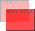
1> translate()
- The
translate()method moves an element from its current position (according to the parameters given for the X-axis and the Y-axis).
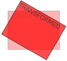
2> rotate()
- The
rotate()method rotates an element clockwise or counter-clockwise according to a given degree.
Example
 div {

     -ms-transform: rotate(20deg); /* IE 9 */

     -webkit-transform: rotate(20deg); /* Safari */

     transform: rotate(20deg);

 }
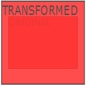
3> scale()
- The
scale()method increases or decreases the size of an element (according to the parameters given for the width and height).
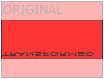
4> skewX(沿X轴形变)
- The
skewX()method skews an element along the X-axis by the given angle.
5> skewY(沿Y轴形变)
- The
skewY()method skews an element along the Y-axis by the given angle.
6> skew(沿X和Y轴形变)
- The
skew()method skews an element along the X and Y-axis by the given angles.
7> matrix()
- The
matrix()method combines all the 2D transform methods into one.
Example
 div {

     -ms-transform: matrix(1, -0.3, 0, 1, 0, 0); /* IE 9 */

     -webkit-transform: matrix(1, -0.3, 0, 1, 0, 0); /* Safari */

     transform: matrix(1, -0.3, 0, 1, 0, 0);

 }
CSS3 3D Transforms
rotateX()rotateY()rotateZ()
1> rotateX()
- The
rotateX()method rotates an element around its X-axis at a given degree.
2> rotateY()
- The
rotateY()method rotates an element around its Y-axis at a given degree.
3> rotateZ()
- The
rotateZ()method rotates an element around its Z-axis at a given degree:
Example
 div {

     -webkit-transform: rotateZ(90deg); /* Safari */

     transform: rotateZ(90deg);

 }
CSS3 Transitions
- Specify the CSS property you want to add an effect to.
- Specify the duration of the effect.
Note: If the duration part is not specified, the transition will have no effect, because the default value is 0.
syntax
transition: property duration timing-function delay|initial|inherit;
Example
 input[type=text] {

     width: 100px;

     -webkit-transition: ease-in-out, width .35s ease-in-out; /* Safari 3.1 to 6.0 */

     transition: width .35s ease-in-out;

 }

 input[type=text]:focus {

     width: 250px;

 }
1> transition-property
- Specify the name of the CSS property
syntax
transition-property: none|all|property|initial|inherit;
Example
 div {

     -webkit-transition-property: width, height; /* Safari */

     transition-property: width, height;

 }

 div:hover {

     width: 300px;

     height: 300px;

 }
2> transition-duration
- Specifies how many seconds (s) or milliseconds (ms) a transition effect takes to complete.
syntax
transition-duration: time|initial|inherit;
Example
 div {

     -webkit-transition-duration: 5s; /* Safari */

     transition-duration: 5s;

 }
3> transition-delay
- The transition-delay property specifies when the transition effect will start.
- The transition-delay value is defined in seconds (s) or milliseconds (ms).
syntax
transition-delay: time|initial|inherit;
Example
 div {

     -webkit-transition-delay: 2s; /* Safari */

     transition-delay: 2s;

 }
4> transition-timing-function
- The transition-timing-function property specifies the speed curve of the transition effect.
- This property allows a transition effect to change speed over its duration.
syntax
transition-timing-function: ease|linear|ease-in|ease-out|ease-in-out|cubic-bezier()|initial|inherit;
| Value | Description |
|---|---|
| ease | Default value. Specifies a transition effect with a slow start, then fast, then end slowly (equivalent to cubic-bezier(0.25,0.1,0.25,1)) |
| linear | Specifies a transition effect with the same speed from start to end (equivalent to cubic-bezier(0,0,1,1)) |
| ease-in | Specifies a transition effect with a slow start (equivalent to cubic-bezier(0.42,0,1,1)) |
| ease-out | Specifies a transition effect with a slow end (equivalent to cubic-bezier(0,0,0.58,1)) |
| ease-in-out | Specifies a transition effect with a slow start and end (equivalent to cubic-bezier(0.42,0,0.58,1)) |
| cubic-bezier(n,n,n,n) | Define your own values in the cubic-bezier function. Possible values are numeric values from 0 to 1 |
| initial | Sets this property to its default value. |
| inherit | Inherits this property from its parent element. |
Example
 /* For Safari 3.1 to 6.0 */

 #div1 {-webkit-transition-timing-function: linear;}

 #div2 {-webkit-transition-timing-function: ease;}

 #div3 {-webkit-transition-timing-function: ease-in;}

 #div4 {-webkit-transition-timing-function: ease-out;}

 #div5 {-webkit-transition-timing-function: ease-in-out;}

 /* Standard syntax */

 #div1 {transition-timing-function: linear;}

 #div2 {transition-timing-function: ease;}

 #div3 {transition-timing-function: ease-in;}

 #div4 {transition-timing-function: ease-out;}

 #div5 {transition-timing-function: ease-in-out;}
CSS3 Animations
1> animation
syntax
animation: name duration timing-function delay iteration-count direction fill-mode play-state;
Example
 div {

     -webkit-animation: mymove 5s infinite; /* Chrome, Safari, Opera */

     animation: mymove 5s infinite;

 }
2> animation-name
- The animation-name property specifies a name for the @keyframes animation.
syntax
animation-name: keyframename|none|initial|inherit;
Example
 /* The animation code */

 @keyframes mymove {

     from {background-color: red;}

     to {background-color: yellow;}

 }

 /* The element to apply the animation to */

 div {

     width: 100px;

     height: 100px;

     background-color: red;

     animation-name: mylove;

     animation-duration: 4s;

 }
3> animation-duration
syntax
animation-duration: time|initial|inherit;
4> animation-timing-function
syntax
animation-timing-function: linear|ease|ease-in|ease-out|cubic-bezier(n,n,n,n)|initial|inherit;
5> animation-delay
syntax
animation-delay: time|initial|inherit;
6> animation-iteration-count
- The animation-iteration-count property specifies the number of times an animation should be played.
syntax
animation-iteration-count: number|infinite|initial|inherit;
7> animation-direction
syntax
animation-direction: normal|reverse|alternate|alternate-reverse|initial|inherit;
?? 8> animation-fill-mode
- The animation-fill-mode property specifies a style for the element when the animation is not playing (when it is finished, or when it has a delay).
syntax
animation-fill-mode: none|forwards|backwards|both|initial|inherit;
9> animation-play-state
- The animation-play-state property specifies whether the animation is running or paused.
syntax
animation-play-state: paused|running|initial|inherit;
Example
 div {

     width: 100px;

     height: 100px;

     background: red;

     position: relative;

     -webkit-animation: mymove 5s infinite;  /* Chrome, Safari, Opera */

     animation: mymove 5s infinite;

 }

 div:hover {

     -webkit-animation-play-state: paused;  /* Chrome, Safari, Opera */

     animation-play-state: paused;

 }

 /* Chrome, Safari, Opera */

 @-webkit-keyframes mymove {

     from {left: 0px;}

     to {left: 200px;}

 }

 @keyframes mymove {

     from {left: 0px;}

     to {left: 200px;}

 }

 </style>
Animation example1
 div {

     animation: example 5s linear 2s infinite alternate;

 }
Animation example2
 <!DOCTYPE html>

 <html>

 <head>

 <style>

 div {

     width: 100px;

     height: 100px;

     background-color: red;

     position: relative;

     animation-name: example;

     animation-duration: 5s;

     animation-timing-function: linear;

     animation-delay: 2s;

     animation-iteration-count: infinite;

     animation-direction: alternate;

 }

 @keyframes example {

     0%   {background-color:red; left:0px; top:0px;}

     25%  {background-color:yellow; left:200px; top:0px;}

     50%  {background-color:blue; left:200px; top:200px;}

     75%  {background-color:green; left:0px; top:200px;}

     100% {background-color:red; left:0px; top:0px;}

 }

 </style>

 </head>

 <body>

 <p><b>Note:</b> This example does not work in Internet Explorer 9 and earlier versions.</p>

 <div></div>

 </body>

 </html>
CSS3 笔记四(Transforms/Transition/Animations)的更多相关文章
- IE10开始支持CSS3 Transitions, Transforms 和 Animations
这是一个好消息,微软公开说明IE10预览版已经支持CSS3属性 Transitions, Transforms 和 Animations,你可以直接写transitions,而不是加个恶心的前缀-ms ...
- css笔记——区分css3中的transform transition animation
出处:http://blog.csdn.net/dyllove98/article/details/8957232 CSS3中和动画有关的属性有三个 transform. transition ...
- C#可扩展编程之MEF学习笔记(四):见证奇迹的时刻
前面三篇讲了MEF的基础和基本到导入导出方法,下面就是见证MEF真正魅力所在的时刻.如果没有看过前面的文章,请到我的博客首页查看. 前面我们都是在一个项目中写了一个类来测试的,但实际开发中,我们往往要 ...
- 《MFC游戏开发》笔记四 键盘响应和鼠标响应:让人物动起来
本系列文章由七十一雾央编写,转载请注明出处. http://blog.csdn.net/u011371356/article/details/9327377 作者:七十一雾央 新浪微博:http:// ...
- IOS学习笔记(四)之UITextField和UITextView控件学习
IOS学习笔记(四)之UITextField和UITextView控件学习(博客地址:http://blog.csdn.net/developer_jiangqq) Author:hmjiangqq ...
- java之jvm学习笔记四(安全管理器)
java之jvm学习笔记四(安全管理器) 前面已经简述了java的安全模型的两个组成部分(类装载器,class文件校验器),接下来学习的是java安全模型的另外一个重要组成部分安全管理器. 安全管理器 ...
- Java学习笔记四---打包成双击可运行的jar文件
写笔记四前的脑回路是这样的: 前面的学习笔记二,提到3个环境变量,其中java_home好理解,就是jdk安装路径:classpath指向类文件的搜索路径:path指向可执行程序的搜索路径.这里的类文 ...
- Java加密与解密笔记(四) 高级应用
术语列表: CA:证书颁发认证机构(Certificate Authority) PEM:隐私增强邮件(Privacy Enhanced Mail),是OpenSSL使用的一种密钥文件. PKI:公钥 ...
- Learning ROS for Robotics Programming Second Edition学习笔记(四) indigo devices
中文译著已经出版,详情请参考:http://blog.csdn.net/ZhangRelay/article/category/6506865 Learning ROS for Robotics Pr ...
随机推荐
- Yii源码阅读笔记(三十一)
Widget类中开始,获取视图对象,获取widget ID,渲染视图,获取路径方法注释: private $_id; /** * Returns the ID of the widget. * 返回插 ...
- 访问API安全性认证设计
1.用户POST登录(账号+密码) | |成功 |2.返回(Private key+时间戳)加密字符串+用户信息+缓存到内存中 | |发起其它请求 |3.发起请求时携带Request参数和(Reque ...
- SEO实战宝典阅读笔记
1. 对搜索引擎更友好 1.1 sitemap sitemap自动生成 https://www.xml-sitemaps.com 谷歌 sitemap.xml 百度 sitemap.html 1.2 ...
- Arduino.h
#ifndef Arduino_h #define Arduino_h #include <stdlib.h> #include <stdbool.h> #include &l ...
- box2d最大速度限制
被坑了好几个小时... 原来box2d中限制了最大速度为2m/frame. 参考http://badlogicgames.com/forum/viewtopic.php?f=11&t=6137 ...
- MVC 关于easyui-datebox 赋值问题
view <script type="text/javascript"> $(function () { var date = '@ViewData["end ...
- django小结
初始化项目 python manage.py runserver python manage.py runserver 127.0.0.1:8080 python manage.py startapp ...
- MongoDB的安装和配置成服务的三种方法和一些难点
1. Hotfix KB2731284 or later update is not installed的问题: If you are running any edition of Windows S ...
- trunk 的坑
三层交换机A和三层交换机B之间原本配置有trunk口,如再用trunk连二层交换机会导致环路,网络不通.将L3 A和L3-B之间断开正常.
- Excel筛选之后如何下拉递增
1.痛点 Excel表格,通过筛选了之后,再想统计行数,通过单纯的拖动或者填充排序啥的,都无法做到排序或行数递增: 2.解决方案 发现了个excel的公式可以完美解决该问题,赞个,找的好辛苦. 3.大 ...