SVG 动画(animate、animateTransform、animateMotion)
原文:https://blog.csdn.net/chy555chy/article/details/53535581
参考 MDN开发文档 https://developer.mozilla.org/en-US/docs/Web/SVG/SVG_animation_with_SMIL
SMIL
As of Chrome 45.0, SMIL animations are deprecated in favor of CSS animations and Web animations.
Gecko 2.0 (Firefox 4 / Thunderbird 3.3 / SeaMonkey 2.1) introduced support for animating SVG using Synchronized Multimedia Integration Language (SMIL). SMIL allows you to:
- animate the numeric attributes of an element (x, y, …)
- animate transform attributes (translation or rotation)
- animate color attributes
- follow a motion path
This is done adding an SVG element like <animate> inside the SVG element to animate. Below are examples for the four different ways.
自Chrome 45.0起,SMIL动画就被废弃了,取而代之的是CSS动画和Web动画。
Gecko 2.0 (Firefox 4 / Thunderbird 3.3 / SeaMonkey 2.1) 介绍使用同步多媒体集成语言(SMIL)支持SVG动画。SMIL允许:
- 将元素的数值属性(x, y, …)作为动画
- 将变换属性(translation,rotation)作为动画
- 将颜色属性作为动画
- 按照运动轨迹移动
通过添加SVG动画元素,比如<animate>到SVG元素内部来实现动画,下面的例子演示了四种不同的动画方式。
animate
The following example animates the cx attribute of a circle. To do so, we add an <animate> element inside the <circle> element. The important attributes for <animate> are:
- attributeName
The name of the attribute to animate.- from
The initial value of the attribute.- to
The final value.- dur
The duration of the animation (for example, write ‘5s’ for 5 seconds).If you want to animate more attributes inside the same element, just add more <animate> elements.
下面的例子将圆的cx属性作为动画。为了实现这种效果,我们添加了一个<animate>元素到<circle>元素的内部。<animate> 比较重要的属性如下:
- attributeName
需要动画的属性名称 - from
属性的初始值 - to
终止值 - dur
动画的时间
如果你想要让该元素的更多属性具有动画效果,只要添加更多的<animate> 元素到该元素内部即可。
<svg xmlns="http://www.w3.org/2000/svg" width="300px" height="100px">

    <rect x="0" y="0" width="300" height="100" stroke="black" stroke-width="1" />

    <circle cx="0" cy="50" r="15" fill="blue" stroke="black" stroke-width="1">

        <animate attributeName="cx" from="0" to="100" dur="5s" repeatCount="indefinite" />

    </circle>

</svg>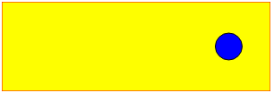
animateTransform
The <animateTransform> element let you animate transform attributes. This new element is necessary because we are not animating a simple attribute like x which is just a number. Rotation attributes look like this: rotation(theta, x, y), where theta is the angle in degrees, and x and y are absolute positions. In the example below, we animate the center of the rotation and the angle.
<animateTransform>元素可以执行变换属性的动画。这个新的元素是必要的,因为我们不能用一个简单的数值的属性就像x来制作这种动画。旋转属性就像:rotation(theta, x, y),theta是一个角度,x和y是绝对坐标。在下面这个例子中我们绕着旋转中心旋转一定的角度。
<svg xmlns="http://www.w3.org/2000/svg" width="300px" height="200px">

    <rect x="0" y="0" width="200" height="200" fill="yellow" stroke="red" stroke-width="1" />

    <rect x="20" y="50" width="15" height="34" fill="blue" stroke="black" stroke-width="1" transform="rotation">

        <!-- Rotate from 0 to 360 degrees, and move from 60 to 100 in the x direction. -->

        <!-- Keep doing this until the drawing no longer exists. -->

        <animateTransform attributeType="XML" attributeName="transform" begin="0s" dur="5s" type="rotate" from="20 60 60" to="360 100 60" repeatCount="indefinite" />

    </rect>

</svg>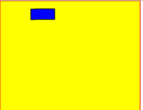
animateMotion
The <animateMotion> element lets you animate an element position and rotation according to a path. The path is defined the same way as in <path>. You can set the attribute to define whether the object rotates following the tangent of the path.
<animateMotion>元素让你可以实现一个路径动画,并且根据路径进行旋转。路径使用和<path>相同的方式进行定义。你可以设置属性来定义对象是否根据路径的正切角度来旋转。
Example 1: Linear motion
In this example, a blue circle bounces between the left and right edges of a black box, over and over again, indefinitely. The animation here is handled by the <animateMotion> element. In this case, we’re establishing a path consisting of a MoveTo command to establish the starting point for the animation, then the Horizontal-line command to move the circle 300 pixels to the right, followed by the Z command, which closes the path, establishing a loop back to the beginning. By setting the value of the repeatCount attribute to indefinite, we indicate that the animation should loop forever, as long as the SVG image exists.
在这个例子中,一个蓝色的圆在黑盒的左右边缘之间来回的反弹,无限地重复着同样的动作。该动画是由<animateMotion>元素控制的。在这种情况下我们建立了一个路径,由MoveTo命令来创建动画的起始点,然后Horizontal-line命令来将圆向右移动300像素到右边,接着使用Z命令,关闭路径,建立一个环回路径。通过设置repeatCount属性为indefinite,我们可以指定只要SVG图片存在的话,动画是否永久循环。
<svg xmlns="http://www.w3.org/2000/svg" width="300px" height="100px">

    <rect x="0" y="0" width="300" height="100" fill="yellow" stroke-width="1" stroke="red" />

    <circle cx="0" cy="50" r="15" fill="blue" stroke="black" stroke-width="1">

        <animateMotion path="M 0 0 H 300 Z" dur="3s" repeatCount="indefinite" />

    </circle>

</svg>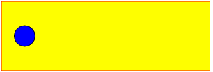
Example 2: Curved motion
Same example as before with a curved path and following the direction of the path.
和上面差不多的例子,只不过现在是沿着曲线和路径方向运动。
<svg width="300px" height="100px">

    <rect x="0" y="0" width="300" height="100" fill="yellow" stroke-width="1" stroke="red" />

    <rect x="0" y="0" width="20" height="20" fill="blue" stroke="black" stroke-width="1">

        <animateMotion path="M 250,80 H 50 Q 30,80 30,50 Q 30,20 50,20 H 250 Q 280,20,280,50 Q 280,80,250,80Z" dur="3s" repeatCount="indefinite" rotate="auto">

    </rect>

</svg>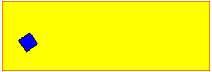
SVG 动画(animate、animateTransform、animateMotion)的更多相关文章
- svg动画 animate
最近使用到svg的动画animate,简单总结下animate的主要属性: 1.定义:SVG 的animate 动画元素放在形状元素的内部,用来定义一个元素的某个属性如何踩着时点改变.在指定持续时间里 ...
- SVG动画
动画原理 SVG动画,就是元素的属性值关于时间的变化. 如下图来说,元素的某个属性值的起始值(from)到结束值(to)在一个时间段(duration)根据时间函数(timing-function)计 ...
- HTML5的 2D SVG和SVG DOM的学习笔记(2)---SVG动画
SVG支持动画.可以通过以下几种方法获得动画效果: 使用SVG动画元素.SVG可以描述随时间变化的图形对象,使用不同的动画元素可以定义运动路径,淡入淡出效果和对象的膨胀.收缩.旋转和变换颜色. 使用S ...
- svg动画学习
首先我们定义一块画布,然后在上面画一个圆形. 他看起来应该是这个样子的:(每一个实例我都会附加图片以及demo链接,方便直观的理解与源代码的查看,查看的时候请使用标准浏览器) 点击查看Demo 现在我 ...
- svg 动画 透明度 放大缩小 x轴Y轴
参考链接:https://www.cnblogs.com/Chrimisia/p/6670303.html vue 中封装svg:http://www.cnblogs.com/Jiangchuanwe ...
- svg动画之日出
效果分析 一个太阳,从底部升起来,天空由黑变蓝.那么要画的东西确定为三个:1.太阳(圆形)2.太阳光芒 3.天空 代码如下 <!--画太阳--> <svg width="6 ...
- 推荐8个实现 SVG 动画的 JavaScript 库
SVG 是一种分辨率无关的图形(矢量图形).这意味着它在任何类型的屏幕都不会遭受任何质量损失.除此之外,你可以让 SVG 灵活现一些动画效果.这篇文章就给大家推荐8个实现 SVG 动画的 JavaSc ...
- 带给你灵感:30个超棒的 SVG 动画展示【下篇】
前端开发人员和设计师一般使用 CSS 来创建 HTML 元素动画.然而,由于 HTML 在创建图案,形状,和其他方面的局限性,它们自然的转向了 SVG,它提供了更多更有趣的能力.借助 SVG,我们有更 ...
- SVG动画实践篇-模拟音量高低效果
git 地址:https://github.com/rainnaZR/svg-animations/tree/master/src/demo/step2/volumn 说明 这个动画的效果就是多个线条 ...
随机推荐
- PyQt4(简单界面)
import sys; from PyQt4 import QtCore, QtGui; app=QtGui.QApplication(sys.argv); widget=QtGui.QWidget( ...
- leetCode题解之修剪二叉查找树
1.题目描述 Given a binary search tree and the lowest and highest boundaries as L and R, trim the tree so ...
- 树莓派2 raspyberry Pi2 交叉编译app
Pi 使用的是ARMV7架构的BCM2836, 下载交叉编译器 arm-linux-gnueabihf-gcc 即可. 本地环境: Ubuntu14 + x86_64 1. 下载编译器地址: 1). ...
- [IIS] [PHP] 500.19 随机出现
微信确认有BUG: https://support.microsoft.com/en-au/help/3007507/-http-error-500.19-error-when-you-browse- ...
- React:组件的生命周期
在组件的整个生命周期中,随着该组件的props或者state发生改变,其DOM表现也会有相应的变化.一个组件就是一个状态机,对于特定地输入,它总返回一致的输出. 一个React组件的生命周期分为三个部 ...
- Composer 的简介、安装及使用
Composer的简介 简单说,Composer 就是一个安装包管理工具,服务于 PHP 生态系统.它包括了两个部分:Composer 和 Packagist. Composer Composer 是 ...
- Nginx 泛解析配置请求映射到多端口实现二级域名访问
由于想实现一个域名放置多个应用运行的目的,而不想通过域名后加端口号方式处理,这种方式处理记起来太麻烦,偷懒党简直不能忍,故而考虑了使用二级域名来处理多个应用同时运行.Google了一番资料并进行了尝试 ...
- grafana的安装与设置(一)
zabbix3.4.9和grafana5.1.3的整合 官方文档:http://docs.grafana.org/installation/rpm/ 本次介绍两种安装方法,其他的方法请查看官方文档: ...
- MySQL复制(一)复制原理探讨
1 复制概述 1.1.复制解决的问题 数据复制技术有以下一些特点: (1) 数据分布 (2) 负载平衡(load balancing) (3) 备份 (4) 高可用性(high availabilit ...
- Ubuntu 14.04安装QQ2012
GTkqq ,pidginQQ........等多多少少都存在一定的缺陷和问题. linuxQQ 有各种版本,这里介绍两种:linuxQQ(基本已不支持) 和 wineQQ (推荐使用) 1 ---- ...