WPF整理-Style
"Consistency in a user interface is an important trait; there are many facets of consistency,
one of which is the consistent look and feel of controls. For example, all buttons should
look roughly the same – similar colors, the same margins, and so on."
UI的风格一致性是应用程序应当关注的重要特性。
“Styles provide a convenient way to group a set of properties (and triggers) under a single
object, and then selectively (or automatically as we'll see later) apply it to elements.”
1.Creating and using styles
用一个Demo,来总结Style。
MainWindow.xaml如下:
<Window x:Class="CreatingAndUsingStyle.MainWindow"

        xmlns="http://schemas.microsoft.com/winfx/2006/xaml/presentation"

        xmlns:x="http://schemas.microsoft.com/winfx/2006/xaml"

        Title="Styled Calculatot" Height="269" Width="180" ResizeMode="CanMinimize">

    <Window.Resources>

        <Style TargetType="Button" x:Key="numericStyle">

            <Setter Property="FontSize" Value="20" />

            <Setter Property="Margin" Value="4" />

            <Setter Property="Padding" Value="6" />

            <Setter Property="Effect">

                <Setter.Value>

                    <DropShadowEffect Color="Blue"/>

                </Setter.Value>

            </Setter>

        </Style>

        <Style TargetType="Button" x:Key="operatorStyle" BasedOn="{StaticResource numericStyle}">

            <Setter Property="FontWeight" Value="ExtraBold" />

            <Setter Property="Effect">

                <Setter.Value>

                    <DropShadowEffect Color="Red" />

                </Setter.Value>

            </Setter>

        </Style>

    </Window.Resources>

    <Grid>

    <Grid.ColumnDefinitions>

        <ColumnDefinition Width="Auto" />

        <ColumnDefinition Width="Auto" />

        <ColumnDefinition Width="Auto" />

        <ColumnDefinition Width="Auto" />

    </Grid.ColumnDefinitions>

    <Grid.RowDefinitions>

        <RowDefinition Height="Auto" />

        <RowDefinition Height="Auto" />

        <RowDefinition Height="Auto" />

        <RowDefinition Height="Auto" />

        <RowDefinition Height="Auto" />

    </Grid.RowDefinitions>

        <TextBox Background="Cyan" IsReadOnly="True"  Grid.ColumnSpan="4"/>

        <Button Content="7" Grid.Row="1" Style="{StaticResource numericStyle}"/>

        <Button Content="8" Grid.Row="1" Grid.Column="1" Style="{StaticResource numericStyle}"/>

        <Button Content="9" Grid.Row="1" Grid.Column="2" Style="{StaticResource numericStyle}"/>

        <Button Content="4" Grid.Row="2" Style="{StaticResource numericStyle}"/>

        <Button Content="5" Grid.Row="2" Grid.Column="1" Style="{StaticResource numericStyle}"/>

        <Button Content="6" Grid.Row="2" Grid.Column="2" Style="{StaticResource numericStyle}"/>

        <Button Content="1" Grid.Row="3" Style="{StaticResource numericStyle}"/>

        <Button Content="2" Grid.Row="3" Grid.Column="1" Style="{StaticResource numericStyle}"/>

        <Button Content="3" Grid.Row="3" Grid.Column="2" Style="{StaticResource numericStyle}"/>

        <Button Content="0" Grid.Row="4" Style="{StaticResource numericStyle}"/>

        <Button Content="=" Grid.Row="4" Grid.Column="1" Grid.ColumnSpan="2" Style="{StaticResource operatorStyle}">

            <Button.Effect>

                <DropShadowEffect Color="Green" />

            </Button.Effect>

        </Button>

        <Button Content="+" Grid.Row="4" Grid.Column="3" Style="{StaticResource operatorStyle}"/>

        <Button Content="-" Grid.Row="3" Grid.Column="3" Style="{StaticResource operatorStyle}"/>

        <Button Content="X" Grid.Row="2" Grid.Column="3" Style="{StaticResource operatorStyle}"/>

        <Button Content="/" Grid.Row="1" Grid.Column="3" Style="{StaticResource operatorStyle}"/>

    </Grid>

</Window>
效果如下:

Point of Interest:
1.“A Style is a container for a bunch of Setter objects (and triggers, as we'll see later). Each
setter indicates which property should have which value; the property must be a dependency
property. The FrameworkElement class exposes a Style property that can be set to such a
Style object. Styles are always built as resources.”
Setter的Property必须是依赖属性;
FrameworkStyle暴露了Style这个属性;
Style一般放在Resources中.
2."The TargetType property of a Style is typically set, which makes the Style applicable to
that particular type (this can be any type, even a type of a custom control) and any derived
types."
TargetType="Button" 指定Style应用的类型。
一般,我们使用Style的时候,我们都会设置这个(In practice ,TargetType is always specified.),想想为什么?
3. x:Key="numericStyle" 可以根据需要进行有或无。
a.当其有的时候,我们需要对需要 Style="{StaticResource numericStyle}" .
b.其不设置的时候,默认所有TargetType使用此Style。 见2.
4. BasedOn="{StaticResource numericStyle}" 这是Style的继承。
Style继承时,可以修改BaseOn Style的Setter。如operatorStyle的 部分所示。
Style继承很好用,但是要注意:基Style的修改会影响子style.
5.“An element that uses a style can change a property that is set explicitly by a Style (a local
value), and this is stronger than a Style property setter.”
对于应用了Style的element,我们可以设置其属性值,且这个优先级更高(覆盖Style设置)。如"="Button的 部分所示。
2.Applying a style automatically
我们移除 x:Key="numericStyle"。让所有Button使用这个style.
MainWindow.xaml修改如下:
<Window x:Class="CreatingAndUsingStyle.MainWindow"

        xmlns="http://schemas.microsoft.com/winfx/2006/xaml/presentation"

        xmlns:x="http://schemas.microsoft.com/winfx/2006/xaml"

        Title="Styled Calculatot" Height="269" Width="180" ResizeMode="CanMinimize">

    <Window.Resources>

        <Style  TargetType="Button">

            <Setter Property="FontSize" Value="20" />

            <Setter Property="Margin" Value="4" />

            <Setter Property="Padding" Value="6" />

            <Setter Property="Effect">

                <Setter.Value>

                    <DropShadowEffect Color="Blue"/>

                </Setter.Value>

            </Setter>

        </Style>

        <Style TargetType="Button" x:Key="operatorStyle" BasedOn="{StaticResource {x:Type Button}}">

            <Setter Property="FontWeight" Value="ExtraBold" />

            <Setter Property="Effect">

                <Setter.Value>

                    <DropShadowEffect Color="Red" />

                </Setter.Value>

            </Setter>

        </Style>

    </Window.Resources>

    <Grid>

    <Grid.ColumnDefinitions>

        <ColumnDefinition Width="Auto" />

        <ColumnDefinition Width="Auto" />

        <ColumnDefinition Width="Auto" />

        <ColumnDefinition Width="Auto" />

    </Grid.ColumnDefinitions>

    <Grid.RowDefinitions>

        <RowDefinition Height="Auto" />

        <RowDefinition Height="Auto" />

        <RowDefinition Height="Auto" />

        <RowDefinition Height="Auto" />

        <RowDefinition Height="Auto" />

    </Grid.RowDefinitions>

        <TextBox Background="Cyan" IsReadOnly="True"  Grid.ColumnSpan="4"/>

        <Button Content="7" Grid.Row="1" />

        <Button Content="8" Grid.Row="1" Grid.Column="1" />

        <Button Content="9" Grid.Row="1" Grid.Column="2" />

        <Button Content="4" Grid.Row="2" />

        <Button Content="5" Grid.Row="2" Grid.Column="1" />

        <Button Content="6" Grid.Row="2" Grid.Column="2" />

        <Button Content="1" Grid.Row="3" />

        <Button Content="2" Grid.Row="3" Grid.Column="1" />

        <Button Content="3" Grid.Row="3" Grid.Column="2" />

        <Button Content="0" Grid.Row="4" Style="{x:Null}"/>

        <Button Content="=" Grid.Row="4" Grid.Column="1" Grid.ColumnSpan="2" Style="{StaticResource operatorStyle}">

            <Button.Effect>

                <DropShadowEffect Color="Green" />

            </Button.Effect>

        </Button>

        <Button Content="+" Grid.Row="4" Grid.Column="3" Style="{StaticResource operatorStyle}"/>

        <Button Content="-" Grid.Row="3" Grid.Column="3" Style="{StaticResource operatorStyle}"/>

        <Button Content="X" Grid.Row="2" Grid.Column="3" Style="{StaticResource operatorStyle}"/>

        <Button Content="/" Grid.Row="1" Grid.Column="3" Style="{StaticResource operatorStyle}"/>

    </Grid>

</Window>
效果如下:

Point of Interest
1.“Automatic styles are created as resources without a key. This does not mean there is no key,
because it's still a dictionary. The key becomes the actual type to apply the style to defined by
the TargetType property.”
不为Style指定x:key,这个Style将应用于所有的x:Tyle element;
没有指定x:key,不代表其没有key,其key由x:Tyle定义,就本例而言是{x:Type Button}},从Style继承中(xaml中绿色高亮代码),可见一斑。
2.如果,这样的Style被Set在Window的Resource,则影响这个Window上的所有x:Type类型的element;
如果被set在application's resources,则影响所有window。
3.“The Style is applied to all elements of the target type, but not derived types.
Any element that does not set its style explicitly obtains that style automatically. If an element
wishes to revert to its default style, it can set its Style property to null ( {x:Null} in XAML)
or set its Style to another named style.”
如果,我们希望某个element不应用这个style,我们可以设置它的Style属性为其他style;
如果想让它保持默认的样子,我们可以设置其Style="{x:Null}",如Button “0”。
3.动态更换Style
“Automatic styles are a great way to create a consistent look and feel without burdening the
developer (or the designer) with the details of the various visual properties. It can also be
used as a quick way to implement skinning."
在Skin文件夹中添加两个Resource Dictionary,如下:

<ResourceDictionary xmlns="http://schemas.microsoft.com/winfx/2006/xaml/presentation"

                    xmlns:x="http://schemas.microsoft.com/winfx/2006/xaml">

    <Style TargetType="TextBox">

        <Setter Property="Background" Value="LightBlue" />

        <Setter Property="Foreground" Value="Black" />

        <Setter Property="BorderThickness" Value="2" />

        <Setter Property="BorderBrush" Value="DarkBlue" />

        <Style.Triggers>

            <Trigger Property="IsReadOnly" Value="True">

                <Setter Property="Background" Value="Blue" />

            </Trigger>

        </Style.Triggers>

    </Style>

    <Style TargetType="Button">

        <Setter Property="Background" Value="Cyan" />

    </Style>

</ResourceDictionary>
<ResourceDictionary xmlns="http://schemas.microsoft.com/winfx/2006/xaml/presentation"

                    xmlns:x="http://schemas.microsoft.com/winfx/2006/xaml">

    <Style TargetType="TextBox">

        <Setter Property="Background" Value="Violet" />

        <Setter Property="Foreground" Value="DarkViolet" />

        <Setter Property="BorderThickness" Value="2" />

        <Setter Property="BorderBrush" Value="LightPink" />

        <Style.Triggers>

            <Trigger Property="IsReadOnly" Value="True">

                <Setter Property="Background" Value="Pink" />

            </Trigger>

        </Style.Triggers>

    </Style>

    <Style TargetType="Button">

        <Setter Property="Background" Value="Red" />

    </Style>

</ResourceDictionary>
并设置其Property为:Content/Aways Copy.
“These settings prevent the default compilation to BAML and also provide the flexibility to
change the skins without recompilation. ”
请参考DebugLZQ前面的博文:WPF整理-二进制资源和内容
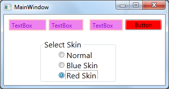
MainWindow.xaml,MainWindow.xaml.cs如下:
<Window x:Class="WPFStyleTriggerAndControlTemplate.MainWindow"

        xmlns="http://schemas.microsoft.com/winfx/2006/xaml/presentation"

        xmlns:x="http://schemas.microsoft.com/winfx/2006/xaml"

        Title="MainWindow" Height="303.719" Width="530.785">

    <Grid Margin="0,0,2,0">

        <TextBox HorizontalAlignment="Left" Height="23" Margin="10,35,0,0" TextWrapping="Wrap" Text="TextBox" VerticalAlignment="Top" Width="120"/>

        <TextBox HorizontalAlignment="Left" Height="23" Margin="156,35,0,0" TextWrapping="Wrap" Text="TextBox" VerticalAlignment="Top" Width="120"/>

        <TextBox HorizontalAlignment="Left" Height="23" Margin="293,35,0,0" TextWrapping="Wrap" Text="TextBox" VerticalAlignment="Top" Width="120" RenderTransformOrigin="1.577,0.303"/>

        <Button Content="Button" HorizontalAlignment="Left" Margin="433,35,0,0" VerticalAlignment="Top" Width="75"/>

        <GroupBox FontSize="28" Header="Select Skin"  Margin="75,102,62,0" VerticalAlignment="Top" Height="158">

            <StackPanel Orientation="Vertical" HorizontalAlignment="Center">

                <RadioButton Content="Normal" Checked="AllRadioButtonChecked"/>

                <RadioButton Content="Blue Skin" Checked="AllRadioButtonChecked"/>

                <RadioButton Content="Red Skin" Checked="AllRadioButtonChecked"/>

            </StackPanel>

        </GroupBox>

    </Grid>

</Window>
using System;

using System.Collections.Generic;

using System.Linq;

using System.Text;

using System.Threading.Tasks;

using System.Windows;

using System.Windows.Controls;

using System.Windows.Data;

using System.Windows.Documents;

using System.Windows.Input;

using System.Windows.Markup;

using System.Windows.Media;

using System.Windows.Media.Imaging;

using System.Windows.Navigation;

using System.Windows.Shapes;

namespace WPFStyleTriggerAndControlTemplate

{

    /// <summary>

    /// Interaction logic for MainWindow.xaml

    /// </summary>

    public partial class MainWindow : Window

    {

        public MainWindow()

        {

            InitializeComponent();

        }

        private void AllRadioButtonChecked(object sender, RoutedEventArgs e)

        {

            switch (((RadioButton)sender).Content.ToString())

            {

                case "Blue Skin":

                    ChangeSkin("Skins/BlueSkin.xaml");

                    break;

                case "Red Skin":

                    ChangeSkin("Skins/RedSkin.xaml");

                    break;

                case "Normal":

                    Application.Current.Resources.MergedDictionaries.Clear();

                    break;

            }

        }

        void ChangeSkin(string skinRelativeUri)

        {

            var si = Application.GetContentStream(new Uri(skinRelativeUri, UriKind.Relative));

            var rd = (ResourceDictionary)XamlReader.Load(si.Stream);

            Application.Current.Resources.MergedDictionaries.Clear();

            Application.Current.Resources.MergedDictionaries.Add(rd);

        }

    }

}
运行效果如下:

4.Other places to set styles
"The example shows styles applied to the FrameworkElement.Style property, but this is
not the only property that can accept a Style.
Other examples include the following:"
"FrameworkElement.FocusVisualStyle property: Accepts a Style that affects
the way the focus indicator is rendered when that element has the keyboard focus."
"ItemsControl.ItemContainerStyle property: Accepts a Style that affects the
container element of each data item (for example, ListBoxItem for a ListBox)."
"DataGrid.CellStyle: Accepts a Style that affects the way a cell is rendered.
Similar properties exposed by the DataGrid include ColumnHeaderStyle,
DragIndicatorStyle, DropLocationIndicatorStyle, RowHeaderStyle,
and RowStyle."
5.Style和ControlTemplate
ControlTemplate一般有如下2种使用方法
方法1:
<Window.Resources>
<ControlTemplate x:Key="AnimatedExpanderButtonTemp" TargetType="{x:Type ToggleButton}">
Template="{StaticResource RevealExpanderTemp}"
--------------
方法2:
<Style TargetType="{x:Type TabControl}">
<Setter Property="Template">
<Setter.Value>
<ControlTemplate TargetType="{x:Type TabControl}">
<Grid>
-----------------------------
关于DataTemplate请参考DebugLZQ前面的博文:WPF整理-使用 DataTemplate
6.Style & Trigger & ControlTemplate一个非常常见的例子
在实际应用中,这3个一般会同时用到。我们用一个自定义的最大化/最小化/关闭按钮等,如下:

一般有2种实现方法,第一种方法如下:
<Window x:Class="WpfApplication1.MainWindow"

        xmlns="http://schemas.microsoft.com/winfx/2006/xaml/presentation"

        xmlns:x="http://schemas.microsoft.com/winfx/2006/xaml"

        Title="MainWindow" Height="362.767" Width="524.468" WindowStyle="None" AllowsTransparency="True" Background="Transparent">

    <Window.Resources>

        <Style TargetType="Button" x:Key="btnStyle1">

            <Setter Property="Template">

                <Setter.Value>

                    <ControlTemplate  TargetType="Button">

                        <Grid x:Name="grid1" Background="Transparent">

                            <ContentPresenter Content="{TemplateBinding Content}" VerticalAlignment="Center" HorizontalAlignment="Center" RecognizesAccessKey="True"/>

                        </Grid>

                        <ControlTemplate.Triggers>

                            <Trigger Property="IsMouseOver" Value="True">

                                <Setter TargetName="grid1" Property="Grid.Background" Value="Red"/>

                            </Trigger>

                        </ControlTemplate.Triggers>

                    </ControlTemplate>

                </Setter.Value>

            </Setter>

        </Style>

        <ControlTemplate  TargetType="Button" x:Key="btnTemplate1">

            <Grid x:Name="grid1" Background="Transparent" Width="{TemplateBinding Width}" Height="{TemplateBinding Height}">

                <ContentPresenter Content="{TemplateBinding Content}" VerticalAlignment="Center" HorizontalAlignment="Center" RecognizesAccessKey="True"/>

            </Grid>

            <ControlTemplate.Triggers>

                <Trigger Property="IsMouseOver" Value="True">

                    <Setter TargetName="grid1" Property="Grid.Background" Value="LightBlue"/>

                </Trigger>

            </ControlTemplate.Triggers>

        </ControlTemplate>

    </Window.Resources>

    <Grid >

        <Grid.Background>

            <ImageBrush ImageSource="Button_Icons/background_mainwnd.png"/>

        </Grid.Background>

        <Grid.RowDefinitions>

            <RowDefinition Height="Auto"/>

            <RowDefinition Height="*"/>

        </Grid.RowDefinitions>

        <StackPanel Grid.Row="0" Orientation="Horizontal" FlowDirection="RightToLeft">

            <Button Style="{StaticResource btnStyle1}" Content="X" Foreground="White" FontSize="20" HorizontalAlignment="Left"  VerticalAlignment="Top" Width="23" Height="23" Margin="5,0,5,0"/>

            <Button Template="{StaticResource btnTemplate1}" Content="口" Foreground="White" FontSize="20" HorizontalAlignment="Left" VerticalAlignment="Top"   Width="23" Height="23" Margin="5,0,5,0"/>

            <Button Template="{StaticResource btnTemplate1}" Content="一" Foreground="White" FontSize="20" HorizontalAlignment="Left" VerticalAlignment="Top"   Width="23" Height="23" Margin="5,0,5,0"/>

        </StackPanel>

    </Grid>

</Window>
效果如下: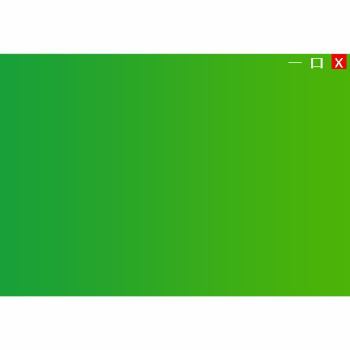
这种方法的缺点是,我们设置的Content比较粗糙~
第二中方法,借助相关的图标的png图片及相应的效果图片,来设置Content,原理同上
<Window x:Class="WpfApplication1.Window1"

        xmlns="http://schemas.microsoft.com/winfx/2006/xaml/presentation"

        xmlns:x="http://schemas.microsoft.com/winfx/2006/xaml"

        Title="Window1" Height="362.767" Width="524.468" WindowStyle="None" AllowsTransparency="True" Background="Transparent">

    <Window.Resources>

        <Style TargetType="Button" x:Key="btnStyle1">

            <Setter Property="Template">

                <Setter.Value>

                    <ControlTemplate  TargetType="Button">

                        <Grid  Background="Transparent">

                            <ContentPresenter x:Name="cp1" Content="{TemplateBinding Content}" VerticalAlignment="Center" HorizontalAlignment="Center" RecognizesAccessKey="True"/>

                        </Grid>

                        <ControlTemplate.Triggers>

                            <Trigger Property="IsMouseOver" Value="True">

                                <Setter TargetName="cp1" Property="Content">

                                    <Setter.Value>

                                        <Image Source="Button_Icons/xm.png"/>

                                    </Setter.Value>

                                </Setter>

                            </Trigger>

                        </ControlTemplate.Triggers>

                    </ControlTemplate>

                </Setter.Value>

            </Setter>

        </Style>

        <Style TargetType="Button" x:Key="btnStyle2">

            <Setter Property="Template">

                <Setter.Value>

                    <ControlTemplate  TargetType="Button">

                        <Grid  Background="Transparent">

                            <ContentPresenter x:Name="cp1" Content="{TemplateBinding Content}" VerticalAlignment="Center" HorizontalAlignment="Center" RecognizesAccessKey="True"/>

                        </Grid>

                        <ControlTemplate.Triggers>

                            <Trigger Property="IsMouseOver" Value="True">

                                <Setter TargetName="cp1" Property="Content">

                                    <Setter.Value>

                                        <Image Source="Button_Icons/mxm.png"/>

                                    </Setter.Value>

                                </Setter>

                            </Trigger>

                        </ControlTemplate.Triggers>

                    </ControlTemplate>

                </Setter.Value>

            </Setter>

        </Style>

        <Style TargetType="Button" x:Key="btnStyle3">

            <Setter Property="Template">

                <Setter.Value>

                    <ControlTemplate  TargetType="Button">

                        <Grid  Background="Transparent">

                            <ContentPresenter x:Name="cp1" Content="{TemplateBinding Content}" VerticalAlignment="Center" HorizontalAlignment="Center" RecognizesAccessKey="True"/>

                        </Grid>

                        <ControlTemplate.Triggers>

                            <Trigger Property="IsMouseOver" Value="True">

                                <Setter TargetName="cp1" Property="Content">

                                    <Setter.Value>

                                        <Image Source="Button_Icons/mim.png"/>

                                    </Setter.Value>

                                </Setter>

                            </Trigger>

                        </ControlTemplate.Triggers>

                    </ControlTemplate>

                </Setter.Value>

            </Setter>

        </Style>

    </Window.Resources>

    <Grid >

        <Grid.Background>

            <ImageBrush ImageSource="Button_Icons/background_mainwnd.png"/>

        </Grid.Background>

        <Grid.RowDefinitions>

            <RowDefinition Height="Auto"/>

            <RowDefinition Height="*"/>

        </Grid.RowDefinitions>

        <StackPanel Grid.Row="0" Orientation="Horizontal" FlowDirection="RightToLeft">

            <Button Style="{StaticResource btnStyle1}"  Foreground="White" FontSize="20" HorizontalAlignment="Left"  VerticalAlignment="Top" Width="30" Height="30" >

                <Button.Content>

                    <Image Source="Button_Icons/xn.png" />

                </Button.Content>

            </Button>

            <Button Style="{StaticResource btnStyle2}"  Foreground="White" FontSize="20" HorizontalAlignment="Left"  VerticalAlignment="Top" Width="30" Height="30" >

                <Button.Content>

                    <Image Source="Button_Icons/mxn.png" />

                </Button.Content>

            </Button>

            <Button Style="{StaticResource btnStyle3}"  Foreground="White" FontSize="20" HorizontalAlignment="Left"  VerticalAlignment="Top" Width="30" Height="30" >

                <Button.Content>

                    <Image Source="Button_Icons/min.png" />

                </Button.Content>

            </Button>

        </StackPanel>

    </Grid>

</Window>
效果如下:

Style的另一个非常常用的场景是:视图切换。参考DebugLZQ前面总结DataTemplate的博文中的一个例子:6.DataTemplate的一个非常常见的应用
请关注后续整理~
Wish it helps~
WPF整理-Style的更多相关文章
- WPF整理-使用用户选择主题的颜色和字体
“Sometimes it's useful to use one of the selected colors or fonts the user has chosen in theWindows ...
- WPF整理-自定义一个扩展标记(custom markup extension)
"Markup extensions are used to extend the capabilities of XAML, by providing declarativeoperati ...
- WPF整理-XAML访问静态属性
"XAML provides an easy way to set values of properties—type converters and the extended propert ...
- WPF整理-XAML构建后台类对象
1.XAML 接触WPF的第一眼就是XAML---XAML是用来描绘界面的.其实不然! "Actually, XAML has nothing to do with UI. It's mer ...
- WPF 之 style文件的引用
总结一下WPF中Style样式的引用方法. 一.内联样式: 直接设置控件的Height.Width.Foreground.HorizontalAlignment.VerticalAlignment等属 ...
- WPF的Style的TargetType不同写法的异同
原文:WPF的Style的TargetType不同写法的异同 <Style TargetType="TextBlock"> <Setter Property=&q ...
- WPF中Style文件的引用——使用xaml代码或者C#代码动态加载
原文:WPF中Style文件的引用--使用xaml代码或者C#代码动态加载 WPF中控件拥有很多依赖属性(Dependency Property),我们可以通过编写自定义Style文件来控制控件的外观 ...
- WPF 中style文件的引用
原文:WPF 中style文件的引用 总结一下WPF中Style样式的引用方法: 一,内联样式: 直接设置控件的Height.Width.Foreground.HorizontalAlignment. ...
- WPF整理-使用逻辑资源
"Traditional application resources consist of binary chunks of data, typically representing thi ...
随机推荐
- CentOS7 cacti 安装
首先centos7 web环境的安装这里就不说了.安装cacti,首先得web环境配置好 其次添加两个用户,一个是cacti用于操作mysql的 cactimysql 一个是cacti操作Linux ...
- 解决eclipse中svn插件总是提示输入密码的问题
一.背景 最近在eclipse中使用svn插件进行远程仓库代码管理时,老是出现提示让输入密码,特别烦人,经过努力,终于解决该问题,拿来和大家分享~ 二.svn插件密码机制以及出现问题的原因分析 当我们 ...
- 如何配置pch文件
pre-Compile Header(预编译头文件) pre-Compile Header简称PCH,由编译器在建立工程时自动生成; 其中存放有工程中已经编译的部分代码; 在以后建立工程时不再重新编译 ...
- https://github.com/chenghuige/tensorflow-exp/blob/master/examples/sparse-tensor-classification/
https://github.com/chenghuige/tensorflow-exp/blob/master/examples/sparse-tensor-classification/ ...
- Android studio 自定义打包apk名
Android Studio打包应用默认生成的apk名称是:app-release.apk .如果我们要让生成的apk名跟我们版本包名有联系的话,那我们就要自定义生成的apk名了 需要在build.g ...
- Delphi容器类之---TList、TObjectList、TComponentList、TClassList
转载自:http://blog.csdn.net/iseekcode/article/details/4922001 从Delphi5开始VCL中增加了新的Contnrs单元,单元中定义了8个新的类, ...
- MySQL和Lucene索引对比分析
MySQL和Lucene都可以对数据构建索引并通过索引查询数据,一个是关系型数据库,一个是构建搜索引擎(Solr.ElasticSearch)的核心类库.两者的索引(index)有什么区别呢?以前写过 ...
- scikit-learn算法选择图
图片来自sklearn官网 最近事情弄完一部分了,继续开始python data science!
- 数据分析师的福音——VS 2017带来一体化的数据分析开发环境
(此文章同时发表在本人微信公众号“dotNET开发经验谈”,欢迎右边二维码来关注.) 题记:在上个月的Connect() 2016大会上,微软宣布了VS 2017 RC的发布,其中为数据分析师带来了一 ...
- artTemplate-master的应用
刚开始,在没有使用这个模板之前,一致都是后台返回一个json的字符串,来在前端自己拼接字符串,不但麻烦,而且费时费力,而且还有时候经常拼接错误!导致了工作效率的延长 js模板的使用 <scrip ...