WPF模拟Office2010文件菜单的TabControl模板
原文:WPF模拟Office2010文件菜单的TabControl模板
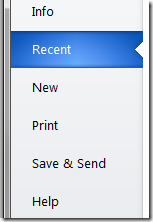
这是Office2010中的文件菜单点开后的效果。本文我将以强大的WPF(www.itstrike.cn)来实现类似的效果。希望你能有所收获。而不是只拷贝/粘贴代码而已。
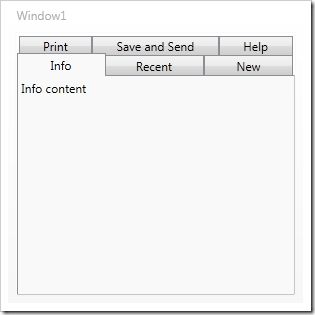
开始之前。先把TabControl找个地方放着。
<Window x:Class="TestClient.MainWindow"
xmlns="http://schemas.microsoft.com/winfx/2006/xaml/presentation"
xmlns:x="http://schemas.microsoft.com/winfx/2006/xaml"
Title="MainWindow" Height="350" Width="525">
<TabControl Name="tabSteps">
<TabItem Header="Info" IsSelected="True">
<TextBlock>Info content</TextBlock>
</TabItem>
<TabItem Header="Recent">
<TextBlock>Recent content tab</TextBlock>
</TabItem>
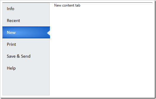
<TabItem Header="New">
<TextBlock>New content tab</TextBlock>
</TabItem>
<TabItem Header="Print">
<TextBlock>Print content tab</TextBlock>
</TabItem>
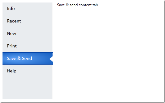
<TabItem Header="Save & Send">
<TextBlock>Save & send content tab</TextBlock>
</TabItem>
<TabItem Header="Help">
<TextBlock>Help tab</TextBlock>
</TabItem>
</TabControl>
</Window>
然后会大概是这个效果
为了改变TabControl的显示效果。我们使用模板机制,我们把模板写进一个资源字典里。这样就可以重用了。添加一个资源字典的步骤如下
右键点击工程-添加-资源字典
然后在资源字典里添加一些代码。
<Grid>
<Grid.ColumnDefinitions>
<ColumnDefinition Width="160" />
<ColumnDefinition/>
</Grid.ColumnDefinitions>
<Border Background="#FFE9ECEF"
Grid.Column="0"
BorderBrush="LightGray"
BorderThickness="1"
SnapsToDevicePixels="True" />
<StackPanel IsItemsHost="True"
Grid.Column="0"
Margin="0,0,-1,0"
SnapsToDevicePixels="True" />
<ContentPresenter
Content="{TemplateBinding SelectedContent}"
Grid.Column="1"
Margin="15,0,0,0" />
</Grid>
</ControlTemplate>
这样就添加了一个有一个grid元素的名为OfficeTabControl的控件模板 . Grid 被分成两列,一列是标签页,一列是页内容。左边的列包含一个灰色背景和亮灰色的边缘线,然后一个StackPanel,IsItemsHost属性被设置为true,
这样标签项被会放在这个栈面板里。第二列是ContentPresenter 这会放置标签页内容。然后让我们前面的TabControl使用新模板。设置Template 属性。
<Window.Resources>
<ResourceDictionary>
<ResourceDictionary.MergedDictionaries>
<ResourceDictionary Source="OfficeTab.xaml" />
</ResourceDictionary.MergedDictionaries>
</ResourceDictionary>
</Window.Resources>
<TabControl Name="tabSteps" Template="{StaticResource OfficeTabControl}">
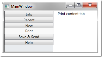
在这之前,先把资源字典加到窗体的Reesouce里。然后再设置。然后运行软件。效果会有一些不一样。
然后要修改左侧单个标签的显示效果。通过改变模板来实现。给模板添加如下的代码
<ControlTemplate x:Key="OfficeTabControl" TargetType="{x:Type TabControl}">
<ControlTemplate.Resources>
<Style TargetType="{x:Type TabItem}">
<Setter Property="Template">
<Setter.Value>
<ControlTemplate TargetType="{x:Type TabItem}">
<Grid SnapsToDevicePixels="True">
<ContentPresenter
Name="buttonText"
Margin="15,0,5,0"
TextBlock.FontFamily="Calibri"
TextBlock.FontSize="12pt"
TextBlock.Foreground="Black"
Content="{TemplateBinding Header}"
VerticalAlignment="Center"/>
</Grid>
</ControlTemplate>
</Setter.Value>
</Setter>
</Style>
</ControlTemplate.Resources>
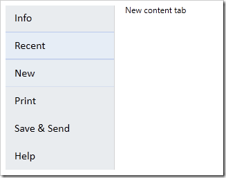
然后再运行

VisualState很有意思。我们可以放在Grid里。然后设置正常状态和鼠标悬停的状态。
为了添加鼠标悬停效果,我们添加两个Borders元素。一个右边缘是灰线,另一个用在背景上。亮蓝色放在上下边缘
<Border Name="hoverShape"
Height="40"
Margin="0,0,1,0"
SnapsToDevicePixels="True"
BorderThickness="0,0,1,0"
BorderBrush="LightGray">
<Border BorderBrush="#FFA1B7EA"
BorderThickness="0,1"
Background="#FFE5EEF9"
Height="40"
SnapsToDevicePixels="True" />
</Border>
之后,我们为VisualState创建故事板,一个是正常状态。会使得hoverShape的透明度为0.另一个是鼠标悬停的状态。透明度会变成1
<Grid SnapsToDevicePixels="True">
<VisualStateManager.VisualStateGroups>
<VisualStateGroup Name="CommonStates">
<VisualState Name="MouseOver">
<Storyboard>
<DoubleAnimation
Storyboard.TargetName="hoverShape"
Storyboard.TargetProperty="Opacity"
To="1"
Duration="0:0:.1"/>
</Storyboard>
</VisualState>
<VisualState Name="Normal">
<Storyboard>
<DoubleAnimation
Storyboard.TargetName="hoverShape"
Storyboard.TargetProperty="Opacity"
To="0"
Duration="0:0:.1"/>
</Storyboard>
</VisualState>
</VisualStateGroup>
之后效果如下
然后添加选中项的样式,在hoverShape 下面再添加一个Border,名字是buttonShape。通过这个我们给被选中项的上下边缘添加2个像素的黑蓝色边缘,
在 Expression Blend中打开, 使用钢笔工具绘制个你想要的路径形状即可。然后把生成的xaml代码拷些过来。
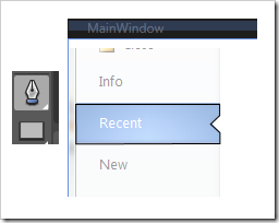
也可以直接用我的代码。。不顾我说过要怎么做了。
最终看起来应该是这样的。
<Border
Name="buttonShape"
Opacity="0"
BorderBrush="#FF0343A6"
BorderThickness="0,2"
Height="40"
SnapsToDevicePixels="True">
<Path
Data="M214,108 L346,108 346.125,118.125 337.75,126.125
346.375,134 346.375,143.875 214.25,144.25 z"
SnapsToDevicePixels="True"
Stretch="Fill"
Height="40">
<Path.Fill>
<RadialGradientBrush GradientOrigin="0.2,0.5" RadiusX="0.8" RadiusY="0.8">
<GradientStop Color="#FF5FA3F6" Offset="0" />
<GradientStop Color="#FF0C55B9" Offset="1" />
</RadialGradientBrush>
</Path.Fill>
</Path>
</Border>
当你运行的时候你会发现没什么变化。我们还要定义被选中标签的VisualState
当添加如下代码的时候 添加一个VisualState组。也就是 SelectionStates ,然后给选中/为选中的状态添加行为/故事板。.这里通过修改透明度来实现一些效果
<VisualStateGroup Name="SelectionStates">
<VisualState Name="Selected">
<Storyboard>
<DoubleAnimation
Storyboard.TargetName="buttonShape" Storyboard.TargetProperty="Opacity"
To="1" Duration="0:0:.3"/>
<DoubleAnimation
Storyboard.TargetName="hoverShape" Storyboard.TargetProperty="Opacity"
To="0" Duration="0:0:.1"/>
<ColorAnimation
Storyboard.TargetName="buttonText"
Storyboard.TargetProperty=
"(TextBlock.Foreground).(SolidColorBrush.Color)"
To="White" Duration="0:0:.1" />
</Storyboard>
</VisualState>
<VisualState Name="Unselected">
<Storyboard>
<DoubleAnimation
Storyboard.TargetName="buttonShape"
Storyboard.TargetProperty="Opacity" To="0" Duration="0:0:.1"/>
<DoubleAnimation
Storyboard.TargetName="hoverShape"
Storyboard.TargetProperty="Opacity" To="0" Duration="0:0:.1"/>
</Storyboard>
</VisualState>
</VisualStateGroup>
现在再运行会发现效果更好了
还有个小问题,就是那个陷进入的小三角形的背景颜色依然还在。通过在下面添加一个白色的形状。,并且对故事板的选中和为选中状态改变一下透明度就可以了。
<VisualStateGroup Name="SelectionStates">
<VisualState Name="Selected">
<Storyboard>
<DoubleAnimation
Storyboard.TargetName="buttonBackgroundShape"
Storyboard.TargetProperty="Opacity" To="1" Duration="0"/>
</Storyboard>
</VisualState>
<VisualState Name="Unselected">
<Storyboard>
<DoubleAnimation
Storyboard.TargetName="buttonBackgroundShape"
Storyboard.TargetProperty="Opacity" To="0" Duration="0"/>
</Storyboard>
</VisualState>
</VisualStateGroup>
最终效果如下:
WPF模拟Office2010文件菜单的TabControl模板的更多相关文章
- WPF 模拟迅雷TabControl界面
WPF模拟迅雷TabControl界面 点击查看下载 <!--TabControl样式--> <Style x:Key="TabControlStyle" Tar ...
- WPF 模仿 UltraEdit 文件查看器系列一 用户控件
WPF 模仿 UltraEdit 文件查看器系列一 用户控件 运行环境:Win10 x64, NetFrameWork 4.8, 作者:乌龙哈里,日期:2019-05-10 章节: 起步 添加用户控件 ...
- wpf datagrid设置右键菜单打开时选中项的背景色
原文:wpf datagrid设置右键菜单打开时选中项的背景色 版权声明:本文为博主原创文章,未经博主允许不得转载. https://blog.csdn.net/huangli321456/artic ...
- FL studio系列教程(十五):FL Studio文件菜单功能详讲
在FL Studio主控面板上的是其主菜单.主菜单包括:文件.编辑.添加.样式.查看.选项.工具和帮助.如下图所示: 为了帮助初学者快速的了解并能使用它制作出作品,今天小编将详细地为大家讲解下这些菜单 ...
- WPF下载远程文件,并显示进度条和百分比
WPF下载远程文件,并显示进度条和百分比 1.xaml <ProgressBar HorizontalAlignment="Left" Height="10&quo ...
- C# WPF 解压缩7zip文件 带进度条 sevenzipsharp
vs2013附件 :http://download.csdn.net/detail/u012663700/7427461 C# WPF 解压缩7zip文件 带进度条 sevenzipsharp W ...
- WPF中使用文件浏览对话框的几种方式
原文:WPF中使用文件浏览对话框的几种方式 WPF本身并没有为我们提供文件浏览的控件, 也不能直接使用Forms中的控件,而文件浏览对话框又是我们最常用的控件之一. 下面是我实现的方式 方式1: 使用 ...
- 《Programming WPF》翻译 第9章 4.模板
原文:<Programming WPF>翻译 第9章 4.模板 对一个自定义元素最后的设计考虑是,它是如何连接其可视化的.如果一个元素直接从FrameworkElement中派生,这将会适 ...
- [WPF疑难]如何禁用WPF窗口的系统菜单(SystemMenu)
原文 [WPF疑难]如何禁用WPF窗口的系统菜单(SystemMenu) [WPF疑难]如何禁用WPF窗口的系统菜单(SystemMenu) 周银辉 点击窗口左上角图标时弹出来的菜单也就是这里所说的系 ...
随机推荐
- P2P网贷第三方托管模式存在5大缺陷,托管机构才是最大赢家
1.注册开户需要2次,用户体验很差劲儿. 理财人和借款人,首先在平台注册,然后还要在第三方托管账户注册. 很多类似的地方,用户体验非常差劲. 比如,密码4个. 平台:登录密码.交易密码 ...
- bootstrap+fileinput插件实现可预览上传照片功能
实际项目中运用: 功能:实现上传图片,更改上传图片,移除图片的功能 <!DOCTYPE html> <html> <head> <meta charset=& ...
- 项目中使用Prism框架
Prism框架在项目中使用 回顾 上一篇,我们介绍了关于控件模板的用法,本节我们将继续说明WPF更加实用的内容,在大型的项目中如何使用Prism框架,并给予Prism框架来构建基础的应用框架,并且 ...
- php实现字符串的排列(交换)(递归考虑所有情况)
php实现字符串的排列(交换)(递归考虑所有情况) 一.总结 交换: 当有abc的时候,分别拿第一位和其它位交换,第一位固定,余下的位做递归,这样有考虑到所有情况,因为第一位只可能是所有的字母,那第一 ...
- Chrome谷歌浏览器web前端开发好用插件(自己用)备忘
Chrome谷歌浏览器web前端开发好用插件(自己用)备忘 一.总结 英语好一点的话要什么工具就直接去Chrome插件里面找非常方便. 二.测试题-简答题 1.Chrome修改页面字符集是什么? 解答 ...
- Android addTextChangedListener(文本监听)参数解释及实现EditText字数监听
由于最近做项目要检测EditText中输入的字数长度,从而接触到了Android中EditText的监听接口,TextWatcher.它有三个成员方法,第一个after很简单,这个方法就是在EditT ...
- Google Guava官方教程
原文链接 译文链接 译者: 沈义扬,罗立树,何一昕,*武祖 * 校对:方腾飞 引言 Guava工程包含了若干被Google的 Java项目广泛依赖 的核心库,例如:集合 [collections] . ...
- oracle 内存结构具体解释
Oracle 内存结构 与 Oracle 实例关联的基本内存结构包含: 系统全局区 (SGA):由全部server和后台进程共享.SGA 中存储的数据演示样例包含快速缓存的数据块和共享 SQL 区域. ...
- Warning: file_put_contents(常用单词1.txt): failed to open stream: Invalid argument in
Warning: file_put_contents(常用单词1.txt): failed to open stream: Invalid argument in 一.总结 1.上述问题是因为Win ...
- PHP如何实现数据类型转换(字符转数字,数字转字符)(三种方式)
PHP如何实现数据类型转换(字符转数字,数字转字符)(三种方式) 一.总结 一句话总结: 1.强制转换:(int) (bool) (float) (string) (array) (object) 2 ...