WPF模拟Office2010文件菜单的TabControl模板
原文:WPF模拟Office2010文件菜单的TabControl模板
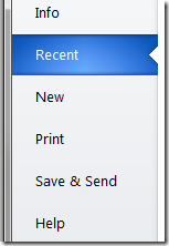
这是Office2010中的文件菜单点开后的效果。本文我将以强大的WPF(www.itstrike.cn)来实现类似的效果。希望你能有所收获。而不是只拷贝/粘贴代码而已。
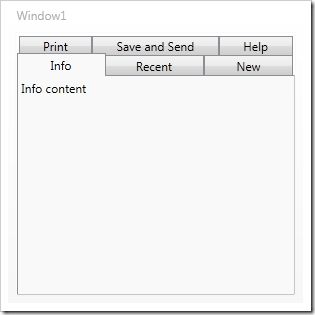
开始之前。先把TabControl找个地方放着。
<Window x:Class="TestClient.MainWindow"
xmlns="http://schemas.microsoft.com/winfx/2006/xaml/presentation"
xmlns:x="http://schemas.microsoft.com/winfx/2006/xaml"
Title="MainWindow" Height="350" Width="525">
<TabControl Name="tabSteps">
<TabItem Header="Info" IsSelected="True">
<TextBlock>Info content</TextBlock>
</TabItem>
<TabItem Header="Recent">
<TextBlock>Recent content tab</TextBlock>
</TabItem>
<TabItem Header="New">
<TextBlock>New content tab</TextBlock>
</TabItem>
<TabItem Header="Print">
<TextBlock>Print content tab</TextBlock>
</TabItem>
<TabItem Header="Save & Send">
<TextBlock>Save & send content tab</TextBlock>
</TabItem>
<TabItem Header="Help">
<TextBlock>Help tab</TextBlock>
</TabItem>
</TabControl>
</Window>
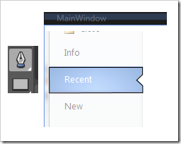
然后会大概是这个效果
为了改变TabControl的显示效果。我们使用模板机制,我们把模板写进一个资源字典里。这样就可以重用了。添加一个资源字典的步骤如下
右键点击工程-添加-资源字典
然后在资源字典里添加一些代码。
<Grid>
<Grid.ColumnDefinitions>
<ColumnDefinition Width="160" />
<ColumnDefinition/>
</Grid.ColumnDefinitions>
<Border Background="#FFE9ECEF"
Grid.Column="0"
BorderBrush="LightGray"
BorderThickness="1"
SnapsToDevicePixels="True" />
<StackPanel IsItemsHost="True"
Grid.Column="0"
Margin="0,0,-1,0"
SnapsToDevicePixels="True" />
<ContentPresenter
Content="{TemplateBinding SelectedContent}"
Grid.Column="1"
Margin="15,0,0,0" />
</Grid>
</ControlTemplate>
这样就添加了一个有一个grid元素的名为OfficeTabControl的控件模板 . Grid 被分成两列,一列是标签页,一列是页内容。左边的列包含一个灰色背景和亮灰色的边缘线,然后一个StackPanel,IsItemsHost属性被设置为true,
这样标签项被会放在这个栈面板里。第二列是ContentPresenter 这会放置标签页内容。然后让我们前面的TabControl使用新模板。设置Template 属性。
<Window.Resources>
<ResourceDictionary>
<ResourceDictionary.MergedDictionaries>
<ResourceDictionary Source="OfficeTab.xaml" />
</ResourceDictionary.MergedDictionaries>
</ResourceDictionary>
</Window.Resources>
<TabControl Name="tabSteps" Template="{StaticResource OfficeTabControl}">
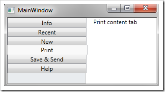
在这之前,先把资源字典加到窗体的Reesouce里。然后再设置。然后运行软件。效果会有一些不一样。
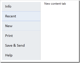
然后要修改左侧单个标签的显示效果。通过改变模板来实现。给模板添加如下的代码
<ControlTemplate x:Key="OfficeTabControl" TargetType="{x:Type TabControl}">
<ControlTemplate.Resources>
<Style TargetType="{x:Type TabItem}">
<Setter Property="Template">
<Setter.Value>
<ControlTemplate TargetType="{x:Type TabItem}">
<Grid SnapsToDevicePixels="True">
<ContentPresenter
Name="buttonText"
Margin="15,0,5,0"
TextBlock.FontFamily="Calibri"
TextBlock.FontSize="12pt"
TextBlock.Foreground="Black"
Content="{TemplateBinding Header}"
VerticalAlignment="Center"/>
</Grid>
</ControlTemplate>
</Setter.Value>
</Setter>
</Style>
</ControlTemplate.Resources>
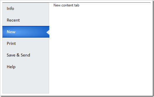
然后再运行

VisualState很有意思。我们可以放在Grid里。然后设置正常状态和鼠标悬停的状态。
为了添加鼠标悬停效果,我们添加两个Borders元素。一个右边缘是灰线,另一个用在背景上。亮蓝色放在上下边缘
<Border Name="hoverShape"
Height="40"
Margin="0,0,1,0"
SnapsToDevicePixels="True"
BorderThickness="0,0,1,0"
BorderBrush="LightGray">
<Border BorderBrush="#FFA1B7EA"
BorderThickness="0,1"
Background="#FFE5EEF9"
Height="40"
SnapsToDevicePixels="True" />
</Border>
之后,我们为VisualState创建故事板,一个是正常状态。会使得hoverShape的透明度为0.另一个是鼠标悬停的状态。透明度会变成1
<Grid SnapsToDevicePixels="True">
<VisualStateManager.VisualStateGroups>
<VisualStateGroup Name="CommonStates">
<VisualState Name="MouseOver">
<Storyboard>
<DoubleAnimation
Storyboard.TargetName="hoverShape"
Storyboard.TargetProperty="Opacity"
To="1"
Duration="0:0:.1"/>
</Storyboard>
</VisualState>
<VisualState Name="Normal">
<Storyboard>
<DoubleAnimation
Storyboard.TargetName="hoverShape"
Storyboard.TargetProperty="Opacity"
To="0"
Duration="0:0:.1"/>
</Storyboard>
</VisualState>
</VisualStateGroup>
之后效果如下
然后添加选中项的样式,在hoverShape 下面再添加一个Border,名字是buttonShape。通过这个我们给被选中项的上下边缘添加2个像素的黑蓝色边缘,
在 Expression Blend中打开, 使用钢笔工具绘制个你想要的路径形状即可。然后把生成的xaml代码拷些过来。
也可以直接用我的代码。。不顾我说过要怎么做了。
最终看起来应该是这样的。
<Border
Name="buttonShape"
Opacity="0"
BorderBrush="#FF0343A6"
BorderThickness="0,2"
Height="40"
SnapsToDevicePixels="True">
<Path
Data="M214,108 L346,108 346.125,118.125 337.75,126.125
346.375,134 346.375,143.875 214.25,144.25 z"
SnapsToDevicePixels="True"
Stretch="Fill"
Height="40">
<Path.Fill>
<RadialGradientBrush GradientOrigin="0.2,0.5" RadiusX="0.8" RadiusY="0.8">
<GradientStop Color="#FF5FA3F6" Offset="0" />
<GradientStop Color="#FF0C55B9" Offset="1" />
</RadialGradientBrush>
</Path.Fill>
</Path>
</Border>
当你运行的时候你会发现没什么变化。我们还要定义被选中标签的VisualState
当添加如下代码的时候 添加一个VisualState组。也就是 SelectionStates ,然后给选中/为选中的状态添加行为/故事板。.这里通过修改透明度来实现一些效果
<VisualStateGroup Name="SelectionStates">
<VisualState Name="Selected">
<Storyboard>
<DoubleAnimation
Storyboard.TargetName="buttonShape" Storyboard.TargetProperty="Opacity"
To="1" Duration="0:0:.3"/>
<DoubleAnimation
Storyboard.TargetName="hoverShape" Storyboard.TargetProperty="Opacity"
To="0" Duration="0:0:.1"/>
<ColorAnimation
Storyboard.TargetName="buttonText"
Storyboard.TargetProperty=
"(TextBlock.Foreground).(SolidColorBrush.Color)"
To="White" Duration="0:0:.1" />
</Storyboard>
</VisualState>
<VisualState Name="Unselected">
<Storyboard>
<DoubleAnimation
Storyboard.TargetName="buttonShape"
Storyboard.TargetProperty="Opacity" To="0" Duration="0:0:.1"/>
<DoubleAnimation
Storyboard.TargetName="hoverShape"
Storyboard.TargetProperty="Opacity" To="0" Duration="0:0:.1"/>
</Storyboard>
</VisualState>
</VisualStateGroup>
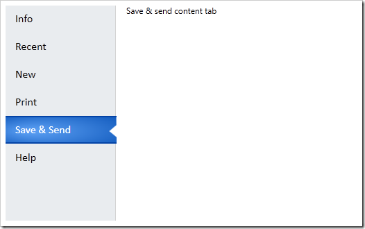
现在再运行会发现效果更好了
还有个小问题,就是那个陷进入的小三角形的背景颜色依然还在。通过在下面添加一个白色的形状。,并且对故事板的选中和为选中状态改变一下透明度就可以了。
<VisualStateGroup Name="SelectionStates">
<VisualState Name="Selected">
<Storyboard>
<DoubleAnimation
Storyboard.TargetName="buttonBackgroundShape"
Storyboard.TargetProperty="Opacity" To="1" Duration="0"/>
</Storyboard>
</VisualState>
<VisualState Name="Unselected">
<Storyboard>
<DoubleAnimation
Storyboard.TargetName="buttonBackgroundShape"
Storyboard.TargetProperty="Opacity" To="0" Duration="0"/>
</Storyboard>
</VisualState>
</VisualStateGroup>
最终效果如下:
WPF模拟Office2010文件菜单的TabControl模板的更多相关文章
- WPF 模拟迅雷TabControl界面
WPF模拟迅雷TabControl界面 点击查看下载 <!--TabControl样式--> <Style x:Key="TabControlStyle" Tar ...
- WPF 模仿 UltraEdit 文件查看器系列一 用户控件
WPF 模仿 UltraEdit 文件查看器系列一 用户控件 运行环境:Win10 x64, NetFrameWork 4.8, 作者:乌龙哈里,日期:2019-05-10 章节: 起步 添加用户控件 ...
- wpf datagrid设置右键菜单打开时选中项的背景色
原文:wpf datagrid设置右键菜单打开时选中项的背景色 版权声明:本文为博主原创文章,未经博主允许不得转载. https://blog.csdn.net/huangli321456/artic ...
- FL studio系列教程(十五):FL Studio文件菜单功能详讲
在FL Studio主控面板上的是其主菜单.主菜单包括:文件.编辑.添加.样式.查看.选项.工具和帮助.如下图所示: 为了帮助初学者快速的了解并能使用它制作出作品,今天小编将详细地为大家讲解下这些菜单 ...
- WPF下载远程文件,并显示进度条和百分比
WPF下载远程文件,并显示进度条和百分比 1.xaml <ProgressBar HorizontalAlignment="Left" Height="10&quo ...
- C# WPF 解压缩7zip文件 带进度条 sevenzipsharp
vs2013附件 :http://download.csdn.net/detail/u012663700/7427461 C# WPF 解压缩7zip文件 带进度条 sevenzipsharp W ...
- WPF中使用文件浏览对话框的几种方式
原文:WPF中使用文件浏览对话框的几种方式 WPF本身并没有为我们提供文件浏览的控件, 也不能直接使用Forms中的控件,而文件浏览对话框又是我们最常用的控件之一. 下面是我实现的方式 方式1: 使用 ...
- 《Programming WPF》翻译 第9章 4.模板
原文:<Programming WPF>翻译 第9章 4.模板 对一个自定义元素最后的设计考虑是,它是如何连接其可视化的.如果一个元素直接从FrameworkElement中派生,这将会适 ...
- [WPF疑难]如何禁用WPF窗口的系统菜单(SystemMenu)
原文 [WPF疑难]如何禁用WPF窗口的系统菜单(SystemMenu) [WPF疑难]如何禁用WPF窗口的系统菜单(SystemMenu) 周银辉 点击窗口左上角图标时弹出来的菜单也就是这里所说的系 ...
随机推荐
- mac系统创建.开头文件.htaccess
thinkphp5 隐藏index.php的时候需要用的.htaccess文件,但是mac默认不让创建这种文件 感谢 https://blog.csdn.net/gyz413977349/articl ...
- js获取浏览器和元素对象的尺寸
1.屏幕尺寸 window.screen.height //屏幕分辨率的高 window.screen.width //屏幕分辨率的宽 window.screen.availHeight //屏幕可用 ...
- POJ 3627 Bookshelf 贪心 水~
最近学业上堕落成渣了.得开始好好学习了. 还有呀,相家了,好久没回去啦~ 还有和那谁谁谁... 嗯,不能发表悲观言论.说好的. 如果这么点坎坷都过不去的话,那么这情感也太脆弱. ----------- ...
- [Angular] Test component template
Component: import { Component, Input, ChangeDetectionStrategy, EventEmitter, Output } from '@angular ...
- 【Heritrix基础教程之3】Heritrix的基本架构 分类: H3_NUTCH 2014-06-01 16:56 1267人阅读 评论(0) 收藏
Heritrix可分为四大模块: 1.控制器CrawlController 2.待处理的uri列表 Frontier 3.线程池 ToeThread 4.各个步骤的处理器 (1)Pre-fetch ...
- thinkphp5项目--练手--企业单车网站(九)(友情链接)
thinkphp5项目--练手--企业单车网站(九)(友情链接) 项目地址 fry404006308/BicycleEnterpriseWebsite: Bicycle Enterprise Webs ...
- [Django] Auth django app with rest api
First, start the env: . bin/activate Then cd to our module cd djangular Create a new app: python man ...
- 【浅墨Unity3D Shader编程】之中的一个 夏威夷篇:游戏场景的创建 & 第一个Shader的书写
本系列文章由@浅墨_毛星云 出品.转载请注明出处. 文章链接:http://blog.csdn.net/poem_qianmo/article/details/40723789 作者:毛星云(浅墨) ...
- asp.net core2.1 部署centos7/linux系统 -- 安装部署(一)
原文:asp.net core2.1 部署centos7/linux系统 -- 安装部署(一) 1.安装dotnet sdk(添加产品秘钥与yum源) 添加yum源:sudo rpm -Uvh htt ...
- 移动端iPhone系列适配问题的一些坑
完成移动端的开发项目之后,发现谷歌自带的调试器似乎没有什么太大的作用,整天借同事的苹果手机测bug,尽管同事不厌其烦,但还是觉得这iPhone系列适配问题适配到想逃逃逃,好在项目已经顺利完成,测试通过 ...