关于css3的背景切割(background-clip)、背景原点(background-origin)的使用


<!doctype html>
<html lang="en">
<head>
<meta charset="UTF-8">
<title>Document</title>
<style type="text/css">
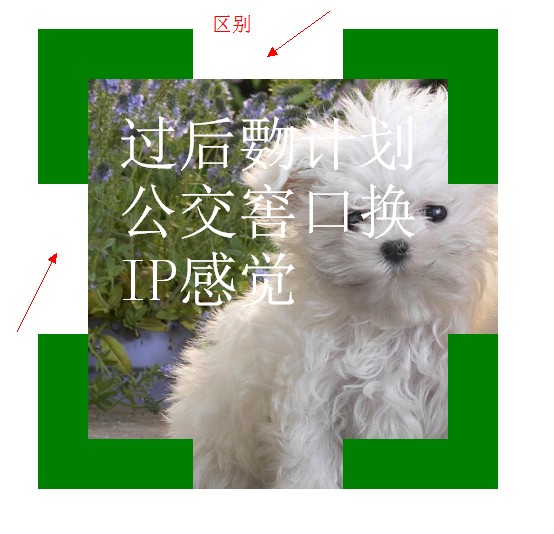
.div1{
width: 300px;
height: 300px;
border:50px dashed green;
font-size: 60px;
color: #fff;
padding: 30px;
margin: 30px;
background: #fff url(bac.jpg) 0 0 no-repeat;
background-clip: border-box;
/*background-clip: padding-box;*/
/*background-clip: content-box;*/
}
</style>
</head>
<body>
<div class="div1">过后覅计划公交窖口换IP感觉</div>
</body>
</html>

<!doctype html>
<html lang="en">
<head>
<meta charset="UTF-8">
<title>Document</title>
<style type="text/css">
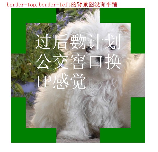
.div1{
width: 300px;
height: 300px;
border:50px dashed green;
font-size: 60px;
color: #fff;
padding: 30px;
margin: 30px;
background: #fff url(bac.jpg) 0 0 no-repeat;
background-clip: border-box;
/*background-clip: padding-box;*/
/*background-clip: content-box;*/
}
</style>
</head>
<body>
<div class="div1">过后覅计划公交窖口换IP感觉</div>
</body>
</html>

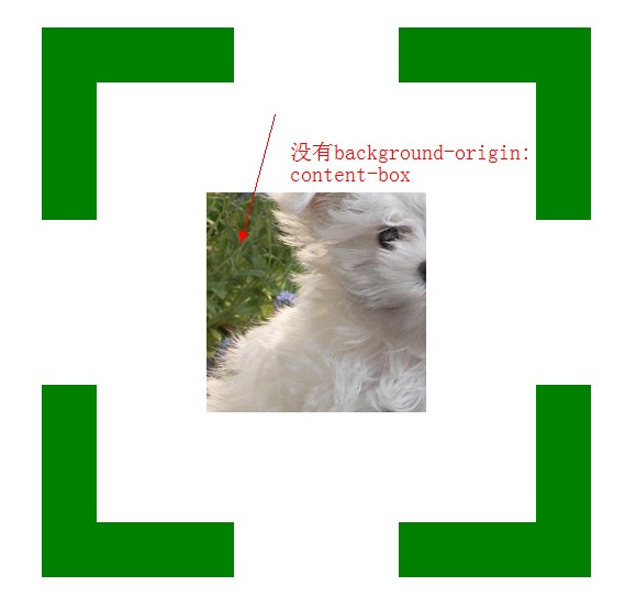
<!doctype html>
<html lang="en">
<head>
<meta charset="UTF-8">
<title>Document</title>
<style type="text/css">
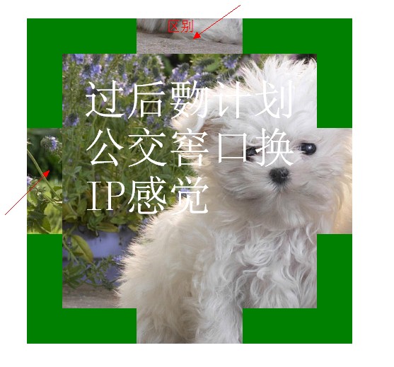
.div1{
width: 300px;
height: 300px;
border:50px dashed green;
font-size: 60px;
color: #fff;
padding: 30px;
margin: 30px;
background: #fff url(bac.jpg) 0 0 no-repeat;
background-clip: border-box;
/*background-clip: padding-box;*/
/*background-clip: content-box;*/
background-origin: border-box;
}
</style>
</head>
<body>
<div class="div1">过后覅计划公交窖口换IP感觉</div>
</body>
</html>


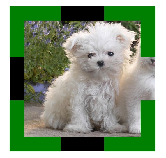
<!doctype html>
<html lang="en">
<head>
<meta charset="UTF-8">
<title>Document</title>
<style type="text/css">
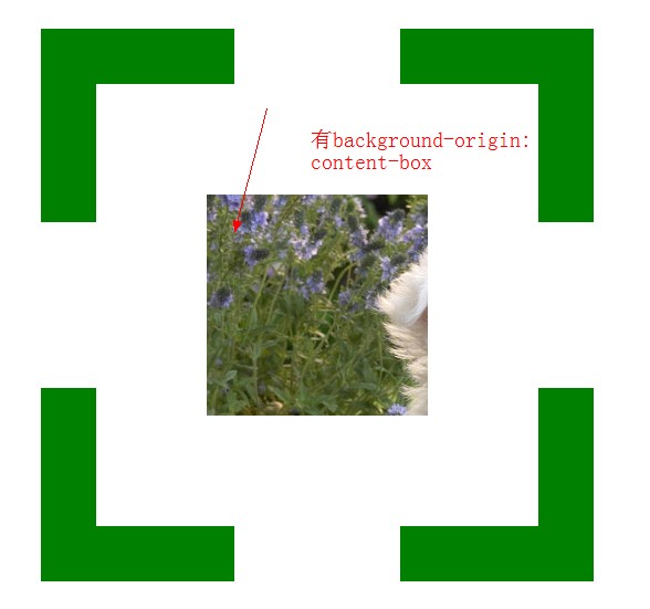
.div1{
width: 200px;
height: 200px;
border:50px dashed green;
font-size: 60px;
color: #fff;
padding: 100px;
margin: 30px;
background: #f00 url(bac.jpg) 0 0 no-repeat;
background-clip: content-box;
background-origin: content-box;
}
</style>
</head>
<body>
<div class="div1"></div>
</body>
</html>
 <!doctype html>

 <html lang="en">

 <head>

 <meta charset="UTF-8">

 <title>Document</title>

 <style type="text/css">

 .div1{

 width: 200px;

 height: 200px;

 border:50px dashed green;

 padding: 100px;

 margin: 30px;

 background: #000 url(bac.jpg) 0 0 no-repeat;

 /*background-size:400px 400px;*/

 /*background-size:100% 100%;*/

 /*background-size:auto;*/

 background-size:cover;

 /*background-size:contain;*/

 }

 </style>

 </head>

 <body>

 <div class="div1"></div>

 </body>

 </html>

 <!doctype html>

 <html lang="en">

 <head>

 <meta charset="UTF-8">

 <title>Document</title>

 <style type="text/css">

 body{

 color: #fff;

 background: #000;

 }

 div{

 color: #fff;

 font-size: 50px;

 font-weight: bold;

 background: rgba(255,255,255,0.5);

 position: absolute;

 }

 </style>

 </head>

 <body>

 <div>会后集合与交通</div>

 </body>

 </html>


 <!doctype html>

 <html lang="en">

 <head>

 <meta charset="UTF-8">

 <title>Document</title>

 <style type="text/css">

 div{

 height: 100px;

 width: 100px;

 background: -webkit-gradient(linear,left center,right center,from(yellow),color-stop(0.5,black),color-stop(0.5,#fff),to(blue));

 }

 </style>

 </head>

 <body>

 <div></div>

 </body>

 </html>


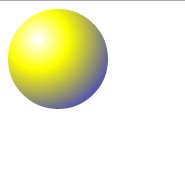
 <!doctype html>

 <html lang="en">

 <head>

 <meta charset="UTF-8">

 <title>Document</title>

 <style type="text/css">

 div{

 height: 100px;

 width: 100px;

 border-radius: 50px;

 background: -webkit-gradient(radial,30 30,1,30 30,100,from(#fff),color-stop(0.3,yellow),to(blue));

 }

 </style>

 </head>

 <body>

 <div></div>

 </body>

 </html>

关于css3的背景切割(background-clip)、背景原点(background-origin)的使用的更多相关文章
- CSS3总结二:(background)背景/渐变色函数
background-color(CSS2) background-image background-position background-size background-repeat backgr ...
- css3基础-选择器+边框与圆角+背景与渐变
Css3选择器相关: section > div直接子元素选择器 div + article相邻兄弟选择器(在元素之后出现) div ~ article通用兄弟选择器(在元素之后出现) 属性选择 ...
- CSS(九):background(背景属性)
通过CSS背景属性,可以给页面元素添加背景样式. 背景属性可以设置背景颜色.背景图片.背景平铺.背景图像固定等. background-color(背景颜色) background-color属性定义 ...
- css考核点整理(八)-在什么情况下通过img引入图片,什么情况用背景图引入?背景属性有哪些
在什么情况下通过img引入图片,什么情况用背景图引入?背景属性有哪些
- PDF如何去除背景,PDF去除背景颜色
PDF文件在使用的时候大多都是单调的白色背景,但是也有小伙伴再制作PDF文件的时候会给PDF文件添加背景颜色,会有影响文字阅读的情况,这个时候就需要把背景颜色去除了,那么该怎么做呢,不会的小伙们就跟小 ...
- CSS3动画设置后台登录页背景切换图片
CSS3的动画很实用很好用,简单几句话就可以做出一个好看而且过渡平滑的body背景图片,不多说,来来来,上代码 body{ animation:mybg 7s; -webkit-animation:m ...
- css3动画,点击圆形背景扩展整个页面效果
上次做项目的时候,要求点击链接,这个链接的圆形背景扩散充满整个页面,今天把这个效果整理一下,是简单的css3的动画特效,粘贴下面的代码看效果 <!DOCTYPE html> <htm ...
- CSS3:元素的边框、背景和大小
边框 和边框相关的属性例如以下. border-width 用于设置边框的宽度,可选择包含: 1)<长度值>:将边框宽度设为以CSS度量单位(如em.px.cm)表达的长度值. 2)< ...
- CSS3背景图片(多重背景、起始位置、裁剪、尺寸)
一.多重背景图片 ①CSS3允许我们在一个元素上添加多个图片 ②多重背景可以把多个图片资源添加到background属性上,用逗号隔开,然后用background-position把他们定位到你想要的 ...
随机推荐
- Intersection of Two Linked Lists(java)
eg: a1 → a2 ↘ c1 → c2 → c3 或者直接a1 → b1 ↗ b1 → b2 → b3求公共链表c1. 常规的指针分裂法,复制法,偏移法. public class Solutio ...
- <转>GC其他:引用标记-清除、复制、标记-整理的说明
注:本文根据<深入理解Java虚拟机>第3章部分内容整理而成. 对象死亡历程 1.基本的mark&sweep是必须的,后续的都是对他的改进, 2.young代理的survivor就 ...
- (原)android的JNI中使用C++的类
android的JNI代码中可以调用C++的类,但是不能直接调用,要加上一个类似于接口的java类,这个类内部调用C++的类.实际上和接口类直接调用C++中的函数差不多,只是稍微复杂了一点. 1. 写 ...
- 为什么所有浏览器的userAgent都带Mozilla
参看下面链接:<为什么所有的浏览器的userAgent都带Mozilla>
- 【Android】设备标识简介(imei imsi mac地址)
IMEI: 1- 意义: 参考http://zh.wikipedia.org/zh-cn/IMEI 国际移动设备辨识码 ,共15位,和厂商,产地等有关. 2- 获取: 直接查看设备信息,设置-关于手 ...
- python给多个发送邮件附件,参考于《python自动化运维》
#!/usr/bin/env python #coding: utf-8 #author:luodi date:2015/02/12 #description:this is a send mail ...
- android studio error configuration with name default not found
Android Studio报错: android studio error configuration with name default not found 在进行sync的时候,提示Error: ...
- Python 整理一
---恢复内容开始--- Python (pailen)最近学习这个语言,其实早在几年前学习perl的时候就知道有这个语言了,在讲perl的那本书后面就推荐学习python,并且还附加了二章的入门.当 ...
- Yii 2.0安装
通过 Composer 安装 注意: php版本最好在5.5以上! 1.下载 Yii2的高级应用程序模板 ,然后将其解压缩到一个Web可访问的文件夹. 2.下载Composer-Setup.exe , ...
- POSIX和SYSTEM的消息队列应该注意的问题
首先看看POSIX的代码: 1.posix_mq_server.c #include <mqueue.h>#include <sys/stat.h>#include <s ...