How to Tell Science Stories with Maps
How to Tell Science Stories with Maps
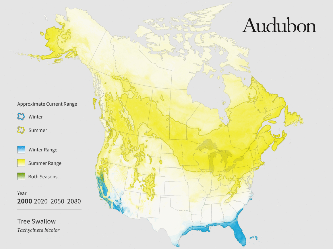
This map, part of Audubon’s Birds and Climate Change report, depicts predicted changes in tree swallows’ summer (yellow) and winter (blue) ranges.
Maps are amazing for their ability to show us something we can’t see directly, from the path of the Curiosity rover on Mars, to the tangle of underground fracking wells in North Dakota, to clusters of unvaccinated schoolchildren in California. For journalists, maps can be both a powerful data-visualization tool and a reporting tool.
“Maps are some of the most information-dense ways of communicating data,” says Len De Groot, director of data visualization at the Los Angeles Times. People understand maps intuitively because they use them in their everyday lives, De Groot says. “You can do a lot in a map because people already understand the fundamentals—unlike, say, a scatterplot.”
Maps can also reveal relationships and stories that aren’t otherwise apparent. In the mid-2000s, De Groot was part of a team at the South Florida Sun-Sentinel that mapped FEMA disbursements after several hurricanes, including Hurricane Frances, which struck in 2004. “We didn’t start with any agenda, we were just doing the standard where’s-the-money-going thing,” he says. “To our surprise there was one zip code in Miami where we saw there was a spike in payouts in areas where we knew there was very little damage.” That led to a broader investigation by the paper, which revealed widespread fraud and got the paper nominated for a Pulitzer Prize and ultimately led to policy changes at FEMA.
Fortunately for cartography-curious journalists, making maps is easier than ever, thanks to a proliferation of (mostly) free and open-source software. Anyone with a computer can put together a nice-looking map in less than an hour. Making really good maps isn’t quite that easy, however. It requires more thought and a willingness to learn some technical skills. Here are some considerations to keep in mind, and some tips on how to get started.
Whether to Map
Just because you could make a map from a given dataset doesn’t necessarily mean you should. The key question is whether location is the most important thing about the story you’re trying to tell, says Virginia Mason, a senior graphics editor at National Geographic. For example, one upcoming story involves a Department of Agriculture program that culls wolves to protect farm animals. The graphics team had data on how many animals have been killed in each state, and their first thought was to make a map, shaded to indicate the number of animals killed. But they soon thought better of it. “Really the significance isn’t where the states are, it’s what the states are,” Mason says. So they decided to instead create a chart that makes it easy to see at a glance which states have killed the most wolves.
If the same data were displayed on a map, readers would have to scan the map and make comparisons between the colors or shading of different states. It’s something our brains aren’t especially good at, says Peter Aldhous, a self-taught mapmaker and science reporter for BuzzFeed News. There’s been a lot of perceptual science research on what visual features our brains are best at discriminating, Aldhous says. It’s found, for example, that we are much better at comparing the length of lines than we are at comparing area, color, or saturation. So, if comparing numbers is the point, a bar chart is a solid choice. (For a good introduction to using perceptual science to make better infographics, check out Alberto Cairo’s book, The Functional Art).
Mason and her colleagues at National Geographic did make a map, or rather a series of them, for another conservation story, a 2013 feature on African lions. The maps show the historical range of lions, which covers large swaths of Africa, and the scattered pockets where they still exist today. In that case, she says, place matters—the lions now survive almost entirely in wildlife parks and other protected areas. Also, most readers aren’t as familiar with African geography as they are with the 50 states. “If you did a chart of lion populations by wildlife reserve, people aren’t going to know where those reserves are,” Mason says.

This map, published in National Geographic in 2014, shows the historical range of lions in Africa and the scattered pockets where they still exist today.
What Is Your Point?
Once you’ve decided that a map is in fact what you want, the next question is what point you want your map to get across. Then, spend some time thinking about how to design the map so that every part of it emphasizes that point, and anything that doesn’t goes away, says Anthony Robinson, a geography professor who teaches cartography at Penn State. (Robinson also developed a mapping MOOCthat’s been taken by more than 100,000 people—it’s a great introduction, but the next installment hasn’t been scheduled yet).
“One common thing I see is satellite or aerial imagery on something like election maps,” Robinson says. If the point of the map is who voted for whom, the land cover is irrelevant. A neutral white or gray background is usually preferable.
Too much clutter is another pitfall, Robinson says. Mapping software puts every little road, stream, and populated place at your disposal. Resist the urge to include them all, even if you have to rebel against the default settings of the software or remove features by hand using Adobe Illustrator or asimilar program.
You can see a nice example of a strong visual hierarchy in the map below, from The New York Times.

This New York Times map documenting the movement of refugees mutes details of oceans and landmasses to minimize clutter.
The red lines show the movement of refugees around the world. The white oceans and gray landmasses are just visible enough to provide a reference. “We used a satellite image, but we took out all the color so the red arrows really popped,” says Tim Wallace, a cartographer and graphics editor at theTimes. This map also illustrates how making a map can reveal new stories—in contrast to recent media attention to refugees’ desperate attempts to cross the Mediterranean and Andaman Seas, the map shows a surprising amount of displacement within Africa.
 Pick the Right Projection
In 2003 The Economist published a map to accompany an article on the threat of missile attacks from North Korea. They used a standard Mercator projection and concentric circles to indicate the regions potentially in harm’s way. Wrong! The Mercator projection grossly distorts distances near the poles, so the real reach of any missiles from Pyongyang would be far greater. The magazine published a correction, along with a revised—and much scarier—map a short time later (see both versionshere).
Picking the wrong projection is a rookie mistake. The problem is simple: The Earth is round, and maps are flat. Projections are the mathematical formulas that force a round planet onto a flat map. Each projection distorts some combination of area, shape, direction, and distance. Each has its strengths and weaknesses. Mercator, devised for 16th-century nautical charts, is very good at preserving direction. The azimuthal equidistant projection, which preserves distances relative to a central point, might have been a good choice for the North Korea map. If preserving area is important, say for mapping the impacts of climate change on bird habitats, the Albers equal-area conic projection is a good choice.
Normalize Your Choropleth
When I first met Anthony Robinson, at a mapping conference in 2013, he was wearing a little pin that said: “Normalize your choropleth.” I had no idea what it meant, but it turns out to be extremely important advice.
Choropleth maps are everywhere. They use colors or shading to map a variable—anything from election results to crop yields to cancer rates. But if you’re not careful, it’s easy to end up with a misleading or meaningless map. Take cancer. If you map the number of cancer cases in different areas across the U.S., you will likely see big dark splotches along the Eastern Seaboard and Southern California, with a few small blobs across the Midwest. Because that’s where the people are. You might as well have made a population map. What’s far more interesting is where the cancer rate—the number of cases per 100,000 inhabitants—is higher or lower than normal. Normalizing (by population, in this case) allows readers to make meaningful comparisons. In other cases, you might want to normalize by area—for example, a map of air-pollution sources might be normalized to show the number of factories or automobiles per square mile.
Color Matters
Nothing makes professional cartographers roll their eyes in dismay like a rainbow color scheme, the kind you often see on weather maps. “It’s like this trend of putting bacon on all kinds of food,” says Robinson. “It’s just gratuitous.” A rainbow palette may look pretty at first glance butit’s rarely a good choice for maps. It’s especially bad for mapping a continuous variable like temperature. If red is warmer than blue, why is violet (a mix of red and blue) colder than blue? And why is it that a two-degree difference in temperature can correspond to either a subtle change from light green to dark green or a dramatic jump from green to yellow? A more intuitive color scheme would use darker shades of a single color to represent higher values.
Robinson’s Penn State colleague Cindy Brewer has spent much of her career applying perceptual research on color to mapmaking. Her website, Color Brewer, is a great resource for beginners. It forces you to think about the data you’re trying to map. For divergent data—areas of above- and below-average rainfall, for example—Color Brewer might suggest a color scheme that transitions from brown to green, with neutral white in the middle. For mapping distinct categories, such as the dominant invasive species in different areas, the site will suggest a combination of unrelated colors that are easy to tell apart. It also limits you to 12 categories—any more than that and readers will have a hard time telling the colors apart. Color Brewer also lets you click boxes to limit yourself to color schemes that can be read by color-blind people, or that look good on paper as well as on screen.
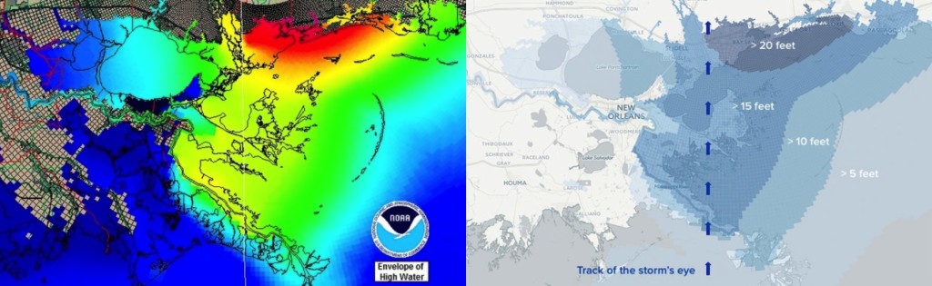
For a recent anniversary story on Hurricane Katrina, BuzzFeed News science reporter Peter Aldhous took storm surge data from a NOAA computer model (left) and tried to “make it look less like an acid trip in a paint factory.” His more subdued but more intuitively readable version is on the right.
Getting Started
Just a few years ago, getting started with digital maps meant diving into the deep end with the kind of complicated geographic-information-system (GIS) software typically used by natural-resource managers, city planners, and other experts. It’s much easier these days. One good option isCartoDB, an online mapmaking tool that allows you to upload datasets and make basic interactive web maps using a point-and-click interface. To make more sophisticated maps, or to customize your maps so they look exactly as you want, you’ll need to learn a bit of coding. You won’t become an expert overnight, but you can quickly pick up enough to be useful, especially if you take advantage of CartoDB’s online courses, which were designed with journalists in mind. Pricing varies according to how much data you’re allowed to upload—a free version allows up to 50MB, which is plenty to play around with.
For some of my very first efforts at making maps, I used an even easier option: ArcGIS online, from Esri, the Microsoft of GIS mapping software. Journalists can request free access through Esri’smedia relations team. The point-and-click interface includes easy access to census data and other public databases, and includes several templates for incorporating photos and text into “story maps,” like this one I made to go with a story on a wildlife die-off in Florida. The free version offers less customization and less data analysis than CartoDB, but it’s a good option for the code averse. Investigative Reporters and Editors recently posted a helpful gallery of video introductions to several mapping and data visualization tools.
CartoDB, Esri, and other makers of mapping software often offer workshops at journalism conferences. As do the journalists who use them. Aldhous and De Groot have taught a mapping workshop at the Knight Digital Media Center at the UC Berkeley Graduate School of Journalism. Aldhous has also taught mapping to journalists at the annual meeting of IRE, an organization he credits with fostering his own interest in mapping and in data journalism more broadly. “They talk a lot about a data frame of mind, where you’re not just thinking about who can I interview for a story, you’re thinking about how can I use data to help me find a story or bring context to a story,” he says. “The maps are really part of that.”

Greg Miller
Guest contributor Greg Miller is a science journalist based in Portland, Oregon. Previously, he was a senior writer at Wired, where he co-founded the cartography blog Map Lab. Follow him on Twitter @dosmonos.
Image credits:
Tree swallow map: National Audubon Society / Stamen Design.
Lion map: Virginia W. Mason / National Geographic.
Refugee map: Sergio Peçanha and Tim Wallace / The New York Times.
xkcd map projections: xkcd (CC BY-NC 2.5).
NOAA and BuzzFeed maps: Peter Aldhous / BuzzFeed News and NOAA.
Photo of Greg Miller: courtesy of Greg Miller.
How to Tell Science Stories with Maps的更多相关文章
- USER STORIES AND USE CASES - DON’T USE BOTH
We’re in Orlando for a working session as part of the Core Team building BABOK V3 and over dinner th ...
- Thoughts on an Article from Science 'A network framework of cultural history'
Apparently, this is an excellent interdisciplinary study. This paper drawn on a simple but large dat ...
- 【Repost】A Practical Intro to Data Science
Are you a interested in taking a course with us? Learn about our programs or contact us at hello@zip ...
- Competing in a data science contest without reading the data
Competing in a data science contest without reading the data Machine learning competitions have beco ...
- 15 Most Read Data Science Articles in 2015. So far …
15 Most Read Data Science Articles in 2015. So far … We've compiled the latest set of "most rea ...
- 11 Facts about Data Science that you must know
11 Facts about Data Science that you must know Statistics, Machine Learning, Data Science, or Analyt ...
- How To Build Compelling Stories From Your Data Sets
How To Build Compelling Stories From Your Data Sets Every number has a story. As a data scientist, y ...
- 【转】The most comprehensive Data Science learning plan for 2017
I joined Analytics Vidhya as an intern last summer. I had no clue what was in store for me. I had be ...
- 【转】Go maps in action
原文: https://blog.golang.org/go-maps-in-action ------------------------------------------------------ ...
随机推荐
- 【Coursera】经验风险最小化
一.经验风险最小化 1.有限假设类情形 对于Chernoff bound 不等式,最直观的解释就是利用高斯分布的图象.而且这个结论和中心极限定律没有关系,当m为任意值时Chernoff bound均成 ...
- 【贪心算法】POJ-1328 区间问题
一.题目 Description Assume the coasting is an infinite straight line. Land is in one side of coasting, ...
- Android-TCP编程
以下是PC端代码: package com.example.sxb.myapplication;import java.io.BufferedReader;import java.io.IOExcep ...
- ps -aux 命令下的前几行内容解释 与 top命令下的前几行内容解释
系统进程分为5种不同的状态: R(运行):正在运行或在运行队列中等待 S(中断):休眠中,在等待某个条件的形成或接受到信号 D(不可中断):收到信号不唤醒和不可运行.进程必须等待直到有中断发生 Z(僵 ...
- poi读取Excel文件和图片
首先得说一下,Excel文件是有03版和07版的区别的,也就是.xls和.xlsx,这两个文件需要分开读取. 其它的废话就不说了,直接贴代码: package util; import java.io ...
- ubuntu下安装lamp环境
使用普通用户来安装lamp环境: 1.安装apache: sudo apt-get install apache2
- zabbix自定义web检测
zabbix自定义web检测 本博客使用zabbix 版本 4.0.3 Web监控的原理 Web监控即对HTTP服务的监控,模拟用户去访问网站,对特定的结果进行比较,如状态码.返回字符串等特定的数据进 ...
- C++ STL 常用遍历算法
C++ STL 常用遍历算法 STL的容器算法迭代器的设计理念 1) STL的容器通过类模板技术,实现数据类型和容器模型的分离 2) STL的迭代器技术实现了遍历容器的统一方法:也为STL的算法提供了 ...
- Oracle 双字段过滤
白名单:数据 id , g_id,sys_id 1,2,3 1,2,4 黑名单:数据 id , g_id,sys_id b,2,3 结果 1,2,4 select t1.* ...
- MT【137】多少个?
数列\(\{a_n\}\)共11项,\(a_1=0,a_{11}=4\),且\(|a_{k+1}-a_{k}|=2,k=1,2,\cdots,10\) 求满足条件的不同的数列的个数______ 解答: ...