纯代码利用CSS3 圆角边框和盒子阴影 制作 iphone 手机效果
原文:纯代码利用CSS3 圆角边框和盒子阴影 制作 iphone 手机效果
大家好,我是小强老师。 今天我们看下CSS3最为简单的两个属性。
css3给我们带来了很多视觉的感受和变化,以前的图片做的事情,很多代码都能实现。 下面给大家简单介绍两种最为常见的圆角边框和盒子阴影,同时附上一个iphone 手机效果,提供大家练习。
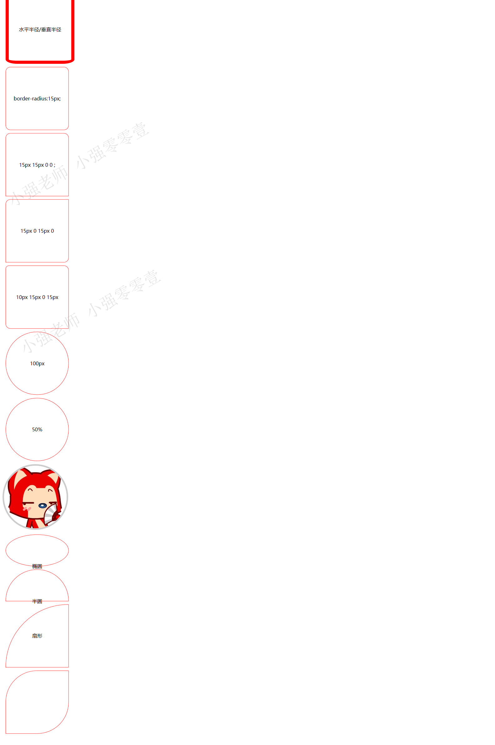
1.border-radius 圆角矩形
语法格式: border-radius: 水平半径/垂直半径
只不过我们平时都把后面的这个垂直半径给省略了。
圆角也有连写的方法
border-radius: 左上角 右上角 右下角 左下角; 采取的是 顺时针
如下图:
代码如下:
 <!DOCTYPE html>

 <html>

 <head lang="en">

     <meta charset="UTF-8">

     <title></title>

     <style>

         div{

             width: 200px;

             height: 200px;

             border:1px solid red;

             margin:10px;

             text-align: center;

             line-height: 200px;

         }

         div:nth-of-type(1)

         {

             border:10px solid red;

             border-radius: 38px/14px;

         }

         div:nth-of-type(2)

         {

             border-radius:15px;

         }

         div:nth-of-type(3)

         {

             border-radius:15px 15px 0 0 ;

         }

         div:nth-of-type(4)

         {

             border-radius:15px 0 15px 0  ;

         }

         div:nth-of-type(5)

         {

             border-radius:10px 15px 0 15px  ;

         }

         div:nth-of-type(6)

         {

             border-radius:100px;

         }

         div:nth-of-type(7)

         {

             border-radius:50%;

         }

         img{

             border:5px solid #ccc;

             border-radius:50%;

         }

         div:nth-of-type(8)

         {

             border-radius:50%;

             height: 100px;

         }

         div:nth-of-type(9)

         {

             border-radius:100px 100px 0 0 ;

             height: 100px;

         }

         div:nth-of-type(10)

         {

             border-radius:200px 0 0 0 ;

         }

         div:nth-of-type(11)

         {

             border-radius:100px 0 100px 0 ;

         }

     </style>

 </head>

 <body>

 <div>水平半径/垂直半径</div>

 <div>border-radius:15px;</div>

 <div>15px 15px 0 0 ;</div>

 <div>15px 0 15px 0</div>

 <div>10px 15px 0 15px  </div>

 <div>100px</div>

 <div>50%</div>

 <img src="1.jpg" alt=""/>

 <div>椭圆</div>

 <div>半圆</div>

 <div>扇形</div>

 <div></div>

 </body>

 </html>
1.2 阴影(box-shadow)
Box-shadow: 水平阴影 垂直阴影 模糊距离 阴影尺寸 阴影颜色 内外阴影;
里面只有水平阴影和垂直阴影是必须的。其他的可以省略有默认值。
默认的外阴影 outset 不能写,写上就看不到效果
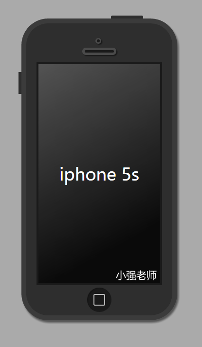
1.3 CSS3iphone 手机的写法
先看效果图吧:
完整代码如下:
<!DOCTYPE html>

<html lang="en">

<head>

    <meta charset="UTF-8">

    <title>Document</title>

    <style type="text/css">

    body{

        background-color: #aaa;

    }

    .iphone5s{

        width: 300px;

        height:600px;

        margin:50px auto;

        background-color: #2e2e2e;

        border:10px solid #3b3b3b;

        border-radius: 55px;

        position: relative;

        box-shadow: 3px 5px 5px  rgba(0,0,0,0.5);

    }

    .iphone5s:before

    {   content: "";

        position: absolute;

        width: 66px;

        height: 6px;

        background-color: #2e2e2e;

        right:60px;

        top:-16px;

        border-radius: 3px 3px 0 0;

    }

    .iphone5s:after{

        content: "";

        position: absolute;

        height: 45px;

        width: 6px;

        background-color: #2e2e2e;

        left:-16px;

        top:100px;

    }

    .listen{

        width: 6px;

        height:6px;

        background-color: #1a1a1a;

        border:3px solid #4a4a4a;

        position: absolute;

        top:30px;

        left:50%;

        margin-left:-8px;

        border-radius: 50%;

        box-shadow: 2px 2px 2px  rgba(0,0,0,0.5);

    }

    .speaker{

        width: 60px;

        height:5px;

        border:5px solid #4a4a4a;

        background-color: #1a1a1a;

        position: absolute;

        left:50%;

        margin-left:-35px;

        top:50px;

        border-radius: 10px;

        box-shadow: 2px 2px 2px  rgba(0,0,0,0.5);

    }

    .content{

        width: 250px;

        height: 450px;

        background-color: #0a0a0a;

        margin:80px auto 0;

        font:35px/450px "微软雅黑";

        text-align: center;

        color:white;

        border:4px solid #1a1a1a;

        position: relative;

    }

    .content:before{

        content: "";

        width: 250px;

        height: 450px;

        position: absolute;

        top:0;

        left:0;

        background: -webkit-linear-gradient(top left,rgba(255,255,255,0.3),rgba(255,255,255,0) 80%)

    }

    .home{

        width: 50px;

        height: 50px;

        background-color: #1a1a1a;

        border-radius: 50%;

        margin:5px auto 0;

        position: relative;

        box-shadow: 2px 2px 2px  rgba(0,0,0,0.2) inset;

    }

    .home:before{

        content: "";

        width: 20px;

        height: 20px;

        border:2px solid rgba(255,255,255,0.7);

        position:absolute;

        top:13px;

        left:13px;

        border-radius: 3px;

    }

    </style>

</head>

<body>

    <div class="iphone5s">

        <div class="listen"></div>

        <div class="speaker"></div>

        <div class="content">

            iphone 5s

        </div>

        <div class="home"></div>

    </div>

</body>

</html>
嘻嘻,怎么样,很简单吧,喜欢,就赶紧自己动手写一下吧! 感谢CSS3给我们带来的好处。 我是小强老师
纯代码利用CSS3 圆角边框和盒子阴影 制作 iphone 手机效果的更多相关文章
- css3圆角矩形、盒子阴影
css3圆角矩形 div{ width: 200px; height: 200px; border: #f00 solid 1px; margin-bottom: 10px; } 1.设置 borde ...
- css3圆角边框
圆角边框 一.border-radius属性简介 为元素添加圆角边框,可以对元素的四个角进行圆角设置(属性不具有继承性) 二.border-radius定义方法 border-radius属性有两 ...
- 纯代码实现CSS圆角
我这里说的是纯代码,是指的不使用图片实现圆角,图片实现圆角,这里就不说了. 纯代码实现圆角主要有3种方法: 第一种:CSS3圆角 #chaomao{ border-radius:2px 2 ...
- css3圆角边框,边框阴影
border-radius向元素添加圆角边框,css3中的.IE9+ chrome safari5+ firefox4+ 现在都支持.可以向input div等设置边框.与border相似,可以四个角 ...
- 盒子显隐,伪类边框,盒子阴影,2d平面形变
-盒子显隐 显隐的盒子尽量不影响其他盒子的布局 display:none; 消失的时候不占位置,显示的时候占位 opacity:0-1; 盒子透明度 overflow: hidden; 超出部分隐藏 ...
- CSS3圆角边框的使用-遁地龙卷风
0.快速入门 border-radius:50px; 1.border-radius详解 border-radius:50px; 上右下左,水平和垂直距离都是50px border-radius:50 ...
- 利用css3的多背景图属性实现幻灯片切换效果
css3里关于背景的属性增加了可以添加多背景图的特性,例如: .box{background: url(img/1.png),url(img/2.png),url(img/3.png);} 这段css ...
- 利用css3实现超出文本指定行数与省略号效果
<style> .text1 {/*单行*/ width:200px; overflow:hidden; text-overflow:ellipsis; -o-text-overflow: ...
- CSS3圆角
使用border-radius属性: (1): (2)但是,如果你要在四个角上一一指定,可以使用以下规则: 四个值: 第一个值为左上角,第二个值为右上角,第三个值为右下角,第四个值为左下角. 三个值: ...
随机推荐
- JVM学习之Eclipse输出GC日志
Java应用启动时,可以通过设置verbose参数来输出JVM的gc情况,命令如下:-verbose:gc或者-XX:+PrintGC在Eclipse中可以通过Run As|Run Configura ...
- CentOS6安装Mysql5.7.10亲测
亲测验证适用于5.7.10 1. 获得二进制文件 wget http://mirrors.sohu.com/mysql/MySQL-5.7/mysql-5.7.10-linux-glibc2.5-x8 ...
- Eclipse 修改字体
- Yaf-Plus 我们只谈框架这件事
预热下,也算对自己的督促. Comming soon!
- python初学笔记(三)
Unicode字符串 字符串还有一个编码问题. 因为计算机只能处理数字,如果要处理文本,就必须先把文本转换为数字才能处理.最早的计算机在设计时采用8个比特(bit)作为一个字节 (byte),所以,一 ...
- Flex整合Spring
工程需要整合Spring和Flex,在网上众多方法中找到了下面这种,记录留存. 个人认为该方法更适合在已有Spring框架的工程中添加Flex时使用,对原工程内容(主要指配置文件)改动较小. 1.添加 ...
- cad移动图案
1.键盘按快捷键M,鼠标变成小方块,选中图案,右击,左击拖动图像 2.选中图像,键盘按m,拖动图像 3.选中图像,右击,图像移动
- 转: ES6异步编程: co函数库的含义与用法
转: ES6异步编程: co函数库的含义与用法 co 函数库是著名程序员 TJ Holowaychuk 于2013年6月发布的一个小工具,用于 Generator 函数的自动执行. 比如,有一个 Ge ...
- impala安装
http://blog.sina.com.cn/s/blog_8c6d7ff60101e3lh.html ----------------------------------------------- ...
- BadgeView使用介绍
前段时间做的一个淘宝客的项目,需要在商品图片上添加价格标签,之前自己使用TextView和Cavas绘制的感觉效果一般,今天偶然在CSDN上发现BadgeView这个开源项目,在git下载下来之后,使 ...