
css3圆角矩形、盒子阴影
css3圆角矩形

        div{

            width: 200px;

            height: 200px;

            border: #f00 solid 1px;

            margin-bottom: 10px;

        }
1、设置 border-radius: 20px;
        div:first-of-type{

            border-radius: 20px;

        }

2、设置 border-radius: 20px 40px;
        div:nth-of-type(2){

            border-radius: 20px 40px;

        }
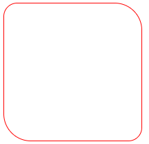
3、设置 border-radius: 20px 40px;
        div:nth-of-type(3){

            border-radius: 20px 40px 60px;/*上-左右-下*/

        }
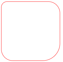
4、设置 border-radius: 20px 40px 60px 80px;
        div:nth-of-type(4){

            border-radius: 20px 40px 60px 80px;/*上-右-下-左*/

        }

5、设置扇形
        div:nth-of-type(5){

            border-radius: 0px 0px 200px;

        }

6、设置圆形
        div:nth-of-type(6){

            border-radius: 100px;

        }
        div:nth-of-type(7){

            border-radius: 50%;

        }
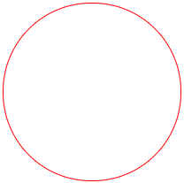 推荐使用border-radius: 50%;
盒子阴影
语法:
box-shadow:水平阴影、垂直阴影、羽化值、阴影大小、阴影颜色、阴影类别【内阴影、外阴影】
        #con{

            width: 200px;

            height: 200px;

            border: #000 solid 1px;

            border-radius: 10px;

            box-shadow: 3px 3px 3px 3px #666;/*水平阴影、垂直阴影、羽化值、阴影大小、阴影颜色*/

        }

box-shadow: 3px 3px 3px 3px #666 inset;/*水平阴影、垂直阴影、羽化值、阴影大小、阴影颜色、内阴影*/
案例:
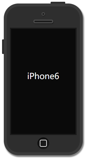
    <div id="phone">

        <div id="camera"></div>

        <div id="headphone"></div>

        <div id="screen">

            <p>iPhone6</p>

        </div>

        <div id="btn"></div>

    </div>
css代码:
        #phone{

            width: 250px;

            height: 500px;

            background: #2e2e2e;

            margin: 60px auto;

            border: #3b3b3b solid 10px;

            border-radius: 50px;

            box-shadow: 3px 5px 5px 1px rgba(0, 0, 0, 0.5);

            position: relative;

        }

        #phone::before{

            content: '';

            width: 50px;

            height: 6px;

            background-color: #2e2e2e;

            display: block;

            position: absolute;

            top: -16px;

            left: 150px;

            border-radius: 3px 3px 0px 0px;

        }

        #phone::after{

            content: '';

            width: 6px;

            height: 50px;

            background-color: #2e2e2e;

            display: block;

            position: absolute;

            top: 113px;

            left: -16px;

            border-radius: 3px 0px 0px 3px;

        }

        #camera{

            width: 6px;

            height: 6px;

            border: #4a4a4a solid 3px;

            margin: 20px auto 0px;

            background-color: #1a1a1a;

            border-radius: 50%;

            box-shadow: 1px 2px 2px rgba( 0, 0, 0, 0.5);

        }

        #headphone{

            width: 60px;

            height: 5px;

            border: #4a4a4a solid 4px;

            margin: 13px auto;

            background-color: #1a1a1a;

            border-radius: 10px;

            box-shadow: 1px 2px 2px rgba( 0, 0, 0, 0.5);

        }

        #screen{

            width: 220px;

            height: 360px;

            margin: 15px auto 0px;

            background-color: #0a0a0a;

            border: #1a1a1a solid 4px;

        }

        #screen p{

            color: #fff;

            text-align: center;

            line-height: 266px;

            font-size: 28px;

        }

        #btn{

            width: 40px;

            height: 40px;

            background-color: #1a1a1a;

            margin: 8px auto 0px;

            border-radius: 50%;

            box-shadow: 1px 2px 2px 2px rgba(0, 0, 0, 0.5) inset;

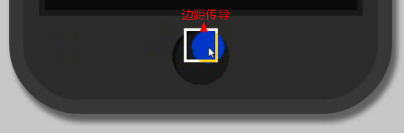
            overflow: hidden;/*阻止边界传导*/

        }

        #btn::before{

            content: '';

            width: 20px;

            height: 20px;

            border: #fff solid 2px;

            display: block;

            margin: 8px auto;

            border-radius: 5px;

        }
|
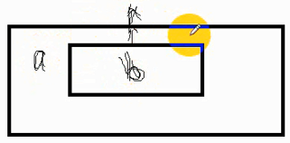
如果子盒子(内部盒子)有上边距,父盒子是空的,子盒子的上边距会传导到父盒子,整合盒子往下来。 不想让它传导,在父盒子样式上加overflow: hidden; |
css3圆角矩形、盒子阴影的更多相关文章
- 第50天学习打卡(CSS 圆角边框 盒子阴影 定位)
4.4圆角边框 圆角边框: <!DOCTYPE html> <html lang="en"> <head> <meta char ...
- 纯代码利用CSS3 圆角边框和盒子阴影 制作 iphone 手机效果
原文:纯代码利用CSS3 圆角边框和盒子阴影 制作 iphone 手机效果 大家好,我是小强老师. 今天我们看下CSS3最为简单的两个属性. css3给我们带来了很多视觉的感受和变化,以前的图片做的事 ...
- css3新增(圆角边框(border-radius),盒子阴影(box-shadow),文字阴影(text-shadow),背景缩放(background-size))
1.圆角边框 border-radius border-radius 属性用于设置元素的外边框圆角 语法:border-radius:length; 参数值可以是数值 或者 百分比 的形式 正方形, ...
- CSS第四天总结 更多的属性 圆角 边框图片 段落属性 颜色渐变 盒子阴影
圆角边框: border-radius 一个值时表示四个角用的圆半径,4个值时分别是左上角.右上角.左下角.右下角,单位可以是px和百分比,百分比是半径相对于边框长度的比例 在CSS3中我们终于 ...
- CSS3 02. 边框、边框圆角、边框阴影、边框图片、渐变、线性渐变、径向渐变、背景、过渡transition、2D转换
边框圆角 border-radius 每个角可以设置两个值,x值.y值 border-top-left-radius:水平半径 垂直半径 border-radius:水平半径/垂直半径 border- ...
- 详解使用CSS3绘制矩形、圆角矩形、圆形、椭圆形、三角形、弧
1.矩形 绘制矩形应该是最简单的了,直接设置div的宽和高,填充颜色,效果就出来了. 2.圆角矩形 绘制圆角矩形也很简单,在1的基础上,在使用css3的border-radius,即可. 3.圆 根据 ...
- JD . 圆角矩形、权重层级、浮动撑开盒子及元素的默认间距、清除浮动、隐藏盒子、盒子的撑开与撑破、子盒子垂直居中|不占位置
---恢复内容开始--- 圆角矩形 border-radius:50% 40% 30% 33px: 像素.百分比.小数( 0.5 ) 左上.右上.右下.左下 权重: 标签 1 : 类选择器 ...
- 从零开始学习前端开发 — 16、CSS3圆角与阴影
一.css3圆角: border-radius:数值+单位; 1.设置一个值:border-radius:20px; 四个方向圆角都为20px(水平半径和垂直半径相等) 2.设置两个值 border- ...
- CSS3 --添加阴影(盒子阴影、文本阴影的使用)
CSS3 - 给div或者文字添加阴影(盒子阴影.文本阴影的使用)CSS3定义了两种阴影:盒子阴影和文本阴影.其中盒子阴影需要IE9及其更新版本,而文本阴影需要IE10及其更新版本.下面分别介绍两种 ...
随机推荐
- 2、eclipse中使用Maven
1.导入Maven项目 1.1从spring官网下载示例工程 访问Spring官网 点击[Browse the Guides]即可看到Spring官方为我们提供的很多Demo.
- 在Windows 7 上安装 Mapnik
环境: 1.Windows 7_64位 2.Python 2.7_32位 步骤: 1.下载 Mapnik SDK http://mapnik.org/download/ 我下载的是 Windo ...
- SharePoint Designer - View
1. 数据视图 可以将图片.新闻等列表(如: Announcement)用以下视图显示,具体做法可以参考这篇文章,但需要强调几个地方: 1.1 选择了视图样式后,需要点击“自定义” --> &q ...
- Java IntelliJ IDEA 不能显示项目里的文件结构的解决方案
按下列步骤操作:1. 关闭IDEA2.然后删除项目文件夹下的.idea文件夹3.重新用IDEA工具打开项目
- Kubernetes JSONpath Support
export POD_NAME=$(kubectl get pods --namespace default -l "app.kubernetes.io/name=test-nginx,ap ...
- fstat、stat和lstat 区别(转)
fstat.stat和lstat 区别(转) stat系统调用系列包括了fstat.stat和lstat,它们都是用来返回“相关文件状态信息”的,三者的不同之处在于设定源文件的方式不同. 1 首先隆重 ...
- MATLAB/Excel-如何将Excel数据导入MATLAB中
在使用MATLAB对矩阵进行数据处理时,为了方便编辑与修改,常常需要先将数据录入到Excel中,然后再将其导入到MATLAB中参与矩阵运算.本文在MATLAB 2013a和Office 2013环境下 ...
- Jmeter入门18 Jmeter添加cookie的两种方式
jmeter中添加cookie可以通过配置HTTP Cookie Manager,也可以通过HTTP Header Manager,因为cookie是放在头文件里发送的. 实例:博客园点击添加新随笔 ...
- Computer Hardware
Computer Hardware Para 1 Computer hardware can be divides into four categories: input hardware, stor ...
- vue.js--基础 事件结合双向数据绑定实现todolist,增加和删除功能
原理很简单,写一个input框,定义一个空的list,当在input中增加数据时,就往list中添加数据,然后在循环这个list的数据,删除数据就是调用list中的splice <templat ...