44-python-三维画图
https://www.cnblogs.com/xingshansi/p/6777945.html
python绘制三维图
作者:桂。
时间:2017-04-27 23:24:55
链接:http://www.cnblogs.com/xingshansi/p/6777945.html
本文仅仅梳理最基本的绘图方法。
一、初始化
假设已经安装了matplotlib工具包。
利用matplotlib.figure.Figure创建一个图框:
|
1
2
3
4
|
import matplotlib.pyplot as pltfrom mpl_toolkits.mplot3d import Axes3Dfig = plt.figure()ax = fig.add_subplot(111, projection='3d') |
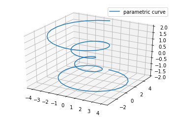
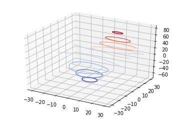
二、直线绘制(Line plots)
基本用法:
|
1
|
ax.plot(x,y,z,label=' ') |
code:
|
1
2
3
4
5
6
7
8
9
10
11
12
13
14
15
16
17
18
|
import matplotlib as mplfrom mpl_toolkits.mplot3d import Axes3Dimport numpy as npimport matplotlib.pyplot as pltmpl.rcParams['legend.fontsize'] = 10fig = plt.figure()ax = fig.gca(projection='3d')theta = np.linspace(-4 * np.pi, 4 * np.pi, 100)z = np.linspace(-2, 2, 100)r = z**2 + 1x = r * np.sin(theta)y = r * np.cos(theta)ax.plot(x, y, z, label='parametric curve')ax.legend()plt.show() |
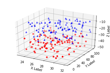
三、散点绘制(Scatter plots)
基本用法:
|
1
|
ax.scatter(xs, ys, zs, s=20, c=None, depthshade=True, *args, *kwargs) |
- xs,ys,zs:输入数据;
- s:scatter点的尺寸
- c:颜色,如c = 'r'就是红色;
- depthshase:透明化,True为透明,默认为True,False为不透明
- *args等为扩展变量,如maker = 'o',则scatter结果为’o‘的形状
code:
|
1
2
3
4
5
6
7
8
9
10
11
12
13
14
15
16
17
18
19
20
21
22
23
24
25
26
27
28
29
30
|
from mpl_toolkits.mplot3d import Axes3Dimport matplotlib.pyplot as pltimport numpy as npdef randrange(n, vmin, vmax): ''' Helper function to make an array of random numbers having shape (n, ) with each number distributed Uniform(vmin, vmax). ''' return (vmax - vmin)*np.random.rand(n) + vminfig = plt.figure()ax = fig.add_subplot(111, projection='3d')n = 100# For each set of style and range settings, plot n random points in the box# defined by x in [23, 32], y in [0, 100], z in [zlow, zhigh].for c, m, zlow, zhigh in [('r', 'o', -50, -25), ('b', '^', -30, -5)]: xs = randrange(n, 23, 32) ys = randrange(n, 0, 100) zs = randrange(n, zlow, zhigh) ax.scatter(xs, ys, zs, c=c, marker=m)ax.set_xlabel('X Label')ax.set_ylabel('Y Label')ax.set_zlabel('Z Label')plt.show() |
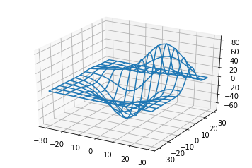
四、线框图(Wireframe plots)
基本用法:
|
1
|
ax.plot_wireframe(X, Y, Z, *args, **kwargs) |
- X,Y,Z:输入数据
- rstride:行步长
- cstride:列步长
- rcount:行数上限
- ccount:列数上限
code:
|
1
2
3
4
5
6
7
8
9
10
11
12
13
14
|
from mpl_toolkits.mplot3d import axes3dimport matplotlib.pyplot as pltfig = plt.figure()ax = fig.add_subplot(111, projection='3d')# Grab some test data.X, Y, Z = axes3d.get_test_data(0.05)# Plot a basic wireframe.ax.plot_wireframe(X, Y, Z, rstride=10, cstride=10)plt.show() |
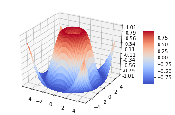
五、表面图(Surface plots)
基本用法:
|
1
|
ax.plot_surface(X, Y, Z, *args, **kwargs) |
- X,Y,Z:数据
- rstride、cstride、rcount、ccount:同Wireframe plots定义
- color:表面颜色
- cmap:图层
code:
|
1
2
3
4
5
6
7
8
9
10
11
12
13
14
15
16
17
18
19
20
21
22
23
24
25
26
27
28
29
30
|
from mpl_toolkits.mplot3d import Axes3Dimport matplotlib.pyplot as pltfrom matplotlib import cmfrom matplotlib.ticker import LinearLocator, FormatStrFormatterimport numpy as npfig = plt.figure()ax = fig.gca(projection='3d')# Make data.X = np.arange(-5, 5, 0.25)Y = np.arange(-5, 5, 0.25)X, Y = np.meshgrid(X, Y)R = np.sqrt(X**2 + Y**2)Z = np.sin(R)# Plot the surface.surf = ax.plot_surface(X, Y, Z, cmap=cm.coolwarm, linewidth=0, antialiased=False)# Customize the z axis.ax.set_zlim(-1.01, 1.01)ax.zaxis.set_major_locator(LinearLocator(10))ax.zaxis.set_major_formatter(FormatStrFormatter('%.02f'))# Add a color bar which maps values to colors.fig.colorbar(surf, shrink=0.5, aspect=5)plt.show() |
六、三角表面图(Tri-Surface plots)
基本用法:
|
1
|
ax.plot_trisurf(*args, **kwargs) |
- X,Y,Z:数据
- 其他参数类似surface-plot
code:
|
1
2
3
4
5
6
7
8
9
10
11
12
13
14
15
16
17
18
19
20
21
22
23
24
25
26
27
28
29
30
|
from mpl_toolkits.mplot3d import Axes3Dimport matplotlib.pyplot as pltimport numpy as npn_radii = 8n_angles = 36# Make radii and angles spaces (radius r=0 omitted to eliminate duplication).radii = np.linspace(0.125, 1.0, n_radii)angles = np.linspace(0, 2*np.pi, n_angles, endpoint=False)# Repeat all angles for each radius.angles = np.repeat(angles[..., np.newaxis], n_radii, axis=1)# Convert polar (radii, angles) coords to cartesian (x, y) coords.# (0, 0) is manually added at this stage, so there will be no duplicate# points in the (x, y) plane.x = np.append(0, (radii*np.cos(angles)).flatten())y = np.append(0, (radii*np.sin(angles)).flatten())# Compute z to make the pringle surface.z = np.sin(-x*y)fig = plt.figure()ax = fig.gca(projection='3d')ax.plot_trisurf(x, y, z, linewidth=0.2, antialiased=True)plt.show() |

七、等高线(Contour plots)
基本用法:
|
1
|
ax.contour(X, Y, Z, *args, **kwargs) |
code:
|
1
2
3
4
5
6
7
8
9
10
11
|
from mpl_toolkits.mplot3d import axes3dimport matplotlib.pyplot as pltfrom matplotlib import cmfig = plt.figure()ax = fig.add_subplot(111, projection='3d')X, Y, Z = axes3d.get_test_data(0.05)cset = ax.contour(X, Y, Z, cmap=cm.coolwarm)ax.clabel(cset, fontsize=9, inline=1)plt.show() |
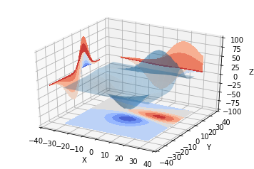
二维的等高线,同样可以配合三维表面图一起绘制:
code:
|
1
2
3
4
5
6
7
8
9
10
11
12
13
14
15
16
17
18
19
20
21
|
from mpl_toolkits.mplot3d import axes3dfrom mpl_toolkits.mplot3d import axes3dimport matplotlib.pyplot as pltfrom matplotlib import cmfig = plt.figure()ax = fig.gca(projection='3d')X, Y, Z = axes3d.get_test_data(0.05)ax.plot_surface(X, Y, Z, rstride=8, cstride=8, alpha=0.3)cset = ax.contour(X, Y, Z, zdir='z', offset=-100, cmap=cm.coolwarm)cset = ax.contour(X, Y, Z, zdir='x', offset=-40, cmap=cm.coolwarm)cset = ax.contour(X, Y, Z, zdir='y', offset=40, cmap=cm.coolwarm)ax.set_xlabel('X')ax.set_xlim(-40, 40)ax.set_ylabel('Y')ax.set_ylim(-40, 40)ax.set_zlabel('Z')ax.set_zlim(-100, 100)plt.show() |

也可以是三维等高线在二维平面的投影:
code:
|
1
2
3
4
5
6
7
8
9
10
11
12
13
14
15
16
17
18
19
20
|
from mpl_toolkits.mplot3d import axes3dimport matplotlib.pyplot as pltfrom matplotlib import cmfig = plt.figure()ax = fig.gca(projection='3d')X, Y, Z = axes3d.get_test_data(0.05)ax.plot_surface(X, Y, Z, rstride=8, cstride=8, alpha=0.3)cset = ax.contourf(X, Y, Z, zdir='z', offset=-100, cmap=cm.coolwarm)cset = ax.contourf(X, Y, Z, zdir='x', offset=-40, cmap=cm.coolwarm)cset = ax.contourf(X, Y, Z, zdir='y', offset=40, cmap=cm.coolwarm)ax.set_xlabel('X')ax.set_xlim(-40, 40)ax.set_ylabel('Y')ax.set_ylim(-40, 40)ax.set_zlabel('Z')ax.set_zlim(-100, 100)plt.show() |
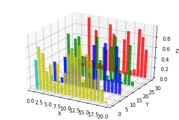
八、Bar plots(条形图)
基本用法:
|
1
|
ax.bar(left, height, zs=0, zdir='z', *args, **kwargs |
- x,y,zs = z,数据
- zdir:条形图平面化的方向,具体可以对应代码理解。
code:
|
1
2
3
4
5
6
7
8
9
10
11
12
13
14
15
16
17
18
19
20
21
|
from mpl_toolkits.mplot3d import Axes3Dimport matplotlib.pyplot as pltimport numpy as npfig = plt.figure()ax = fig.add_subplot(111, projection='3d')for c, z in zip(['r', 'g', 'b', 'y'], [30, 20, 10, 0]): xs = np.arange(20) ys = np.random.rand(20) # You can provide either a single color or an array. To demonstrate this, # the first bar of each set will be colored cyan. cs = [c] * len(xs) cs[0] = 'c' ax.bar(xs, ys, zs=z, zdir='y', color=cs, alpha=0.8)ax.set_xlabel('X')ax.set_ylabel('Y')ax.set_zlabel('Z')plt.show() |
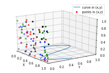
九、子图绘制(subplot)
A-不同的2-D图形,分布在3-D空间,其实就是投影空间不空,对应code:
|
1
2
3
4
5
6
7
8
9
10
11
12
13
14
15
16
17
18
19
20
21
22
23
24
25
26
27
28
29
30
31
|
from mpl_toolkits.mplot3d import Axes3Dimport numpy as npimport matplotlib.pyplot as pltfig = plt.figure()ax = fig.gca(projection='3d')# Plot a sin curve using the x and y axes.x = np.linspace(0, 1, 100)y = np.sin(x * 2 * np.pi) / 2 + 0.5ax.plot(x, y, zs=0, zdir='z', label='curve in (x,y)')# Plot scatterplot data (20 2D points per colour) on the x and z axes.colors = ('r', 'g', 'b', 'k')x = np.random.sample(20*len(colors))y = np.random.sample(20*len(colors))c_list = []for c in colors: c_list.append([c]*20)# By using zdir='y', the y value of these points is fixed to the zs value 0# and the (x,y) points are plotted on the x and z axes.ax.scatter(x, y, zs=0, zdir='y', c=c_list, label='points in (x,z)')# Make legend, set axes limits and labelsax.legend()ax.set_xlim(0, 1)ax.set_ylim(0, 1)ax.set_zlim(0, 1)ax.set_xlabel('X')ax.set_ylabel('Y')ax.set_zlabel('Z') |
B-子图Subplot用法
与MATLAB不同的是,如果一个四子图效果,如:
MATLAB:
subplot(2,2,1)subplot(2,2,2)subplot(2,2,[3,4])Python:
subplot(2,2,1)subplot(2,2,2)subplot(2,1,2)
code:
|
1
2
3
4
5
6
7
8
9
10
11
12
13
14
15
16
17
18
19
20
21
22
23
24
25
26
27
28
29
30
31
32
33
34
35
36
37
|
import matplotlib.pyplot as pltfrom mpl_toolkits.mplot3d.axes3d import Axes3D, get_test_datafrom matplotlib import cmimport numpy as np# set up a figure twice as wide as it is tallfig = plt.figure(figsize=plt.figaspect(0.5))#===============# First subplot#===============# set up the axes for the first plotax = fig.add_subplot(2, 2, 1, projection='3d')# plot a 3D surface like in the example mplot3d/surface3d_demoX = np.arange(-5, 5, 0.25)Y = np.arange(-5, 5, 0.25)X, Y = np.meshgrid(X, Y)R = np.sqrt(X**2 + Y**2)Z = np.sin(R)surf = ax.plot_surface(X, Y, Z, rstride=1, cstride=1, cmap=cm.coolwarm, linewidth=0, antialiased=False)ax.set_zlim(-1.01, 1.01)fig.colorbar(surf, shrink=0.5, aspect=10)#===============# Second subplot#===============# set up the axes for the second plotax = fig.add_subplot(2,1,2, projection='3d')# plot a 3D wireframe like in the example mplot3d/wire3d_demoX, Y, Z = get_test_data(0.05)ax.plot_wireframe(X, Y, Z, rstride=10, cstride=10)plt.show() |

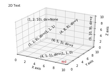
补充:
文本注释的基本用法:
code:
|
1
2
3
4
5
6
7
8
9
10
11
12
13
14
15
16
17
18
19
20
21
22
23
24
25
26
27
28
29
30
31
32
33
|
from mpl_toolkits.mplot3d import Axes3Dimport matplotlib.pyplot as pltfig = plt.figure()ax = fig.gca(projection='3d')# Demo 1: zdirzdirs = (None, 'x', 'y', 'z', (1, 1, 0), (1, 1, 1))xs = (1, 4, 4, 9, 4, 1)ys = (2, 5, 8, 10, 1, 2)zs = (10, 3, 8, 9, 1, 8)for zdir, x, y, z in zip(zdirs, xs, ys, zs): label = '(%d, %d, %d), dir=%s' % (x, y, z, zdir) ax.text(x, y, z, label, zdir)# Demo 2: colorax.text(9, 0, 0, "red", color='red')# Demo 3: text2D# Placement 0, 0 would be the bottom left, 1, 1 would be the top right.ax.text2D(0.05, 0.95, "2D Text", transform=ax.transAxes)# Tweaking display region and labelsax.set_xlim(0, 10)ax.set_ylim(0, 10)ax.set_zlim(0, 10)ax.set_xlabel('X axis')ax.set_ylabel('Y axis')ax.set_zlabel('Z axis')plt.show() |
参考:
44-python-三维画图的更多相关文章
- python matplotlib画图产生的Type 3 fonts字体没有嵌入问题
ScholarOne's 对python matplotlib画图产生的Type 3 fonts字体不兼容,更改措施: 在程序中添加如下语句 import matplotlib matplotlib. ...
- matlab三维画图
matlab三维画图主要有三个命令:plot3命令.mesh命令和surf命令. plot3 plot3是三维画图的基本函数,绘制的是最为主要的3D曲线图,最主要的调用格式是: plot3(X,Y,Z ...
- python seaborn 画图
python seaborn 画图 59888745@qq.com 2017.08.02 distplot( ) kdeplot( ) distplot( )为hist加强版, kdeplot( ) ...
- python数据分析画图体验
对于numpy的函数,pands等,不是很熟,我来copy一下code,敲击一下,找找感觉. 默认的导入包import numpy as npimport matplotlib.pyplot as p ...
- Python科学画图小结
Python画图主要用到matplotlib这个库.具体来说是pylab和pyplot这两个子库.这两个库可以满足基本的画图需求,而条形图,散点图等特殊图,下面再单独具体介绍. 首先给出pylab神器 ...
- Python基础-画图:matplotlib
Python画图主要用到matplotlib这个库.具体来说是pylab和pyplot这两个子库.这两个库可以满足基本的画图需求. pylab神器:pylab.rcParams.update(para ...
- [python]pycharm画图插件matplotlib、numpy、scipy的下载与安装
最近在用pycharm学习python语言,不得不感叹python语言的强大与人性化! 但对于使用pycharm画图(较复杂的图)就要用到几个插件了,即matplotlib.numpy和scipy!但 ...
- python pandas 画图、显示中文、股票K线图
目录: 1.pandas官方画图链接 2.标记图中数据点 3.画图显示中文 4.画股票K线图 5.matplotlib基本用法 6.format输出 6.format输出例子 eps_range=[0 ...
- 基于osg的python三维程序开发(一)
背景: osg是一款开源的三维引擎,在过去多年的发展中积累了大量的用户,该引擎基于场景树的管理,使用方法简单.但是对长期使用python作为开发工具的朋友来说, 有一定门槛. 下面的小程序,演示了如何 ...
- python基础 画图
python 画图 matplotlib 库只保存图片,不显示图片? 在导入库时,添加如下代码 import matplotlib matplotlib.use('Agg') 各种 symbol ? ...
随机推荐
- C# 控制台程序(Console Application )启动后隐藏
背景 前段时间给项目编写了数据适配器,读取其他系统的数据后推送到MQ上,我们的系统通过订阅MQ的方式来获取.由于其他系统支持C#编程,且为了一时方便,选择了C#的控制台程序. 最近用户在使用中,总是不 ...
- mysql5.5版本以后插入中午显示问号的解决办法
先看看中午变问号的结果 现在看看我们建立数据库和建表的操作 看到这里相信大家都知道创建成功了,没错,数据库跟表是创建成功了,可当你录入的信息带中文的时候就显示问号. 现在用传统的解决办法 在查看下表的 ...
- Python - Django - 登录页面
登录页 login.html: <!DOCTYPE html> <html lang="zh-CN"> <head> <meta char ...
- python写批量weblogic爆破脚本
前言: 整理笔记的时候,发现了weblogic的攻击方法.心里打着算盘看看怎么写 个批量的弱口令爆破脚本.得出了以下思路 思路: 1.利用钟馗之眼采集weblogic的网站,将IP写入到txt 2.添 ...
- delphi RAD Studio新版本及路线图 及官方网站 官方 版本发布时间
delphi RAD Studio Berlin 10.1 主要是FireMonkey 移动开发的改动,VCL确实没有多大变化. http://docwiki.embarcadero.com/RAD ...
- J2SE 8的输入输出--缓冲
FileChannel带缓冲 //1. read the point location FileChannel channelRead = FileChannel.open(Paths.get(&qu ...
- ABAP-ITS Mobile
ITS Mobile是14年开发EWM项目时用到的技术方案,本文主要记录下ITS Mobile的整个实现过程. 1.ITS Mobile介绍 ITS Mobile:Internet Transacti ...
- UI5-文档-4.11-Pages and Panels
在完成了应用程序结构的所有工作之后,是时候改进我们的应用程序的外观了.在这一步中,您还将了解控件聚合. Preview A panel is now displaying the controls f ...
- 泛型集合与DataSet相互转换
一.泛型转DataSet /// <summary> /// 泛型集合转换DataSet /// </summary> /// <typeparam name=" ...
- Gulp的安装与配置
http://blog.csdn.net/itlsx/article/details/49981459