ECharts 报表事件联动系列三:柱状图,饼状图实现联动
源码如下:
<!DOCTYPE html>

<html>

<head>

    <meta http-equiv="Content-Type" content="text/html; charset=UTF-8">

    <title>ECharts</title>

    <script src="http://echarts.baidu.com/dist/echarts.min.js"></script>

</head>

<body>

    <!-- 为ECharts准备一个具备大小(宽高)的Dom -->

    <div id="bar" style="width: 600px;height:400px;"></div>

    <div id="pie" style="width: 600px;height:400px;"></div>

</body>

<script type="text/javascript">

        // 基于准备好的dom,初始化echarts实例

        var myBarChart = echarts.init(document.getElementById('bar'));

        var n1 = Math.floor(Math.random()*500+1);

        var n2 = Math.floor(Math.random()*500+1);

        var n3 = Math.floor(Math.random()*500+1);

        var n4 = Math.floor(Math.random()*500+1);

        var n5 = Math.floor(Math.random()*500+1);

        var n6 = Math.floor(Math.random()*500+1);

        // 指定图表的配置项和数据

        var option = {

            title: {

                text: 'ECharts 入门示例'

            },

            tooltip: {

                triggerEvent:true},

            legend: {

                data:['销量',"趋势"]

            },

            xAxis: {

                data: ["衬衫","羊毛衫","雪纺衫","裤子","高跟鞋","袜子"],

                triggerEvent:true,  //可以点击x轴坐标,

                axisTick: {

                    alignWithLabel: true //坐标值是否在刻度中间

                }

            },

            yAxis: {

                type: 'value',

                splitArea: {

                    show: true

                },

                //百分比显示Y轴

                axisLabel: {

                  show: true,

                  interval: 'auto'

                },

                show: true,

                triggerEvent:true //可以点击y轴坐标

            },

            series: [{

                name: '销量',

                type: 'bar',

                data: [n1, n2, n3, n4, n5, n6],

                itemStyle: {

                    normal: {

                        label: {

                            show: true,

                            position: 'top'

                        }

                    }

                }

            },{

                name: '趋势',

                type: 'line',

                data: [n1, n2, n3, n4, n5, n6],

                smooth:false,   //是否为曲线,默认为false

                itemStyle:{

                    normal:{

                        lineStyle:{

                            width:1,       // 虚线的宽度

                            type:'dotted'  //'dotted'虚线 'solid'实线

                        }

                    }

                }

            }]

        };

        // 使用刚指定的配置项和数据显示图表。

        myBarChart.setOption(option);

        //方法1:https://zhuanlan.zhihu.com/p/33050579

        // var ids = [55,66,85,86,55,544,5,6,8,4,88,89];

      //这样就可以获取到点击柱子或者文本标签对应的id了

      // myBarChart.on('click', function (params) {

      //     if(params.componentType =="xAxis"){

      //         alert("单击了"+params.value+"x轴标签, 你点击的是第"+(Number(params.event.target.anid.split("_")[1])+1)+"个X标签;当前对应的id为:"+ids[params.event.target.anid.split("_")[1]]);

      //     }else{

      //         alert("单击了"+params.name+"柱状图, 你点击的是第"+(params.dataIndex+1)+"个柱状图;当前对应的id为:"+ids[params.dataIndex]);   //数组下标是从0开始的哦,图也是从0开始的

      //     }

      // });

      //方法二:https://blog.csdn.net/sophia_xiaoma/article/details/78055947

      myBarChart.on('click', function (params) {

        // 当componentType == "xAxis"或者 ==“yAxisx”时,取被点击时坐标轴的值params.value

            alert("单击了"+params.componentType+"x轴标签"+params.value);

        if(params.componentType == "xAxis"){

            alert("单击了"+params.value+"x轴标签"+params.name);

        }else{

            alert("单击了"+params.name+"柱状图"+params.value);

        }

      });

      //方法三:http://www.jb51.net/article/125820.htm

      // myBarChart.on("click", barConsole);

      // function barConsole(param) {

      //   //     获取data长度

      //   //   alert(option.series[0].data.length);

      //   //      获取地N个data的值

      //     alert(option.series[0].data[i]);

      //   //     获取series中param.dataIndex事件对应的值

      //   //   alert(option.series[param.seriesIndex].data[param.dataIndex]);

      //       // alert(param.value); //与上一行等价

      //   //    获取xAxis当前点击事件索引对应的值,可以用作传参了

      //         // alert(option.xAxis.data[param.dataIndex]);

      //     //param.dataIndex 获取当前点击索引,

      //   //   alert(param.dataIndex);

      //   //  当前点击事件位于series中的索引

      //   //   alert(param.seriesIndex);

      //   //   clickFunc(param.dataIndex);//执行点击效果

      //   //param具体包含的参数见 https://blog.csdn.net/allenjay11/article/details/76033232

      //   //刷新页面

      //   // location.reload();

      //   // window.location.reload();

      //       refresh();

      //   }

      //方法四:饼图添加事件示例 https://www.cnblogs.com/zhzhair-coding/p/6953982.html?utm_source=itdadao&utm_medium=referral

</script>

<script type="text/javascript">

    // 基于准备好的dom,初始化echarts实例

    var myPieChart = echarts.init(document.getElementById('pie'));

    var n1 = Math.floor(Math.random()*500+1);

    var n2 = Math.floor(Math.random()*500+1);

    var n3 = Math.floor(Math.random()*500+1);

    var n4 = Math.floor(Math.random()*500+1);

    var n5 = Math.floor(Math.random()*500+1);

    // 指定图表的配置项和数据

    var option = {

                "legend":{

                    "orient":"vertical",

                    "left":"left"

                },

                "series":[

                    {

                        "data":[

                            {

                                "name":"直接访问",

                                "value":n1

                            },

                            {

                                "name":"邮件营销",

                                "value":n2

                            },

                            {

                                "name":"联盟广告",

                                "value":n3

                            },

                            {

                                "name":"视频广告",

                                "value":n4

                            },

                            {

                                "name":"搜索引擎",

                                "value":n5

                            }

                        ],

                        "center":[

                            "50%",

                            "60%"

                        ],

                        "name":"访问来源",

                        "itemStyle":{

                            "normal":{

                                "label":{

                                    "formatter":"{b}\n{c}\n{d}%",

                                    "show":true

                                }

                            },

                            "emphasis":{

                                "shadowOffsetX":0,

                                "shadowBlur":10,

                                "shadowColor":"rgba(0, 0, 0, 0.5)"

                            }

                        },

                        "radius":"55%",

                        "type":"pie"

                    }

                ],

                "tooltip":{

                    "formatter":"{a} <br/>{b} : {c} ({d}%)",

                    "trigger":"item"

                },

                "title":{

                    "subtext":"纯属虚构",

                    "x":"center",

                    "text":"某站点用户访问来源"

                }

            };

    // 使用刚指定的配置项和数据显示图表。

    myPieChart.setOption(option);

    myPieChart.on("click", pieConsole);

  //方法三:http://www.jb51.net/article/125820.htm

  function pieConsole(param) {

    //     获取data长度

      alert(option.series[0].data.length);

    //      获取地N个data的值

    //   alert(option.series[0].data[i]);

    //     获取series中param.dataIndex事件对应的值

        alert(param.value);

        alert(param.name);

       alert(option.series[param.seriesIndex].data[param.dataIndex].value);

        alert(option.series[param.seriesIndex].data[param.dataIndex].name);

        //   clickFunc(param.dataIndex);//执行点击效果,触发相应js函数

    //param具体包含的方法见 https://blog.csdn.net/allenjay11/article/details/76033232

    //刷新页面

    // location.reload();

    // window.location.reload();

    }

</script>

<!--每5秒自动刷新页面-->

<script type="text/javascript">

    function refresh(){

    // 刷新页面

    // location.reload();

        window.location.reload();

    };

    // setInterval(refresh, 5000);//5秒钟执行一次

</script>

</html>
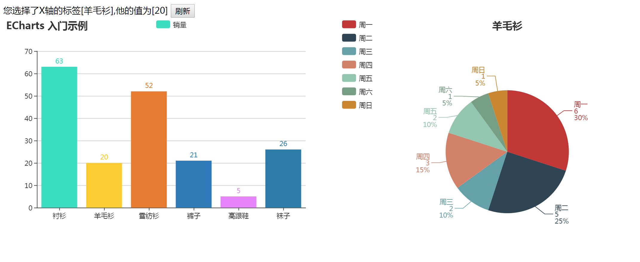
显示效果如下:
ECharts 报表事件联动系列三:柱状图,饼状图实现联动的更多相关文章
- Echarts 简单报表系列三:饼状图
代码如下: <!DOCTYPE html> <html lang="en"> <head> <meta charset="UTF ...
- iNeuOS工业互联平台,发布:消息管理、子用户权限管理、元件移动事件、联动控制和油表饼状图,v3.4版本
目 录 1. 概述... 2 2. 平台演示... 2 3. 消息管理... 2 4. 子用户权限管理... 3 5. 元件移动事件... ...
- ECharts 报表事件联动系列四:柱状图,折线图,饼状图实现联动
代码如下: <!DOCTYPE html> <html> <head> <meta http-equiv="Content-Type" c ...
- D3.js系列——布局:饼状图和力导向图
一.饼状图 在布局的应用中,最简单的就是饼状图. 1.数据 有如下数据,需要可视化: , , , , ]; 这样的值是不能直接绘图的.例如绘制饼状图的一个部分,需要知道一段弧的起始角度和终止角度,这些 ...
- JupyterLab绘制:柱状图,饼状图,直方图,散点图,折线图
JupyterLab绘图 喜欢python的同学,可以到 https://v3u.cn/(刘悦的技术博客) 里面去看看,爬虫,数据库,flask,Django,机器学习,前端知识点,JavaScrip ...
- PSP 进度条 柱状图 饼状图
9号 类别 开始时间 结束时间 间隔 净时间 燃尽图 8::00 8:20 0 20分钟 站立会议 8:20 8:50 0 30分钟 读构建之法 9:20 13:20 120分钟 120分钟 四人小组 ...
- ExtJS 饼状图报表
简单的ExtJS饼状图报表. 先上源码,咱再慢慢解析: Ext.onReady(function(){ var store = Ext.create('Ext.data.JsonStore', { f ...
- C#+JQuery+.Ashx+百度Echarts实现全国省市地图和饼状图动态数据图形报表的统计
在目前的一个项目中,需要用到报表表现数据,这些数据有多个维度,需要同时表现出来,同时可能会有大量数据呈现的需求,经过几轮挑选,最终选择了百度的echarts作为报表基础类库.echarts功能强大,界 ...
- Java-jfree报表(学习整理)----饼状图、柱状图、折线统计图
1.使用的报表工具: jfree报表 2.下载网址: http://www.jfree.org/ 下载之后先解压:如下图 下载后:需要的jar包!如下图: 打开:找到以下的两个jar包 再导入开发项目 ...
随机推荐
- Git回顾
抄自廖雪峰的官方网站 完整图文请访问https://github.com/Mrlution/study/tree/master/git 关于repository 我认为repository是一个存放代 ...
- 如何在 sublime text 中以当前文件目录打开 cmd
需求描述 sublime 固定可以自己设置和添加新的编译环境,比如在我们写 js 的时候可能会添加 node 来对 js 文件进行运行.但是,这样做的结果是,我们只能看到运行结果.有时候还希望能做些其 ...
- sublime插件开发手记
原:http://blog.hickwu.com/sublime插件开发手记 标题: sublime插件开发手记 时间: 2014-01-05 14:58:02 正文: 插件基本结构 基本插件实现 ...
- 【搬运工】——Java中的static关键字解析(转)
原文链接:http://www.cnblogs.com/dolphin0520/p/3799052.html static关键字是很多朋友在编写代码和阅读代码时碰到的比较难以理解的一个关键字,也是各大 ...
- Mybatis拦截器(一)
拦截器需要实现 interceptor接口 public interface Interceptor { //3 对目标对象拦截进行处理的内容 Object intercept(Invocation ...
- Python self,init,对象属性
self关键字的作用 __init__初始化 # coding=utf-8 支持中文 class Human(object): laugh = 'Ha' def show_laugh(self): p ...
- Java中的单实例
前几天刚学完单实例设计模式,今天看代码时发现一行代码很奇怪,getRuntime()函数的返回类型怎么是它本身,忽然想起前几天学的单实例模式,于是找到方法的定义,果然是静态私有变量,获取实例的公有方法 ...
- cacheManager ABP中的缓存
ABP的缓存是key---(key,value) 形式存储 GetCache获取到的是ICache类型 如果知道这个ICache的具体类型 可以直接强转Icache.AsTyped<int ...
- wow 滚动动画
1.demo <!DOCTYPE html> <html lang="zh-CN"> <head> <meta charset=" ...
- 网络通信框架:Netty和Mina
参考: https://www.cnblogs.com/wrencai/p/5907042.html https://blog.csdn.net/qq_29954971/article/details ...