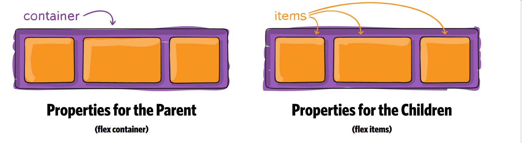
CSS3 Flex布局
Flex 用于使页面上的内容自适应屏幕
首先,在网页代码的头部,加入一行viewport元标签。
<meta name=”viewport” content=”width=device-width, initial-scale=1″ />
viewport是网页默认的宽度和高度,上面这行代码的意思是,网页宽度默认等于屏幕宽度(width=device-width),原始缩放比例(initial-scale=1)为1.0,即网页初始大小占屏幕面积的100%。
HTML 代码
<div class="container">

    <div class="item"></div>

    <div class="item"></div>

    <div class="item order"></div>

    <div class="item"></div>

    <div class="item"></div>

</div>
Container CSS 代码
1. flex
要使用flex必须在container上加上display:flex 和 display: -webkit-flex; /_ Safari _/
.container {

  display: flex; /* or inline-flex */
  display: -webkit-flex; /_ Safari _/
}
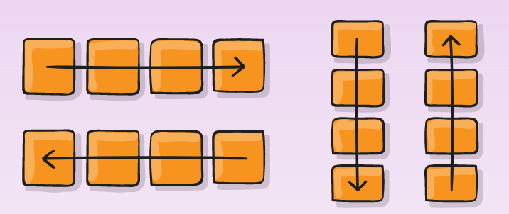
2. flex-direction
.container {

  -webkit-flex-direction: row | row-reverse | column | column-reverse;

  flex-direction: row | row-reverse | column | column-reverse;

}
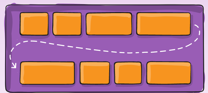
3. flex-wrap
.container{
  -webkit-flex-wrap: nowrap | wrap | wrap-reverse;

  flex-wrap: nowrap | wrap | wrap-reverse;

}
4. flex-flow
This property is a shorthand for setting the flex-direction and flex-wrap properties.
flex-flow: <‘flex-direction’> || <‘flex-wrap’>
.container {

  -webkit-flex-flow:  row nowrap;

  flex-flow:  row nowrap ;

}
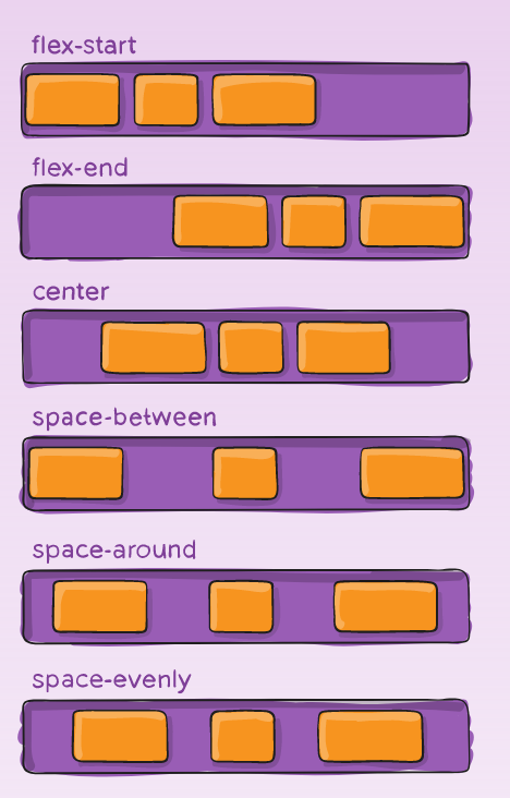
5. justify-content
Value : flex-start | flex-end | center | space-between | space-around | space-evenly;
.container {

  -webkit-justify-content: flex-start; /_ Safari _/

  justify-content:         flex-start;

}
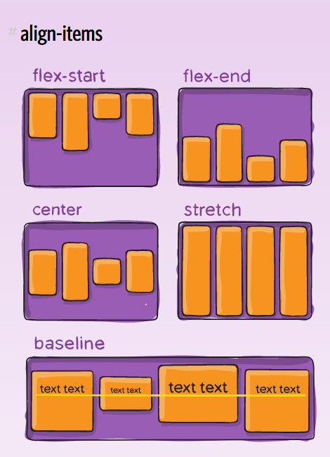
6. align-items
Value : flex-start | flex-end | center | baseline | stretch;
.container {

  -webkit-align-items: stretch; /_ Safari _/

  align-items:         stretch;

}
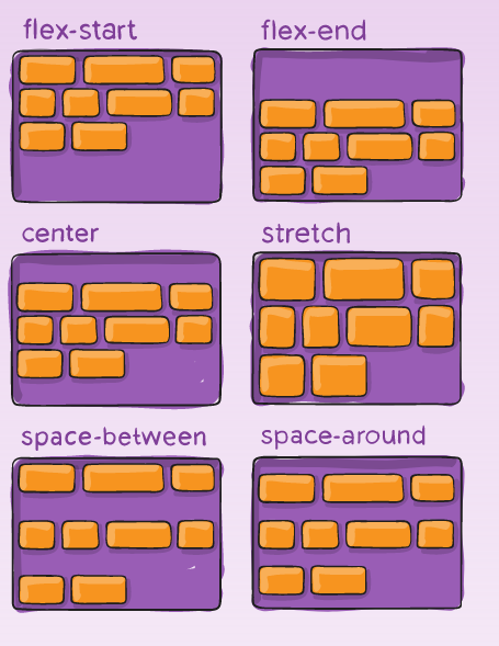
7. align-content
Value : flex-start | flex-end | center | space-between | space-around | stretch;
.container {

  -webkit-align-content: stretch; /_ Safari _/

  align-content:         stretch;

}
Item CSS 代码
1. Order
默认值为0,数值越小,排列越靠前.
.item.order {

  -webkit-order: 1; /_ Safari _/

  order:         1;

}
2. flex-grow
属性定义项目的放大比例,默认为0,即如果存在剩余空间,也不放大。
.item {

  -webkit-flex-grow: 0; /_ Safari _/

  flex-grow:         0;

}
3. flex-shrink
属性定义了项目的缩小比例,默认为1,即如果空间不足,该项目将缩小。
.item {

  flex-shrink: 1;

}
4. flex-basis
This property takes the same values as the width and height properties, and specifies the initial main size of the flex item, before free space is distributed according to the flex factors.
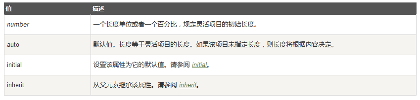
.item {

  -webkit-flex-basis: auto; /_ Safari _/

  flex-basis:         auto;

}
5. flex
This property is the shorthand for the flex-grow, flex-shrink and flex-basis properties. Among other values it also can be set to auto (1 1 auto) and none (0 0 auto).
Default value: 0 1 auto
.item {

  -webkit-flex: 0 1 auto; /_ Safari _/

  flex: 0 1 auto;

}
6. align-self
align-self属性允许单个项目有与其他项目不一样的对齐方式,可覆盖align-items属性。默认值为auto,表示继承父元素的align-items属性,如果没有父元素,则等同于stretch。
Value : auto | flex-start | flex-end | center | baseline | stretch;
.item {

  -webkit-align-self: auto; /_ Safari _/

  align-self:         auto;

}
https://developer.mozilla.org/en-US/docs/Web/CSS/CSS_Flexible_Box_Layout
https://css-tricks.com/snippets/css/a-guide-to-flexbox/
https://scotch.io/tutorials/a-visual-guide-to-css3-flexbox-properties
http://www.ruanyifeng.com/blog/2015/07/flex-grammar.html?utm_source=tuicool)
CSS3 Flex布局的更多相关文章
- CSS3 Flex布局整理(三)-项目属性
一.Flex布局中 Flex Item属性控制,可以指定显示顺序.剩余空间的放大,缩小.交叉轴的排列 1.order:定义项目的排列顺序,数值越小,排列越靠前,默认为0.类似z-index 2.fle ...
- CSS3 Flex布局整理(二)-容器属性
一.Flex容器属性介绍 1.flex-flow :水平或垂直方向上的流动方式,包裹处理,其中包括了flex-direction属性和flex-wrap属性. 2.justify-content:定义 ...
- CSS3 Flex布局整理(一)
一.说明 1.在以往的布局方案中,都是基于盒装模型,依赖display属性+position属性+float属性等. 他对于那些特殊布局非常不方便,比如,垂直居中等. 并且不同浏览器的盒模型还有些差异 ...
- CSS3 Flex布局(伸缩布局盒模型)学习
CSS3 Flex布局(伸缩布局盒模型)学习 转自:http://www.xifengxx.com/web-front-end/1408.html CSS2定义了四种布局:块布局.行内布局.表格布局盒 ...
- CSS3 Flex布局(项目)
一.order属性 order属性定义项目的排列顺序.数值越小,排列越靠前,默认为0. 二.flex-grow属性 flex-grow属性定义项目的放大比例,默认为0,即如果存在剩余空间,也不放大. ...
- CSS3 Flex布局(容器)
一.flex-direction属性 row(默认值):主轴为水平方向,起点在左端. row-reverse:主轴为水平方向,起点在右端. column:主轴为垂直方向,起点在上沿. column-r ...
- CSS3 Flex 布局教程
网页布局(layout)是 CSS 的一个重点应用. 布局的传统解决方案,基于盒状模型,依赖 display 属性 + position属性 + float属性.它对于那些特殊布局非常不方便,比如,垂 ...
- css3 flex 布局
今天做一个小实战,需要让一个登录框始终保持水平和垂直居中,第一个想到的就是通过定位(要想让一个div居中,采用定位可以解决,示例), 然后开始接触flex布局,学完感觉真的好用,现把知识点记录一下,以 ...
- css3 flex布局结合transform生成一个3D骰子
预览地址: https://zhaohh.github.io/flex-dice/index.html 1 Flex 布局 首先聊聊Flex 布局,Flex 布局又称"弹性布局", ...
- css3 flex布局/grid布局
1.CSS3 Flexbox 布局完全指南(图解 Flexbox 布局详细教程) 2.CSS Grid 布局完全指南(图解 Grid 详细教程)
随机推荐
- cordova插件汇总
1.获取当前应用的版本号 cordova plugin add cordova-plugin-app-version 2.获取网络连接信息 cordova plugin add cordova-plu ...
- 三种方法实现调用Restful接口
1.基本介绍 Restful接口的调用,前端一般使用ajax调用,后端可以使用的方法比较多, 本次介绍三种: 1.HttpURLConnection实现 2.HttpClient实现 3.Spring ...
- matlab函数int2str, num2str, str2num
函数名:int2str 功能:将整数值转换为字符串 输入格式:str = int2str(N) 备注:就将该值四舍五入后转换为字符串,接受向量和矩阵输入. 如果是向量和矩阵输入,列数字之间会补加两个空 ...
- icpc南宁站赛后总结
11月24号,我们经过26个小时的火车来到了广西南宁,一场漫长的过程. 24号晚到达南宁,做地铁到达学校,找到住的地方,南宁的天真是让人无奈. 25号,上午去广西大学体育馆报道,然后回去好好整理了一下 ...
- Nginx 常见问题
1. CreateFile() "C:\Users\zhang\Desktop\K\My Project\SSL-数字证书\Nginx配置\nginx-1.12.2/conf/nginx.c ...
- gRPC 如何使用python表示多维数组
在使用gRPC作为远程调用框架时,如何使用python来表示多维数组呢?gRPC中定义proto文件时,有一个参数是repeated,用来表示重复的数据类型,使用这个参数可以表示list类型.如下,我 ...
- 我的CSS
外框 固定宽高 内容居中 height: 200px ; width:200px; margin: 50rpx auto 0 auto; //上下居中 text-align: center; ...
- MT【326】曲线中的爱恨情仇
[我思故我在]----笛卡尔爱心曲线$r=a(1-sin\theta)$ Matrix 67分手曲线
- did not finish being created even after we waited 189 seconds or 61 attempts. And its status is downloading
did not finish being created even after we waited 189 seconds or 61 attempts. And its status is down ...
- HEOI2013SAO
题目描述 给定一个\(DAG\),问这个\(DAG\)有多少种拓扑序. 题解 我们首先需要设计一个能够比较好的转移的状态. 我们可以设\(dp[i][j]\)表示第i个点在当前\(dp\)的子图中拓扑 ...