
[MAUI程序设计]界面多态与实现
.NET MAUI 实现界面多态有很多种方式,今天主要来说说在日常开发中常见的需求该如何应对。
需求一:在不同设备上使用不同 UI 外观
.NET MAUI是一个跨平台的UI框架,可在一个项目中开发Android、iOS、Windows、MacOS等多个平台的应用。在不同设备上我们希望应用的界面或交互方式能够有所不同。
比如在本示例中,我们希望博客条目的菜单使用平台特性的交互方式以方便触屏或鼠标的操作:比如手机设备中博客条目的菜单使用侧滑方式呈现,而在桌面设备中使用右键菜单呈现。
要实现不同平台下的控件外观,我们可以定义一个ContentView控件,然后在不同平台上使用不同的控件模板(ControlTemplate)。
控件模板(ControlTemplate)是我们的老朋友了,早在WPF时代就已经出现了,它可以完全改变一个控件的可视结构和外观,与使用Style改变控件外观样式和行为样式不同,使用Style只能改变控件已有的属性。
定义控件 UI 外观
首先用控件模板定义博客条目的外观,“博客条目”是包含博客标题,内容,以及发布时间等信息的卡片,视觉上呈现圆角矩形的白色不透明卡片效果。
博客条目控件是一个基于ContentView控件
<ContentView xmlns="http://schemas.microsoft.com/dotnet/2021/maui"

             xmlns:x="http://schemas.microsoft.com/winfx/2009/xaml"

             xmlns:service="clr-namespace:Lession1.Models;assembly=Lession1"

             x:Class="Lession1.Views.TextBlogView">

    <Grid>

       <VerticalStackLayout>

            <Label Text="{Binding Title}" FontAttributes="Bold">

            </Label>

            <Label Text="{Binding Content}"

                   LineBreakMode="WordWrap"></Label>

        </VerticalStackLayout>

    </Grid>

</ContentView>
在页面的资源中,添加如下两个ControlTemplate模板,分别用于手机设备和桌面设备。
- BlogCardViewPhone用于博客条目在手机设备中的呈现,条目菜单侧滑栏方式展开,我们配置SwipeView控件,作为卡片,用一个Frame框架包裹其内容。设置卡片的阴影,圆角,以及内边距。
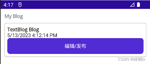
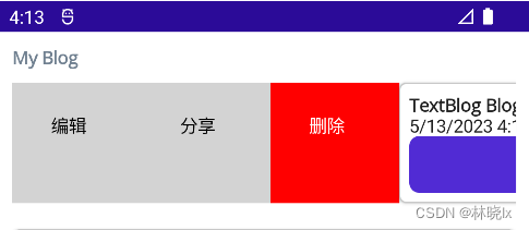
代码如下
<ControlTemplate x:Key="BlogCardViewPhone">

    <Grid>

        <SwipeView>

            <SwipeView.LeftItems>

                <SwipeItems>

                    <SwipeItem Text="编辑"

                                IconImageSource="delete.png"

                                BackgroundColor="LightGray" />

                    <SwipeItem Text="分享"

                                IconImageSource="delete.png"

                                BackgroundColor="LightGray" />

                    <SwipeItem Text="删除"

                                IconImageSource="delete.png"

                                BackgroundColor="Red" />

                </SwipeItems>

            </SwipeView.LeftItems>

            <Frame  HasShadow="True"

                    Margin="0,10,0,10"

                    CornerRadius="5"

                    Padding="8">

                <VerticalStackLayout>

                    <ContentPresenter />

                    <Label Text="{TemplateBinding BindingContext.PostTime}"

                            FontFamily="FontAwesome"></Label>

                    <Button Text="编辑/发布"

                            Command="{TemplateBinding BindingContext.SwitchState}" />

                </VerticalStackLayout>

            </Frame>

        </SwipeView>

    </Grid>

</ControlTemplate>
- BlogCardViewDesktop用于博客条目在桌面设备中的呈现,条目菜单右键菜单方式展开,我们配置FlyoutBase.ContextFlyout属性,作为卡片,用一个Frame框架包裹其内容。设置卡片的阴影,圆角,以及内边距。
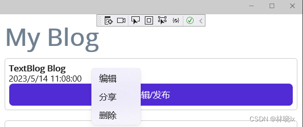
代码如下:
<ControlTemplate x:Key="BlogCardViewDesktop">

    <Frame HasShadow="True"

            Margin="0,10,0,10"

            CornerRadius="5"

            Padding="8">

        <FlyoutBase.ContextFlyout>

            <MenuFlyout>

                <MenuFlyoutItem Text="编辑" />

                <MenuFlyoutItem Text="分享" />

                <MenuFlyoutItem Text="删除" />

            </MenuFlyout>

        </FlyoutBase.ContextFlyout>

        <VerticalStackLayout>

            <ContentPresenter  />

            <Label Text="{TemplateBinding BindingContext.PostTime}"

                    FontFamily="FontAwesome"></Label>

            <Button Text="编辑/发布"

                    Command="{TemplateBinding BindingContext.SwitchState}" />

        </VerticalStackLayout>

    </Frame>

</ControlTemplate>
.NET MAUI 提供了ContentPresenter作为模板控件中的内容占位符,用于标记模板化自定义控件或模板化页面要显示的内容将在何处显示。
各平台模板中的<ContentPresenter /> 将显示控件的Content属性,也就是将TextBlogView中定义的内容,放到ContentPresenter处。
<view:TextBlogView ControlTemplate="{StaticResource BlogCardViewPhone}">

</view:TextBlogView>
基于平台自定义配置
.NET MAUI 提供了 OnPlatform 标记扩展和 OnIdiom 标记扩展。以便在不同平台上使用不同的控件模板。
通过 OnPlatform 标记扩展可基于每个平台控件属性:
| 属性 | 描述 |
|---|---|
| Default | 平台的属性的默认值。 |
| Android | 属性在 Android 上应用的值。 |
| iOS | 属性在 iOS 上应用的值。 |
| MacCatalyst | 设置为要在 Mac Catalyst 的值。 |
| Tizen | 属性在 Tizen 平台的值。 |
| WinUI | 属性在 WinUI 的值。 |
通过 OnIdiom 标记扩展可基于设备语义上的控件属性
| 属性 | 描述 |
|---|---|
| Default | 设备语义的属性的默认值。 |
| Phone | 属性在手机上应用的值。 |
| Tablet | 属性在平板电脑的值。 |
| Desktop | 设置为要在桌面平台的值。 |
| TV | 属性在电视平台的值。 |
| Watch | 属性在可穿戴设备(手表)平台的值。 |
在本示例中,我们使用OnIdiom标记扩展,分别为手机和桌面设备配置不同的模板。
<view:TextBlogView>

    <view:TextBlogView.ControlTemplate>

        <OnIdiom Phone="{StaticResource BlogCardViewPhone}"

                    Desktop="{StaticResource BlogCardViewDesktop}">

        </OnIdiom>

    </view:TextBlogView.ControlTemplate>

</view:TextBlogView>
需求二:在不同数据类别中使用不同的 UI 外观
数据模板(DataTemplate) 可以在支持的控件上(如:CollectionView)定义数据表示形式
可以使用数据模板选择器(DataTemplateSelector) 来实现更加灵活的模板选择。
DataTemplateSelector 可用于在运行时根据数据绑定属性的值来选择 DataTemplate。 这样可将多个 DataTemplate 应用于同一类型的对象,以自定义特定对象的外观。
相对于ControlTemplate方式,DataTemplateSelector是从Xamarin.Forms 2.1引入的新特性。
定义视图 UI 外观
创建两种视图和模板选择器:
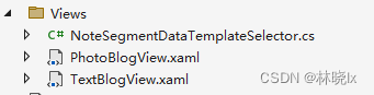
- TextBlog: 文本博客
- PhotoBlog: 图片博客
编写文本博客条目展示标题和内容,创建TextBlogView.xaml,定义如下:
<ContentView xmlns="http://schemas.microsoft.com/dotnet/2021/maui"

             xmlns:x="http://schemas.microsoft.com/winfx/2009/xaml"

             xmlns:service="clr-namespace:Lession1.Models;assembly=Lession1"

             x:Class="Lession1.Views.TextBlogView">

    <Grid>

       <VerticalStackLayout>

            <Label Text="{Binding Title}" FontAttributes="Bold">

            </Label>

            <Label Text="{Binding Content}"

                   LineBreakMode="WordWrap"></Label>

        </VerticalStackLayout>

    </Grid>

</ContentView>
编写图片博客条目展示标题和博客中图片的缩略图,创建PhotoBlogView.xaml,定义如下:
<ContentView xmlns="http://schemas.microsoft.com/dotnet/2021/maui"

             xmlns:x="http://schemas.microsoft.com/winfx/2009/xaml"

             xmlns:service="clr-namespace:Lession1.Models;assembly=Lession1"

             x:Class="Lession1.Views.PhotoBlogView">

    <Grid>

        <Label Text="{Binding Title}"

                FontAttributes="Bold">

        </Label>

        <StackLayout BindableLayout.ItemsSource="{Binding Images}"

                        Orientation="Horizontal">

            <BindableLayout.ItemTemplate>

                <DataTemplate>

                    <Image Source="{Binding}"

                            Aspect="AspectFill"

                            WidthRequest="44"

                            HeightRequest="44" />

                </DataTemplate>

            </BindableLayout.ItemTemplate>

        </StackLayout>

    </Grid>

</ContentView>
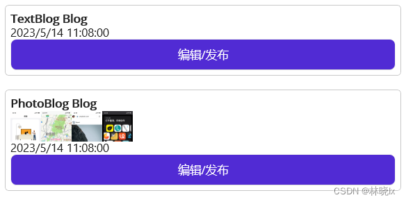
创建数据模板
在页面的资源中,添加各个视图创建数据模板(DataTemplate)类型的资源。
<ContentPage.Resources>

    <DataTemplate x:Key="PhotoBlog">

        <view:PhotoBlogView>

            <view:PhotoBlogView.ControlTemplate>

                <OnIdiom Phone="{StaticResource BlogCardViewPhone}"

                            Tablet="{StaticResource BlogCardViewDesktop}"

                            Desktop="{StaticResource BlogCardViewDesktop}">

                </OnIdiom>

            </view:PhotoBlogView.ControlTemplate>

        </view:PhotoBlogView>

    </DataTemplate>

    <DataTemplate x:Key="TextBlog">

        <view:TextBlogView>

            <view:TextBlogView.ControlTemplate>

                <OnIdiom Phone="{StaticResource BlogCardViewPhone}"

                            Tablet="{StaticResource BlogCardViewDesktop}"

                            Desktop="{StaticResource BlogCardViewDesktop}">

                </OnIdiom>

            </view:TextBlogView.ControlTemplate>

        </view:TextBlogView>

    </DataTemplate>

</ContentPage.Resources>
创建选择器
创建BlogDataTemplateSelector,根据博客的类型,返回不同的数据模板(DataTemplate)对象。
public class BlogDataTemplateSelector : DataTemplateSelector

{

    public object ResourcesContainer { get; set; }

    protected override DataTemplate OnSelectTemplate(object item, BindableObject container)

    {

        if (item == null)

        {

            return default;

        }

        if (item is Blog)

        {

            var dataTemplateName = (item as Blog).Type;

            if (dataTemplateName == null) { return default; }

            if (ResourcesContainer == null)

            {

                return Application.Current.Resources[dataTemplateName] as DataTemplate;

            }

            return (ResourcesContainer as VisualElement).Resources[dataTemplateName] as DataTemplate;

        }

        return default;

    }

}
DataTemplate将在页面资源字典中被创建。若没有绑定ResourcesContainer,则在App.xaml中寻找。
同样, 将BlogDataTemplateSelector添加到页面的资源中
  <view:BlogDataTemplateSelector x:Key="BlogDataTemplateSelector"

ResourcesContainer="{x:Reference MainContentPage}" />
注意,此时BlogDataTemplateSelector.ResourcesContainer指向MainContentPage,显式设置MainPage对象的名称:x:Name="MainContentPage"
定义数据
我们定义一个Blog类, 用于表示博客条目,包含标题,内容,发布时间,图片等属性。
public class Blog

{

    public Blog()

    {

        PostTime = DateTime.Now;

        State = BlogState.Edit;

    }

    public Guid NoteId { get; set; }

    public string Title { get; set; }

    public string Type { get; set; }

    public BlogState State { get; set; }

    public string Content { get; set; }

    public List<string> Images { get; set; }

    public DateTime PostTime { get; set; }

    public bool IsHidden { get; set; }

}
定义博客列表的绑定数据源 ObservableCollection<Blog> Blogs,给数据源初始化一些数据,用于测试。
private async void CreateBlogAction(object obj)

{

    var type = obj as string;

    if (type == "TextBlog")

    {

        var blog = new Blog()

        {

            NoteId = Guid.NewGuid(),

            Title = type + " Blog",

            Type = type,

            Content = type + " Blog Test, There are so many little details that a software developer must take care of before publishing an application. One of the most time-consuming is the task of adding icons to your toolbars, buttons, menus, headers, footers and so on.",

            State = BlogState.PreView,

            IsHidden = false,

        };

        this.Blogs.Add(blog);

    }

    else if (type == "PhotoBlog")

    {

        var blog = new Blog()

        {

            NoteId = Guid.NewGuid(),

            Title = type + " Blog",

            Type = type,

            Content = type + " Blog Test",

            Images = new List<string>() { "p1.png", "p2.png", "p3.png", "p4.png" },

            State = BlogState.PreView,

            IsHidden = false,

        };

        this.Blogs.Add(blog);

    }

}
设置博客列表控件CollectionView绑定的数据源为Blogs,并设置数据模板选择器为BlogDataTemplateSelector
<ContentPage.Content>

    <Grid Margin="10">

        <Grid.RowDefinitions>

            <RowDefinition Height="auto" />

            <RowDefinition Height="1*" />

        </Grid.RowDefinitions>

        <!--标题区域-->

        <Label Text="My Blog"

                TextColor="SlateGray"

                FontSize="Header"

                FontAttributes="Bold"></Label>

        <CollectionView x:Name="MainCollectionView"

                        Grid.Row="1"

                        ItemsSource="{Binding Blogs}"

                        ItemTemplate="{StaticResource BlogDataTemplateSelector}" />

    </Grid>

</ContentPage.Content>
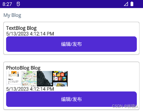
则列表中的每个博客条目将根据博客类型,使用不同的数据模板进行渲染。
效果如下:
需求三:在不同数据状态中使用不同的 UI 外观
此功能没有一个固定的解决方案,可以根据实际情况,选择合适的方式实现。
比如在本项目中,博客存在编辑和发布两个状态
public enum BlogState

{

    Edit,

    PreView

}
使用绑定模型更改控件的外观
最简单的方式是用IsVisible来控制控件中元素的显示和隐藏。
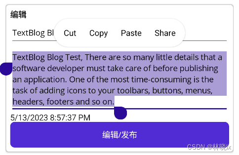
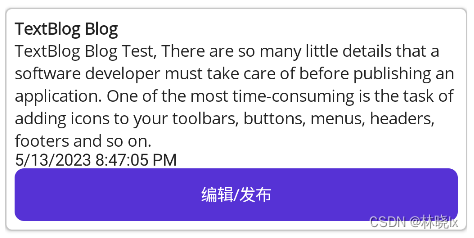
在本示例中,TextBlogView需要对编辑中的状态和预览中的状态进行区分。
EnumToBoolConverter是枚举到bool值的转换器,它返回当前绑定对象的State属性与指定的BlogState枚举项是否一致,详情请查看 .NET MAUI 社区工具包
<ContentView xmlns="http://schemas.microsoft.com/dotnet/2021/maui"

             xmlns:x="http://schemas.microsoft.com/winfx/2009/xaml"

             xmlns:service="clr-namespace:Lession1.Models;assembly=Lession1"

             x:Class="Lession1.Views.TextBlogView">

    <Grid>

        <VerticalStackLayout IsVisible="{Binding State, Converter={StaticResource EnumToBoolConverter}, ConverterParameter={x:Static service:BlogState.PreView}}">

            <Label Text="{Binding Title}" FontAttributes="Bold">

            </Label>

            <Label Text="{Binding Content}"

                   LineBreakMode="WordWrap"></Label>

        </VerticalStackLayout>

        <VerticalStackLayout IsVisible="{Binding State, Converter={StaticResource EnumToBoolConverter}, ConverterParameter={x:Static service:BlogState.Edit}}">

            <Label Text="编辑"

                   FontAttributes="Bold">

            </Label>

            <Entry Text="{Binding Title}"

                   Placeholder="标题"></Entry>

            <Editor Text="{Binding Content}"

                    AutoSize="TextChanges"

                    Placeholder="内容"></Editor>

        </VerticalStackLayout>

    </Grid>

</ContentView>
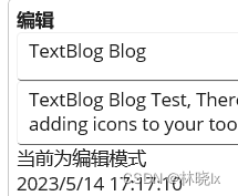
编辑状态:
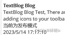
发布状态:
使用视觉状态更改控件的外观
还可以使用定义自定义视觉状态对界面进行控制。
在本示例中,使用VisualStateManager定义了两个视觉状态,分别对应Label的编辑状态和发布状态,当State属性的值发生变化时,会触发对应的视觉状态。
<Label Grid.Row="1">

    <VisualStateManager.VisualStateGroups>

        <VisualStateGroup>

            <VisualState Name="BlogPreView">

                <VisualState.StateTriggers>

                    <StateTrigger

                                    IsActive="{Binding State, Converter={StaticResource EnumToBoolConverter}, ConverterParameter={x:Static service:BlogState.PreView}}" />

                </VisualState.StateTriggers>

                <VisualState.Setters>

                    <Setter Property="Text"

                            Value="当前为发布模式" />

                </VisualState.Setters>

            </VisualState>

            <VisualState Name="BlogEdit">

                <VisualState.StateTriggers>

                    <StateTrigger IsActive="{Binding State, Converter={StaticResource EnumToBoolConverter}, ConverterParameter={x:Static service:BlogState.Edit}}" />

                </VisualState.StateTriggers>

                <VisualState.Setters>

                    <Setter Property="Text"

                            Value="当前为编辑模式" />

                </VisualState.Setters>

            </VisualState>

        </VisualStateGroup>

    </VisualStateManager.VisualStateGroups>

</Label>
编辑状态:
发布状态:
项目地址
关注我,学习更多.NET MAUI开发知识!
[MAUI程序设计]界面多态与实现的更多相关文章
- 【我要学python】面对对象编程之继承和多态
class animal(object): def run(): print('animal is running...') class dog(animal): def run(self): pri ...
- java学习笔记(详细)
java平台 1.J2SE java开发平台标准版 2.J2EE java开发平台企业版 java程序需要在虚拟机上才可以运行,换言之只要有虚拟机的系统都可以运行java程序.不同系统上要安装对应的虚 ...
- DeltaFish 校园物资共享平台 第三次小组会议
一.想法 娄雨禛: 网页底层开发转移到后端,快速建站,效率高. 可以依照模板进行仿制. 可以考虑只进行页面设计. 但是出现问题不会调试. 所以自己写源码,做出一个大致的样子. 二.上周进度汇报 齐天杨 ...
- Golang核心编程
源码地址: https://github.com/mikeygithub/GoCode 第1章 1Golang 的学习方向 Go 语言,我们可以简单的写成 Golang 1.2Golang 的应用领域 ...
- JAVA(3)
接口注意事项: 1.接口不能被实例化 2.接口中所有的方法都不能有主体 (不能有{ }) 3.一个类可以实现多个接口 4.接口中可以有变量<但变量不能用private和protected修饰& ...
- OpenGL基础图形编程
一.OpenGL与3D图形世界1.1.OpenGL使人们进入三维图形世界 我们生活在一个充满三维物体的三维世界中,为了使计算机能精确地再现这些物体,我们必须能在三维空间描绘这些物体.我们又生活在一个充 ...
- php面向对象之抽像类、接口、final、类常量
一.抽像类(abstract) 在我们实际开发过程中,有些类并不需要被实例化,如前面学习到的一些父类,主要是让子类来继承,这样可以提高代码复用性语法结构: 代码如下 复制代码 ab ...
- C#基本线程同步
0 概述 所谓同步,就是给多个线程规定一个执行的顺序(或称为时序),要求某个线程先执行完一段代码后,另一个线程才能开始执行. 第一种情况:多个线程访问同一个变量: 1. 一个线程写,其它线程读:这种情 ...
- BIOS
转自BIOS BIOS(Basic Input/Output System的缩写.中文:基本输入输出系统),在IBM PC兼容机上,是一种业界标准的固件接口.BIOS这个字眼是在1975第一次由CP/ ...
- ASP.NET 设计模式(转)
Professional ASP.NET Design Patterns 为什么学习设计模式? 运用到ASP.NET应用程序中的设计模式.原则和最佳实践.设计模式和原则支持松散耦合.高内聚的代码,而这 ...
随机推荐
- GRAPH ATTENTION NETWORKS(GAT)图注意力网络
摘要: 我们提出一个图注意力网络,一个新的用来操作图结构数据的神经网络结构,它利用"蒙面"的自我注意力层来解决基于图卷积以及和它类似结构的短板.通过堆叠一些层,这些层的节点能够参与 ...
- Python--相关环境的安装,以及hello world的实现
相关环境 进入官网:https://www.python.org/downloads/ 点击这里: 来到新的界面之后,向下滑动: 找到上图中的界面,选择版本进行下载即可. 具体的安装步骤可以参考这里看 ...
- MySQL Mock大量数据做查询响应测试
上个迭代版本发布后,生产环境业务同事反馈仓配订单查询的页面加载时间过长. 因为页面原来是有的,这次开发是在原来基础上改的,因此没有额外做性能.测试环境只调用接口请求了少量数据去验证功能.在对比该迭代添 ...
- Masa Framework源码解读-02缓存模块(分布式缓存进阶之多级缓存)
序言 今天这篇文章来看看Masa Framework的缓存设计,上一篇文章中说到的MasaFactory的应用也会在这章节出现.文章中如有错误之处还请指点,咱们话不多说,直入主题. Masa Fr ...
- Pycharm 搭建 Django 项目
1. 安装需求 在使用 python 框架 Django 需要注意下面事项 Pycharm 版本是专业版而不是社区版本 Pycharm 配置好了 python 解释器 (一般我们现在用的都是pytho ...
- Java (强/弱/软/虚)引用
一.整体架构
- Vue2模版编译(AST、Optimize 、Render)
在Vue $mount过程中,我们需要把模版编译成render函数,整体实现可以分为三部分: parse:解析模版 template生成 AST语法树 optimize: 优化 AST语法树,标记静态 ...
- Go 语言:通过TDD驱动开发创建一个 Web 服务器,用户可以在其中跟踪玩家赢了多少场游戏。
你被要求创建一个 Web 服务器,用户可以在其中跟踪玩家赢了多少场游戏. GET /players/{name} 应该返回一个表示获胜总数的数字 POST /players/{name} 应该为玩 ...
- 最新版本 Stable Diffusion 开源 AI 绘画工具之使用篇
目录 界面参数 采样器 文生图(txt2img) 图生图(img2img) 模型下载 界面参数 在使用 Stable Diffusion 开源 AI 绘画之前,需要了解一下绘画的界面和一些参数的意义 ...
- NTP 4.2.6p5版本导致多个系统安全漏洞
问题描述:通过漏洞扫描发现NTP 4.2.6p5版本导致多个系统漏洞,需要升级版本更高的ntp,一般刚开始都是yum直接装ntp包,现在需要重新卸载安装源码包 下载链接:http://distfile ...