CSS——动画
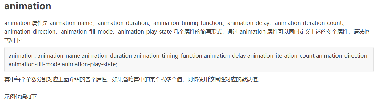
@keyframes 规则
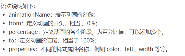
要创建 CSS 动画,您首先需要了解 @keyframes 规则,@keyframes 规则用来定义动画各个阶段的属性值,类似于 flash 动画中的关键帧,语法格式如下:
@keyframes animationName {

    from {

        properties: value;

    }

    percentage {

        properties: value;

    }

    to {

        properties: value;

    }

}

// 或者

@keyframes animationName {

    0% {

        properties: value;

    }

    percentage {

        properties: value;

    }

    100% {

        properties: value;

    }

}
下面我们来看一个简单的 @keyframes 规则示例:
@keyframes ball {

    0% { top: 0px; left: 0px;}

    25% { top: 0px; left: 350px;}

    50% { top: 200px; left: 350px;}

    75% { top: 200px; left: 0px;}

    100% { top: 0px; left: 0px;}

}

下面就来详细介绍一下上述属性的使用:
<!DOCTYPE html>

<html>

<head>

    <style>

        @keyframes ball {

            0% { top: 0px; left: 0px;}

            25% { top: 0px; left: 350px;}

            50% { top: 200px; left: 350px;}

            75% { top: 200px; left: 0px;}

            100% { top: 0px; left: 0px;}

        }

        div {

            width: 100px;

            height: 100px;

            border-radius: 50%;

            border: 3px solid black;

            position: relative;

            animation-name: ball;

        }

    </style>

</head>

<body>

    <div></div>

</body>

</html>
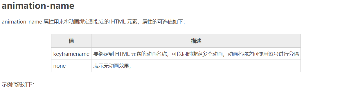
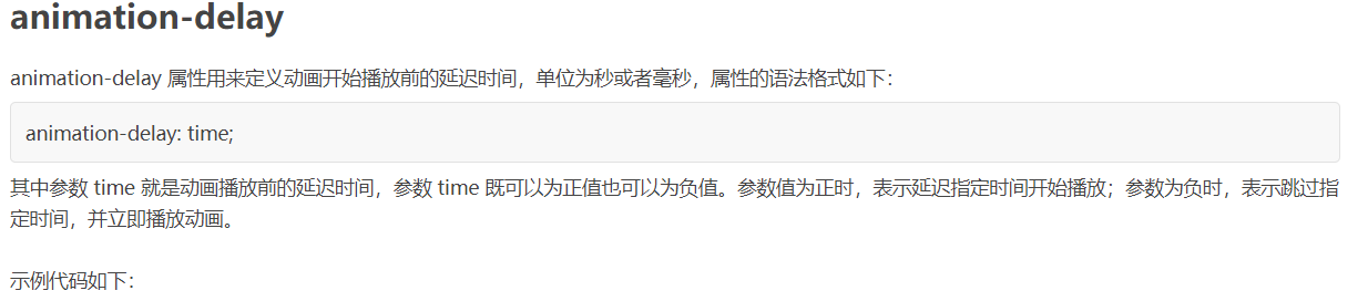
注意:要想让动画成功播放,您还需要定义 animation-duration 属性,否则会因为 animation-duration 属性的默认值为 0,导致动画并不会播放。

<!DOCTYPE html>

<html>

<head>

    <style>

        @keyframes ball {

            0% { top: 0px; left: 0px;}

            25% { top: 0px; left: 350px;}

            50% { top: 200px; left: 350px;}

            75% { top: 200px; left: 0px;}

            100% { top: 0px; left: 0px;}

        }

        div {

            width: 100px;

            height: 100px;

            border-radius: 50%;

            border: 3px solid black;

            position: relative;

            animation-name: ball;

            animation-duration: 2s;

        }

    </style>

</head>

<body>

    <div></div>

</body>

</html>
提示:动画若想成功播放,必须要定义 animation-name 和 animation-duration 属性。
<!DOCTYPE html>
<html>
<head>
<style>
@keyframes ball {
0% {left: 0px;}
50% {left: 350px;}
100% {left: 0px;}
}
div {
width: 100px;
height: 100px;
border-radius: 50%;
border: 3px solid black;
text-align: center;
line-height: 100px;
position: relative;
animation-name: ball;
animation-duration: 2s;
}
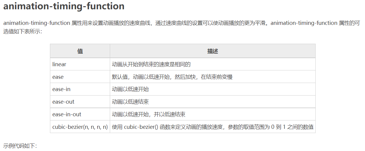
.one {
animation-timing-function: ease;
}
.two {
animation-timing-function: ease-in;
}
.three {
animation-timing-function: ease-out;
}
.four {
animation-timing-function: ease-in-out;
}
</style>
</head>
<body>
<div class="one">ease</div>
<div class="two">ease-in</div>
<div class="three">ease-out</div>
<div class="four">ease-in-out</div>
</body>
</html>
<!DOCTYPE html>
<html>
<head>
<style>
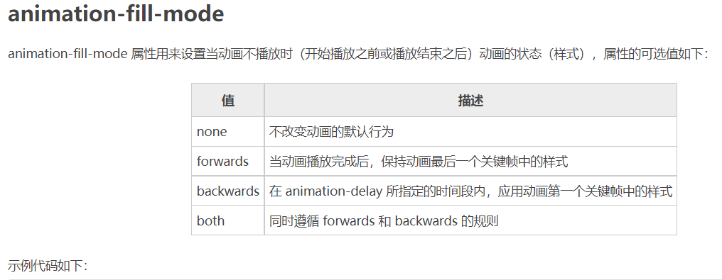
@keyframes box {
0% {transform: rotate(0);}
50% {transform: rotate(0.5turn);}
100% {transform: rotate(1turn);}
}
div {
width: 100px;
height: 100px;
border-radius: 50%;
float: left;
border: 3px solid black;
text-align: center;
line-height: 100px;
position: relative;
animation-name: box;
animation-duration: 2s;
animation-iteration-count: 1;
animation-fill-mode: forwards;
}
</style>
</head>
<body>
<div>forwards</div>
</body>
</html>
<!DOCTYPE html>

<html>

<head>

    <style>

        @keyframes ball {

            0% {left: 0px;}

            50% {left: 350px;}

            100% {left: 0px;}

        }

        div {

            width: 100px;

            height: 100px;

            border-radius: 50%;

            border: 3px solid black;

            text-align: center;

            line-height: 100px;

            position: relative;

            animation-name: ball;

            animation-duration: 2s;

        }

        .one {

            animation-delay: 0.5s;

        }

        .two {

            animation-delay: -0.5s;

        }

    </style>

</head>

<body>

    <div class="one">0.5s</div>

    <div class="two">-0.5s</div>

</body>

</html>
<!DOCTYPE html>

<html>

<head>

    <style>

        @keyframes box {

            0% {transform: rotate(0);}

            50% {transform: rotate(0.5turn);}

            100% {transform: rotate(1turn);}

        }

        div {

            width: 100px;

            height: 100px;

            float: left;

            border: 3px solid black;

            text-align: center;

            line-height: 100px;

            position: relative;

            animation-name: box;

            animation-duration: 2s;

        }

        .one {

            animation-iteration-count: 1;

        }

        .two {

            margin-left: 50px;

            animation-iteration-count: infinite;

        }

    </style>

</head>

<body>

    <div class="one">1</div>

    <div class="two">infinite</div>

</body>

</html>
<!DOCTYPE html>

<html>

<head>

    <style>

        @keyframes box {

            0% {transform: rotate(0);}

            50% {transform: rotate(0.5turn);}

            100% {transform: rotate(1turn);}

        }

        div {

            width: 100px;

            height: 100px;

            float: left;

            border: 3px solid black;

            text-align: center;

            line-height: 100px;

            position: relative;

            animation-name: box;

            animation-duration: 2s;

            animation-iteration-count: infinite;

        }

        .one {

            animation-direction: reverse;

        }

        .two {

            margin-left: 50px;

            animation-direction: alternate;

        }

    </style>

</head>

<body>

    <div class="one">reverse</div>

    <div class="two">alternate</div>

</body>

</html>
<!DOCTYPE html>

<html>

<head>

    <style>

        @keyframes box {

            0% {transform: rotate(0);}

            50% {transform: rotate(0.5turn);}

            100% {transform: rotate(1turn);}

        }

        div {

            width: 100px;

            height: 100px;

            float: left;

            border: 3px solid black;

            text-align: center;

            line-height: 100px;

            position: relative;

            animation-name: box;

            animation-duration: 2s;

            animation-iteration-count: infinite;

        }

        .one {

            animation-play-state: running;

        }

        .two {

            margin-left: 50px;

            animation-play-state: paused;

        }

    </style>

</head>

<body>

    <div class="one">running</div>

    <div class="two">paused</div>

</body>

</html>
<!DOCTYPE html>

<html>

<head>

    <style>

        @keyframes box {

            0% {transform: rotate(0);}

            50% {transform: rotate(0.5turn);}

            100% {transform: rotate(1turn);}

        }

        div {

            width: 100px;

            height: 100px;

            border-radius: 50%;

            float: left;

            border: 3px solid black;

            text-align: center;

            line-height: 100px;

            position: relative;

            animation: box 2s linear 0s infinite alternate;

        }

    </style>

</head>

<body>

    <div>animation</div>

</body>

</html>
CSS——动画的更多相关文章
- 梅须逊雪三分白,雪却输梅一段香——CSS动画与JavaScript动画
CSS动画并不是绝对比JavaScript动画性能更优越,开源动画库Velocity.js等就展现了强劲的性能. 一.两者的主要区别 先开门见山的说说两者之间的区别. 1)CSS动画: 基于CSS的动 ...
- Css 动画的回调
在做项目中经常会遇到使用动画的情况.以前的情况是用js写动画,利用setTimeout函数或者window.requestAnimationFrame()实现目标元素的动画效果.虽然后者解决了刷新频率 ...
- 【译】css动画里的steps()用法详解
原文地址:http://designmodo.com/steps-c... 原文作者:Joni Trythall 我想你在css 动画里使用steps()会和我一样有很多困惑.一开始我不清楚怎样使用它 ...
- css动画属性性能
性能主要表现:流量.功耗与流畅度 在现有的前端动画体系中,通常有两种模式:JS动画与CSS3动画. JS动画是通过JS动态改写样式实现动画能力的一种方案,在PC端兼容低端浏览器中不失为一种推荐方案. ...
- Css动画形式弹出遮罩层,内容区上下左右居中于不定宽高的容器中
<!DOCTYPE html> <html> <head> </head> <body id="body"> <! ...
- css动画与js动画的区别
CSS动画 优点: (1)浏览器可以对动画进行优化. 1. 浏览器使用与 requestAnimationFrame 类似的机制,requestAnimationFrame比起setTimeout ...
- CSS动画与GPU
写在前面 满世界的动画性能优化技巧,例如: 只允许改变transform.opacity,其它属性不要动,避免重新计算布局(reflow) 对动画元素应用transform: translate3d( ...
- 15个来自 CodePen 的酷炫 CSS 动画效果【下篇】
CodePen 是一个在线的前端代码编辑和展示网站,能够编写代码并即时预览效果.你在上面可以在线分享自己的 Web 作品,也可以欣赏到世界各地的优秀开发者在网页中实现的各种令人惊奇的效果. 今天这篇文 ...
- 赞!15个来自 CodePen 的酷炫 CSS 动画效果
CodePen 是一个在线的前端代码编辑和展示网站,能够编写代码并即时预览效果.你在上面可以在线分享自己的 Web 作品,也可以欣赏到世界各地的优秀开发者在网页中实现的各种令人惊奇的效果. 今天这篇文 ...
- Animo.js :一款管理 CSS 动画的强大的小工具
Animo.js 是一个功能强大的小工具,用于管理 CSS 动画.它的特色功能包括像堆栈动画,创建跨浏览器的模糊,设置动画完成的回调等等.Animo 还包括惊人的 animate.css,为您提供了近 ...
随机推荐
- Python队列----queue
import queue # 官网文档:https://docs.python.org/3/library/queue.html a1 = queue.Queue() # 先进先出队列 a2 = qu ...
- 机器学习常见的sampling策略 附PyTorch实现
简单的采样策略 首先介绍三种简单采样策略: Instance-balanced sampling, 实例平衡采样. Class-balanced sampling, 类平衡采样. Square-roo ...
- VIM YouCompleteMe(ycm) 对于Python3第三方库的自动补全【部分解决】
VIM YouCompleteMe(ycm) 对于Python3第三方库的自动补全[部分解决] Python3 学习笔记 问题:VIM 用YouCompleteMe(ycm)自动补全插件时,只能支持P ...
- 编译 OpenCV 的 Python 依赖
这一次编译 OpenCV 的 Python 依赖为了方便运行我们使用 Docker 进行编译,环境准备如下: 系统依赖:Ubuntu 18.04 Python 版本:3.6,Ubuntu 18.04 ...
- 【笔记】go语言--结构体,方法,包与封装
[笔记]go语言--结构体,方法,包与封装 结构体和方法 面向对象 go语言仅支持封装,不支持继承和多态 go语言没有class,只有struct //结构的定义 type TreeNode stru ...
- 力扣409(java&python)-最长回文串(简单)
题目: 给定一个包含大写字母和小写字母的字符串 s ,返回 通过这些字母构造成的 最长的回文串 . 在构造过程中,请注意 区分大小写 .比如 "Aa" 不能当做一个回文字符串. 示 ...
- 这种精度高,消耗资源少的大模型稀疏训练方法被阿里云科学家找到了!已被收录到IJCAI
简介: 论文通过减少模型稀疏训练过程中需要更新的参数量,从而减少大模型稀疏训练的时间以及资源开销,是首个大模型参数高效的稀疏训练算法PST. 作者:李深.李与超 近日,阿里云机器学习PAI关于大模型稀 ...
- JDBC 在性能测试中的应用
简介: 我们能否绕开 http 协议,直接测试数据库的性能?是否觉得从数据库中导出 CSV 文件来构造压测数据很麻烦?怎样在压测结束后做数据清理?能不能通过数据库中的插入(删除)记录对压测请求做断言? ...
- 实时计算pv/uv Demo
简介: 本文由阿里巴巴高级技术专家邓小勇(静行)分享,主要用 Demo 演示如何通过实时计算 Flink 实时计算pv/uv的场景. 本文由阿里巴巴高级技术专家邓小勇(静行)分享,主要用 Demo 演 ...
- Apache Dubbo 3.0.0 正式发布 - 全面拥抱云原生
简介: 一个新的里程碑! 一.背景 自从 Apache Dubbo 在 2011 年开源以来,在一众大规模互联网.IT公司的实践中积累了大量经验后,Dubbo 凭借对 Java 用户友好.功能丰富.治 ...