WPF自定义控件 使用阿里巴巴图标
上一篇介绍了 WPF自定义控件
按钮 的初步使用,在进一步介绍WPF自定义控件
按钮之前,先介绍一下如何在WPF项目中使用阿里巴巴图标,方便以后做示例。
1.还是在上一篇项目基础上,在WPF自定义控件类库项目 Controls 文件夹下,新建一个资源字典(WPF)文件,取名: MyIcon.xaml ,并且添加如下代码:
<ResourceDictionary xmlns="http://schemas.microsoft.com/winfx/2006/xaml/presentation"

                    xmlns:x="http://schemas.microsoft.com/winfx/2006/xaml"

                    xmlns:local="clr-namespace:WpfCustomControlLibrary.Controls">

    <Style x:Key="MyIcon" TargetType="TextBlock">

        <Setter Property="FontFamily" Value="/WpfCustomControlLibrary;component/Resources/#iconfont"></Setter>

        <Setter Property="Foreground" Value="White"/>

        <Setter Property="TextAlignment" Value="Center"/>

        <Setter Property="HorizontalAlignment" Value="Center"/>

        <Setter Property="VerticalAlignment" Value="Center"/>

        <Setter Property="FontSize" Value="20"/>

    </Style>

</ResourceDictionary>
2.在项目下新建一个 Resources 文件夹,去阿里巴巴图标网站 http://www.iconfont.cn/ 下载 ttf 文件,放到该文件夹下,注意将此ttf文件的生成操作设置成 Resource ;

3.在Generic.xaml文件中,添加对MyIcon.xaml的引用:
<ResourceDictionary

    xmlns="http://schemas.microsoft.com/winfx/2006/xaml/presentation"

    xmlns:x="http://schemas.microsoft.com/winfx/2006/xaml"

    xmlns:local="clr-namespace:WpfCustomControlLibrary">

    <ResourceDictionary.MergedDictionaries>

            <ResourceDictionary Source="pack://application:,,,/WpfCustomControlLibrary;component/Controls/MyButton1.xaml"/>

            <ResourceDictionary Source="pack://application:,,,/WpfCustomControlLibrary;component/Controls/MyIcon.xaml" />

    </ResourceDictionary.MergedDictionaries>

</ResourceDictionary>
4.在测试项目的 app.xaml 文件中加入MyIcon.xaml的引用:
<Application x:Class="WpfApplication1.App"

             xmlns="http://schemas.microsoft.com/winfx/2006/xaml/presentation"

             xmlns:x="http://schemas.microsoft.com/winfx/2006/xaml"

             xmlns:local="clr-namespace:WpfApplication1"

             StartupUri="MainWindow.xaml">

    <Application.Resources>

        <ResourceDictionary>

            <ResourceDictionary.MergedDictionaries>

                <ResourceDictionary Source="pack://application:,,,/WpfCustomControlLibrary;component/Controls/MyIcon.xaml"/>

            </ResourceDictionary.MergedDictionaries>

        </ResourceDictionary>

    </Application.Resources>

</Application>
5.在测试项目中加入一个textblock用以测试:
<Window x:Class="WpfApplication1.MainWindow"
xmlns="http://schemas.microsoft.com/winfx/2006/xaml/presentation"
xmlns:x="http://schemas.microsoft.com/winfx/2006/xaml"
xmlns:d="http://schemas.microsoft.com/expression/blend/2008"
xmlns:mc="http://schemas.openxmlformats.org/markup-compatibility/2006"
xmlns:local="clr-namespace:WpfApplication1"
xmlns:controls="clr-namespace:WpfCustomControlLibrary.Controls;assembly=WpfCustomControlLibrary"
mc:Ignorable="d"
Title="MainWindow" Height="350" Width="525">
<Grid>
<Grid.RowDefinitions>
<RowDefinition></RowDefinition>
<RowDefinition></RowDefinition>
<RowDefinition></RowDefinition>
</Grid.RowDefinitions>
<Grid.ColumnDefinitions>
<ColumnDefinition></ColumnDefinition>
<ColumnDefinition></ColumnDefinition>
</Grid.ColumnDefinitions>
<Button Grid.Row="0" Grid.Column="0" Content="Default Button" Width="100" Height="50"></Button>
<controls:MyButton1 Grid.Row="0" Grid.Column="1" Width="80" Height="80" >
<controls:MyButton1.Content>
<TextBlock Text="MyButton1" Margin="10,30,10,10"></TextBlock>
</controls:MyButton1.Content>
</controls:MyButton1>
<TextBlock Grid.Row="1" Grid.Column="0" Text="" FontSize="50" Foreground="Green" Style="{StaticResource MyIcon}" ></TextBlock>
</Grid>
</Window>
最终效果就是显示一个微信图标:

将这个icon图标和上一篇介绍的 MyButton1 结合起来使用,可以达到 图标按钮的效果,如:
1)将 MyButton1.xaml 改成:
<ResourceDictionary xmlns="http://schemas.microsoft.com/winfx/2006/xaml/presentation"
xmlns:x="http://schemas.microsoft.com/winfx/2006/xaml"
xmlns:local="clr-namespace:WpfCustomControlLibrary.Controls">
<ResourceDictionary.MergedDictionaries>
<ResourceDictionary Source="pack://application:,,,/WpfCustomControlLibrary;component/Controls/MyIcon.xaml" />
</ResourceDictionary.MergedDictionaries>
<ControlTemplate x:Key="MyButton1_Template" TargetType="{x:Type local:MyButton1}">
<Border x:Name="border" Background="{Binding RelativeSource={RelativeSource Mode=TemplatedParent}, Path= Background}"
Height="{Binding RelativeSource={RelativeSource Mode=TemplatedParent}, Path=Height}"
CornerRadius="2"
BorderBrush="{TemplateBinding BorderBrush}" BorderThickness="{TemplateBinding BorderThickness}"
Width="{Binding RelativeSource={RelativeSource Mode=TemplatedParent}, Path=Width}">
<!--Icon/Text-->
<StackPanel Orientation="Horizontal" VerticalAlignment="Center"
Margin="{TemplateBinding Padding}"
HorizontalAlignment="{TemplateBinding HorizontalContentAlignment}">
<TextBlock x:Name="icon" Margin="3"
RenderTransformOrigin="0.5,0.5" Style="{StaticResource MyIcon}"
Text=""
FontSize="30"
Foreground="Green">
<TextBlock.RenderTransform>
<RotateTransform x:Name="transIcon" Angle="0"/>
</TextBlock.RenderTransform>
</TextBlock>
<TextBlock VerticalAlignment="Center" x:Name="txt"
TextDecorations="{Binding RelativeSource={RelativeSource Mode=TemplatedParent}, Path=ContentDecorations}"
Text="{Binding RelativeSource={RelativeSource Mode=TemplatedParent}, Path=Content}" />
</StackPanel>
</Border>
</ControlTemplate>
<Style TargetType="{x:Type local:MyButton1}">
<Setter Property="Template" Value="{StaticResource MyButton1_Template}"/>
</Style>
</ResourceDictionary>2)测试代码改成:
<Window x:Class="WpfApplication1.MainWindow"
xmlns="http://schemas.microsoft.com/winfx/2006/xaml/presentation"
xmlns:x="http://schemas.microsoft.com/winfx/2006/xaml"
xmlns:d="http://schemas.microsoft.com/expression/blend/2008"
xmlns:mc="http://schemas.openxmlformats.org/markup-compatibility/2006"
xmlns:local="clr-namespace:WpfApplication1"
xmlns:controls="clr-namespace:WpfCustomControlLibrary.Controls;assembly=WpfCustomControlLibrary"
mc:Ignorable="d"
Title="MainWindow" Height="350" Width="525">
<Grid>
<Grid.RowDefinitions>
<RowDefinition></RowDefinition>
<RowDefinition></RowDefinition>
<RowDefinition></RowDefinition>
</Grid.RowDefinitions>
<Grid.ColumnDefinitions>
<ColumnDefinition></ColumnDefinition>
<ColumnDefinition></ColumnDefinition>
</Grid.ColumnDefinitions>
<Button Grid.Row="0" Grid.Column="0" Content="Default Button" Width="100" Height="50"></Button>
<controls:MyButton1 Grid.Row="0" Grid.Column="1" Width="100" Height="50" Content="MyButton1" Background="Orange" />
<TextBlock Grid.Row="1" Grid.Column="0" Text="" FontSize="50" Foreground="Green" Style="{StaticResource MyIcon}" ></TextBlock>
</Grid>
</Window>
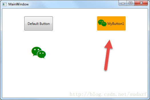
那么 按钮将变成图标+文字的组合,如图:
WPF自定义控件 使用阿里巴巴图标的更多相关文章
- WPF自定义控件与样式(1)-矢量字体图标(iconfont)
一.图标字体 图标字体在网页开发上运用非常广泛,具体可以网络搜索了解,网页上的运用有很多例子,如Bootstrap.但在C/S程序中使用还不多,字体图标其实就是把矢量图形打包到字体文件里,就像使用一般 ...
- WPF使用矢量字体图标(阿里巴巴iconfont)
原文:WPF使用矢量字体图标(阿里巴巴iconfont) 版权声明:本文为博主原创文章,转载请注明出处. https://blog.csdn.net/lwwl12/article/details/78 ...
- WPF自定义控件与样式(3)-TextBox & RichTextBox & PasswordBox样式、水印、Label标签、功能扩展
一.前言.预览 申明:WPF自定义控件与样式是一个系列文章,前后是有些关联的,但大多是按照由简到繁的顺序逐步发布的等,若有不明白的地方可以参考本系列前面的文章,文末附有部分文章链接. 本文主要是对文本 ...
- WPF自定义控件与样式(2)-自定义按钮FButton
一.前言.效果图 申明:WPF自定义控件与样式是一个系列文章,前后是有些关联的,但大多是按照由简到繁的顺序逐步发布的等,若有不明白的地方可以参考本系列前面的文章,文末附有部分文章链接. 还是先看看效果 ...
- WPF自定义控件与样式(15)-终结篇 & 系列文章索引 & 源码共享
系列文章目录 WPF自定义控件与样式(1)-矢量字体图标(iconfont) WPF自定义控件与样式(2)-自定义按钮FButton WPF自定义控件与样式(3)-TextBox & Ric ...
- WPF自定义控件与样式(4)-CheckBox/RadioButton自定义样式
一.前言 申明:WPF自定义控件与样式是一个系列文章,前后是有些关联的,但大多是按照由简到繁的顺序逐步发布的等,若有不明白的地方可以参考本系列前面的文章,文末附有部分文章链接. 本文主要内容: Che ...
- WPF自定义控件与样式(5)-Calendar/DatePicker日期控件自定义样式及扩展
一.前言 申明:WPF自定义控件与样式是一个系列文章,前后是有些关联的,但大多是按照由简到繁的顺序逐步发布的等,若有不明白的地方可以参考本系列前面的文章,文末附有部分文章链接. 本文主要内容: 日历控 ...
- WPF自定义控件与样式(6)-ScrollViewer与ListBox自定义样式
一.前言 申明:WPF自定义控件与样式是一个系列文章,前后是有些关联的,但大多是按照由简到繁的顺序逐步发布的等,若有不明白的地方可以参考本系列前面的文章,文末附有部分文章链接. 本文主要内容: Scr ...
- WPF自定义控件与样式(7)-列表控件DataGrid与ListView自定义样式
一.前言 申明:WPF自定义控件与样式是一个系列文章,前后是有些关联的,但大多是按照由简到繁的顺序逐步发布的等,若有不明白的地方可以参考本系列前面的文章,文末附有部分文章链接. 本文主要内容: Dat ...
随机推荐
- VMware虚拟机12安装linux系统详细教程
亲测有效,附图: 工具/原料 VM ware workstation12虚拟机(百度下载) 深度linux镜像ios系统文件 链接:https://pan.baidu.com/s/1RY1Plgru4 ...
- Linux快捷键、文件管理和查询
Linux学习(1)-常用快捷键.文件管理和查询 阅读目录 有话要说 Shell应用技巧,常用快捷键 帮助命令 man (帮助命令) info (和man差不多) whatis (查询基本信息 ...
- p2p网贷系统的架构设计
p2p网贷系统,标准版已经初步完成了. 最近写点总结,也算是分享吧. 简介:p2p网贷系统,是理财类的互联网金融系统.核心功能,就是理财人用户注册,冲钱,然后投标,标到期之后,收到回款.如果不想 ...
- 关于如何在Sublime下安装插件
安装插件的两种方式 通过Package Control安装 不能安装 手工安装 安装插件的两种方式 在sublime下安装插件有两种方式,一种是通过package control来进行安装,另一种呢就 ...
- 【u026】房间最短路问题
描述 在一个长宽均为10,入口出口分别为(0,5).(10,5)的房间里,有几堵墙,每堵墙上有两个缺口,求入口到出口的最短路经. 格式 输入格式 第一排为n(n<=20),墙的数目. 接下来n排 ...
- nopCommerce 3.9 接口笔记
接口笔记 Nop.Services.Configuration ISettingService : 配置接口(查看) Nop.Services.Localization ILocalizationSe ...
- 【v2.x OGE-example 第一节】 绘制实体
前言: OGE即 OGEngine,是由橙子游戏开发的基于Java支持跨平台的开源游戏引,从12年4月项目成立至今已经有2年多的发展历程.在此期间基于OGEngine开发的项目已经有非常多成功投放市场 ...
- C++ public、protected、private 继承方式的区别
访问修饰符 public.protected.private,无论是修饰类内成员(变量.函数),还是修饰继承方式,本质上实现的都是可见性的控制. Difference between private, ...
- 详细回复某个CSDN网友,对我的文章和技术实力以及CSDN的吐槽
貌似被大学生鄙视了,我也是醉了,现在的大学生水平和信心,都这么高了~ 看来,我得加把劲了~ o(︶︿︶)o 电子商务系列文章,是我闲来无事,分享自己的一些业余实践经验的文章.其中关于数据库设计的这一篇 ...
- C# Tuple VS ValueTuple
C# Tuple VS ValueTuple(元组类 VS 值元组) C# 7.0已经出来一段时间了,大家都知道新特性里面有个对元组的优化:ValueTuple.这里利用详尽的例子详解Tuple VS ...