基于ElementUI封装可复用的表格组件
<template>

    <section class="ces-table-page">

        <!-- 表格操作按钮 -->

        <section class="ces-handle" v-if='isHandle'>

            <el-button

                v-for='item in tableHandles'

                :key='item.label'

                :size="size || item.size"

                :type="item.type"

                :icon='item.icon'

                @click="item.handle(that)">{{item.label}}

            </el-button>

        </section>

        <!-- 数据表格 -->

        <section class="ces-table">

            <el-table

                 :data='tableData'

                 :size='size'

                  height="100%"

                 style="width: 100%"

                 :border  ='isBorder'

                 @select='select'

                @select-all='selectAll'

                v-loading='loading'

                :defaultSelections='defaultSelections'

                ref="cesTable">

                // 复选框

                <!--<el-table-column v-if="isSelection" type="selection" align="center" ></el-table-column>-->

                // 序号

                <!--<el-table-column v-if="isIndex" type="index" :label="indexLabel" align="center" width="50"></el-table-column>-->

                <!-- 数据栏 -->

                <el-table-column

                     v-for="item in tableCols"

                     :key="item.id"

                     :prop="item.prop"

                     :label="item.label"

                     :width="item.width"

                     :align="item.align"

                     :render-header="item.require?renderHeader:null"

                >

                    <template slot-scope="scope" >

                        <!-- 按钮-->

                        <template v-if="item.type === 'Button'">

                            <el-button v-for="btnItem in item.btnList" :key="btnItem.label"

                                    :disabled="btnItem.disabled && btnItem.disabled(scope.row)"

                                   :type="btnItem.type"

                                   :size="size || btnItem.size"

                                   :icon="btnItem.icon"

                                   @click="btnItem.handle(that,scope.row)">{{btnItem.label}}

                            </el-button>

                        </template>

                        <!-- html -->

                        <span v-if="item.type==='html'" v-html="item.html(scope.row)"></span>

                        <!-- 下拉框 -->

                        <el-select v-if="item.type==='select'" v-model="scope.row[item.prop]" :size="size || btn.size"  :props="item.props"

                                   :disabled="item.isDisabled && item.isDisabled(scope.row)"

                                   @change='item.change && item.change(that,scope.row)'>

                        <el-option v-for="op in item.options" :label="op.label" :value="op.value" :key="op.value"></el-option>

                        </el-select>

                        <!-- 单选 -->

                        <el-radio-group v-if="item.type==='radio'" v-model="scope.row[item.prop]"

                                        :disabled="item.isDisabled && item.isDisabled(scope.row)" :size="size || btn.size"

                                        @change='item.change && item.change(that,scope.row)'>

                            <el-radio v-for="ra in item.radios" :label="ra.value" :key="ra.value">{{ra.label}}</el-radio>

                        </el-radio-group>

                        <!-- 复选框 -->

                        <el-checkbox-group v-if="item.type==='checkbox'" v-model="scope.row[item.prop]"

                                           :disabled="item.isDisabled && item.isDisabled(scope.row)" :size="size || btn.size"

                                           @change='item.change && item.change(that,scope.row)'>

                            <el-checkbox v-for="ra in item.checkboxs" :label="ra.value" :key='ra.value'>{{ra.label}}</el-checkbox>

                        </el-checkbox-group>

                        <!-- 评价 -->

                        <el-rate v-if="item.type==='rate'" v-model="scope.row[item.prop]"

                                 :disabled="item.isDisabled && item.isDisabled(scope.row)" :size="size || btn.size"

                                 @change='item.change && item.change(scope.row)'></el-rate>

                        <!-- 开关 -->

                        <el-switch v-if="item.type==='switch'" v-model="scope.row[item.prop]" :size="size || btn.size"

                                   :active-value='item.values&&item.values[0]'

                                   :inactive-value='item.values&&item.values[1]'

                                   :disabled="item.isDisabled && item.isDisabled(scope.row)"

                                   @change='item.change && item.change(scope.row)'></el-switch>

                        <!-- 图像 -->

                        <img v-if="item.type==='image'" :src="scope.row[item.prop]" @click="item.handle && item.handle(scope.row)"/>

                        <!-- 滑块 -->

                        <el-slider v-if="item.type==='slider'" v-model="scope.row[item.prop]"

                                   :disabled="item.isDisabled && item.isDisabled(scope.row)" :size="size || btn.size"

                                   @change='item.change && item.change(scope.row)'></el-slider>

                        <!-- 默认 -->

                        <span v-if="!item.type"

                              :style="item.itemStyle && item.itemStyle(scope.row)" :size="size || btn.size"

                              :class="item.itemClass && item.item.itemClass(scope.row)">{{(item.formatter && item.formatter(scope.row)) || scope.row[item.prop]}}</span>

                    </template>

                </el-table-column>

            </el-table>

        </section>

        <!-- 分页 -->

        <section class="ces-pagination"  v-if='isPagination'>

            <el-pagination style='display: flex;justify-content: center;height: 100%;align-items: center;margin-top: 20px;'

                   @current-change="handleCurrentChange"

                   @size-change="handleSizeChange"

                   background

                   layout="total,sizes ,prev, pager, next, jumper"

                   :page-size="tablePage.pageSize"

                   :current-page="tablePage.pageNum"

                   :total="tablePage.total"

            ></el-pagination>

        </section>

    </section>

</template>

<script>

  export default {

    props:{

      that: { type: Object, default: this },

      // 表格型号:mini,medium,small

      size:{type:String,default:'medium'},

      isBorder:{type:Boolean,default:true},

      loading:{type:Boolean,default:false},

      // 表格操作

      isHandle:{type:Boolean,default:false},

      tableHandles:{type:Array,default:()=>[]},

      // 表格数据

      tableData:{ type:Array,default:()=>[]},

      // 表格列配置

      tableCols:{ type:Array,default:()=>[]},

      // 是否显示表格复选框

      isSelection:{type:Boolean,default:false},

      defaultSelections:{ type:[Array,Object], default:()=>null},

      // 是否显示表格索引

      isIndex:{type:Boolean,default:false},

      indexLabel: {type:String,default:'序号'},

      // 是否显示分页

      isPagination:{type:Boolean,default:true},

      // 分页数据

      tablePage:{ type:Object,default:()=>({pageSize:10,pageNum:1,total:0})},

    },

    data(){

      return {

      }

    },

    watch:{

      'defaultSelections'(val) {

        this.$nextTick(function(){

          if(Array.isArray(val)){

            val.forEach(row=>{

              this.$refs.cesTable.toggleRowSelection(row)

            })

          }else{

            this.$refs.cesTable.toggleRowSelection(val)

          }

        })

      }

    },

    methods:{

      // 表格勾选

      select(rows,row){

        this.$emit('select',rows,row);

      },

      // 全选

      selectAll(rows){

        this.$emit('select',rows)

      },

      //

      handleCurrentChange(val){

        this.tablePage.pageNum = val;

        this.$emit('CurrentChange',val);

      },

      handleSizeChange(val) {

        this.tablePage.pageSize = val;

        this.$emit('SizeChange',val);

      },

      // tableRowClassName({rowIndex}) {

      //     if (rowIndex % 2 === 0) {

      //         return "stripe-row";

      //     }

      //     return "";

      // }

      renderHeader(h,obj) {

        return h('span',{class:'ces-table-require'},obj.column.label)

      },

    },

  }

</script>

<style>

    .ces-table-require::before{

        content:'*';

        color:red;

    }

    .el-table__row td {

        text-align: center;

    }

    .has-gutter tr th {

        text-align: center;

    }

    . el-table__body-wrapper {

        height: 500px !important;

    }

</style>
以上是封装好的表格组件 table.vue
使用该组件
<template>
  <div class="ces-main">
    <table-com
      :that='that'
      size='small '
      :isSelection='true'
      :isIndex='true'
      :isHandle='true'
      :tableData='tableData'
      :tableCols='tableCols'
      :newBtnList="newBtnList"
      :isPagination='true'
      :tablePage='pagination'
      :longDatas="longDatas"
    >
    </table-com>

  </div>
</template>

<script>
  import tableCom from '../../components/tableCompnment/tableForm'
  export default {
    components : {
      tableCom
    },
    data () {
      return {
        that : this,
        // 查询表单
        searchData:{
          carNumber:null,
        },
        searchForm:[//搜索栏
          {type:'Input',prop:'carNumber',width:'180px',placeholder:'请输入车牌'},
        ],
        searchHandle:[//搜索按钮
          {label:'查询',icon:"el-icon-search",type:'primary',handle:()=>this.searchNews()},
        ],
        tableData : [
          {id:1,carNumber:'粤B555'},
          {id:2,carNumber:'粤B555'},
          {id:3,carNumber:'粤B555'},],// 表格数据
        tableCols:[// 表头
          {label:'车牌',prop:'carNumber'},
          {label:'车辆信息',type:'longData'},
          {label:'下单时间',prop:'inputTime'},
          {label:'业务类型',prop:'checkType'},
          {label:'故障描述',prop:'note'},
          {label:'发动机缸数量',prop:'carCylinder'},
          {label:'当前操作人',prop:'operatorName'},
          {label:'操作',type:'button',},
          {label:'冻结',type:'Button',btnList:[
              {type:'danger',label:'冻结工单',handle:(row,that)=>this.showRecord(row,that)},
            ]},
        ],
        newBtnList:[
          {id : 1,btnList:[
              {type:'primary',label:'上传照片',isShow:true, handle:(row,that)=>this.showEditTest(row,that)},
              {type:'success',label:'完成',isShow:false, handle:row=>''}
            ]
          },
          {id : 2,btnList:[
              {type:'primary',label:'上传照片',isShow:true, handle:(row,that)=>this.showEditTest(row,that)},
              {type:'success',label:'完成',isShow:true, handle:row=>''}
            ]
          },
          {id : 3,btnList:[
              {type:'primary',label:'上传照片',isShow:true, handle:(row,that)=>this.showEditTest(row,that)},
              {type:'success',label:'完成',isShow:true, handle:row=>''}
            ]
          }
        ],

        longDatas : [],
        pagination:{//页数...
          pageSize:10,
          pageNum:1,
          total:0
        },
        orderPageShowOrgName: false,
      }
    },
  }
</script>

<style>
</style>
最后效果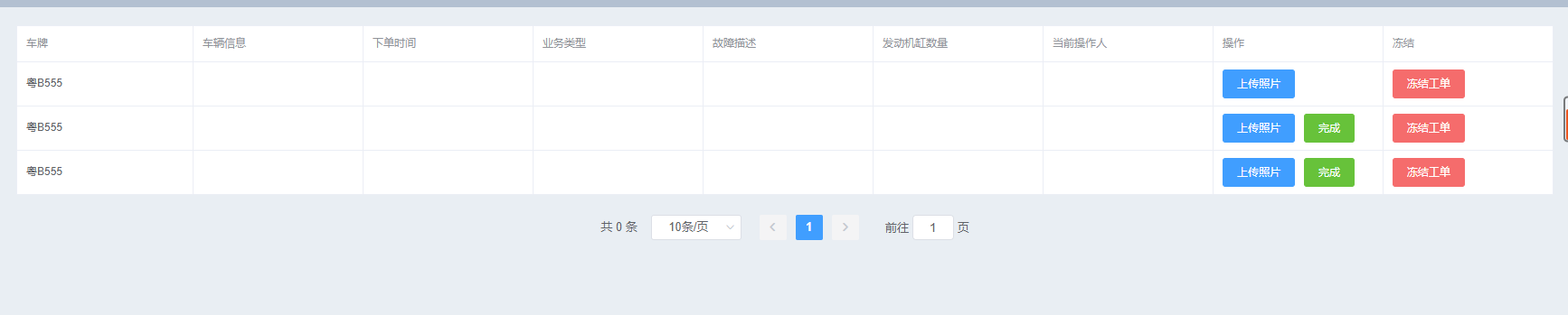
基于ElementUI封装可复用的表格组件的更多相关文章
- 如何快速为团队打造自己的组件库(下)—— 基于 element-ui 为团队打造自己的组件库
文章已收录到 github,欢迎 Watch 和 Star. 简介 在了解 Element 源码架构 的基础上,接下来我们基于 element-ui 为团队打造自己的组件库. 主题配置 基础组件库在 ...
- Vue.js与ElementUI搭建无限级联层级表格组件
前言 今天,回老家了.第一件事就是回家把大屏安排上,写作的感觉太爽了,终于可以专心地写文章了.我们今天要做的项目是怎么样搭建一个无限级联层级表格组件,好了,多了不多说,赶快行动起来吧!项目一览 到底是 ...
- 基于ElementUI封装Excel数据导入组件
由于前端项目使用的是Vue-cli3.0 + TypeScript的架构,所以该组件也是基于ts语法封装的,组件的完整代码如下: <template> <div id="m ...
- 基于element-ui封装一个Table模板组件
大家在做后台管理系统的时候,写的最多的可能就是表格页面了,一般分三部分:搜索功能区.表格内容区和分页器区.一般这些功能都是使用第三方组件库实现,比如说element-ui,或者vuetify.这两个组 ...
- 基于antd封装一个高可用form组件 减少cv代码导致的bug
引言 在开发中台过程中 我们的原型中有很多表单,antd有表单组件,但是粒度比较细,就单纯组件而言,无可厚非,但是在开发过程中,可能会造成代码不够聚合,有些表单公共逻辑无法提取,copy paste比 ...
- 基于highcharts封装的组件-demo&源码
前段时间做的项目中需要用到highcharts绘制各种图表,其实绘制图表本身代码很简单,但是由于需求很多,有大量的图形需要绘制,所以就不得不复制粘贴大量重复(默认配置等等)的代码,所以,后来抽空自己基 ...
- 封装Vue Element的可编辑table表格组件
前一段时间,有博友在我那篇封装Vue Element的table表格组件的博文下边留言说有没有那种"表格行内编辑"的封装组件,我当时说我没有封装过这样的组件,因为一直以来在实际开发 ...
- 使用Vue CLI 3将基于element-ui二次封装的组件发布到npm
前言:之前在网上找的好多都是基于vue-cli 2.x的,而使用vue-cli 3的文章比较少,Vue CLI 3 中文文档,所以我在自己尝试的时候把几篇文章结合了一下,调出来了我想要的模式,也就是V ...
- Vue + Element-ui实现后台管理系统(5)---封装一个Form表单组件和Table表格组件
封装一个Form表单组件和Table组件 有关后台管理系统之前写过四遍博客,看这篇之前最好先看下这四篇博客.另外这里只展示关键部分代码,项目代码放在github上: mall-manage-syste ...
随机推荐
- 洛谷P2178 [NOI2015]品酒大会 后缀数组+单调栈
P2178 [NOI2015]品酒大会 题目链接 https://www.luogu.org/problemnew/show/P2178 题目描述 一年一度的"幻影阁夏日品酒大会" ...
- MySql学习- 存储引擎简介
mysql可以将数据以不同的技术存储在文件(内存)中,这种技术就称为存储引擎. 每一种存储引擎使用不同的存储机制.索引技巧.锁定水平,最终提供广泛且不同的功能. MySQL支持的存储引擎: MyISA ...
- 配置UOJ数据的正确姿势
最近瞎搞用开源UOJ搭了个OJ,在题目配置方面搞了挺久,一开始看vfleaking的文档还折腾了SVN,特意写下这篇文章为后来人少走弯路 Step 1 拥有管理权限并设置好题面,支持\(LaTex\) ...
- Java实现发邮件功能---网易邮箱
目录 Java实现发邮件功能 前言 开发环境 代码 效果 结束语 Java实现发邮件功能 前言 电子邮件的应用场景非常广泛,例如新用户加入,即时发送优惠清单.通过邮件找回密码.监听后台程序,出现异常自 ...
- Ubuntu18.04通过网线共享网络
Ubuntu18.04通过网线共享网络 这几天要给实验室一个新电脑装系统,但是实验室路由器好像有点问题,所以决定共享我的笔记本的网络,但是搜了很多教程都是基于Ubuntu16.04的,而Ubuntu1 ...
- CompletionService异步非阻塞获取并行任务执行结果
第1部分 问题引入 <Java并发编程实践>一书6.3.5节CompletionService:Executor和BlockingQueue,有这样一段话: "如果向Execut ...
- 将windows当做linux/Mac来用 scoop强大的包管理工具
在Linux中有apt-get.yum这些包安装管理 安装相当方便:如ubuntu安装一个mysql5.7,只需要一个简单的命令: apt-get 而在windows中需要在MySQL官网下载对应版本 ...
- maskrcnn-benchmark错误:ImportError: cannot import name rnn_compat
错误: from apex import amp File "build/bdist.linux-x86_64/egg/apex/__init__.py", line 5, in ...
- TAP/TUN浅析
转:http://www.cnblogs.com/yml435/p/5917628.html 参考链接:https://www.ibm.com/developerworks/cn/linux/1310 ...
- PXC节点启动与关闭
PXC节点启动与关闭 最后关闭的PXC节点是安全退出时. cat /var/lib/mysql/grastate.dat,其中safe_to_bootstrap: 1,再次启动集群是则先启动该节点 s ...