基于element-ui封装一个Table模板组件
大家在做后台管理系统的时候,写的最多的可能就是表格页面了,一般分三部分:搜索功能区、表格内容区和分页器区。一般这些功能都是使用第三方组件库实现,比如说element-ui,或者vuetify。这两个组件库都各有各的优点,但就table组件来说,我还是比较喜欢vuetify的实现,不用手写一个个column,只要传入headers的配置数组就行,甚至分页器都内置在了table组件里,用起来十分方便。有兴趣可以看看:vuetify data table。
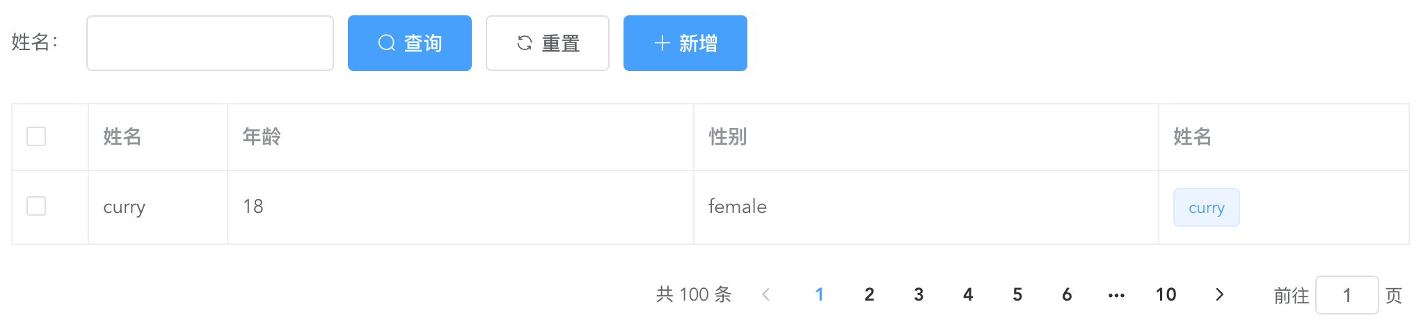
上面是一个经典的用element-ui开发的table页面,而且实际工作中如果每个table页面都写一遍,重复代码太多了,所以不妨写一个table模板组件,减少重复代码。我的思路是这样的:
搜索功能区:
提供
searchBar插槽,可以自定义搜索输入框,搜索、重置按钮必有,新增按钮通过props控制显隐。这里对应的代码如下:genSearchBar() {
if (this.noSearchBar || !this.$scopedSlots.searchBar) return '';
return (
<el-form class="seatch-form" inline={true} label-width="100">
{this.$scopedSlots.searchBar()}
<el-button
class="filter-item"
icon="el-icon-search"
type="primary"
onClick={this.handleSearchBtnClick}
>
查询
</el-button>
<el-button
class="filter-item"
icon="el-icon-refresh"
onClick={this.handleResetBtnClick}
>
重置
</el-button>
<el-button
class="filter-item"
icon="el-icon-plus"
type="primary"
v-show={this.showAddBtn}
onClick={this.handleAddBtnClick}
>
新增
</el-button>
</el-form>
);
}表格内容区:
通过传入
headers自动生成columns,参数如下:{
label: '性别',
prop: 'sex',
width: '180',
filter: 'sexFilter'
}
可对应如下代码:
<el-table-column
prop="sex"
label="性别"
width="180">
<template slot-scope="scope">{{scope.row.sex | sexFilter}}</template>
</el-table-column>
注意,只支持全局
filter。如果你想自定义
column,也提供tableColumn插槽,支持自定义column,可以如下配置:{
prop: 'action'
}
<el-table-column
prop="action"
label="操作"
width="180">
<template slot-scope="scope">
<el-button>编辑</el-button>
<el-button>删除</el-button>
</template>
</el-table-column>
这样,就会按传入的
prop匹配对应的column,十分方便。实现代码如下:
genTableSlot(h) {
let customeColumns = this.$scopedSlots.tableColumn
? this.$scopedSlots.tableColumn()
: [];
return this.headers.map((item) => {
// 根据item.prop判断是否使用传入的插槽内容
let foundItem = customeColumns.find(
(ele) =>
ele.componentOptions &&
ele.componentOptions.propsData.prop === item.prop
);
return foundItem
? foundItem
: h('el-table-column', {
props: {
...item,
},
scopedSlots: {
default: (props) => {
// 根据传入的全局filter处理column数据
let filter = this.$options.filters[
item.filter
];
let itemValue = props.row[item.prop];
return h(
'span',
filter ? filter(itemValue) : itemValue
);
},
},
});
});
}
genTable(h) {
return h(
'el-table',
{
ref: 'tableRef',
props: {
...this.$attrs,
data: this.data,
},
on: {
'selection-change': (val) => {
this.$emit('selection-change', val);
},
},
},
[...this.genTableSlot(h)]
);
}
分页器区:
如无特殊需求,分页器功能一致,所以直接内置。
实现代码如下:
genPagination() {
return (
<div class="pagination-wrap">
<el-pagination
layout="total,prev,pager,next,jumper"
current-page={this.current}
page-size={this.pageSize}
total={this.total}
{...{
on: { 'current-change': this.handleCurrentChange },
}}
></el-pagination>
</div>
);
}
最后附完整代码和demo:
<script>
export default {
name: 'TableTemplate',
props: {
data: {
type: Array,
default: () => [],
required: true,
},
headers: {
type: Array,
default: () => [],
required: true,
},
current: {
type: Number,
default: 1,
},
pageSize: {
type: Number,
default: 10,
},
total: {
type: Number,
default: 0,
},
noSearchBar: Boolean,
showAddBtn: Boolean,
},
mounted() {
this.$nextTick(() => {
this.$emit('search');
});
},
methods: {
genSearchBar() {

    if (this.noSearchBar || !this.$scopedSlots.searchBar) return '';

    return (

        <el-form class="seatch-form" inline={true} label-width="100">

            {this.$scopedSlots.searchBar()}

            <el-button

                class="filter-item"

                icon="el-icon-search"

                type="primary"

                onClick={this.handleSearchBtnClick}

            >

                查询

            </el-button>

            <el-button

                class="filter-item"

                icon="el-icon-refresh"

                onClick={this.handleResetBtnClick}

            >

                重置

            </el-button>

            <el-button

                class="filter-item"

                icon="el-icon-plus"

                type="primary"

                v-show={this.showAddBtn}

                onClick={this.handleAddBtnClick}

            >

                新增

            </el-button>

        </el-form>

    );

},
genTableSlot(h) {
let customeColumns = this.$scopedSlots.tableColumn
? this.$scopedSlots.tableColumn()
: [];
return this.headers.map((item) => {
// 根据item.prop判断是否使用传入的插槽内容
let foundItem = customeColumns.find(
(ele) =>
ele.componentOptions &&
ele.componentOptions.propsData.prop === item.prop
);
return foundItem
? foundItem
: h('el-table-column', {
props: {
...item,
},
scopedSlots: {
default: (props) => {
let filter = this.$options.filters[
item.filter
];
let itemValue = props.row[item.prop];
return h(
'span',
filter ? filter(itemValue) : itemValue
);
},
},
});
});
},
genTable(h) {

    return h(

        'el-table',

        {

            ref: 'tableRef',

            props: {

                ...this.$attrs,

                data: this.data,

            },

            on: {

                'selection-change': (val) => {

                    this.$emit('selection-change', val);

                },

            },

        },

        [...this.genTableSlot(h)]

    );

},
genPagination() {

    return (

        <div class="pagination-wrap">

            <el-pagination

                layout="total,prev,pager,next,jumper"

                current-page={this.current}

                page-size={this.pageSize}

                total={this.total}

                {...{

                    on: { 'current-change': this.handleCurrentChange },

                }}

            ></el-pagination>

        </div>

    );

},
resetPagination() {
this.$emit('update:current', 1);
},
handleCurrentChange(val) {
this.$emit('update:current', val);
this.$emit('search');
},
handleSearchBtnClick() {
this.$emit('search');
},
handleResetBtnClick() {
this.resetPagination();
this.$emit('reset');
},
handleAddBtnClick() {
this.$emit('add');
},
getTableRef() {
return this.$refs.tableRef;
},
},
render(h) {
return (
<div>
{this.genSearchBar()}
{this.genTable(h)}
{this.genPagination()}
</div>
);
},
};
</script> <style scoped>
.seatch-form {
text-align: left;
}
.pagination-wrap {
margin-top: 20px;
text-align: right;
}
</style>Demo:
<template>

    <div>

        <table-template

            border

            :headers="headers"

            :data="tableData"

            :current.sync="current"

            :total="total"

            ref="tableTemplate"

            showAddBtn

            @search="handleSearch"

            @reset="handleReset"

            @add="handleAdd"

            @selection-change="handleSelectionChange"

        >

            <template #searchBar>

                <el-form-item label="姓名:" prop="title">

                    <el-input class="filter-item" v-model="searchForm.title" ></el-input>

                </el-form-item>

            </template>

            <template #tableColumn>

                <el-table-column

                    prop="selection"

                    type="selection"

                    width="55"

                ></el-table-column>

                <el-table-column prop="test" label="姓名" width="180">

                    <template slot-scope="scope">

                        <el-popover trigger="hover" placement="top">

                            <p>姓名:{{ scope.row.name }}</p>

                            <p>住址:{{ scope.row.address }}</p>

                            <div slot="reference" class="name-wrapper">

                                <el-tag size="medium">{{scope.row.name}}</el-tag>

                            </div>

                        </el-popover>

                    </template>

                </el-table-column>

            </template>

        </table-template>

    </div>

</template>

<script>

import TableTemplate from './TableTemplate';

export default {

    name: 'Demo',

    components: {

        TableTemplate,

    },

    data() {

        return {

            current: 1,

            total: 100,

            headers: [

                {

                    prop: 'selection',

                },

                {

                    label: '姓名',

                    prop: 'name',

                    width: '100',

                },

                {

                    label: '年龄',

                    prop: 'year',

                },

                {

                    label: '性别',

                    prop: 'sex',

                    width: 'sexFilter',

                },

                {

                    prop: 'test',

                },

            ],

            tableData: [

                {

                    name: 'curry',

                    year: 18,

                    sex: 'female',

                    address: '天安门',

                },

            ],

            searchForm: {

                title: '',

            },

        };

    },

    methods: {

        handleSearch() {

            console.log(this.current);

        },

        handleReset() {

            this.searchForm = {

                title: '',

            };

        },

        handleAdd() {

            console.log('添加');

        },

        handleSelectionChange(val) {

            console.log(val);

        },

        getTableRef() {

            console.log(this.$refs.tableTemplate.getTableRef());

        },

    },

};

</script>
基于element-ui封装一个Table模板组件的更多相关文章
- 基于element UI 的上传插件
为了不再重复的上传文件,做了一个统一选择文件和上传文件的 基于 element UI :http://element-cn.eleme.io 前端实现文件下载和拖拽上传 演示 用法 <uploa ...
- 封装Vue Element的可编辑table表格组件
前一段时间,有博友在我那篇封装Vue Element的table表格组件的博文下边留言说有没有那种"表格行内编辑"的封装组件,我当时说我没有封装过这样的组件,因为一直以来在实际开发 ...
- vue+element ui 的表格列使用组件
前言:工作中用到 vue+element ui 的前端框架,有这个场景:很多表格的列有许多一样的,所以考虑将列封装为组件.转载请注明出处:https://www.cnblogs.com/yuxiaol ...
- 基于ionic框架封装一个图片轮播指令的几点
在这里我想在项目中封装一个图片轮播的指令 (本项目使用的是ionic框架) 1)定义指令 define(['app'],function(myapp){ myapp.directive('myslid ...
- 基于element ui的图片预览插件
写插件很简单,满足两个条件即可,一.基本的逻辑思路,二.熟悉插件语法要求.本次Vue插件也比较简单,点击“查看图片”用轮播的方式限制用户上传的图片,如图: 项目采用的是vue-element-admi ...
- vue封装一个弹框组件
这是一个提示框和对话框,例: 这是一个组件 eject.vue <template> <div class='kz-cont' v-show='showstate'> &l ...
- 基于element ui的级联选择器组件实现的分类后台接口
今天在做资产管理系统的时候遇到一个分类的级联选择器,前端是用的element的组件,需要后台提供接口支持. 这个组件需要传入的数据结构大概是这样的,详细的可参考官方案例: [{ value: ...
- Element ui 中使用table组件实现分页记忆选中
我们再用vue和element-ui,或者其他的表格的时候,可能需要能记忆翻页勾选,那么实现以下几个方法就ok了 示例如下 <el-table :data="tableData&quo ...
- element ui 里面的table怎么弹出一个框让表中数据点击出现弹框
<el-table-column label="团队" prop="name" min-width="120px" align=&qu ...
随机推荐
- 一文弄懂-《Scalable IO In Java》
目录 一. <Scalable IO In Java> 是什么? 二. IO架构的演变历程 1. Classic Service Designs 经典服务模型 2. Event-drive ...
- HanLP 下载和配置
方式一.Maven 为了方便用户,特提供内置了数据包的Portable版,只需在pom.xml加入: <dependency> <groupId>com.hankcs</ ...
- HBase原理 – 分布式系统中snapshot是怎么玩的?(转载)
snapshot(快照)基础原理 snapshot是很多存储系统和数据库系统都支持的功能.一个snapshot是一个全部文件系统.或者某个目录在某一时刻的镜像.实现数据文件镜像最简单粗暴的方式是加锁拷 ...
- 使用 requests.post 方法抓取有道翻译结果
import requests as rq import json def get_translate(word=None): url = 'http://fanyi.youdao.com/trans ...
- P2120 [ZJOI2007] 仓库建设(斜率优化DP)
题意:\(1\sim N\) 号工厂,第\(i\) 个工厂有\(P_i\)个成品,第\(i\)个工厂建立仓库需要\(C_i\)的费用,该工厂距离第一个工厂的距离为\(X_i\),编号小的工厂只能往编号 ...
- P1268 树的重量(板子)
题目: 题目描述 树可以用来表示物种之间的进化关系.一棵"进化树"是一个带边权的树,其叶节点表示一个物种,两个叶节点之间的距离表示两个物种的差异.现在,一个重要的问题是,根据物种之 ...
- C# Dictionary(字典)源码解析&效率分析
通过查阅网上相关资料和查看微软源码,我对Dictionary有了更深的理解. Dictionary,翻译为中文是字典,通过查看源码发现,它真的内部结构真的和平时用的字典思想一样. 我们平时用的字典主要 ...
- java通过HttpClient调用接口总结
2.HttpClient 2.1简介: 最近看项目的代码,看到工程中有两个jar包张的很像,一个是commons.httpclient-3.1.jar,一个是httpclient4.2.1.jar,很 ...
- ApiPost V5 升级指南
同旧版本相比,ApiPost V5 (以下简称V5)重新规划了底层架构,大大降低了内存使用率:并加入了大量新功能,用户体验也有了全新的提升.但是同旧版相比,很多使用方式有所不同,本文重点讲解以下用户升 ...
- [Golang]-4 错误处理、Panic、Defer
目录 错误和异常 案例 Panic Defer 使用 defer+recover 来处理错误 参考文章: Go 语言使用一个独立的·明确的返回值来传递错误信息的.这与使用异常的 Java 和 Ruby ...