常用css样式(布局)
兼容css3新属性
在css3中,我们可以使用prefixfree.min.js这个插件来自动为css3的相关属性加上兼容浏览器属性,使我们不用为每个css3新属性再加上属性(需要用到大量css3的项目时再引入)
content布局
当h5内嵌在app里面的时候,在iso手机下,底部(头部)固定按钮会跟着一起滚动,需要使用content布局,然后使用padding-bottom或者padding-top,把相应的位置空出来!!!
当需要在content里面滚动的时候,需要将body和html设置height:100%;然后content也需要设置height:100%,这样才可以实现在content里面里面滚动,当需要在body里面滚动的时候,需要将html、body中的height:100%;设置去掉!!不然body会被限制住,内容只显示一半不能滚动!!!
还有一种解决弹窗遮罩层底部出现滚动的方法就是,当出现弹窗的时候,通过js控制底下的内容为body{height:100%;overflow:hidden;},然后关闭弹窗的时候移除掉这个样式!!!
<body>

     <header></header>

     <div class="content"></div>

     <footer></footer>

</body>
.content {

    padding-top: .88rem;

    -webkit-box-sizing: border-box;

    -moz-box-sizing: border-box;

    box-sizing: border-box;

    max-width: 750px;

    width: %;

    margin:  auto;

    overflow-x: hidden;

    height: %;

    overflow-y: auto;

    -webkit-overflow-scrolling: touch;
使用这种布局方式可以解决,单页面滚动的时候,点击弹窗,弹窗会被遮住滚动问题!!!
注意:当需要计算body的高度的时候,不能使用,还有当页面中,有表单,需要使用position:relative时,来使安卓键盘不被挡住!!!!但是为解决弹窗不滚动问题,可以通过,弹窗的时候,增加content布局,关闭弹窗的是移除content布局!!!
        //点击领取

        $(".reward-btn").click(function(){

            $(".reward-page").wrap("<div class='contentS'></div>");

            $(".insurance-box").show();

            $(".dialog2").show();

        });

        //点击关闭大弹窗按钮

        $(".closeDia").click(function(){

            $(this).parent().parent().hide();

            $(".dialog2").hide();

            $(".reward-page").unwrap("<div class='contentS'></div>");

        });
场景二:在content布局下,需要给页面设置背景图,可以在content下面在包裹一层大的div,然后对这个div进行全页面背景图设置,这样背景图才会随着内容超出一屏幕而滚动,而不是直接在content这个容器上设置背景图,如果直接在这个容器上设置背景图,那背景图不会滚动!!!
常见头部布局
两边有时候有文字或者图标,但是中间的标题固定居中,大概位置如下,就是内容会变化!!

布局如下
<div  class="head"> <a class="head-left">设置</a>个人中心<a class="head-right">更多</a></div>

css:

.head{

    position:relative;

    width:%;

    height:88px;

    line-height:88px;

    text-align:center;

}

.head-left, .head-right{

    position:absolute;

    height:88px;

    line-height:88px;

}

.head-left {

    left:30px;

}

.head-right {

    right:30px;

}
模拟上拉加载
            $(window).scroll(function() {

                var winH = $(window).height();

                var scrH = $(window).scrollTop();

                var htmH = $(document).height();

                //解决滚动到下面,遮罩层一半

                $(".fixed").height(htmH);

                if(winH + scrH >= htmH) {

                    console.info(tabActive);

                    if(tabActive==){

                        console.info();

                        if(next_page){

                            if(ajax_lock == true)

                            {

                                ajax_lock = false;

                                page++;

                                getRecord(page,);

                            }

                        }

                    }

});
1.美化复选框
效果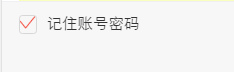
html代码
<label>

<input id="rememberPwdCheck" class="checkbox hidden" type="checkbox" checked="checked">

<i class="icon icon-checkbox"></i>

<span class="rememberPwdtxt">记住账号密码</span>

</label>
css代码
.hidden {

     display: none;

}

.checkbox:checked ~.icon-checkbox {

    background: url(../images/yes_15.png) no-repeat;

    background-size: 0.3rem 0.25rem;

}

.icon-checkbox {

    width: 0.3rem;

    height: 0.3rem;

    margin-right: 0.1rem;

    border: 0.02rem solid #d7d7d7;

    border-radius: 0.06rem;

}

.icon {

    display: inline-block;

    vertical-align: middle;

}
js

if(!$('#agreeTerm').is(":checked")){

$.alert('请勾选同意《保险条款》和《重要告知与申明》');

return;

};
<div class="allCheck">

       <input type="checkbox" id="allCheck" class="check hidden">
       <label for="allCheck" class="check-icon">全选</label>

</div>
.allCheck {
padding:0 .1rem 0 .3rem;
}
.check-icon {
display: inline-block;
width:1.5rem;
padding-left:.5rem;
background:url("../../assets/select-no.png")no-repeat left center;
background-size:.42rem .42rem ;
}
.check:checked ~ .check-icon {
background:url("../../assets/selected.png")no-repeat left center;
background-size:.42rem .42rem ;
}
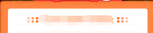
2.模拟单选按钮
类似效果

html代码
<dl id="" class="money">

    <dt>选择补偿金额<span class="p_help help">补偿金说明</span></dt>

    <dd>

        <span>

            <input id="money_type_0" name="money_type" class="selection-rd hidden" type="radio" value="" checked="">

            <label class="selection-lb" for="money_type_0">10元</label>

        </span>

        <span>

            <input id="money_type_1" name="money_type" class="selection-rd hidden" type="radio" value="">

            <label class="selection-lb" for="money_type_1">20元</label>

        </span>

        <span>

            <input id="money_type_2" name="money_type" class="selection-rd hidden" type="radio" value="">

            <label class="selection-lb" for="money_type_2">50元</label>

        </span>

    </dd>

</dl>
css代码
.selection-rd:checked ~ .selection-lb {

    color: #e44;

    border:1px solid #e44;

}

.selection-lb {

    display: inline-block;

    margin:33px 30px 30px ;

    width:150px;

    height: 64px;

    line-height: 64px;

    white-space: nowrap;

    background-color: #fff;

    border:1px solid #bbc;

    border-radius: 5px;

    text-align: center;

    font-size: 32px;

}
jq代码
var payLevel=$("input[name='money_type']:checked").val();
3.中间文字,两边横线居中
效果

代码
<div class="title-center"><div>学生信息</div></div>
/*中间文字两边横线效果*/
.title-center {
position:relative;
width:100%;
text-align: center;
height: 100px;
line-height: 100px;
font-size: 28px;
color: #4d72e2;
}
.title-center div{
display: inline-block;
padding:0 20px;
}
.title-center:before ,.title-center:after{
display: inline-block;
position: relative;
content:"";
height:2px;
width:48px;
top:-6px;
background-color:#4d72e2;
}
当设置rem为单位时,1px,会显示偏大,将.title-center:before ,.title-center:after修改为如下:
.title-center:before, .title-center:after {
display: inline-block;
position: relative;
content: "";
height: 1px;
width: 1.88rem;
top: -.1rem;
background-color: #fd734f;
-webkit-transform: scaleY(0.5);
transform: scaleY(0.5);
-webkit-transform-origin: 0 0;
transform-origin: 0 0;
}
终极版,rem单位,横线自适应长度!!!!
<div class="flexbox flexbox-middle">
<span class="flexchild border-center"></span>
<span style="padding:0 .2rem;">我要居中,两边横线对齐</span>
<span class="flexchild border-center"></span>
</div>
.border-center{
/*display:inline-block; 使用flexchild布局的时候,不能给元素设置这个属性,不然, -webkit-box-flex: 1;会失效*/
height: 1px;
background-color: #fd734f;
-webkit-transform: scaleY(0.5);
transform: scaleY(0.5);
-webkit-transform-origin: 0 0;
transform-origin: 0 0;
}
中间文字,两边横线居中方法2
效果图
<div class="card-title"><span class="text">不辜负你比较快糖果盒如果好</span></div>
css
.card-title {
padding-top: .4rem;
font-size: .34rem;
color: #3c3c3c;
text-align: center;
font-weight: bold;
}
.card-title .text {
position: relative;
}
.card-title .text:before ,.card-title .text:after {
content: "";
display: inline-block;
position: absolute;
width: .4rem;
height: .32rem;
background: url('../images/card-title.png')no-repeat;
background-size: 100% 100%;
top: 50%;
margin-top: -.16rem;
}
.card-title .text:before{
left: -.51rem;
}
.card-title .text:after{
transform: rotateY(180deg);
-webkit-transform: rotateY(180deg);
right: -.51rem;
}
4.怎么实现图标水平垂直居中(rem单位)
利用background-size来设置背景图的本身大小尺寸,然后利用background-position:center center;来设置背景图相对元素的水平垂直居中,其中元素的宽是背景图的宽,高就是原来的高
sass的写法

@mixin headerIcon($width,$height,$url,$position) {

position: absolute;

$position: .3rem;

top:;

width: $width; //图标的宽度

height: .88rem; //头部的高度

background: url($url) no-repeat;

background-position:left center;

background-size:$width $height;

font-size: .3rem;

text-align: left;

}
方法二,

html:

<a>

     <i class="foot-nav1 icon"></i>

     <span>首页</span>

</a>

css:

a{display:inline-block;}

.foot-nav1{

   width: .66rem;

    height: .66rem;

    display: block;

    margin:  auto;

    background:url();

}

span {

   display: block;

    line-height: .24rem;

    text-align: center;

    font-size: .24rem;

    height: .24rem;

    margin-bottom: .8rem;

    color: #;

}
5.头部常用样式设置
<div class="header flexbox flexbox-middle bg-white"><a class="left-icon"></a><h1>我是标题</h1><a class="right-icon"></a></div>
.header{

      width: 100%;

      height: .88rem;

      position: absolute;

      left:;

      top:;

      z-index:;

      border-bottom: 1px solid #f1f1f1;

      text-align: center;

      h1{

          font-size: .36rem;

          font-family: PingFangSC-Medium, sans-serif;

      }

      .left-icon{

        position: absolute;

        width: .88rem;

        height: .88rem;

        left: .3rem;

        top:;

        background: url('../../assets/back-icon.png') no-repeat;

        background-size:.17rem .35rem;

        background-position: left center;

        }

 .right-icon{

        position: absolute;

        width: .88rem;

        height: .88rem;

        right: .3rem;

        top:;

        background: url('../../assets/back-icon.png') no-repeat;

        background-size:.17rem .35rem;

        background-position: left center;

        }
6.常用表单布局
效果:
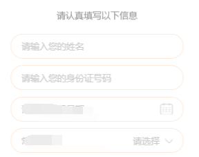
代码:
<div class="section2">

               <div class="des-title"><span class="text">请认真填写以下信息</span></div>

                <ul>

                    <li class="flexbox">

                        <input type="text" placeholder="请输入您的姓名" class="flexchild fill-content" id="tbName2">

                    </li>

                    <li class="flexbox flexbox-middle">

                        <span class="fill-label">收货地址:</span>

                        <span class="adress" style="overflow: hidden;">

                            <input id="provinceCity2" name="rec_address_select" class="txt" placeholder="请选择" readonly="readonly">

                            <input id="detailssq2" type="hidden" readonly="readonly">

                            <i class="ui-icon Rmore-icon noborder"></i>

                         </span>

                    </li>

                    <li class="flexbox">

                        <input type="text" placeholder="请填写详细地址" class="flexchild fill-content " id="adressDetail">

                    </li>

                </ul>

            </div>
css:
.section2 li {

    list-style: none;

    position: relative;

    width: 500px;

    margin: 0 auto;

    border: 1px solid #ffd6b9;

    box-sizing: border-box;

    padding: 17px 30px;

    background-color: #fff;

    margin-top: 20px;

    border-radius: 40px;

}

.section2 li input {

    background-color: transparent;

    border: 0 none;

    color: #333;

    outline: none;

    position: relative;

    font-size: 26px;

    width: 435px;

    z-index: 102;

}
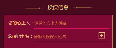
html:
<li class="flexbox">

     <label>您的心上人:</label>

     <input type="text" placeholder="请输入心上人姓名" class="flexchild" id="loveName">

</li>
css:
.sec3 li {

    position: relative;

    height: .88rem;

    -webkit-box-align: end;

    -moz-box-align: end;

    -ms-flex-align: end;

    -webkit-align-items: flex-end;

    align-items: flex-end;

    box-sizing: border-box;

}

.sec3 li label {

    padding-bottom: .2rem;

}

.sec3 li input {

    position: relative;

    width: .86rem;

    background: transparent;

    border:  none;

    border-bottom: 1px solid #dc115b;

    padding-bottom: .2rem;

    color: #efc283;

    font-size: .28rem;

    border-radius: ;

}
7、上方图片下方文文字,水平居中布局
效果


css样式
.mall .details-foot .details-kefu {

    width: .56rem;

    height: .99rem;

    border-right: 1px solid #f1f1f1;

}
.mall .details-foot .details-kefu i {

    display: block;

    width: .42rem;

    height: .42rem;

    margin: .12rem auto .06rem;

    background: url(data:image/png;base64,iVBORw0KGgoAAAANSUhEUgAAACoAAAAqCAYAAADFw8lbAAAAGXRFW…7oxfKRixjo4VSJhW/sUYi1M9kR4RNoUZHpQEuX+Z/pXwEGAHRzn0c9HGr7AAAAAElFTkSuQmCC) no-repeat;

    background-size: % %;

}
.mall .details-foot .details-kefu-name {

    text-align: center;

}
8、答题进度条
就是用来展示答题进度的进度条,效果如下
其中img是形状底色(小圆圈是透明的)。而recommend-jd-bg是进度条背景色,recommend-jd-ks是控制进度的颜色!!,其中img的z-index>recommend-jd-bg>recommend-jd-ks

html:
<div class="recommend-jd">
<div class="recommend-jd-bg"></div>
<div class="recommend-jd-ks" style="width: 37.5%;"></div>
<img src="/src/m7.0/images/recommend/jd.png">
</div>
css:
.recommend-jd {

    width: .43rem;

    position: absolute;

    top: .59rem;

    left: .54rem;

}

.recommend-jd-bg {

    width: %;

    height: .31rem;

    background: #fff;

    position: absolute;

    top: ;

    z-index: ;

}

.recommend-jd-ks {

    width: 12.5%;  //这个是js控制,根据题数的进度来控制!

    height: .31rem;

    background: #4a90ff;

    position: absolute;

    top: ;

    z-index: ;

}

.recommend-jd img {

    width: %;

    display: block;

    position: absolute;

    top: ;

    z-index: ;

    height: .31rem;

}
进度条2

<div class="progressBar">
    <span class="progressPer" style="width: 2rem;">
        <span class="moneyBox">
           <span class="moneyText">¥0.01</span>
        </span>
   </span>
</div>
.progressBar {

    margin: .3rem auto .1rem;

    width: .3rem;

    height: .1rem;

    background-color: rgb(, , );

}

.progressPer {

    position: relative;

    top: ;

    left: ;

    display: inline-block;

    width: ;

    height: .1rem;

    background-color: #efc283;

}

.moneyBox {

    position: absolute;

    right: -.53rem;

    top: .3rem;

    display: inline-block;

    width: .06rem;

    height: .4rem;

    background: url(../images/moneyBox.png)no-repeat;

    background-size: % %;

}

.moneyBox .moneyText {

    position: absolute;

    bottom: ;

    left: ;

    width: .04rem;

    height: .34rem;

    line-height: .34rem;

    text-align: center;

    color: #efc283;

    font-size: .26rem;

}
9.答题测试1-10题都在同一个页面
10、去掉selected自带的下拉框标识,增加如下属性
select {

    background: transparent;

        border:  none;

        outline:none;

       appearance:none;

    -moz-appearance:none;

    -webkit-appearance:none;

}
11、修改input的placeholder样式
.detail-page input::-webkit-input-placeholder { /* WebKit, Blink, Edge */

    font-size: .26rem;

    color:#b2b2b2;

    opacity:  ;

}

.detail-page input:-moz-placeholder { /* Mozilla Firefox 4 to 18 */

   font-size: .26rem;

   color:#b2b2b2;

   opacity:  ;

}

.detail-page input::-moz-placeholder { /* Mozilla Firefox 19+ */

   font-size: .26rem;

   color:#b2b2b2;

   opacity:  ;

}

.detail-page input:-ms-input-placeholder { /* Internet Explorer 10-11 */

   font-size: .26rem;

   color:#b2b2b2;

   opacity:  ;

}
12.input中增加disabled会自带灰色,修改颜色如下
input:disabled{

      border:1px solid #DDD;

      background-color:#F5F5F5;

      color:#ACA899;

}
13、多行文字左右对齐:
p {
text-align: justify;
text-justify: inter-ideograph;
}
效果

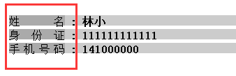
14、实现单行文字两端对齐,例如要实现下列单行文字对齐
方法一,使用伪类:
html:
<div class="line">

    <div class="public">姓名</div>

    <b>:</b>

    <b>林小</b>

</div>

<div class="line">

    <div class="public">身份证</div>

    <b>:</b>

    <b></b>

</div>

<div class="line">

    <div class="public">手机号码</div>

    <b>:</b>

    <b></b>

</div>
css:
.line{

 width:100%;

 height:15px;

 margin:5px;

}

.public{

 width:80px;

 height:100%;

 display:inline-block;

 text-align: justify;

 vertical-align:top;

}

.public::after{

 content:"";

 display: inline-block;

 width:100%;

 overflow:hidden;

 height:0;

}
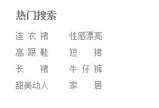
方法二使用letter-spacing来解决:
html:
<span style="font-size:12px;"><dl class="hotsearch" style="width:300px;">

<dt>热门搜索</dt>

<dd><a href="#" target="_blank" ref="nav" class="w3">电视机</a></dd>

<dd><a href="#" target="_blank" ref="nav" class="w4">性感漂亮</a></dd>

<dd><a href="#" target="_blank" ref="nav" class="w3">高跟鞋</a></dd>

<dd><a href="#" target="_blank" ref="nav" class="w2">手机</a></dd>

<dd><a href="#" target="_blank" ref="nav" class="w2">对齐</a></dd>

<dd><a href="#" target="_blank" ref="nav" class="w3">牛仔裤</a></dd>

<dd><a href="#" target="_blank" ref="nav" class="w4">小家碧玉</a></dd>

<dd><a href="#" target="_blank" ref="nav" class="w2">家居</a></dd>

</dl></span>
css:
.hotsearch dd{

float: left;

line-height: 24px;

margin-right: 30px;

overflow: hidden;

text-align: center;

width: 4em; /*这个值是看最长能显示几个文字,如x,则为x em*/

}

.hotsearch dd a{

display:block;

}

.w2{

letter-spacing:2em; /*如果需要y个字两端对齐,则为(x-y)/(y-1),这里是(4-2)/(2-1)=2em */

margin-right:-2em; /*同上*/

}

.w3{

letter-spacing:0.5em; /*如果需要y个字两端对齐,则为(x-y)/(y-1),这里是(4-3)/(3-1)=0.5em */

margin-right:-0.5em; /*同上*/

}
效果
15、实现图片加载过程高度自适应
应用情景:在页面布局过程中,遇到轮播图或者大张图片,当图片下面还有其它块内容,在图片加载过程中,由于高度是0,下面的元素会往上跑,图片加载完。元素会往下跑,给用户感觉抖动。
解决方法:在图片最外层设置一个div,给这个div设置如下样式
.img-box {

        overflow: hidden;

        width: %;

        height: ;

        padding-bottom: %;

        /*方法二*/

        width:%;

        /*高度相对父级宽度比例*/

        height: %vw;
        background:#eee;

}
16、实现文字超出省略...(需要设置宽度,当父级元素使用flex布局时,需要在display:flex;这边设置min-width:0;不然ellipsis会失效!!)
.ellipsis {

    overflow: hidden;

    text-overflow: ellipsis;

    white-space: nowrap;

}

.ellipsis-2l {

    display: -webkit-box;

    overflow: hidden;

    text-overflow: ellipsis;

    -webkit-box-orient: vertical;

    -webkit-line-clamp: ; //第几行

}
17、竖向滚动条
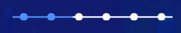
效果,每次点都要与时间对齐,可以把小圆点放在跟日期同一个div上,然后横线做成整个记录的背景图
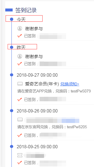
html:
<div class="list">

    <div class="list-item">

        <div class="list-item-time flexbox flexbox-middle"><span class="progres2-item"></span><span>今天</span></div>

        <div class="list-item-award yhj">2元优惠券,无门槛可用<a class="go">去使用></a></div>

        <div class="list-item-text">已签到,获得1个白鸽币</div>

    </div>

    <div class="list-item">

        <div class="list-item-time flexbox flexbox-middle"><span class="progres2-item"></span><span>今天</span></div>

        <div class="list-item-award yhj">2元优惠券,无门槛可用<a class="list-btn">去使用></a></div>

        <div class="excode">请在爱奇艺APP兑换,兑换码:testPw5079</div>

        <div class="list-item-text">已签到,获得1个白鸽币</div>

    </div>

    <div class="list-item">

        <div class="list-item-time flexbox flexbox-middle"><span class="progres2-item"></span><span>--</span></div>

        <div class="list-item-text">已签到,获得1个白鸽币</div>

    </div>

    <div class="list-item">

        <div class="list-item-time flexbox flexbox-middle"><span class="progres2-item"></span><span>今天</span></div>

        <div class="list-item-award yhj">2元优惠券,无门槛可用<a class="list-btn">去使用></a></div>

        <div class="excode">请在爱奇艺APP兑换,兑换码:testPw5079</div>

        <div class="list-item-text">已签到,获得1个白鸽币</div>

    </div>

</div>
css:
.list {

    padding-top: .1rem;

    padding-bottom: .1rem;

    font-size: .3rem;

    color: #;

    background-color: #fff;

}

.list-item {

    width: %;

    margin-left: .32rem;

    margin-top: -.15rem;

    padding-bottom: .4rem;

    background: url("../images/border.png") no-repeat .1rem .21rem;

    background-size: 1px %;

}
.progres2-item {
display: inline-block;
margin-right: .25rem;
width: .21rem;
height: .21rem;
background-color: #4d72e2;
border-radius: 50%;
}
/*最后一个没有直线也就是没有背景,只有一个的时候也没有*/

.list-item:last-of-type{

    background:transparent;

}

.list-item-award,.list-item-text {

    margin-left: .5rem;

}

.list-item-award{

    padding-left: .53rem;

    margin-bottom: .12rem;

    margin-top: .22rem;

}

.list-item-text {

    width: %;

    padding-left: .46rem;

    padding-bottom: .16rem;

    background: url("../images/sign-icon.png") no-repeat left .05rem;

    background-size: .32rem .25rem;

    font-size: .26rem;

    color: #;

    box-sizing: border-box;

    border-bottom: 1px solid #f4f4f4;

}

.list-item:last-of-type .list-item-text {

    border-bottom:  none;

}

.list-item .list-btn {

    padding-left: .1rem;

    text-decoration: underline;

    font-size: .28rem;

    color: #316cec;

}
18、文字底部横线背景
<div class="login-title">让小白鸽知道您不是机器人哦!</div>

.login-title {

    position: relative;

    height: .39rem;

    margin-top: .4rem;

    font-size: .34rem;

    color: #fff;

    text-align: center;

}

.login-title:after {

    content: "";

    position: absolute;

    width: .05rem;

    height: .21rem;

    background-color: #fe923f;

    z-index: -;

    left: ;

    right: ;

    margin:  auto;

    bottom: ;

}
常用css样式(布局)的更多相关文章
- 获取jQuery对象的第N个DOM元素 && table常用css样式
获取jQuery对象的第N个DOM元素 1.$(selector).get(N-1) 2.$(selector)[N-1] 注意:.index()方法返回的是一个数,相当于C#中的IndexOf() ...
- 11种常用css样式学习大结局滚动条与显示隐藏
滚动条展示 overflow-x: hidden;/*是否对内容的左/右边缘进行裁剪*/overflow-y: hidden;/*是否对内容的上/下边缘进行裁剪*/overflow:scroll;/* ...
- 11种常用css样式之表格和定位样式学习
table表格中border-collapse: collapse;/*表格边框是否合并*/border-spacing: 10px;/*表格边框之间的距离*/定位详情可以阅读position属性值4 ...
- 11种常用css样式之鼠标、列表和尺寸样式学习
鼠标cursor常见样式crosshair;/*十字形状*/cursor:pointer;/*小手形状*/cursor:wait;/*等待形状*/cursor:text;/*默认 文本形状*/curs ...
- 11种常用css样式之border学习
边框border通常简写为"border:1px solid red;"但其实一个完整的border边框其实是由1.border-width/*边框宽度*/,2.border-st ...
- 11种常用css样式之background学习
background如何简写?如何在背景图像不变的情况下,依旧实现页面文字滚动,为之奈何?别担心,快用background-attachment: fixed;/*固定定位*/常用的backgroun ...
- 11种常用css样式之开篇文本字体学习
常见css样式:1.字体与颜色2.背景属性3.文本属性4.边框属性5.鼠标光标属性6.列表样式7.定位属性8.内外边距9.浮动和清除浮动10.滚动条11.显示和隐藏 文本:1.letter-spaci ...
- Day 31:CSS选择器、常用CSS样式、盒子模型
<!DOCTYPE html PUBLIC "-//W3C//DTD XHTML 1.0 Transitional//EN" "http://www.w3.org/ ...
- common.css 值得学习的css样式布局
正常的项目当中,应当有一个common.css,就是把一些常用的样式,写入其中. 然后再结合一些特性的css,构造漂亮的页面. 下面欣赏一些海盗商城的common.css. /***样式初始化***/ ...
随机推荐
- BZOJ 4785 [Zjoi2017]树状数组 | 二维线段树
题目链接 BZOJ 4785 题解 这道题真是令人头秃 = = 可以看出题面中的九条可怜把求前缀和写成了求后缀和,然后他求的区间和却仍然是sum[r] ^ sum[l - 1],实际上求的是闭区间[l ...
- 大公司面试经典数据结构与算法题C#/Java解答
几个大公司(IBM.MicroSoft and so on)面试经典数据结构与算法题C#解答 1.链表反转 我想到了两种比较简单的方法 第一种是需要开一个新的链表,将原链表的元素从后到前的插入到新链表 ...
- 【POJ1179】Polygon 区间DP
这道题是典型的环形石子归并模型,破环成链后时间复杂度为\(O(n^3)\) 不过,因为题目中所给的数字可能是负数,仅仅记录区间内合并之后的最大值并不满足动态规划的最优子结构性质.因此,还需要额外记录下 ...
- 解决invalid record found in VCF4 file (at least 8 tab-delimited fields expected)问题,批量修改空格改为制表格格式
出现这种问题说明一般存在两个问题: 第一,vcf文件不足8个分割制表符,比如像如下文件: 为了解决这个问题,说明在做snp filter时候,需要提取至少8个制表符的字符串,比如,像如下文件所示: 第 ...
- 二进制手动部署kubernetes 1.10.10
转载于:https://www.jevic.cn/2018/09/23/kuberentes-1.10.10/?tdsourcetag=s_pcqq_aiomsg#heapster 通读一遍在实际操作 ...
- nmap常用参数详解
nmap常用参数详解 作者:尹正杰 版权声明:原创作品,谢绝转载!否则将追究法律责任. 借用英雄联盟的一个英雄赵信的一句话:“即使敌众我寡,末将亦能万军丛中取敌将首级!”.三国关羽,万军丛中斩了颜良, ...
- SerializeField和HideInInspector
在Unity中,一个变量为公有类型,但是呢你不想让它显示在属性面板上,这个时候用 [HideInInspector] 这是隐藏的意思,举例: 用了[HideInInspector] 之后 就是这样用的 ...
- python---redis的python使用
set以及相关: r.set("foo","bar") print(r.get("foo"))#b'bar' #在Redis中设置值,默认, ...
- javascript 字符串的连接和截取
<!DOCTYPE html> <html lang="en"> <head> <meta charset="UTF-8&quo ...
- xshell访问Ubuntu16.04显示乱码(即使在xshell设置了utf8)解决方案
一开始问题是:(无法显示,也无法输入) 然后使用: locale -a 查看服务器安装的全部编码: (且服务器使用的 LANG=C) 只要用: 即可显示中文.也可以输入中文.