Responsive Design in 3 Steps
Responsive web design is no doubt a big thing now. If you still not familiar with responsive design, check out the list of responsive sites that I recently posted. To newbies, responsive designmight sound a bit complicated, but it is actually simpler than you think. To help you quickly get started with responsive design, I've put together a quick tutorial. I promise you can learn about the basic logic of responsive design and media queries in 3 steps (assuming you have the basic CSS knowledge).
Step 1. Meta Tag (view demo)
Most mobile browsers scale HTML pages to a wide viewport width so it fits on the screen. You can use the viewport meta tag to reset this. The viewport tag below tells the browser to use the device width as the viewport width and disable the initial scale. Include this meta tag in the <head>.
<meta name="viewport" content="width=device-width, initial-scale=1.0">
Internet Explorer 8 or older doesn't support media query. You can use media-queries.jsor respond.js to add media query support in IE.
<!--[if lt IE 9]>

	<script src="http://css3-mediaqueries-js.googlecode.com/svn/trunk/css3-mediaqueries.js"></script>

<![endif]-->
Step 2. HTML Structure
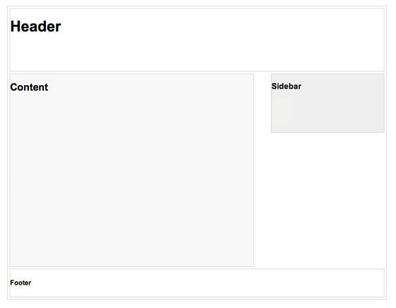
In this example, I have a basic page layout with a header, content container, sidebar, and a footer. The header has a fixed height 180px, content container is 600px wide and sidebar is 300px wide.
Step 3. Media Queries
CSS3 media query is the trick for responsive design. It is like writing if conditions to tell the browser how to render the page for specified viewport width.
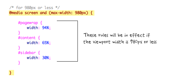
The following set of rules will be in effect if the viewport width is 980px or less. Basically, I set all the container width from pixel value to percentage value so the containers will become fluid.
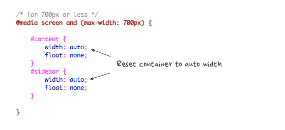
Then for viewport 700px or less, specify the #content and #sidebar to auto width and remove the float so they will display as full width.
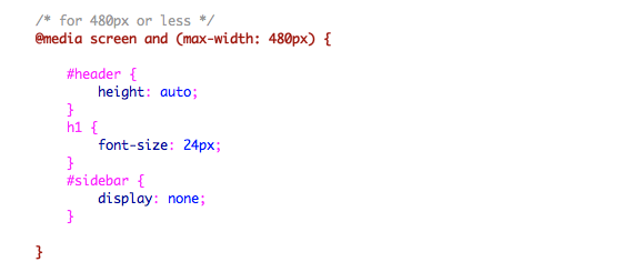
For 480px or less (mobile screen), reset the #header height to auto, change the h1 font size to 24px and hide the #sidebar.
You can write as many media query as you like. I've only shown 3 media queries in my demo. The purpose of the media queries is to apply different CSS rules to achieve different layouts for specified viewport width. The media queries can be in the same stylesheet or in a separate file.
Conclusion
This tutorial is intended to show you the basics of responsive design. If you want more in-depth tutorial, check out my previous tutorial: Responsive Design With Media Queries.
Responsive Design in 3 Steps的更多相关文章
- 企业级的响应式设计(Responsive design at enterprise level)译
导言 响应式设计是现在人们谈论的热点,但如何部署,特别是在有多种设备的大型项目中如何组织响应式设计,响应式设计和可伸缩性(Scalable)有什么区别?这都是需要解决的难题. 优化用户经验——Opti ...
- responsive design
http://www.chinaz.com/manage/2011/1121/221607.shtml http://alistapart.com/article/responsive-web-des ...
- Responsive Design响应式网站设计心得笔记
这个词已经喊了很久了,一直都是小打小闹,没正经的做过大的响应式全站,这次终于有机会了.网站刚上线半个月,就要改版为响应式设计,支持手机/PC等各类终端显示浏览.今天把首页做好,并测试无误,这里把一些应 ...
- Understanding Responsive Web Design: Cross-browser Compatibility
http://www.sitepoint.com/understanding-responsive-web-design-cross-browser-compatibility/ In the las ...
- 转:15 Best Responsive Web Design Testing Tools
Responsive Web Design is regarded as being the approach which suggests that web design and developme ...
- Responsive web design 学习笔记
Advanced Styling with Responsive Design 此笔记为Coursera同名课程笔记. Week1 什么是响应式设计? 响应式设计: It is designing y ...
- iPhone 6 Screen Size and Web Design Tips
Apple updated its iPhone a bit ago making the form factor much bigger. The iPhone 6 screen size is b ...
- Ace - Responsive Admin Template
Ace简介: Ace 是一个轻量.功能丰富.HTML5.响应式.支持手机及平板电脑上浏览的管理后台模板,基于CSS框架Bootstrap制作,Bootstrap版本更新至 3.0,Ace – Resp ...
- 项目新的需求,网页的自适应交付/响应式交付 Responsive/Adaptive Delivery
网页为什么要做自适应交付,皆因现在移动设备大行其道,现在是移动互联网时代,以IOS及Android为首的各种移动终端已经遍地开花. 当人家用380px的iphone打开你的网页时,你总不能显示个102 ...
随机推荐
- ajax jsonp跨域
js跨域问题是指:js不同域进行数据传输或通信之间,让我们用ajax到不同的域请求数据.或js获得在不同领域的框架页(iframe)数据.只有到协议.域名.port无论是有不同的.它们被认为是不同的域 ...
- Webots入门(二)-build up a controller
A simple controller 控制器程序读取传感器的值,然后改动行走速度来避开障碍物. 以下是控制器源码mybot_simple.c: #include<webots/robot.h& ...
- Cocos2d-x 3.x plist+png 做动画
***************************************转载请注明出处:http://blog.csdn.net/lttree************************** ...
- TextWatcher原因activity内存泄漏问题
TextWatcher原因activity内存泄漏. EditText配置addTextChangedListener该接口,至onDestroy电话里removeTextChangedListene ...
- UVA 239 - Tempus et mobilius. Time and motion(更换周期)
UVA 239 - Tempus et mobilius. Time and motion 题目链接 题意:这题题意也是吊得飞起,看了老半天,大概是这样: 有一个放球的队列.和3个轨道(说白了就是栈) ...
- use grep & awk to get ed2k links in the webpage
in cygwin grep "href=\"ed2k" c.htm |awk -F '\"' '{print $2}' >ed2k.txt
- Task的异步模式
Task的异步模式 返回该系列目录<基于Task的异步模式--全面介绍> 生成方法 编译器生成 在.NET Framework 4.5中,C#编译器实现了TAP.任何标有async关键字的 ...
- navicat如何导入sql文件
工具--数据的传输--文件 版权声明:本文博客原创文章,博客,未经同意,不得转载.
- ffmpeg.c简单的结构功能分析(平局)
当转码的研究看前一阵子FFmpeg资源. 因为ffmpeg.c与此相反的较长的代码.而有相当一部分人AVFilter相关代码(这部分已经不太熟悉),所以学习之前FFmpeg时间,还没有好好看看它的源代 ...
- AngularJS html5Mode 使用 SVG Marker失效
接上一篇文章: 问题: 解决了html5Mode的路由问题之后,今天突然发现一个奇怪的问题:项目中使用SVG所画的箭头全都不见了?反复测试之后发现Chrome和Firefox有问题,而IE却可以显示, ...