
Python数据可视化库-Matplotlib(二)
我们接着上次的继续讲解,先讲一个概念,叫子图的概念。
我们先看一下这段代码
import matplotlib.pyplot as plt

fig = plt.figure()

ax1 = fig.add_subplot(3,2,1)

ax2 = fig.add_subplot(3,2,2)

ax3 = fig.add_subplot(3,2,3)

ax4 = fig.add_subplot(3,2,6)

plt.show()

我们看到plt.figure()这个方法,我们设置一个整体的图。然后我们在往这个图中增加我们需要的子图
fig.add_subplot(3,2,1)意思是在figure中,添加一个3行2列的子图,其中,最后一个参数是子图的位置
我们在做一下变换,对比一下可以很清楚的看到,我们看看下面的代码
import matplotlib.pyplot as plt

fig = plt.figure()

ax1 = fig.add_subplot(4,4,1)

ax2 = fig.add_subplot(4,4,2)

ax3 = fig.add_subplot(4,4,3)

ax4 = fig.add_subplot(4,4,4)

ax5 = fig.add_subplot(4,4,6)

ax6 = fig.add_subplot(4,4,7)

ax6 = fig.add_subplot(4,4,16)

plt.show()
可以得到如下的一个子图

import numpy as np

fig = plt.figure(figsize=(6,6))

ax1 = fig.add_subplot(2,1,1)

ax2 = fig.add_subplot(2,1,2)

ax1.plot(np.random.randint(1,5,5),np.arange(5))

ax2.plot(np.arange(10)*3,np.arange(10))

plt.show()

我们可以看到,我们设置figsize=(6,6)我们可以图的大小。设置两个图
我们在画图的时候,可以直接通过ax1.plot,ax2.plot进行随机数据配置
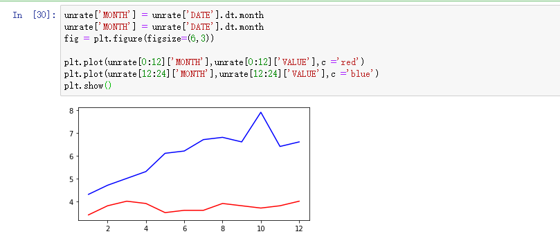
unrate['MONTH'] = unrate['DATE'].dt.month

unrate['MONTH'] = unrate['DATE'].dt.month

fig = plt.figure(figsize=(6,3))

plt.plot(unrate[0:12]['MONTH'],unrate[0:12]['VALUE'],c ='red')

plt.plot(unrate[12:24]['MONTH'],unrate[12:24]['VALUE'],c ='blue')

plt.show()
可以看到我们可以设置折线图的不同的颜色。
下面我们看看这个例子
fig = plt.figure(figsize=(10,6))

colors = ['red','blue','green','orange','black']

for i in range(5):

    start_index = i*12

    end_index = (i+1)*12

    subset = unrate[start_index:end_index]

    plt.plot(subset['MONTH'],subset['VALUE'],c=colors[i])

plt.show()

我们把数据通过不同的颜色的线条画出来了,但是不知道每条线代表的是什么意思。下面我们给折线图加上一个图例:
fig = plt.figure(figsize=(10,6))

colors = ['red', 'blue', 'green', 'orange', 'black']

for i in range(5):

    start_index = i*12

    end_index = (i+1)*12

    subset = unrate[start_index:end_index]

    label = str(1948 + i)

    plt.plot(subset['MONTH'], subset['VALUE'], c=colors[i], label=label)

plt.legend(loc='best')

plt.show()

我们通过label=label 设置好一个label为图例,然后进行设置,默认为plt.legend(loc='best')图例显示在右边
我们做下点单的修改,让整个折线图完整标准的显示
fig = plt.figure(figsize=(10,6))

colors = ['red', 'blue', 'green', 'orange', 'black']

for i in range(5):

    start_index = i*12

    end_index = (i+1)*12

    subset = unrate[start_index:end_index]

    label = str(1948 + i)

    plt.plot(subset['MONTH'], subset['VALUE'], c=colors[i], label=label)

plt.legend(loc='upper left')

plt.xlabel('Month, Integer')

plt.ylabel('Unemployment Rate, Percent')

plt.title('Monthly Unemployment Trends, 1948-1952')

plt.show()
我们增加了整个折线图的XY轴表示,图例位置调整为左边。添加了折线图的标题。

今天讲解就先到这里,我们可以看到,通过Matplotlib库,可以很轻松的画出我们想要的图。
感谢各位的阅读,谢谢~~
Python数据可视化库-Matplotlib(二)的更多相关文章
- Python数据可视化库-Matplotlib(一)
今天我们来学习一下python的数据可视化库,Matplotlib,是一个Python的2D绘图库 通过这个库,开发者可以仅需要几行代码,便可以生成绘图,直方图,功率图,条形图,错误图,散点图等等 废 ...
- Python数据可视化——使用Matplotlib创建散点图
Python数据可视化——使用Matplotlib创建散点图 2017-12-27 作者:淡水化合物 Matplotlib简述: Matplotlib是一个用于创建出高质量图表的桌面绘图包(主要是2D ...
- python的数据可视化库 matplotlib 和 pyecharts
Matplotlib大家都很熟悉 不谈. ---------------------------------------------------------------------------- ...
- python 数据可视化(matplotlib)
matpotlib 官网 :https://matplotlib.org/index.html matplotlib 可视化示例:https://matplotlib.org/gallery/inde ...
- Python数据可视化之Matplotlib实现各种图表
数据分析就是将数据以各种图表的形式展现给领导,供领导做决策用,因此熟练掌握饼图.柱状图.线图等图表制作是一个数据分析师必备的技能.Python有两个比较出色的图表制作框架,分别是Matplotlib和 ...
- Python数据可视化利器Matplotlib,绘图入门篇,Pyplot介绍
Pyplot matplotlib.pyplot是一个命令型函数集合,它可以让我们像使用MATLAB一样使用matplotlib.pyplot中的每一个函数都会对画布图像作出相应的改变,如创建画布.在 ...
- Python数据可视化之matplotlib
常用模块导入 import numpy as np import matplotlib import matplotlib.mlab as mlab import matplotlib.pyplot ...
- python数据可视化(matplotlib)
- python数据可视化-matplotlib入门(7)-从网络加载数据及数据可视化的小总结
除了从文件加载数据,另一个数据源是互联网,互联网每天产生各种不同的数据,可以用各种各样的方式从互联网加载数据. 一.了解 Web API Web 应用编程接口(API)自动请求网站的特定信息,再对这些 ...
随机推荐
- Phoenix在2345公司的实践(转)
本文介绍Phoenix在2345公司的实践,主要是实时查询平台的背景.难点.Phoenix解决的问题.Phoenix-Sql的优化以及Phoenix与实时数仓的融合思路.具体内容如下: 实时数据查询时 ...
- tcpdump笔记
最好的学习: man tcpdump ....... 一.TCPdump抓包命令 tcpdump是一个用于截取网络分组,并输出分组内容的工具.tcpdump凭借强大的功能和灵活的截取策略,使其成为类 ...
- 洛谷 P4135 作诗
分块大暴力,跟区间众数基本一样 #pragma GCC optimize(3) #include<cstdio> #include<algorithm> #include< ...
- 递推DP URAL 1031 Railway Tickets
题目传送门 /* 简单递推DP:读题烦!在区间内的都更新一遍,dp[]初始化INF 注意:s1与s2大小不一定,坑! 详细解释:http://blog.csdn.net/kk303/article/d ...
- DP Codeforces Round #303 (Div. 2) C. Woodcutters
题目传送门 /* 题意:每棵树给出坐标和高度,可以往左右倒,也可以不倒 问最多能砍到多少棵树 DP:dp[i][0/1/2] 表示到了第i棵树时,它倒左或右或不动能倒多少棵树 分情况讨论,若符合就取最 ...
- 在Android 源码中添加系统服务
Android系统本身提供了很多系统服务,如WindowManagerService,PowerManagerService等.下面描述一下添加一个系统服务的具体步骤. 1.定义自定义系统服务接口 撰 ...
- windows 7 正确禁用 IPv6
与Windows XP和Windows Server 2003不同的是,Windows Vista和Windows Server 2008中的IPv6无法被卸载.然而,在Windows Vista和W ...
- Spring Boot整合Spring Batch
引言 Spring Batch是处理大量数据操作的一个框架,主要用来读取大量数据,然后进行一定的处理后输出指定的形式.比如我们可以将csv文件中的数据(数据量几百万甚至几千万都是没问题的)批处理插入保 ...
- 【经验总结】关于使用某些第三方插件库元素设置display:none后重新show不显示的问题;(display、opacity、宽高0的使用场景)
display:none 直接取消元素所占用的位置(但是元素还是存在的),后面元素看他就相当于不存在了: opacity:0 隐藏,但是其依旧占用位置: height.width:0 和displa ...
- MSComDlg.CommonDialog服务器不能创建对象错误的解决
作者:朱金灿 来源:http://blog.csdn.net/clever101 在JavaScript中弹出打开文件对话框,代码如下: var fileOpenDlg = new ActiveXOb ...