WPF实现树形下拉列表框(TreeComboBox)
前言
树形下拉菜单是许多WPF应用程序中常见的用户界面元素,它能够以分层的方式展示数据,提供更好的用户体验。本文将深入探讨如何基于WPF创建一个可定制的树形下拉菜单控件,涵盖从原理到实际实现的关键步骤。
一、需求分析
树形下拉菜单控件的核心是将ComboBox与TreeView结合起来,以实现下拉时的树状数据展示。在WPF中,可以通过自定义控件模板、样式和数据绑定来实现这一目标。
我们首先来分析一下ComboBox控件的模板。
<ControlTemplate x:Key="ComboBoxTemplate" TargetType="{x:Type ComboBox}">

    <Grid x:Name="templateRoot" SnapsToDevicePixels="true">

        <Grid.ColumnDefinitions>

            <ColumnDefinition Width="*"/>

            <ColumnDefinition MinWidth="{DynamicResource {x:Static SystemParameters.VerticalScrollBarWidthKey}}" Width="0"/>

        </Grid.ColumnDefinitions>

        <Popup x:Name="PART_Popup" AllowsTransparency="true" Grid.ColumnSpan="2" IsOpen="{Binding IsDropDownOpen, Mode=TwoWay, RelativeSource={RelativeSource Mode=TemplatedParent}}" Margin="1" Placement="Bottom" PopupAnimation="{DynamicResource {x:Static SystemParameters.ComboBoxPopupAnimationKey}}">

            <theme:SystemDropShadowChrome x:Name="shadow" Color="Transparent" MinWidth="{Binding ActualWidth, ElementName=templateRoot}" MaxHeight="{TemplateBinding MaxDropDownHeight}">

                <Border x:Name="dropDownBorder" Background="{DynamicResource {x:Static SystemColors.WindowBrushKey}}" BorderBrush="{DynamicResource {x:Static SystemColors.WindowFrameBrushKey}}" BorderThickness="1">

                    <ScrollViewer x:Name="DropDownScrollViewer">

                        <Grid x:Name="grid" RenderOptions.ClearTypeHint="Enabled">

                            <Canvas x:Name="canvas" HorizontalAlignment="Left" Height="0" VerticalAlignment="Top" Width="0">

                                <Rectangle x:Name="opaqueRect" Fill="{Binding Background, ElementName=dropDownBorder}" Height="{Binding ActualHeight, ElementName=dropDownBorder}" Width="{Binding ActualWidth, ElementName=dropDownBorder}"/>

                            </Canvas>

                            <ItemsPresenter x:Name="ItemsPresenter" KeyboardNavigation.DirectionalNavigation="Contained" SnapsToDevicePixels="{TemplateBinding SnapsToDevicePixels}"/>

                        </Grid>

                    </ScrollViewer>

                </Border>

            </theme:SystemDropShadowChrome>

        </Popup>

        <ToggleButton x:Name="toggleButton" Background="{TemplateBinding Background}" BorderBrush="{TemplateBinding BorderBrush}" BorderThickness="{TemplateBinding BorderThickness}" Grid.ColumnSpan="2" IsChecked="{Binding IsDropDownOpen, Mode=TwoWay, RelativeSource={RelativeSource Mode=TemplatedParent}}" Style="{StaticResource ComboBoxToggleButton}"/>

        <ContentPresenter x:Name="contentPresenter" ContentStringFormat="{TemplateBinding SelectionBoxItemStringFormat}" ContentTemplate="{TemplateBinding SelectionBoxItemTemplate}" Content="{TemplateBinding SelectionBoxItem}" ContentTemplateSelector="{TemplateBinding ItemTemplateSelector}" HorizontalAlignment="{TemplateBinding HorizontalContentAlignment}" IsHitTestVisible="false" Margin="{TemplateBinding Padding}" SnapsToDevicePixels="{TemplateBinding SnapsToDevicePixels}" VerticalAlignment="{TemplateBinding VerticalContentAlignment}"/>

    </Grid>

</ControlTemplate>
从以上代码可以看出,其中的Popup控件就是下拉部分,那么按照常理,我们在Popup控件中放入一个TreeView控件即可实现该需求,但是现实情况远没有这么简单。我们开发一个控件,不仅要从外观上实现功能,还需要考虑数据绑定、事件触发、自定义模板等方面的问题,显然,直接放置一个TreeView控件虽然也能实现功能,但是从封装的角度看,它并不优雅,使用也不方便。那么有没有更好的方法满足以上需求呢?下面提供另一种思路,其核心思想就是融合ComboBox控件与TreeView控件模板,让控件既保留TreeView的特性,又拥有ComboBox的外观。
二、代码实现
2.1 编辑TreeView模板;
2.2 提取ComboBox的模板代码;
2.3 将ComboBox的模板代码移植到TreeView模板中;
2.4 将TreeView模板包含ItemsPresenter部分的关键代码放入ComboBox模板中的Popup控件内;
以下为融合后的xaml代码
<ControlTemplate TargetType="{x:Type local:TreeComboBox}">

    <Grid x:Name="templateRoot" SnapsToDevicePixels="true">

        <Grid.ColumnDefinitions>

            <ColumnDefinition Width="*" />

            <ColumnDefinition Width="0" MinWidth="{DynamicResource {x:Static SystemParameters.VerticalScrollBarWidthKey}}" />

        </Grid.ColumnDefinitions>

        <Popup

                            x:Name="PART_Popup"

                            Grid.ColumnSpan="2"

                            MaxHeight="{TemplateBinding MaxDropDownHeight}"

                            Margin="1"

                            AllowsTransparency="true"

                            IsOpen="{Binding IsDropDownOpen, Mode=TwoWay, RelativeSource={RelativeSource Mode=TemplatedParent}}"

                            Placement="Bottom"

                            PopupAnimation="{DynamicResource {x:Static SystemParameters.ComboBoxPopupAnimationKey}}">

            <Border

                                x:Name="PART_Border"

                                Width="{Binding RelativeSource={RelativeSource AncestorType=local:TreeComboBox}, Path=ActualWidth}"

                                Background="{DynamicResource {x:Static SystemColors.WindowBrushKey}}"

                                BorderBrush="{DynamicResource {x:Static SystemColors.WindowFrameBrushKey}}"

                                BorderThickness="1"

                                SnapsToDevicePixels="true">

                <ScrollViewer

                                    x:Name="_tv_scrollviewer_"

                                    Padding="{TemplateBinding Padding}"

                                    Background="{TemplateBinding Background}"

                                    CanContentScroll="false"

                                    Focusable="false"

                                    HorizontalScrollBarVisibility="{TemplateBinding ScrollViewer.HorizontalScrollBarVisibility}"

                                    SnapsToDevicePixels="{TemplateBinding SnapsToDevicePixels}"

                                    VerticalScrollBarVisibility="{TemplateBinding ScrollViewer.VerticalScrollBarVisibility}">

                    <ItemsPresenter />

                </ScrollViewer>

            </Border>

        </Popup>

        <ToggleButton

                            x:Name="toggleButton"

                            Grid.ColumnSpan="2"

                            Background="{TemplateBinding Background}"

                            BorderBrush="{TemplateBinding BorderBrush}"

                            BorderThickness="{TemplateBinding BorderThickness}"

                            IsChecked="{Binding IsDropDownOpen, Mode=TwoWay, RelativeSource={RelativeSource Mode=TemplatedParent}}"

                            Style="{StaticResource ComboBoxToggleButton}" />

        <ContentPresenter

                            x:Name="contentPresenter"

                            Margin="{TemplateBinding Padding}"

                            HorizontalAlignment="{TemplateBinding HorizontalContentAlignment}"

                            VerticalAlignment="{TemplateBinding VerticalContentAlignment}"

                            Content="{TemplateBinding SelectionBoxItem}"

                            ContentTemplate="{TemplateBinding SelectionBoxItemTemplate}"

                            IsHitTestVisible="False" />

    </Grid>

    <ControlTemplate.Triggers>

        <Trigger Property="IsEnabled" Value="false">

            <Setter TargetName="PART_Border" Property="Background" Value="{DynamicResource {x:Static SystemColors.ControlBrushKey}}" />

        </Trigger>

        <Trigger Property="VirtualizingPanel.IsVirtualizing" Value="true">

            <Setter TargetName="_tv_scrollviewer_" Property="CanContentScroll" Value="true" />

        </Trigger>

        <MultiTrigger>

            <MultiTrigger.Conditions>

                <Condition Property="IsGrouping" Value="true" />

                <Condition Property="VirtualizingPanel.IsVirtualizingWhenGrouping" Value="false" />

            </MultiTrigger.Conditions>

            <Setter Property="ScrollViewer.CanContentScroll" Value="false" />

        </MultiTrigger>

    </ControlTemplate.Triggers>

</ControlTemplate>
以下为使用控件的代码。
<TreeComboBox

                Width="315"

                MinHeight="30"

                Padding="5"

                HorizontalAlignment="Center"

                VerticalAlignment="Top"

                VerticalContentAlignment="Stretch"

                IsAutoCollapse="True"

                ItemsSource="{Binding Collection}">

    <TreeComboBox.SelectionBoxItemTemplate>

        <ItemContainerTemplate>

            <Border>

                <TextBlock VerticalAlignment="Center" Text="{Binding Property1}" />

            </Border>

        </ItemContainerTemplate>

    </TreeComboBox.SelectionBoxItemTemplate>

    <TreeComboBox.ItemTemplate>

        <HierarchicalDataTemplate ItemsSource="{Binding Collection}">

            <TextBlock

                            Margin="5,0,0,0"

                            VerticalAlignment="Center"

                            Text="{Binding Property1}" />

        </HierarchicalDataTemplate>

    </TreeComboBox.ItemTemplate>

</TreeComboBox>
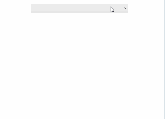
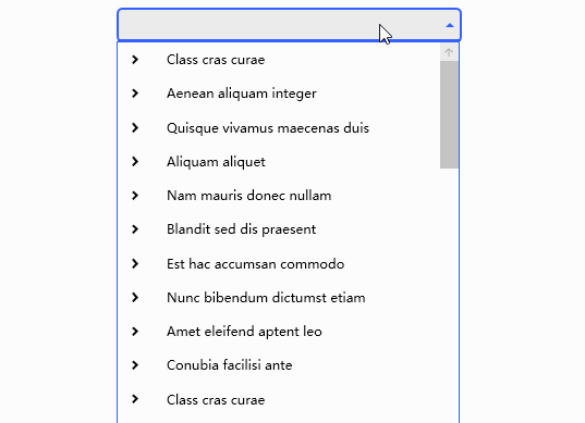
三、运行效果
3.1 单选效果

3.2 多选效果
四、个性化外观
当控件默认外观无法满足需求时,我们可以通过编辑样式的方式来实现个性化外观,也可以引用第三方UI库样式,以下为使用MaterialDesign的效果。
4.1 单选效果
4.2 多选效果

WPF实现树形下拉列表框(TreeComboBox)的更多相关文章
- 【WPF】树形结构TreeView的用法(MVVM)
TreeView控件的用法还是有蛮多坑点的,最好记录一下. 参考项目: https://www.codeproject.com/Articles/26288/Simplifying-the-WPF-T ...
- 《深入浅出WPF》 学习笔记
<深入浅出WPF> 序言 1. 什么是WPF 2. 为什么要学习WPF 第一章 XAML概览 1. XAML是什么? 2. XAML有哪些优点 第二章 从零起步认识XAML 1. 新 ...
- C#图片色彩的纠正-上
WPF(C#)图片色彩的纠正-上 WPF(C#)图片色彩的纠正-下 前言 对图片进行色彩的纠正,其实与WPF是没有什么关系的,为什么标题又是“WPF(C#)图片色彩的纠正”呢,因为这些图片色彩的纠正功 ...
- 循序渐进VUE+Element 前端应用开发(26)--- 各种界面组件的使用(2)
在我们使用Vue+Element开发前端的时候,往往涉及到很多界面组件的使用,其中很多直接采用Element官方的案例即可,有些则是在这个基础上封装更好利用.更少代码的组件:另外有些则是直接采用第三方 ...
- WPF:使用Json.NET在TreeView中树形显示JSON数据
原文 WPF:使用Json.NET在TreeView中树形显示JSON数据 据 读者可以参考这个开源的可以树形显示XML和JSON的工具: Mgen Object 603:XML/JSON树形显示小工 ...
- Asp.Net Mvc自定义控件之树形结构数据生成表格 - WPF特工队内部资料
最近项目中有一个需求,将树形结构的数据,以表格的形式展示在页面中,下图是最终呈现效果: 源码: @{ Layout = null; } <!DOCTYPE html> <html&g ...
- WPF树形菜单--递归与非递归遍历生成树结构的集合
一.新建了WPF项目作为测试,使用TreeView控件进行界面展示. 第一步创建实体类TreeEntity: public class TreeEntity { private int _mid; p ...
- wpf 菜单样式和绑定树形数据
前言 在wpf开发中,经常会使用到Menu和ContentMenu.但是原生的样式比较简陋,对于比较追求界面美好的人来说是十分不友好的.那么,这就涉及到对Menu的样式修改了.与此同时,我们还希望Me ...
- WPF下递归生成树形数据绑定到TreeView上
最终效果图:(用于学习类的效果 图片丑了点,看官莫怪) 新建窗体 然后在前端适当位置插入如下代码: <TreeView x:Name="> <TreeView.ItemTe ...
- 【WPF】1、 基本控件的简介
WPF一直都是断断续续的使用.偶尔用到一下.但是每次间隔比较长,需要重新学习,就写了这篇日志.以后有问题,看这个就可以了解各大概,然后针对细节再另外想办法. 微软的东西真心好,如果什么都不懂,可以直接 ...
随机推荐
- 需要入门IT行业并且想做java后台小伙伴-简单谈谈后台开发Spring与SpringBoot
1.Spring能做什么 1.1.Spring的能力 1.2.Spring的生态 https://spring.io/projects/spring-boot 覆盖了: web开发 数据访问 安全控制 ...
- React之父组件向子组件传值
class Parent extends React.Component{ constructor(){ super(); this.state={co:"red"} } rend ...
- 【Azure App Service】当App Service中使用系统标识无法获取Access Token时
问题描述 App Serive上的应用配置了系统标识(System Identity),通过系统标识获取到访问Key Vault资源的Access Token.但这次确遇见了无法获取到正常的Acces ...
- 【Azure K8S | AKS】在中国区AKS上遇见ImagePullBackOff时的替代方案
问题描述 在AKS集群中部署calico时候,遇见 ImagePullBackOff 问题. 在创建POD calico-typha-horizontal-autoscale 时候遇见拉取镜像失败问题 ...
- 【Azure 应用服务】Web.config中设置域名访问限制,IP地址限制访问特定的页面资源 (Rewrite)
问题描述 问题一:web app已经绑定了域名,例如是www.a.com,现在只允许使用www.a.com 访问,如果使用默认的域名xxxx.chinacloundsites.cn访问的时候,需要显示 ...
- RocketMQ—RocketMQ集成SpringBoot
RocketMQ-RocketMQ集成SpringBoot 新建生产者的boot项目和消费者的boot项目,pom文件重点如下: <dependencies> <dependency ...
- 面试官:说说SSO单点登录的实现原理?
单点登录(Single Sign-On, SSO)是一种让用户在多个应用系统之间只需登录一次就可以访问所有授权系统的机制.单点登录主要目的是为了提高用户体验并简化安全管理. 举个例子,您在一个大型企业 ...
- C#实现图片对比
前言 虽然已经正式转JAVA了,但最近发现一个特别好的开源项目masuit,不仅提供很多简便的功能,还有图像的一些特殊操作功能. 下面就实现一个简单图像对比. 实现对比 代码如下,实现一个可以对比翻转 ...
- Java ----多线程 案例
1 package bytezero.threadtest2; 2 3 /** 4 * 银行有一个账户 5 * 有两个储户分别向同一个账户存 3000元,每次存1000,存三次,每次存完打印账户余额 ...
- Docker下搭建Redis集群并实现动态扩/缩容
一.Redis集群方案的简单介绍 Redis集群的方案一般分为三种: 哈希取余分区 一致性哈希算法分区 哈希槽分区(本文介绍的就是这种) 1.哈希取余分区: 优点: 简单粗暴,只要提前预估好数据量,然 ...