matplotlib学习之散点图与条形图
# coding:utf-8
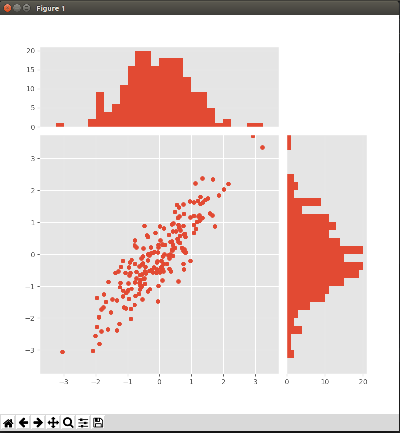
from matplotlib import pyplot as plt
import numpy as np plt.style.use('ggplot') x = np.random.randn(200)
y = x + np.random.randn(200) * 0.5 # 确定图的位置
margin_border = 0.1
width = 0.6
margin_between = 0.02
height = 0.2 left_s = margin_border
bottom_s = margin_border
height_s = width
width_s = width left_x = margin_border
bottom_x = margin_border + width + margin_between
height_x = height
width_x = width left_y = margin_border + width + margin_between
bottom_y = margin_border
height_y = width
width_y = height plt.figure(1, figsize=(8, 8))
rect_s = [left_s, bottom_s, width_s, height_s]
rect_x = [left_x, bottom_x, width_x, height_x]
rect_y = [left_y, bottom_y, width_y, height_y] axScatter = plt.axes(rect_s)
axHisX = plt.axes(rect_x)
axHisY = plt.axes(rect_y) axHisX.set_xticks([])
axHisY.set_yticks([]) # 绘图
axScatter.scatter(x, y) bin_width = 0.25
xymax = np.max([np.max(np.fabs(x)), np.max(np.fabs(y))])
lim = int(xymax / bin_width + 1) * bin_width axScatter.set_xlim(-lim, lim)
axScatter.set_ylim(-lim, lim) bins = np.arange(-lim, lim + bin_width, bin_width) axHisX.hist(x, bins=bins)
axHisY.hist(y, bins=bins, orientation='horizontal') # 同步条形图与散点图的横纵坐标
axHisX.set_xlim(axScatter.get_xlim())
axHisY.set_ylim(axScatter.get_ylim()) plt.show()
matplotlib学习之散点图与条形图的更多相关文章
- Matplotlib学习笔记(一)
原 matplotlib学习笔记 参考:Python数据科学入门教程 Python3.6.1 jupyter notebook .caret, .dropup > .btn > .ca ...
- Matplotlib学习---matplotlib的一些基本用法
Matplotlib有两种接口,一种是matlab风格接口,一种是面向对象接口.在这里,统一使用面向对象接口.因为面向对象接口可以适应更复杂的场景,在多图之间进行切换将变得非常容易. 首先导入matp ...
- matplotlib 学习总结
matplotlib 学习总结 作者:csj更新时间:01.09 email:59888745@qq.com 说明:因内容较多,会不断更新 xxx学习总结: 回主目录:2017 年学习记录和总结 # ...
- Matplotlib学习笔记(二)
原 Matplotlib学习笔记 参考:Python数据科学入门教程 Python3.6.1 jupyter notebook .caret, .dropup > .btn > .car ...
- Matplotlib学习---用matplotlib画箱线图(boxplot)
箱线图通过数据的四分位数来展示数据的分布情况.例如:数据的中心位置,数据间的离散程度,是否有异常值等. 把数据从小到大进行排列并等分成四份,第一分位数(Q1),第二分位数(Q2)和第三分位数(Q3)分 ...
- Matplotlib学习---用matplotlib画直方图/密度图(histogram, density plot)
直方图用于展示数据的分布情况,x轴是一个连续变量,y轴是该变量的频次. 下面利用Nathan Yau所著的<鲜活的数据:数据可视化指南>一书中的数据,学习画图. 数据地址:http://d ...
- Matplotlib学习---用matplotlib画散点图,气泡图(scatter plot, bubble chart)
Matplotlib里有两种画散点图的方法,一种是用ax.plot画,一种是用ax.scatter画. 一. 用ax.plot画 ax.plot(x,y,marker="o",co ...
- matplotlib常见绘图基础代码小结:折线图、散点图、条形图、直方图、饼图
一.折线图 二.散点图 三.条形图 四.直方图 五.饼图 一.折线图折线图用于显示随时间或有序类别的变化趋势 from matplotlib import pyplot as plt x = rang ...
- Matplotlib散点图、条形图、直方图-02
对比常用统计图 折线图: 特点:能够显示数据的变化趋势,反映事物的变化情况.(变化) 直方图: 特点:绘制连续性的数据,展示一组或者多组数据的分布情况(统计) 条形图: 特点:绘制离散的数据,能够一眼 ...
随机推荐
- 【Codeforces Round #456 (Div. 2) C】Perun, Ult!
[链接] 我是链接,点我呀:) [题意] 在这里输入题意 [题解] set1 < pair < int,int > > set1;记录关键点->某个人怪物永远打不死了,第 ...
- ListView- 最后一行添加控件
今天在做一个功能的时候,要求必须是在一个listview下,有一段提示行的文字,自己的那个listview的adapter用的是cursoradapter,这样的话,处理布局的灵活性就大打折扣了.最开 ...
- Android开机自动运行APP——BroadcastReceiver
前言: 有些时候,应用需要在开机时就自动运行,例如某个自动从网上更新内容的后台service.怎样实现开机自动运行的应用?在撰写本文时,联想到高焕堂先生以“Don't call me, I'll ca ...
- 1.16 Python基础知识 - 装饰器初识
Python中的装饰器就是函数,作用就是包装其他函数,为他们起到修饰作用.在不修改源代码的情况下,为这些函数额外添加一些功能,像日志记录,性能测试等.一个函数可以使用多个装饰器,产生的结果与装饰器的位 ...
- Flask项目之手机端租房网站的实战开发(十一)
说明:该篇博客是博主一字一码编写的,实属不易,请尊重原创,谢谢大家! 接着上一篇博客继续往下写 :https://blog.csdn.net/qq_41782425/article/details/8 ...
- 51Nod——N1284 2 3 5 7的倍数
https://www.51nod.com/onlineJudge/questionCode.html#!problemId=1284 基准时间限制:1 秒 空间限制:131072 KB 分值: 5 ...
- [Angular] Http Custom Headers and RequestOptions
updatePassenger(passenger: Passenger): Observable<Passenger> { let headers = new Headers({ 'Co ...
- [Err] 1064 - You have an error in your SQL syntax; check the manual that corresponds to your MySQL server version for the right syntax to use near ''<h1 style="text-align: center;">php
[Err] 1064 - You have an error in your SQL syntax; check the manual that corresponds to your MySQL s ...
- android String 类型转换成UTF-8格式
在android开发中,有时候会遇到汉字乱码的问题,在这个时候,吧String串加一个编码格式转换,转换成UTF-8的格式就可以了 public static String toUtf8(String ...
- css页面滚动条出现时防止页面跳动的方法
大家写页面时应该都遇到过一个问题,尤其是写单页面应用的时候, 在有滚动条页面和没有滚动条页面之间相互跳转时, 你页面的主体内容会向左或者向右抖一下,让强迫症看了很不舒服. 现在就来解救一下强迫症: 方 ...