
吴裕雄--天生自然 R语言数据可视化绘图(2)
par(ask=TRUE)

opar <- par(no.readonly=TRUE) # save original parameter settings

library(vcd)

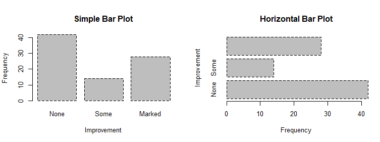
counts <- table(Arthritis$Improved)

counts
# Listing 6.1 - Simple bar plot
# vertical barplot
barplot(counts,
main="Simple Bar Plot",
xlab="Improvement", ylab="Frequency")
# horizontal bar plot
barplot(counts,
main="Horizontal Bar Plot",
xlab="Frequency", ylab="Improvement",
horiz=TRUE)

# obtain 2-way frequency table

library(vcd)

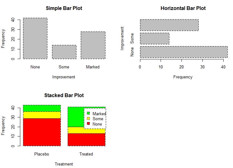
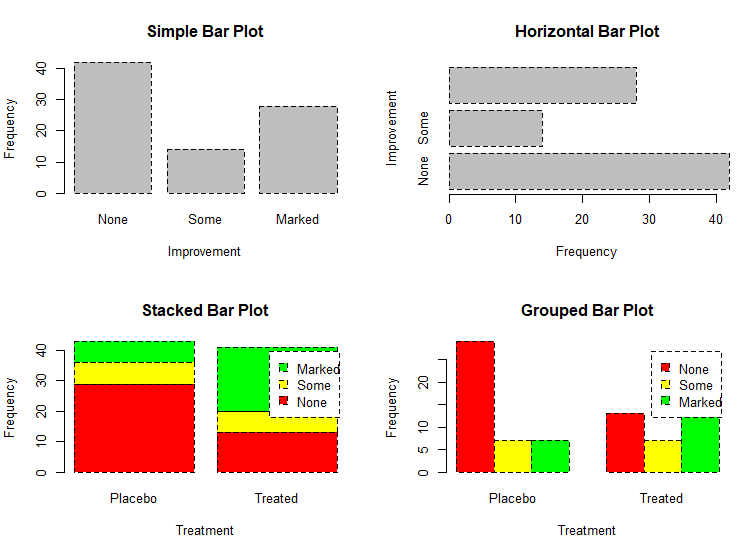
counts <- table(Arthritis$Improved, Arthritis$Treatment)

counts

# Listing 6.2 - Stacked and grouped bar plots

# stacked barplot

barplot(counts,

        main="Stacked Bar Plot",

        xlab="Treatment", ylab="Frequency",

        col=c("red", "yellow","green"),

        legend=rownames(counts))
# grouped barplot

barplot(counts,

        main="Grouped Bar Plot",

        xlab="Treatment", ylab="Frequency",

        col=c("red", "yellow", "green"),

        legend=rownames(counts), beside=TRUE)
# Listing 6.3 - Bar plot for sorted mean values

states <- data.frame(state.region, state.x77)

means <- aggregate(states$Illiteracy, by=list(state.region), FUN=mean)

means

means <- means[order(means$x),]

means

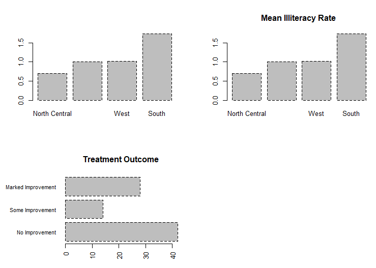
barplot(means$x, names.arg=means$Group.1)

title("Mean Illiteracy Rate")

# Listing 6.3 - Bar plot for sorted mean values

states <- data.frame(state.region, state.x77)

means <- aggregate(states$Illiteracy, by=list(state.region), FUN=mean)

means

means <- means[order(means$x),]

means

barplot(means$x, names.arg=means$Group.1)

title("Mean Illiteracy Rate")

# Listing 6.4 - Fitting labels in bar plots

par(las=2)                # set label text perpendicular to the axis

par(mar=c(5,8,4,2))       # increase the y-axis margin

counts <- table(Arthritis$Improved) # get the data for the bars

# produce the graph

barplot(counts,

        main="Treatment Outcome", horiz=TRUE, cex.names=0.8,

        names.arg=c("No Improvement", "Some Improvement", "Marked Improvement")

)

par(opar)
# Spinograms

library(vcd)

attach(Arthritis)

counts <- table(Treatment,Improved)

spine(counts, main="Spinogram Example")

detach(Arthritis)

# Listing 6.5 - Pie charts

par(mfrow=c(2,2))

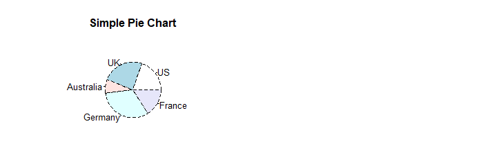
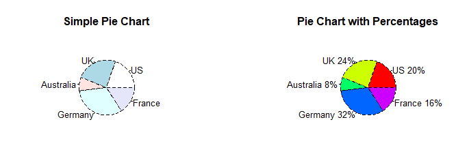
slices <- c(10, 12,4, 16, 8)

lbls <- c("US", "UK", "Australia", "Germany", "France")

pie(slices, labels = lbls,

    main="Simple Pie Chart")
pct <- round(slices/sum(slices)*100)

lbls <- paste(lbls, pct)

lbls <- paste(lbls,"%",sep="")

pie(slices,labels = lbls, col=rainbow(length(lbls)),

    main="Pie Chart with Percentages")
library(plotrix)

pie3D(slices, labels=lbls,explode=0.1,

      main="3D Pie Chart ")

mytable <- table(state.region)

lbls <- paste(names(mytable), "\n", mytable, sep="")

pie(mytable, labels = lbls,

    main="Pie Chart from a dataframe\n (with sample sizes)")

par(opar)
mytable <- table(state.region)

lbls <- paste(names(mytable), "\n", mytable, sep="")

pie(mytable, labels = lbls,

    main="Pie Chart from a dataframe\n (with sample sizes)")

par(opar)

# Fan plots

library(plotrix)

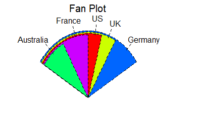
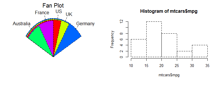
slices <- c(10, 12,4, 16, 8)

lbls <- c("US", "UK", "Australia", "Germany", "France")

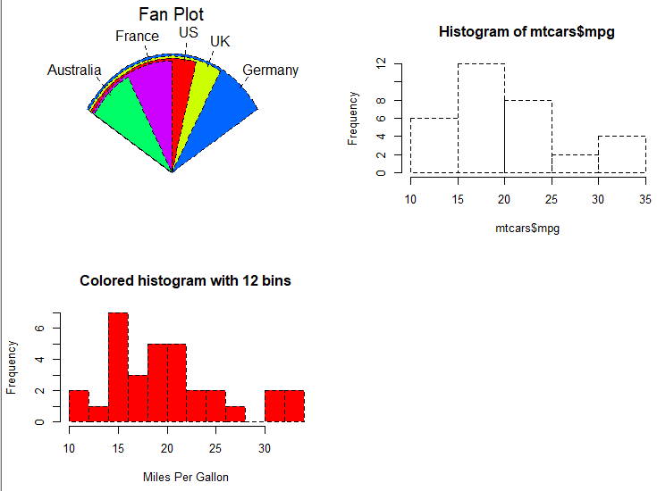
fan.plot(slices, labels = lbls, main="Fan Plot")
# Listing 6.6 - Histograms

# simple histogram                                                        1

hist(mtcars$mpg)
# colored histogram with specified number of bins

hist(mtcars$mpg,

     breaks=12,

     col="red",

     xlab="Miles Per Gallon",

     main="Colored histogram with 12 bins")
# colored histogram with rug plot, frame, and specified number of bins

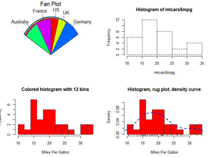
hist(mtcars$mpg,

     freq=FALSE,

     breaks=12,

     col="red",

     xlab="Miles Per Gallon",

     main="Histogram, rug plot, density curve")

rug(jitter(mtcars$mpg))

lines(density(mtcars$mpg), col="blue", lwd=2)
# histogram with superimposed normal curve (Thanks to Peter Dalgaard)

x <- mtcars$mpg

h<-hist(x,

        breaks=12,

        col="red",

        xlab="Miles Per Gallon",

        main="Histogram with normal curve and box")

xfit<-seq(min(x),max(x),length=40)

yfit<-dnorm(xfit,mean=mean(x),sd=sd(x))

yfit <- yfit*diff(h$mids[1:2])*length(x)

lines(xfit, yfit, col="blue", lwd=2)

box()
# Listing 6.6 - Histograms

# simple histogram                                                        1

hist(mtcars$mpg)

# colored histogram with specified number of bins

hist(mtcars$mpg,

     breaks=12,

     col="red",

     xlab="Miles Per Gallon",

     main="Colored histogram with 12 bins")

# colored histogram with rug plot, frame, and specified number of bins

hist(mtcars$mpg,

     freq=FALSE,

     breaks=12,

     col="red",

     xlab="Miles Per Gallon",

     main="Histogram, rug plot, density curve")

rug(jitter(mtcars$mpg))

lines(density(mtcars$mpg), col="blue", lwd=2)

# histogram with superimposed normal curve (Thanks to Peter Dalgaard)

x <- mtcars$mpg

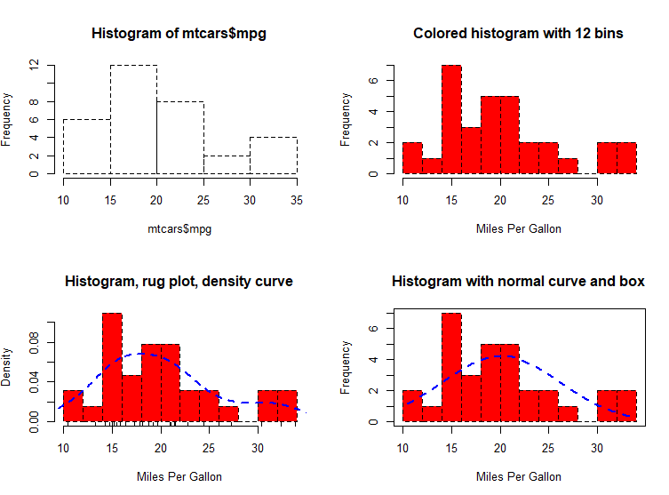
h<-hist(x,

        breaks=12,

        col="red",

        xlab="Miles Per Gallon",

        main="Histogram with normal curve and box")

xfit<-seq(min(x),max(x),length=40)

yfit<-dnorm(xfit,mean=mean(x),sd=sd(x))

yfit <- yfit*diff(h$mids[1:2])*length(x)

lines(xfit, yfit, col="blue", lwd=2)

box()
# Listing 6.7 - Kernel density plot

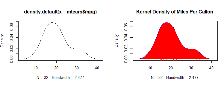
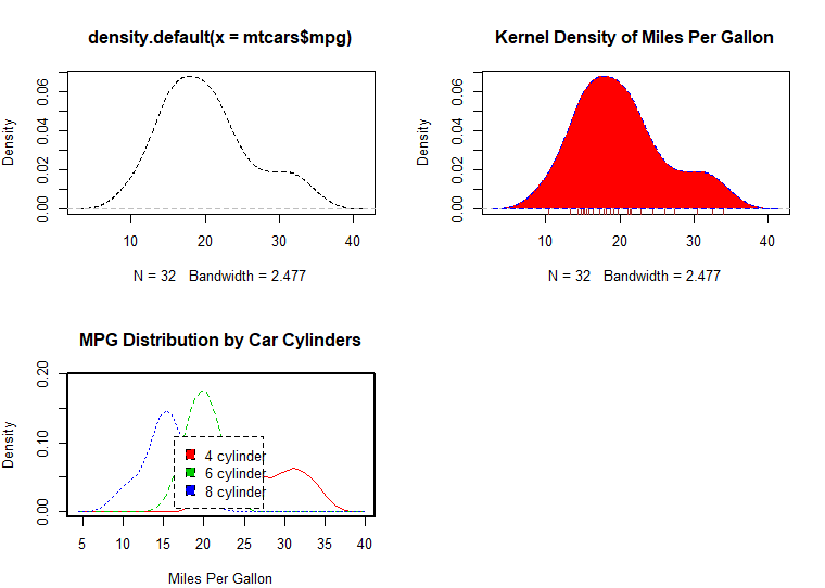
d <- density(mtcars$mpg) # returns the density data

plot(d) # plots the results

d <- density(mtcars$mpg)

plot(d, main="Kernel Density of Miles Per Gallon")

polygon(d, col="red", border="blue")

rug(mtcars$mpg, col="brown")
# Listing 6.8 - Comparing kernel density plots

par(lwd=2)

library(sm)

attach(mtcars)

# create value labels

cyl.f <- factor(cyl, levels= c(4, 6, 8),

                labels = c("4 cylinder", "6 cylinder", "8 cylinder"))

# plot densities

sm.density.compare(mpg, cyl, xlab="Miles Per Gallon")

title(main="MPG Distribution by Car Cylinders")

# add legend via mouse click

colfill<-c(2:(2+length(levels(cyl.f))))

cat("Use mouse to place legend...","\n\n")

legend(locator(1), levels(cyl.f), fill=colfill)

detach(mtcars)

par(lwd=1)
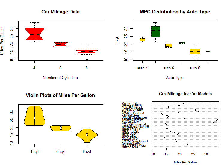
# parallel box plots

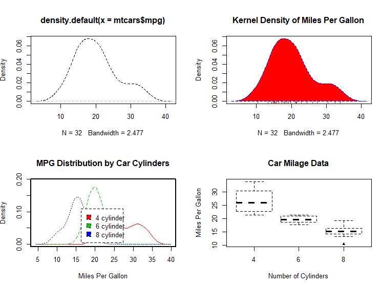
boxplot(mpg~cyl,data=mtcars,

        main="Car Milage Data",

        xlab="Number of Cylinders",

        ylab="Miles Per Gallon")
# notched box plots

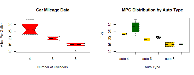
boxplot(mpg~cyl,data=mtcars,

        notch=TRUE,

        varwidth=TRUE,

        col="red",

        main="Car Mileage Data",

        xlab="Number of Cylinders",

        ylab="Miles Per Gallon")

# Listing 6.9 - Box plots for two crossed factors
# create a factor for number of cylinders
mtcars$cyl.f <- factor(mtcars$cyl,
levels=c(4,6,8),
labels=c("4","6","8"))
# create a factor for transmission type
mtcars$am.f <- factor(mtcars$am,
levels=c(0,1),
labels=c("auto","standard"))
# generate boxplot
boxplot(mpg ~ am.f *cyl.f,
data=mtcars,
varwidth=TRUE,
col=c("gold", "darkgreen"),
main="MPG Distribution by Auto Type",
xlab="Auto Type")
# Listing 6.10 - Violin plots

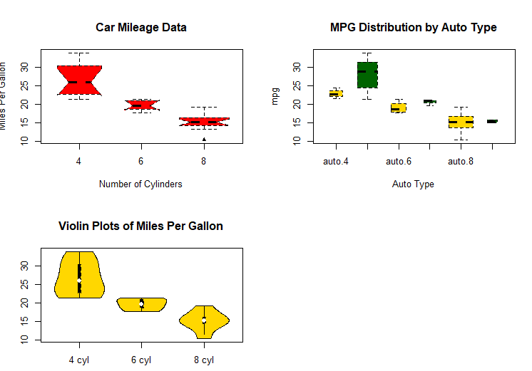
library(vioplot)

x1 <- mtcars$mpg[mtcars$cyl==4]

x2 <- mtcars$mpg[mtcars$cyl==6]

x3 <- mtcars$mpg[mtcars$cyl==8]

vioplot(x1, x2, x3,

        names=c("4 cyl", "6 cyl", "8 cyl"),

        col="gold")

title("Violin Plots of Miles Per Gallon")
# dot chart

dotchart(mtcars$mpg,labels=row.names(mtcars),cex=.7,

         main="Gas Mileage for Car Models",

         xlab="Miles Per Gallon")
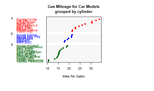
# Listing 6.11 - Dot plot grouped, sorted, and colored

x <- mtcars[order(mtcars$mpg),]

x$cyl <- factor(x$cyl)

x$color[x$cyl==4] <- "red"

x$color[x$cyl==6] <- "blue"

x$color[x$cyl==8] <- "darkgreen"

dotchart(x$mpg,

         labels = row.names(x),

         cex=.7,

         pch=19,

         groups = x$cyl,

         gcolor = "black",

         color = x$color,

         main = "Gas Mileage for Car Models\ngrouped by cylinder",

         xlab = "Miles Per Gallon")
吴裕雄--天生自然 R语言数据可视化绘图(2)的更多相关文章
- 吴裕雄--天生自然 R语言数据可视化绘图(3)
par(ask=TRUE) opar <- par(no.readonly=TRUE) # record current settings # Listing 11.1 - A scatter ...
- 吴裕雄--天生自然 R语言数据可视化绘图(4)
par(ask=TRUE) # Basic scatterplot library(ggplot2) ggplot(data=mtcars, aes(x=wt, y=mpg)) + geom_poin ...
- 吴裕雄--天生自然 R语言数据可视化绘图(1)
par(ask=TRUE) opar <- par(no.readonly=TRUE) # make a copy of current settings attach(mtcars) # be ...
- 吴裕雄--天生自然 R语言开发学习:R语言的安装与配置
下载R语言和开发工具RStudio安装包 先安装R
- 吴裕雄--天生自然 R语言开发学习:数据集和数据结构
数据集的概念 数据集通常是由数据构成的一个矩形数组,行表示观测,列表示变量.表2-1提供了一个假想的病例数据集. 不同的行业对于数据集的行和列叫法不同.统计学家称它们为观测(observation)和 ...
- 吴裕雄--天生自然 R语言开发学习:导入数据
2.3.6 导入 SPSS 数据 IBM SPSS数据集可以通过foreign包中的函数read.spss()导入到R中,也可以使用Hmisc 包中的spss.get()函数.函数spss.get() ...
- 吴裕雄--天生自然 R语言开发学习:处理缺失数据的高级方法(续一)
#-----------------------------------# # R in Action (2nd ed): Chapter 18 # # Advanced methods for mi ...
- 吴裕雄--天生自然 R语言开发学习:R语言的简单介绍和使用
假设我们正在研究生理发育问 题,并收集了10名婴儿在出生后一年内的月龄和体重数据(见表1-).我们感兴趣的是体重的分 布及体重和月龄的关系. 可以使用函数c()以向量的形式输入月龄和体重数据,此函 数 ...
- 吴裕雄--天生自然 R语言开发学习:使用键盘、带分隔符的文本文件输入数据
R可从键盘.文本文件.Microsoft Excel和Access.流行的统计软件.特殊格 式的文件.多种关系型数据库管理系统.专业数据库.网站和在线服务中导入数据. 使用键盘了.有两种常见的方式:用 ...
随机推荐
- 【WPF学习】第四章 加载和编译XAML
前面已经介绍过,尽管XAML和WPF这两种技术具有相互补充的作用,但他们也是相互独立的.因此,完全可以创建不使用XAML和WPF应用程序. 总之,可使用三种不同的编码方式来创建WPF应用程序: 只使用 ...
- 【Java并发基础】局部变量是线程安全的
前言 方法中的变量(即局部变量)是不存在数据竞争(Data Race)的,也是线程安全的.为了理解为什么,我们先来了一下方法是如何被执行的,然后再分析局部变量的安全性,最后再介绍利用局部变量不会共享的 ...
- Linux 常用工具openssh之ssh-add
前言 ssh-add命令是把专用密钥添加到ssh-agent的高速缓存中,从而提高ssh的认证速度 语法 ssh-add [-cDdLlXx] [-t life] [file ...] 选项 -D:删 ...
- Spring 依赖注入原理
所谓依赖注入就是指:在运行期,由外部容器动态地将依赖对象注入到组件中.当spring容器启动后,spring容器初始化,创建并管理bean对象,以及销毁它.所以我们只需从容器直接获取Bean对象就行, ...
- 全网最详细的Linux命令系列-Screen远程会话命令
screen 管理你的远程会话 你是不是经常需要 SSH 或者 telent 远程登录到 Linux 服务器?你是不是经常为一些长时间运行的任务而头疼,比如系统备份.ftp 传输等等.通常情况下我们都 ...
- 【OpenGL】OpenGL4.3常用指令目录
参考OpenGL编程指南 第8版 VAO void glGenVertexArrays(GLsizei n, GLuint *arrays); 返回n个未使用的对象名到数组arrays中,用作顶点数组 ...
- USBWebServer - 在U盘里搭一个Web服务器!
文章选自我的博客:https://blog.ljyngup.com/archives/321.html/ 本文将介绍一款可以在U盘内直接搭建Web服务器的软件 软件可以免安装直接在U盘内运行,适合外出 ...
- 1.【Spring Cloud Alibaba】服务发现-Nacos
一.服务的提供者与服务的消费者 二.服务发现原理 如果用户中心地址发生变化怎么办? 服务的消费者总能找到服务的提供者的这种原理,即服务发现原理. 三.什么是Nacos? Nacos文档地址请查看,引入 ...
- linux 使用nfs 服务实现远程共享
首先安装 apt install -y nfs-kernel-server nfs-common 编辑配置文件 vim /etc/exports 添加内容: /root/test *(rw,sync, ...
- [HTML5] input标签 disable属性
<span>服务器名称:<input type="text" name="server_name" placeholder="服务器 ...