吴裕雄--天生自然 R语言数据可视化绘图(3)
par(ask=TRUE)

opar <- par(no.readonly=TRUE) # record current settings

# Listing 11.1 - A scatter plot with best fit lines

attach(mtcars)

plot(wt, mpg,

     main="Basic Scatterplot of MPG vs. Weight",

     xlab="Car Weight (lbs/1000)",

     ylab="Miles Per Gallon ", pch=19)

abline(lm(mpg ~ wt), col="red", lwd=2, lty=1)

lines(lowess(wt, mpg), col="blue", lwd=2, lty=2)

detach(mtcars)

# Scatter plot with fit lines by group

library(car)

scatterplot(mpg ~ wt | cyl, data=mtcars, lwd=2,main="Scatter Plot of MPG vs. Weight by # Cylinders", xlab="Weight of Car (lbs/1000)",ylab="Miles Per Gallon",id.method="identify",legend.plot=TRUE,boxplots="xy")

# Scatter-plot matrices

pairs(~ mpg + disp + drat + wt, data=mtcars,

      main="Basic Scatterplot Matrix")

library(car)

scatterplotMatrix(~ mpg + disp + drat + wt, data=mtcars,

                  spread=FALSE, smoother.args=list(lty=2),

                  main="Scatter Plot Matrix via car Package")

# high density scatterplots

set.seed(1234)

n <- 10000

c1 <- matrix(rnorm(n, mean=0, sd=.5), ncol=2)

c2 <- matrix(rnorm(n, mean=3, sd=2), ncol=2)

mydata <- rbind(c1, c2)

mydata <- as.data.frame(mydata)

names(mydata) <- c("x", "y")

with(mydata,

     plot(x, y, pch=19, main="Scatter Plot with 10000 Observations"))

with(mydata,

     smoothScatter(x, y, main="Scatter Plot colored by Smoothed Densities"))

library(hexbin)

with(mydata, {

  bin <- hexbin(x, y, xbins=50)

  plot(bin, main="Hexagonal Binning with 10,000 Observations")

})


# 3-D Scatterplots
library(scatterplot3d)
attach(mtcars)
scatterplot3d(wt, disp, mpg,
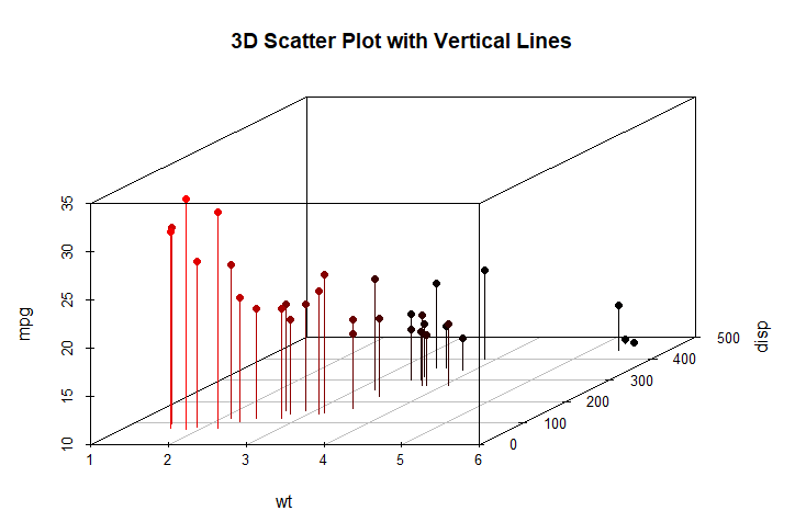
main="Basic 3D Scatter Plot") scatterplot3d(wt, disp, mpg,
pch=16,
highlight.3d=TRUE,
type="h",
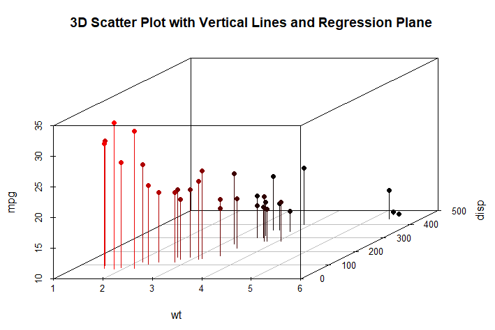
main="3D Scatter Plot with Vertical Lines") s3d <-scatterplot3d(wt, disp, mpg,
pch=16,
highlight.3d=TRUE,
type="h",
main="3D Scatter Plot with Vertical Lines and Regression Plane")
fit <- lm(mpg ~ wt+disp)
s3d$plane3d(fit)
detach(mtcars)

# spinning 3D plot

library(rgl)

attach(mtcars)

plot3d(wt, disp, mpg, col="red", size=5)

# alternative

library(car)

with(mtcars,

     scatter3d(wt, disp, mpg))

# bubble plots

attach(mtcars)

r <- sqrt(disp/pi)

symbols(wt, mpg, circle=r, inches=0.30,

        fg="white", bg="lightblue",

        main="Bubble Plot with point size proportional to displacement",

        ylab="Miles Per Gallon",

        xlab="Weight of Car (lbs/1000)")

text(wt, mpg, rownames(mtcars), cex=0.6)

detach(mtcars)

# Listing 11.2 - Creating side by side scatter and line plots

opar <- par(no.readonly=TRUE)

par(mfrow=c(1,2))

t1 <- subset(Orange, Tree==1)

plot(t1$age, t1$circumference,

     xlab="Age (days)",

     ylab="Circumference (mm)",

     main="Orange Tree 1 Growth")

plot(t1$age, t1$circumference,

     xlab="Age (days)",

     ylab="Circumference (mm)",

     main="Orange Tree 1 Growth",

     type="b")

par(opar)

# Listing 11.3 - Line chart displaying the growth of 5 Orange trees over time

Orange$Tree <- as.numeric(Orange$Tree)

ntrees <- max(Orange$Tree)

xrange <- range(Orange$age)

yrange <- range(Orange$circumference)

plot(xrange, yrange,

     type="n",

     xlab="Age (days)",

     ylab="Circumference (mm)"

)

colors <- rainbow(ntrees)

linetype <- c(1:ntrees)

plotchar <- seq(18, 18+ntrees, 1)

for (i in 1:ntrees) {

  tree <- subset(Orange, Tree==i)

  lines(tree$age, tree$circumference,

        type="b",

        lwd=2,

        lty=linetype[i],

        col=colors[i],

        pch=plotchar[i]

  )

}

title("Tree Growth", "example of line plot")

legend(xrange[1], yrange[2],

       1:ntrees,

       cex=0.8,

       col=colors,

       pch=plotchar,

       lty=linetype,

       title="Tree"

)

# Correlograms
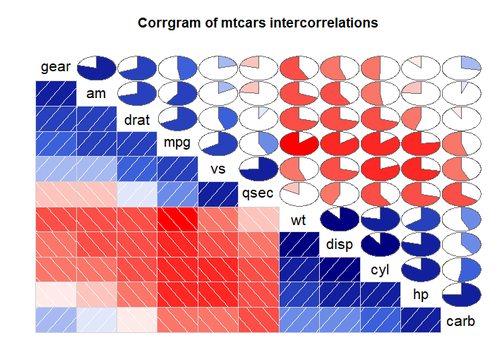
options(digits=2)
cor(mtcars) library(corrgram)
corrgram(mtcars, order=TRUE, lower.panel=panel.shade,
upper.panel=panel.pie, text.panel=panel.txt,
main="Corrgram of mtcars intercorrelations") corrgram(mtcars, order=TRUE, lower.panel=panel.ellipse,
upper.panel=panel.pts, text.panel=panel.txt,
diag.panel=panel.minmax,
main="Corrgram of mtcars data using scatter plots
and ellipses") cols <- colorRampPalette(c("darkgoldenrod4", "burlywood1",
"darkkhaki", "darkgreen"))
corrgram(mtcars, order=TRUE, col.regions=cols,
lower.panel=panel.shade,
upper.panel=panel.conf, text.panel=panel.txt,
main="A Corrgram (or Horse) of a Different Color")


# Mosaic Plots

ftable(Titanic)

library(vcd)

mosaic(Titanic, shade=TRUE, legend=TRUE)

library(vcd)

mosaic(~Class+Sex+Age+Survived, data=Titanic, shade=TRUE, legend=TRUE)


# type= options in the plot() and lines() functions

x <- c(1:5)

y <- c(1:5)

par(mfrow=c(2,4))

types <- c("p", "l", "o", "b", "c", "s", "S", "h")

for (i in types){

  plottitle <- paste("type=", i)

  plot(x,y,type=i, col="red", lwd=2, cex=1, main=plottitle)

}

吴裕雄--天生自然 R语言数据可视化绘图(3)的更多相关文章
- 吴裕雄--天生自然 R语言数据可视化绘图(4)
par(ask=TRUE) # Basic scatterplot library(ggplot2) ggplot(data=mtcars, aes(x=wt, y=mpg)) + geom_poin ...
- 吴裕雄--天生自然 R语言数据可视化绘图(2)
par(ask=TRUE) opar <- par(no.readonly=TRUE) # save original parameter settings library(vcd) count ...
- 吴裕雄--天生自然 R语言数据可视化绘图(1)
par(ask=TRUE) opar <- par(no.readonly=TRUE) # make a copy of current settings attach(mtcars) # be ...
- 吴裕雄--天生自然 R语言开发学习:R语言的安装与配置
下载R语言和开发工具RStudio安装包 先安装R
- 吴裕雄--天生自然 R语言开发学习:数据集和数据结构
数据集的概念 数据集通常是由数据构成的一个矩形数组,行表示观测,列表示变量.表2-1提供了一个假想的病例数据集. 不同的行业对于数据集的行和列叫法不同.统计学家称它们为观测(observation)和 ...
- 吴裕雄--天生自然 R语言开发学习:导入数据
2.3.6 导入 SPSS 数据 IBM SPSS数据集可以通过foreign包中的函数read.spss()导入到R中,也可以使用Hmisc 包中的spss.get()函数.函数spss.get() ...
- 吴裕雄--天生自然 R语言开发学习:处理缺失数据的高级方法(续一)
#-----------------------------------# # R in Action (2nd ed): Chapter 18 # # Advanced methods for mi ...
- 吴裕雄--天生自然 R语言开发学习:R语言的简单介绍和使用
假设我们正在研究生理发育问 题,并收集了10名婴儿在出生后一年内的月龄和体重数据(见表1-).我们感兴趣的是体重的分 布及体重和月龄的关系. 可以使用函数c()以向量的形式输入月龄和体重数据,此函 数 ...
- 吴裕雄--天生自然 R语言开发学习:使用键盘、带分隔符的文本文件输入数据
R可从键盘.文本文件.Microsoft Excel和Access.流行的统计软件.特殊格 式的文件.多种关系型数据库管理系统.专业数据库.网站和在线服务中导入数据. 使用键盘了.有两种常见的方式:用 ...
随机推荐
- 牛客网在线编程_有序矩阵中第K小的元素
Leetcode378原题,所以一样没有数据范围...( log(max-min)二分答案,然后NlogN二分每一行求出小于答案的元素个数,为了保证二分的答案在矩阵中,二分写的要和平常不太一样,最后输 ...
- Spring(四)核心容器 - BeanDefinition 解析
前言 在上篇文章中,我们讨论了 refresh 的前四个方法,主要是对 ApplicationContext 上下文启动做一些准备工作.原计划是对接下来的 invokeBeanFactoryPostP ...
- Dubbo(二):深入理解Dubbo的服务发现SPI机制
一.前言 用到微服务就不得不来谈谈服务发现的话题.通俗的来说,就是在提供服务方把服务注册到注册中心,并且告诉服务消费方现在已经存在了这个服务.那么里面的细节到底是怎么通过代码实现的呢,现在我们来看看D ...
- django中navie time 和 aware time的使用和转换
在django中有关时间被分为navie time 和 aware time两种,前者指的是不带时区标记的时间格式,后者被认为是带有时区标记的时间格式.在django框架的setting.py文件中 ...
- FFMPEG学习----使用SDL播放PCM数据
参考雷神的代码: /** * 最简单的SDL2播放音频的例子(SDL2播放PCM) * Simplest Audio Play SDL2 (SDL2 play PCM) * * 本程序使用SDL2播放 ...
- sqlserver backup and restore -- partital restore
Like a tratitional database, sqlserver not only could resotre full database but also do restore one ...
- learn about sqlserver partitition and partition table 1
Dear all, Let get into business, the partitions on sql server is very different with that on oracle. ...
- 2020牛客寒假算法基础集训营4 E:最小表达式
E:最小表达式 考察点 : 贪心,高精度 坑点 : 高精度一定不要写错,一定一定不要写错 剩下的就是细节问题 侃侃 : 1.字符串长度达到 5e5,如果要涉及到加法,乘法,普通的肯定会爆 long l ...
- 导出Chrome浏览器中保存的密码
title: 导出Chrome浏览器中保存的密码 date: 2018-02-11 17:54:51 tags: --- 导出Chrome浏览器中保存的密码 先知看到的,挺有意思,记录一下 不同浏览器 ...
- SQL基础语法—update语句
1 update语句介绍 update语句用来修改表中的数据内容 Single-table syntax: UPDATE [LOW_PRIORITY] [IGNORE] table_reference ...