CSS3 Animations
-
CSS Animations 是CSS的一个模块,它定义了如何用关键帧来随时间推移对CSS属性的值进行动画处理。关键帧动画的行为可以通过指定它们的持续时间,它们的重复次数以及它们如何重复来控制。
animation-delay
animation-delayCSS属性定义动画于何时开始,即从动画应用在元素上到动画开始的这段时间的长度。0s是该属性的默认值,代表动画在应用到元素上后立即开始执行。否则,该属性的值代表动画样式应用到元素上后到开始执行前的时间长度;定义一个负值会让动画立即开始。但是动画会从它的动画序列中某位置开始。例如,如果设定值为-1s,动画会从它的动画序列的第1秒位置处立即开始。
通常用
animation简写属性一次性设置动画效果较为方便。初始值 0s适用元素 all elements, ::beforeand::afterpseudo-elements是否是继承属性 否 适用媒体 visual 计算值 as specified Animation type discrete 正规顺序 the unique non-ambiguous order defined by the formal grammar 语法
animation-delay: 3s;

animation-delay: 2s, 4ms;
值
<time>- 从动画样式应用到元素上到元素开始执行动画的时间差。该值可用单位为秒(s)和毫秒(ms)。如果未设置单位,定义无效。
animation-direction
概述
animation-directionCSS 属性指示动画是否反向播放,它通常在简写属性animation中设定初始值 normal适用元素 all elements, ::beforeand::afterpseudo-elements是否是继承属性 否 适用媒体 visual 计算值 as specified Animation type discrete 正规顺序 the unique non-ambiguous order defined by the formal grammar 语法
<single-animation-direction> = normal | reverse | alternate | alternate-reverse

animation-direction: normal

animation-direction: reverse

animation-direction: alternate

animation-direction: alternate-reverse

animation-direction: normal, reverse

animation-direction: alternate, reverse, normal
值
normal每个循环内动画向前循环,换言之,每个动画循环结束,动画重置到起点重新开始,这是默认属性。alternate动画交替反向运行,反向运行时,动画按步后退,同时,带时间功能的函数也反向,比如,ease-in 在反向时成为ease-out。计数取决于开始时是奇数迭代还是偶数迭代reverse- 反向运行动画,每周期结束动画由尾到头运行。
alternate-reverse反向交替, 反向开始交替- 动画第一次运行时是反向的,然后下一次是正向,后面依次循环。决定奇数次或偶数次的计数从1开始.
animation-duration
概述
animation-duration属性指定一个动画周期的时长。默认值为0s,表示无动画。
使用简写属性
animation很方便地同时设置所有的动画属性。初始值 0s适用元素 all elements, ::beforeand::afterpseudo-elements是否是继承属性 否 适用媒体 visual 计算值 as specified 是否适用于 CSS 动画 否 正规顺序 the unique non-ambiguous order defined by the formal grammar 语法
animation-duration: 6s

animation-duration: 120ms

animation-duration: 1s, 15s

animation-duration: 10s, 30s, 230ms
值
<time>- 一个动画周期的时长,单位为秒(s)或者毫秒(ms),无单位值无效。
注意:负值无效,浏览器会忽略该声明,但是一些早起的带前缀的声明会将负值当作0s。animation-fill-mode
概述
animation-fill-mode这个 CSS 属性用来指定在动画执行之前和之后如何给动画的目标应用样式。初始值 none适用元素 all elements, ::beforeand::afterpseudo-elements是否是继承属性 否 适用媒体 visual 计算值 as specified Animation type discrete 正规顺序 the unique non-ambiguous order defined by the formal grammar 语法
<single-animation-fill-mode> = none | forwards | backwards | both

animation-fill-mode: none

animation-fill-mode: forwards

animation-fill-mode: backwards

animation-fill-mode: both

/* 可以应用多个参数,这个时候使用逗号隔开  */

/* 各个参数应用于与次序相对应的动画名 */

animation-fill-mode: none, backwards

animation-fill-mode: both, forwards, none
值
none动画执行前后不改变任何样式forwards目标保持动画最后一帧的样式,最后一帧是哪个取决于animation-direction和animation-iteration-count:-
animation-directionanimation-iteration-countlast keyframe encountered normaleven or odd 100%ortoreverseeven or odd 0%orfromalternateeven 0%orfromalternateodd 100%ortoalternate-reverseeven 100%ortoalternate-reverseodd 0%orfrom backwards动画采用相应第一帧的样式,保持animation-delay,第一帧取法如下:-
animation-directionfirst relevant keyframe normaloralternate0%orfromreverseoralternate-reverse100%orto both动画将会执行 forwards 和 backwards 执行的动作。
代码实例:
<!DOCTYPE html>
<html>
<head>
<meta charset="utf-8">
<title>动画</title>
<style type="text/css">
.demo {
border-top: 100px solid #ccc;
height: 300px;
font-family: sans-serif;
}
@keyframes grow {
0% { font-size: 0 }
100% { font-size: 40px }
}
@-webkit-keyframes grow {
0% { font-size: 0 }
100% { font-size: 40px }
}
.demo:hover .grows {
animation-name: grow;
animation-duration: 3s;
-webkit-animation-name: grow;
-webkit-animation-duration: 3s;
}
.demo:hover .growsandstays {
animation-name: grow;
animation-duration: 3s;
animation-fill-mode: forwards;
-webkit-animation-name: grow;
-webkit-animation-duration: 3s;
-webkit-animation-fill-mode: forwards;
} </style>
</head>
<body>
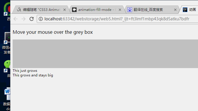
<p>Move your mouse over the grey box</p>
<div class="demo">
<div class="grows">This just grows</div>
<div class="growsandstays">This grows and stays big</div>
</div>
</body>
</html>animation-iteration-count
概要
animation-iteration-countCSS属性定义动画在结束前运行的次数可以是1次无限循环.默认属性
animation默认播放动画循环一次.初始值 1适用元素 all elements, ::beforeand pseudo-elements::after是否是继承属性 否 适用媒体 visual 计算值 as specified Animation type discrete 正规顺序 the unique non-ambiguous order defined by the formal grammar 语法
animation-iteration-count: infinite;

animation-iteration-count: ;

animation-iteration-count: 2.3;

animation-iteration-count: , , infinite;
值
infinite- 无限循环播放动画.
<number>- 动画播放的次数不可为负值.可以用小数定义循环(
0.5将播放动画到关键帧的一半(from 0 ~ 50%).
语法
<single-animation-iteration-count> = infinite | <number>animation-name
概述
animation-name属性指定应用的一系列动画,每个名称代表一个由@keyframes定义的动画序列。使用简写属性
animation可以很方便地同时设置所有的动画属性。初始值 none适用元素 all elements, ::beforeand::afterpseudo-elements是否是继承属性 否 适用媒体 visual 计算值 as specified 是否适用于 CSS 动画 否 正规顺序 the unique non-ambiguous order defined by the formal grammar 语法
<single-animation-name> = none | IDENTanimation-name: none
animation-name: test_05
animation-name: -specific
animation-name: sliding-vertically animation-name: test1
animation-name: test1, animation4
animation-name: none, -moz-specific, sliding animation-name: initial
animation-name: inherit
animation-name: unset值
none- 特殊关键字,表示无关键帧。可以不改变其他标识符的顺序而使动画失效,或者使层叠的动画样式失效。
IDENT- 标识动画的字符串,由大小写不敏感的字母a-z、数字0-9、下划线(_)和/或横线(-)组成。第一个非横线字符必须是字母,数字不能在字母前面,不允许两个横线出现在开始位置。
animation-play-state
概述
animation-play-stateCSS 属性定义一个动画是否运行或者暂停。可以通过查询它来确定动画是否正在运行。另外,它的值可以被设置为暂停和恢复的动画的重放。恢复一个已暂停的动画,将从它开始暂停的时候,而不是从动画序列的起点开始在动画。
初始值 running适用元素 all elements, ::beforeand::afterpseudo-elements是否是继承属性 否 适用媒体 visual 计算值 as specified 是否适用于 CSS 动画 否 正规顺序 the unique non-ambiguous order defined by the formal grammar 语法
/* Single animation */

animation-play-state: running;

animation-play-state: paused;

/* Multiple animations */

animation-play-state: paused, running, running;

/* Global values */

animation-play-state: inherited;

animation-play-state: initial;

animation-play-state: unset;
值
running- 当前动画正在运行。
paused- 当前动画以被停止。
正式语法
<single-animation-play-state> = running | pausedanimation-timing-function
概述
CSS
animation-timing-function属性定义CSS动画在每一动画周期中执行的节奏。可能值为一或多个<timing-function>。对于关键帧动画来说,timing function作用于一个关键帧周期而非整个动画周期,即从关键帧开始开始,到关键帧结束结束。
定义于一个关键帧区块的缓动函数(animation timing function)应用到改关键帧;另外,若该关键帧没有定义缓动函数,则使用定义于整个动画的缓动函数。
通常用
animation简写定义整个动画属性更为方便。初始值 ease适用元素 all elements, ::beforeand::afterpseudo-elements是否是继承属性 否 适用媒体 visual 计算值 as specified 是否适用于 CSS 动画 否 正规顺序 the unique non-ambiguous order defined by the formal grammar 语法
animation-timing-function: ease;

animation-timing-function: ease-in;

animation-timing-function: ease-out;

animation-timing-function: ease-in-out;

animation-timing-function: linear;

animation-timing-function: cubic-bezier(0.1, 0.7, 1.0, 0.1);

animation-timing-function: step-start;

animation-timing-function: step-end;

animation-timing-function: steps(, end);

animation-timing-function: ease, step-start, cubic-bezier(0.1, 0.7, 1.0, 0.1);
值
<timingfunction>- 每个
<timing-function>代表了应用于动画的timing function,定义于animation-property.
正式语法
<timing-function>#
CSS3 Animations的更多相关文章
- CSS3 笔记四(Transforms/Transition/Animations)
CSS3 2D Transforms Methods translate() rotate() scale() skewX() skewY() matrix() 1> translate() T ...
- Magic CSS3 – 创建各种神奇的交互动画效果
Magic CSS3 Animations 动画是一个独特的 CSS3 动画特效包,你可以自由地使用您的 Web 项目中.只需简单的在页面上引入 CSS 样式: magic.css 或者压缩版本 ma ...
- 40免费的 jQuery & CSS3 图片热点特效
jQuery CSS3 形象悬停效果可能是一个优秀的网站项目中添加的效果.这个特殊的收集是大约50个 jQuery CSS3 形象徘徊影响最近出版的.这些图像悬停效果可以作为一个有效的和创造性的方式添 ...
- CSS3入门
CSS3 w3cschools css3 MDN英文 MDN中文 CSS3 is the latest evolution of the Cascading Style Sheets langua ...
- Magic CSS3 一款独特的CSS3动画特效包
插件描述: Magic CSS3 Animations 动画是一款独特的CSS3动画特效包,你可以自由地使用在您的网页中.只需简单的在页面上引入 CSS 文件: magic.css 或者压缩版本 ...
- 丰富您设计的10个CSS3效果库
Magic CSS3 Animations Magic CSS3 Animations是一个CSS3动画包,拥有一些特效可以你的Web项目中免费使用.拥有像金光闪闪,角度,旋转,炸弹等特殊效果.使用简 ...
- 竟然没有转载。。。A Few of My Favorite HTML5 and CSS3 Online Tools
HTML5 Boilerplate HTML5 Boilerplate provides a great way to get started building HTML5 sites. It inc ...
- 纯CSS3跳动焦点广告轮播特效
1. [代码] 纯CSS3跳动焦点广告轮播特效 <!-- Author: Developed by Caleb Jacob Author Website: http://iamceege.co ...
- 从Knockout到Angular的架构演变
2008年第一次在WPF中使用MVVM模式之后,就一直热衷于耦合隔离.模块化与重构.UI和逻辑分离.单元测试以及后面的领域模型.谈及MVVM模式,自己也开发过一套框架,但没有长期更新和维护,所以索性就 ...
随机推荐
- uva live 7639 Extreme XOR Sum (暴力+二项式)
题目链接:https://icpcarchive.ecs.baylor.edu/index.php?option=com_onlinejudge&Itemid=8&page=show_ ...
- ngTemplateOutlet递归的问题
今天尝试通过 ng-template 加 ngTemplateOutlet实现一个递归的菜单.但是遇到一个问题:NullInjectorError: No provider for NzMenuDir ...
- ConcurrentSkipListMap 源码分析
ConcurrentSkipListMap ConcurrentSkipListMap 能解决什么问题?什么时候使用 ConcurrentSkipListMap? 1)ConcurrentSkipLi ...
- python -加密(MD5)
import hashlib def md5_passwd(str,salt ='aaaaa') str = str + salt m = hashlib.md5()#构造一个MD5对象 m.upda ...
- log4j 不输出mybatis的sql
有可能导入多个日志工具jar,导致mybatis不知道使用哪种日志.修改你的mybatis配置,添加setting,指定日志类型为log4j. <configuration> <!- ...
- 博客图片上传picgo工具安装配置github图传使用
摘要 对于每一个写博客的人来说,图片是至关重要.这一路经历了多次图片的烦恼,之前选择了微博个人文章那里粘贴图片的方式上传,感觉也挺方便的.但是由于新浪的图片显示问题,如果header中不设置 标签就不 ...
- 【FICO系列】SAP FICO 基本概念
公众号:SAP Technical 本文作者:matinal 原文出处:http://www.cnblogs.com/SAPmatinal/ 原文链接:[FICO系列]SAP FICO 基本概念 ...
- 【BASIS系列】SAP 批量锁住用户和TCODE的方法
公众号:SAP Technical 本文作者:matinal 原文出处:http://www.cnblogs.com/SAPmatinal/ 原文链接:[BASIS系列]SAP 批量锁住用户和TCOD ...
- YOLOv3 算法的详细说明
YOLOv3没有太多的创新,主要是借鉴一些好的方案融合到YOLO里面.不过效果还是不错的,在保持速度优势的前提下,提升了预测精度,尤其是加强了对小物体的识别能力. 本文主要讲v3的改进,由于是以v1和 ...
- 一些基础的ES6 语法
<script> window.onload = function () { //---------------------------let----------------------- ...